When talking to John Keefe, Product Manager & Bot Developer at Quartz, he encourages the journalism community to experiment with chat bots and try different tools. In this video, he shares some tips and tricks with us on what platforms to use and how journalists can build chat bots themselves.
Building chat bots is not as hard as it seems!
I would say, just give it a try!
Michaela Gruber is a journalism and media management student, based in Vienna, Austria. During her studies she spent a semester abroad in France, where she started working for HEI-DA.
As the company’s communication officer, she is in charge of the Data Journalism Blog and several social media activities. This year, Michaela was HEI-DA’s editor covering the Data Journalism Awards in Lisbon, Portugal.
Lessons learned from an online discussion with experts
The COP23 conference is right round the corner (do I hear “climate change”?) and many data journalists around the world may wonder: How do you go about reporting on environmental data?
With the recent onslaught of hurricanes, such as Harvey, Irma, and Maria, and wildfires in Spain, Portugal and California, data journalists have been working hard to interpret scientific data, as well as getting creative to make it reader friendly.
The COP23 (do I hear climate change?) also serves as a great opportunity for data journalists to take a step back and ask:
What is the best way of reporting on data related to the environment? Where do you find the data in the first place? How do you make it relatable to the public and which challenges do you face along the way?
From top left to bottom right: Kate Marvel of NASA GISS (USA), James Anderson of Global Forest Watch (USA), Rina Tsubaki of European Forest Institute (Spain), Gustavo Faleiros of InfoAmazonia (Brazil), Elisabetta Tola of Formicablu (Italy), and Tim Meko of The Washington Post (USA)
Here is a recap of what we’ve learned including tips and useful links.
Environmental data comes in many formats…only known by scientists
When it comes to working with environmental data, both journalists and scientists seem to be facing challenges. The main issue seems not to come from scarcity of data but rather from what journalists can do with it, as Elisabetta Tola of Formicablu (Italy) explained:
‘Things are still quite complicated because we have more data available than before but it is often difficult to interpret and to use with journalistic tools’, she said.
There also seems to be a gap between the speed at which data formats evolve in that area and how fast journalists learn how to work with these formats.
‘I think we are still in a moment where we know just a little about data formats. We know about spreadsheets and geodata, but then there are all these other formats, used only by scientists. And I am not really sure how we could use those’, said Gustavo Faleiros of InfoAmazonia (Brazil).
Environmental data should be more accessible and easy to interpret and scientists and journalists should be encouraged to work hand-in-hand more often. The existing incentive structure makes that hard: ‘Scientists don’t get paid or promoted for talking to journalists, let alone helping process data’, said Kate Marvel of NASA GISS (USA).
So what could be done to make things better?
“We need to open up more channels between journalists and scientists: find more effective ways of communicating’, said Elisabetta Tola of Formicablu.
We also need more collaboration not just among data journalism folks, but with larger communities.
‘Really, it is a question of rebuilding trust in media and journalism’, said Rina Tsubaki of European Forest Institute.
‘I think personalising stories, making them hyper-local and relevant, and keeping the whole process very transparent and open are key’, said James Anderson of Global Forest Watch.
Indeed, there seems to be a need to go further than just showing the data: ‘People feel powerless when presented with giant complex environmental or health problems. It would be great if reporting could go one step further and start to indicate ‘what’s the call to action’. That may involve protecting themselves, engaging government, responding to businesses’, said James Anderson of Global Forest Watch.
Top idea raised during the discussion: “It would be great to have something like Hacks&Hackers where scientists and journalists could work together. Building trust between these communities would improve the quality of environmental reporting but also the reward, at least in terms of public recognition, of scientists work.” Suggested by Elisabetta Tola of Formicablu.
To make environmental data more ‘relatable’, add a human angle to your story
As the use of environmental data has become much more mainstream, at least in American media markets, audiences can interact more directly with the data than ever before.
‘But we will have to find ways to keep innovating, to keep people’s attention, possibly with much more personalised data stories (what does the data say about your city, your life in particular, for example)’, said James Anderson of Global Forest Watch.
‘Characters! People respond to narratives, not data. Even abstract climate change concepts can be made engaging if they’re embedded in a story’, said Kate Marvel of NASA GISS.
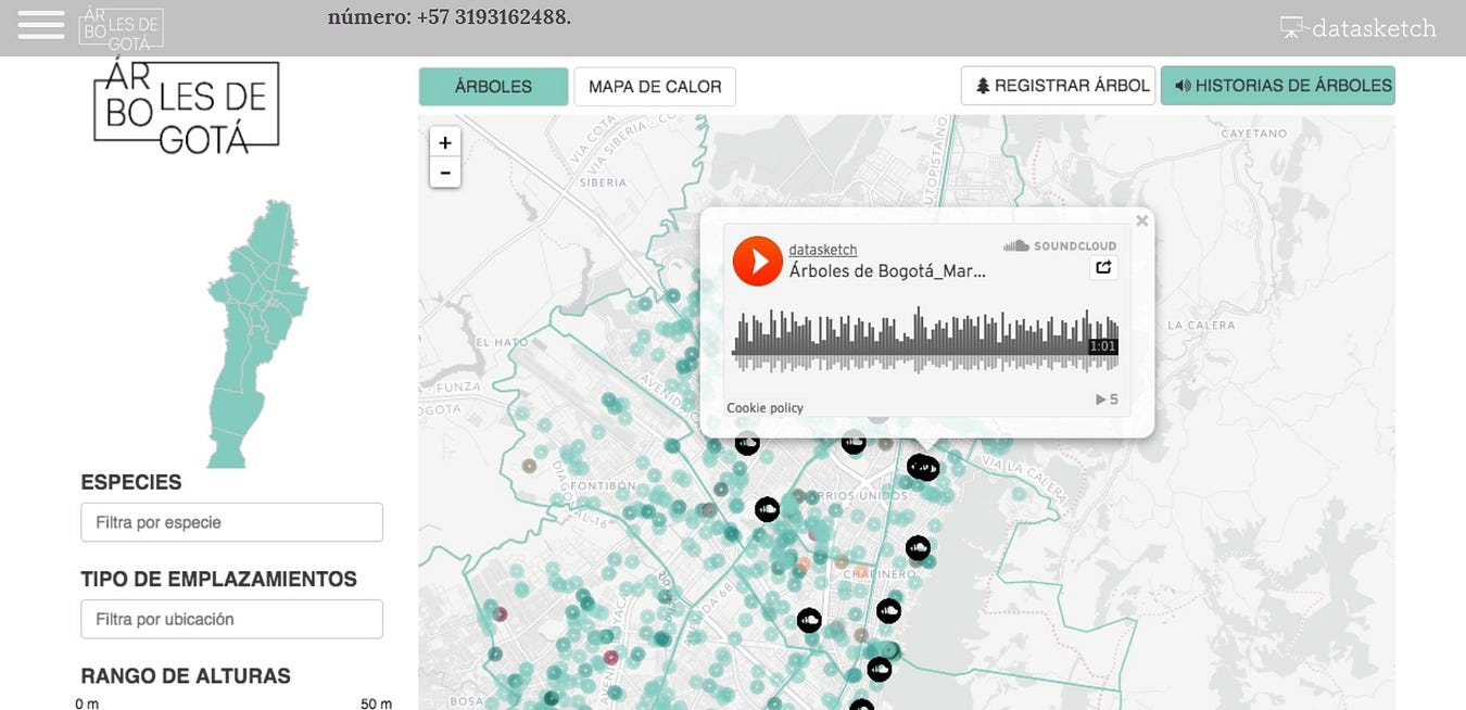
For example, this project by Datasketch, shows how Bogotá has changed radically in the last 30 years. ‘One of the main transformations’, the website says ‘is in the forestation of the city as many of the trees with which the citizens grew have disappeared’.
This project by Datasketch, shows how Bogotá has changed radically in the last 30 years and include citizen’s stories of trees
With this project, Juan Pablo Marín and his team attached citizen stories to specific trees in their city. They mapped 1.2 million trees and enabled users to explore narrated stories by other citizens on a web app.
‘I like any citizen science efforts, because that gets a community of passionate people involved in actually collecting the data. They have a stake in it’, James Anderson of Global Forest Watch argued.
He pointed out to this citizen science project where scientists are tracking forest pests through people’s social media posts.
One more idea for engaging storytelling on climate change: Using art to create a beautiful and visual interactive: Illustrated Graphs: Using Art to Enliven Scientific Data by Science Friday
Shared by Rina Tsubaki of European Forest Institute
Tips on how to deal with climate change sceptics
‘Climate denial isn’t about science — we can’t just assume that more information will change minds’, said Kate Marvel of NASA GISS.
Most experts seem to agree. ‘It often is more of a tribal or cultural reaction, so more information might not stick. I personally think using language other than ‘climate change’, but keeping the message (and call to action to regulate emissions) can work’, said James Anderson of Global Forest Watch.
‘Keeping a high quality and a very transparent process can help people who look for information with an open mind or at least a critical attitude’, Elisabetta Tola of Formicablu added.
A great initiative where scientists are verifying media’s accuracy: Climate Feedback
Shared by Rina Tsubaki of European Forest Institute
Places to find data on the environment
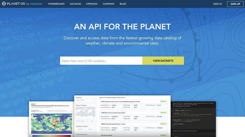
The Planet OS Datahub makes it easy to build data-driven applications and analyses by providing consistent, programmatic access to high-quality datasets from the world’s leading providers.
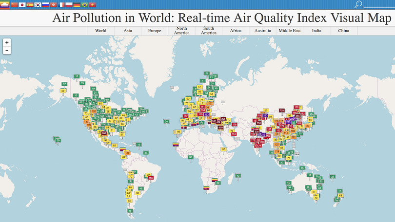
AQICN looks at air pollution in the world with a real-time air quality index.
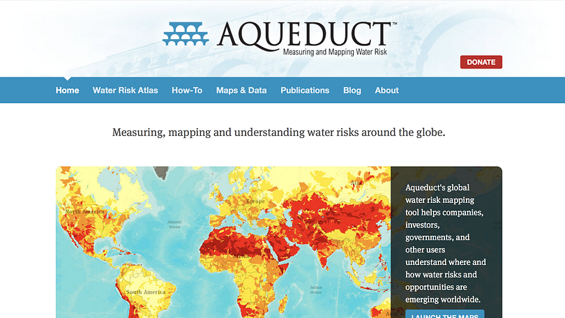
Aqueduct by the World Resources Institute, for mapping water risk and floods around the world.
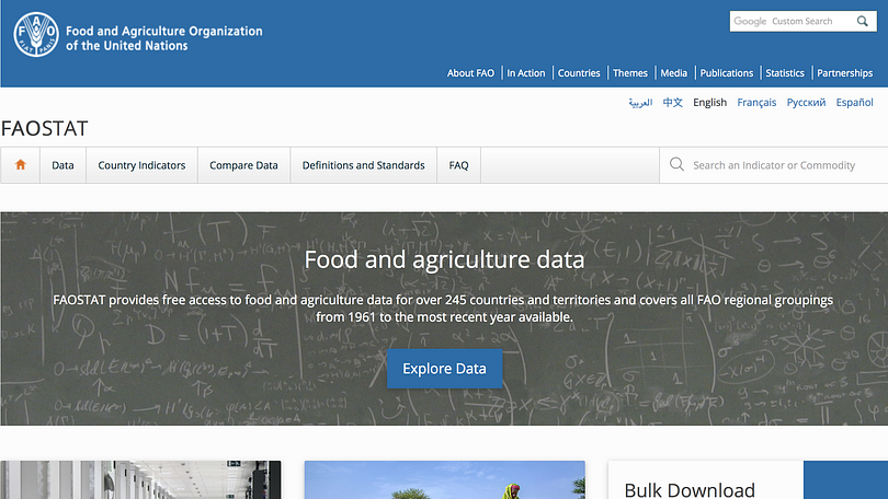
FAOSTAT provides free access to food and agriculture data for over 245 countries and territories and covers all FAO regional groupings from 1961 to the most recent year available.
Global Forest Watch offers the latest data, technology and tools that empower people everywhere to better protect forests.
The Global Land Cover Facility (GLCF) provides earth science data and products to help everyone to better understand global environmental systems. In particular, the GLCF develops and distributes remotely sensed satellite data and products that explain land cover from the local to global scales.
Planet Labs is also great for local imagery and monitoring. Their website feature practical examples of where their maps and satellite images were used by news organisations.
News from our community: In a few months, James Anderson and the team at Global Forest Watch will launch an initiative called Resource Watch which will work as an aggregator and tackle a broader set of environmental issues.
“It was inspired by the idea that environmental issues intersect — for example forests affect water supply, and fires affect air quality. We wanted people to be able to see how interconnected these things are,” said Anderson.
What to do if there is no reliable data: the case of non-transparent government
It is not always easy or straightforward to get data on the environment, and the example of Nigeria was brought about during our discussion by a member of the DJA Slack team.
‘This is because of hypocrisy in governance’, a member argued.
‘I wish to say that press freedom is guaranteed in Nigeria on paper but not in reality.
You find that those in charge of information or data management are the first line of gatekeepers that will make it practically impossible for journalists to access such data.
I can tell you that, in Nigeria, there is no accurate data on forestry, population figure and so on’.
So what is the way out? Here are some tips from our experts:
‘I would try using some external, no official sources. You can try satellite imagery by NASA or Planet Labs or even Google, then distribute via Google Earth or their Google News Lab. Also you can download deforestation, forest fires and other datasets from sites of University of Maryland or the CGIAR Terra-i initiative’, Gustavo Faleiros of InfoAmazonia suggested.
‘I think with non-transparent governments, it is sometimes useful to play both an “inside game” (work with the government to slowly [publish] more and more data under their own banner) and an “outside game” (start providing competing data that is better, and it will raise the bar for what people [should] expect)’, said James Anderson of Global Forest Watch.
‘It’s a really tough question. We’ve worked with six countries in the Congo Basin to have them improve their data collection, quality-control, and sharing. They now have key land data in a publicly-available portal. But it took two decades of hard work to build that partnership’, he added.
‘I think this is exactly the case when a good connection with local scientists can help’, said Elisabetta Tola of Formicablu. ‘There are often passionate scientists who really wish to see their data out. Especially if they feel it could be of use to the community. I started working on data about seismic safety over five years ago. I am still struggling to get the data that is hidden in tons of drawers and offices. I know it’s there’, she added.
‘For non-transparent governments, connect with people who are behind facilitating negotiations for programmes like REDD to get insider view’, added Rina Tsubaki of European Forest Institute.
CARTO is the platform for turning location data into business outcomes.
What tools do you use when reporting on environmental data?
Here is what our data journalism community said they played with on a regular basis:
CARTO enriches your location data with versatile, relevant datasets, such as demographics and census, and advanced algorithms, all drawn from CARTO’s own Data Observatory and offered as Data as a Service.
QGIS is a free and open source geographic information system. It enables you to create, edit, visualise, analyse and publish geospatial information.
OpenStreetMap is a map of the world, created by members of the public and free to use under an open licence.
Datawrapper, an open source tool helping everyone to create simple, correct and embeddable charts in minutes.
R, Shiny and Leaflet with plugins were used to make these heatmaps of distribution of tree species in Bogotá.
D3js, a JavaScript library for visualizing data with HTML, SVG, and CSS.
Flourish makes it easy to turn your spreadsheets into world-class responsive visualisations, maps, interactives and presentations. It is also free for journalists.
Great examples of data journalism about the environment we’ve come across lately
How Much Warmer Was Your City in 2015?
By K.K. Rebecca Lai for The New York Times
Interactive chart showing high and low temperatures and precipitation for 3,116 cities around the world.
(shared by Gustavo Faleiros of InfoAmazonia)
What temperature in Bengaluru tells about global warming
By Shree DN for Citizen Matters
Temperature in Bengaluru was the highest ever in 2015. And February was the hottest. Do we need more proof of global warming?
(shared by Shree DN of Citizen Matters in India)
Data Science and Climate Change: An Audience Visualization
By Hannah Chapple for Affinio Blog
Climate change has already been a huge scientific and political topic in 2017. In 2016, one major win for climate change supporters was the ratifying of the Paris Agreement, an international landmark agreement to limit global warming.
(shared by Rina Tsubaki of European Forest Institute)
Google’s Street View cars can collect air pollution data, too
By Maria Gallucci for Mashable
“On the question of compelling environmental stories to prioritize, (this was a bit earlier in the thread) I feel like hyper-local air quality (what is happening on your street?) is powerful stuff. People care about what their family breathes in, and its an urgent health crisis. Google StreetView cars are now mapping this type of pollution in some places.”
(shared by James Anderson of Global Forest Watch)
This Is How Climate Change Will Shift the World’s Cities
By Brian Kahn for Climate Central
Billions of people call cities home, and those cities are going to get a lot hotter because of climate change.
(shared by Rina Tsubaki of European Forest Institute)
Treepedia :: MIT Senseable City Lab Exploring the Green Canopy in cities around the world
(shared by Rina Tsubaki of European Forest Institute)
Losing Ground
By ProPublica and The Lens
Scientists say one of the greatest environmental and economic disasters in the nation’s history — the rapid land loss occurring in the Mississippi Delta — is rushing toward a catastrophic conclusion. ProPublica and The Lens explore why it’s happening and what we’ll all lose if nothing is done to stop it.
(shared by Elisabetta Tola of Formicablu)
Watergrabbing
A Story of Water, looks into the water-hoarding phenomenon. Every story explains a specific theme (transboundary waters, dams, hoarding for political and economic purposes), and shows the players involved, country-by-country. Take time to read and discover what water grabbing means. So that water can become a right for each country and every person.
(shared by Elisabetta Tola of Formicablu)
Ice and sky
By Wild-Touch
Discover the history and learn about climate changes — the interactive documentary
(shared by Gustavo Faleiros of InfoAmazonia)
Extreme Weather
By Vischange.org
The resources in this toolkit will allow communicators to effectively communicate extreme weather using strategically framed visuals and narratives. Watch the video to see it in action!
(shared by Rina Tsubaki of European Forest Institute)
Plus, there is a new version of Bear 71 available for all browsers: Bear 71 VR
Explore the intersection of humans, nature and technology in the interactive documentary. Questioning how we see the world through the lens of technology, this story blurs the lines between the wild world, and the wired one.
(shared by Gustavo Faleiros of InfoAmazonia)
Marianne Bouchart is the founder and director of HEI-DA, a nonprofit organisation promoting news innovation, the future of data journalism and open data. She runs data journalism programmes in various regions around the world as well as HEI-DA’s Sensor Journalism Toolkit project and manages the Data Journalism Awards competition.
Before launching HEI-DA, Marianne spent 10 years in London where she worked as a web producer, data journalism and graphics editor for Bloomberg News, amongst others. She created the Data Journalism Blog in 2011 and gives lectures at journalism schools, in the UK and in France.
I’ve been working in data journalism since 2012. And one of the biggest personal challenges I still face is balancing between learning new tools, become more proficient with older ones, and not missing deadlines because I am spending too much time learning how to use data journalism tools.
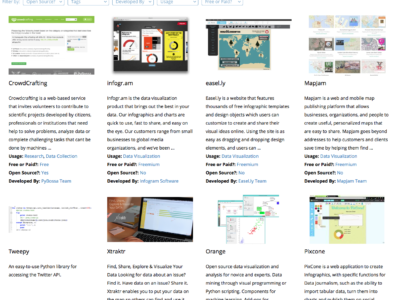
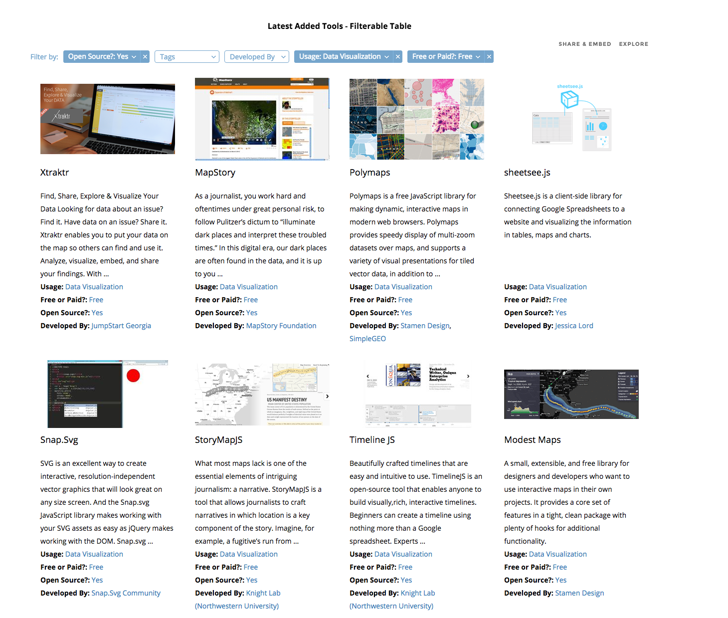
When I started as a data journalism student, I began filling in a spreadsheet with links to inspiring tools I wanted to use and learn. I collected these from mailing lists, tweets, blogs and friends’ suggestions. At first, the spreadsheet was simply an ugly dump of links that I used as a student, then as a freelancer, then as a data journalist and data expert at Silk. A month ago I decided to turn it into something useful for other data journalists as well: an interactive and searchable database of data journalism tools. I knew that there were already many resources listing hundreds of (data) journalism tools. But all the ones I saw were lacking the data structure that would make it easy (and beautiful) to sift through the information.
Silk.co is a platform for publishing, visualizing and sharing data on the Web. I realized that this was also the best tool to publish my data journalism tools’ database.
On Silk I could:
quickly upload a spreadsheet to organize the information in an interactive database
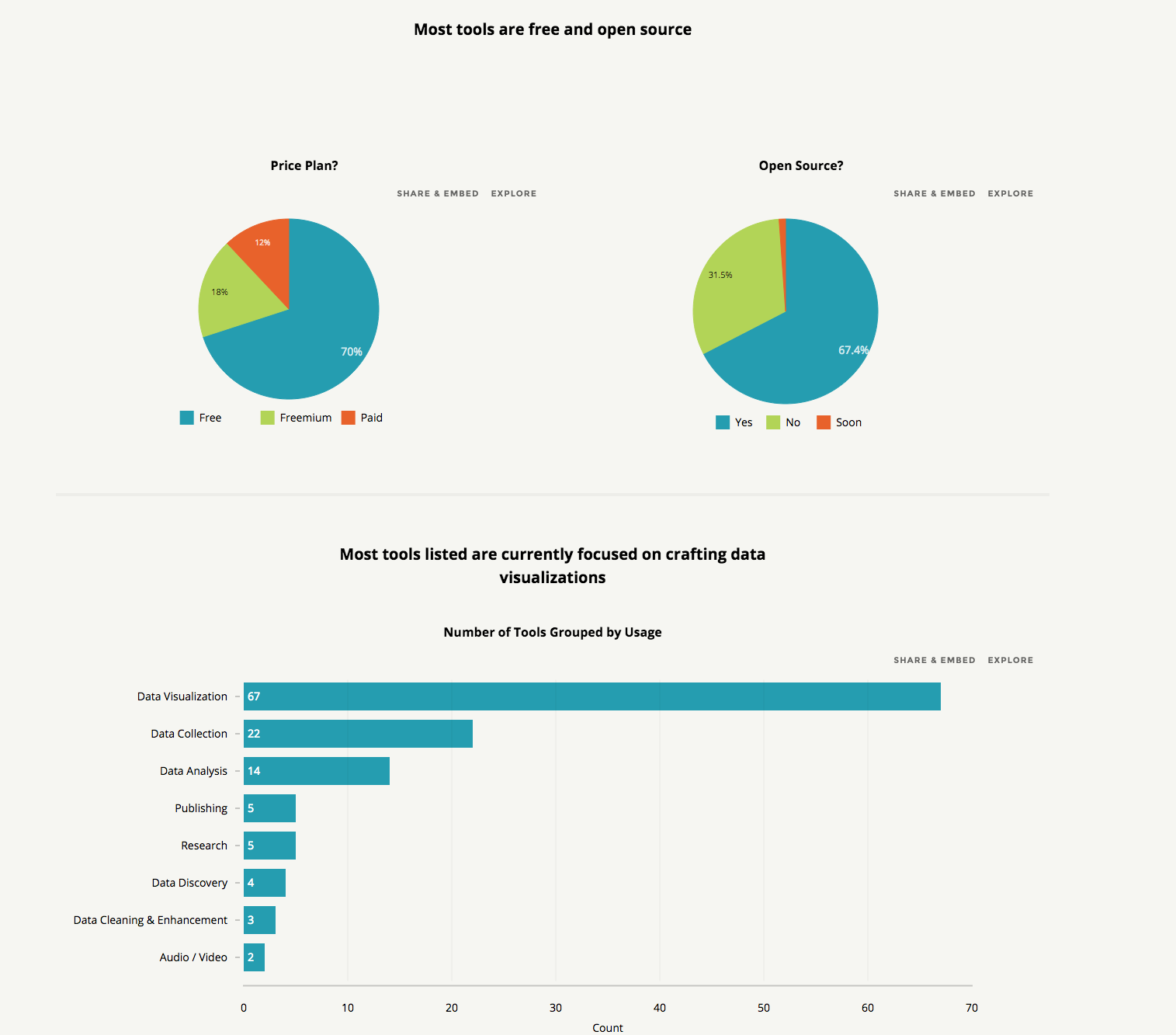
visualize information about the tools, either as individual entries in galleries or tables or as a chart showing types of tools and other data
have individual profiles for each tool
generate inline filters that each time would allow me to find the tool I needed.
The project went live two weeks ago. You can find it at data-journalism-tools.silk.co. I am regularly updating the Data Journalism Tools Silk, adding about 10 new tools every week. You can go to the website to check it out, or you can also “follow” it to receive free updates via email every time something new is added.
Just as this Data Journalism Tools Silk is intended for the community, it will greatly benefit from the community’s input. For this, I’ve made a Google Form so that anyone can suggest a favourite tool.
The key thing for me is that adding real structure to data adds tremendous power to whatever presentation vector you choose to deploy. There are blogs and lists that contain many, many more journalism tools than this one. But by adding structure to each tool and putting it onto its own structured Web page, we can unlock the power of the data as a filtering, visualization and discovery tool. More structured data equals more discovery.
We’re all acquainted with the perks and limitations of using Google Fusion, Tableau, Many Eyes and Open Street Map but I was wondering what other visualisation and infographic tools are readily accessible and available for wannabe data journalists. And more specifically, wannabe data journalists with no graphic design experience (like me).
After studying Data Journalism for a year at City University I have come to appreciate the importance of having the skillset to make the most out of numbers and statistics. Many aspiring journalists still see data as something that is separate from journalism, and as something that does not interest them. In response, I have compiled some reasons why data is increasingly important:
1. Make sense of Mass Information
Having the skills to scrape, analyse, clean and present data allows journalists to present complicated and otherwise incomprehensible information in a clear way. It is an essential part of journalism to find material and present it to the public. Understanding data allows journalists to do this with large amounts of information, which would otherwise be impossible to understand.
2. New Approaches to Storytelling
Able to create infographics and visualisations, data journalists can see and present information in a new and interesting way. Stories no longer need to be linear and based solely on text. Data can be grafted into a narrative which people can read visually. Interactive elements of data visualisations allow people to explore the information presented and make sense of it in their own way.
3. Data Journalism is the Future
Understanding data now will put journalists ahead of the game. Information is increasingly being sourced and presented using data. Journalists who refuse to adapt to the modern, increasingly technological world will be unable to get the best stories, by-lines and scoops and their careers will suffer as a result.
4. Save Time
No longer must journalists pore over spread-sheets and numbers for hours when there could be a simpler way to organise the information. Being technologically savvy and knowing the skills to apply to data sets can save journalists time when cleaning, organising and making sense of data. Not making mistakes due to lack of knowledge can also save a journalist time.
5. A way to see things you might otherwise not see
Understanding large data sets can allow journalists to see significant information that they might otherwise have overlooked. Equally, some stories are best told using data visualisations as this enables people to see things that they might otherwise have been unable to understand.
6. A way to tell richer stories
Combining traditional methods of storytelling with data visualisations, infographics, video or photographs, creates richer, more interesting and detailed stories.
7. Data is an essential part of Journalism
Many journalists do not see data as a specialist and separate area of journalism, but an interwoven, essential and important element of it. It is not there to replace traditional methods of finding information, but to enhance them. The journalist that can combine a good contact book and an understanding of data will be invaluable in the future.
When collaboratively constructing datasets to be consumed by interactive graphics, a Google Spreadsheet is often where everything starts. This makes a lot of sense — the cloud-based nature of the document means it’s very accessible and doesn’t need to be emailed around to everyone with each revision, multiple people can simultaneously work on it without having to worry about syncing a bunch of changes and it’s easier to use than a relational database (or even the back-end tools to manipulate such databases; for instance, phpMyAdmin.).
However, what about when the dataset’s finished? One completed, it likely has to then be exported as a CSV and imported into a database, or, worse yet, manually reproduced in another web-consumable format — for instance, JSON.
If your dataset never changes and everyone on your team knows how to move the data from Google Spreadsheets into the web-consumable format, this might not be a problem. But what about if that data changes frequently? Or what if you’re on the development end of the project and want to start building the interactive before the dataset is complete?
Clearly what’s needed is a way to make Google Spreadsheets speak JSON. Google has two built-in ways of doing this, but neither works very well — the actual spreadsheet data is buried under several layers of metadata and, worse yet, header rows don’t map to anything. These reasons combined make it difficult to use for anything more complex than a simple list.
First, your Google Spreadsheet needs to be “published.” Note that this doesn’t mean it’s fully available online — how visible it is reflects whatever value is selected in “Sharing” settings. In short, unless your data is set to “Public on the web,” you don’t really need to worry about anyone finding it before you publish. To make it consumable for JSON, go File, Publish to the Web… and click Start Publishing. Under “Get a link to the published data,” select “CSV (comma-separated values)” and copy the URL it gives you to the clipboard.
Download the CSV to JSON script and upload it to a PHP-enabled directory of your webserver.
Paste the URL from step 1 into the $feed variable.
This will work fine for a local AJAX request. However, because of AJAX’s same origin requirement, you won’t be able to consume data from the script on domains outside of the one it’s being hosted on. This is problematic if, for instance, your newspaper’s tech team won’t let you run random bits of PHP on your pages and you are thus wanting to host the above script on ScraperWiki, or if you’re wanting to create a web-service that lets your readers consume the data as JSON.
The way around this is to use JSONP, which is essentially regular JSON wrapped in a callback. This lets you use jQuery’s getJSON(); function like so:
jQuery.getJSON(’http://www.aendrew.com/csv-to-jsonp.php?callback=?’, function(response) {

//code for consuming JSON here -- JSON object returned as variable “response”

});
To do so, simply change the header value in the CSV to JSON script from “application/json” to “script/javascript” and replace the last line with the following:
Alternately, I’ve posted a modified fork of Flaherty’s code here.
Notes:
Depending on the debug level of your version of PHP, you might get warnings about array_combine(); on line 55. Place an @ in front of that function to suppress them.
The CSV to JSON script uses the first row as column headings, which are mapped as the name of each item in the JSON response. Make sure no two column headings are identical — otherwise, the first one will be overwritten by the second.
Audience: intermediate coders with a knowledge of PHP
PHP provides a lot of useful tools when using it for simple webpage scraping, but one begins to see its limitations when put up against a search form or website that uses hidden server-generated fields to validate user input.
This is the data analysis behind how I, Andrew Stuart, did the data for the Daily Post interactive election map for 2012 on the website for the Daily Post, a regional daily newspaper in North Wales. I used Google Docs and Excel to work with the data we got hold of.
How the story appeared in the newspaper, with what we found through the data.
As a British citizen, I know that getting information for council elections is pretty difficult. How do you vote? Yes, you can vote along party lines, but they are generally dictated by national policy, wherever that may be. Generally, for local council elections, you have to wait for the information to drop through the letter box, or have a story about them.
However, Local councils really are where the stuff that we see and use on a day-to-day basis is done. Rubbish collections, inspecting where we go to eat, repairing the roads, street lighting, and planning. So, the people who decide this policy are important. And, knowing what they’re for, against, or couldn’t give two hoots about matters.
Sadly, writing individual feature pieces on 243 wards, with over 753 residents putting their names forward, for a regional paper covering 6 counties (5 of which are to have elections) is next to impossible. I say next to, because nothing is impossible.
So, when I was at the Daily Post, we decided to use the web to show who was standing where. That way, they are a quick Google search or a reference away to find out more about them. This is what we came up with:
The Election Map. Click the image to go the fusion table
So, how did we do it?
First, you need to gather data. This sounds easier than it is. Some council’s had a nice list of each statement of nomination so you can scroll through. Some had a good word doc for reference. Some had the images saved as PDF files, and are on the website individually. Some had three different areas of the council because the county is so big! All of them were not in the same format.
So, we have to type them out. Not the best way, but the only way. These are new candidates, and the data is not online in any sort of format I can import to Google Docs. Claire Miller for WalesOnline had to do the same thing. For every council in Wales, bar the 5 I did. I do not envy her job.
I typed all the name for a ward into the one cell in the format “Name Middle name surname (party), etc”. The comma is important. I saved three files – the online version, the reference version, and a raw backup.
Using a uniform way of typing means I can parse easily at the comma. This allows the file to be shared around different journalists, so they can cover the patches and get the story behind the story. The single cell one for online works in the info box.
The next bit was to make the map work. For this, I need the KML files. There is an easy way of doing this using ScraperWiki. That would bring all the children of each County Council into a file. What I did, however, was to save each file from mapit.mysociety.org (not that strenuous), then create individual county shapefiles in Google Earth. I then have individual maps, and joining all the wards together allows me to create a whole North Wales map.
Then, merge the two tables – the one with all the prospective councillor details and the one with the shape files into Google Fusion tables, and check for errors. The one which did flag up was Mostyn. There is a Mostyn ward in Conwy and Flintshire. The way around it? Type Mostyn, Conwy, and Mostyn Flintshire. It worked.
All you need to do then is to colour the shapefiles by county. To do this, I put the HTML colour codes in a column on the councillor list, and selected that column as the one for the colours for the polygons, and you have coloured counties.
And to get around the way of Anglesey not having elections? In the Anglesey cells, I typed no election. The info box then shows no election.
That’s how you inform 243 wards of who’s standing where, in one fell swoop, and may I say so, quite beautifully too.
This was originally posted on andrewwgstuart.com. Trinity Mirror own copyright for the cuttings used in this piece. Andrew Stuart created the map.
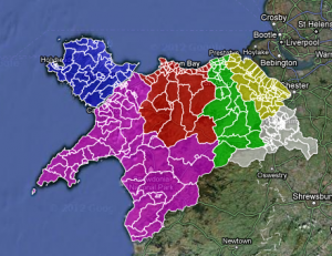
Simon Rogers has published a fantastic interactive graphic for the Guardian Datastore that maps teenage pregnancy rates in England and Wales from 1998 to 2010.
The visualisation shows the conception rate of under-eighteen year olds, per 1000 women, in different counties across England and Wales. The interactive map is an ideal way to present the information, as the visualisation contains a large amount of data in a comprehensible way. From the graphic we can derive that the number of teenage pregnancies has declined in the last decade, although this varies by area.
In order to focus on a specific county the user can scroll the mouse over the map and click on a different area, labelled by county at the side of the map. Once you click on a county the line graph changes to show the counties’ change in number of teenage pregnancies by year and how this compares to the England and Wales average. This allows the user to have more detailed and specific information simply by clicking on the infographic. Thus the graphic allows users to see the more personalised, local data.
By using this tool the user can focus on various localised data, and see how they compare with each other. For example, in Wales it is apparent that poorer counties, such as Merthyr Tydfil and the South Wales Valleys, are significantly over the national average regarding the number of teenage pregnancies. In contrast, geographically close but wealthier counties like Monmouthshire and Powys are below the national average. In most cases this has not altered over the decade.
The map thus proves that in certain circumstances seeing only the larger data can give a limited understanding, as it shows a national decline in the number of teenage pregnancies but does not tell us that many individual counties have not changed significantly. In this way a graphic of this kind presents to users the ‘big picture’, in a clearer way than text alone.
The graphic also allows users to ignore information that is not of interest to them and to focus on geographical locations that are. This gives users a certain amount of control over the visualisation, as information is not decided for the user, as would be the case with textual narrative.
The interactive element of the visualisation allows users to find the story or information for themselves with no difficulty. This is more satisfying than simply being told information. At a time when the general public’s trust in journalism is low, visualisations such as this demonstrate that the journalist has not played around and sifted information but presented all of it to the user and allowed them to draw their own conclusions. In this way the user can get a more detailed, accurate and neutral understanding of the issue presented. It also breaks down the barrier between journalist and user and implies trust in the user to interpret and organise the data in an intelligent way.
The graph also uses visual symbols to organise the large amount of data. The map of England and Wales is easily recognisable, as is many of the counties. The counties that are under the national average are a light shade of blue and this gets darker as the percentage increases. The use of blue and purple makes the map visually attractive and the differences in shade easily identifiable. It is apparent that darker areas cluster together and that generally the North of England is darker than the South. In this way the user can obtain information from the visualisation by looking at it alone. The darker shade of purple stands out amongst the generally lighter shades and thus the graphic signals to the reader some of the most dramatic information. Thus, although the user is given control and the freedom to explore the data and draw their own conclusions, visual signals guide them to the most extreme data.
The orange circle that is drawn around a county when it is selected contrasts with the blue, making it clear. It also correlates with the colour of the line graph, making the visualisation easily readable.
By pressing ‘play’ the user can focus on one county and see how it breaks down by each year, as well as how the colours across the UK has changed by year, thus presenting more information.
The visualisation thus works as it presents a large amount of data comprehensibly. It allows the user to interpret and organise the data, but gives them visual signals to guide them. It also gives information for the whole country, as well as localised data, thus presenting the ‘big picture’. It is clear and easy to read and breaks down the barrier between journalist and user. It is therefore an excellent way to present the data.
Visualisations are an important tool when presenting data, and can be used to show patterns, correlations and the ‘big picture’.
Ben Fry has said that visualisations ‘answer questions in a meaningful way that makes answers accessible to others’ and Paul Bradshaw explains that ‘visualisation is the process of giving a visual form to information which is otherwise dry or impenetrable.’
Traditionally stories have been conveyed through text, and visualisations have been used to display additional or supporting information. Recently, however, improved software has allowed journalists to create sophisticated narrative visualisations that are increasingly being used as standalone stories. These can be be linear and interactive, inviting verification, new questions and alternative explanations.

 Michaela Gruber is a journalism and media management student, based in Vienna, Austria. During her studies she spent a semester abroad in France, where she started working for HEI-DA.