Tool of the week for journalists – Playground, to monitor social media analytics

Tool of the week: Playground, by PeopleBrowsr.

This post was first published on Journalism.co.uk

What is it? A social analytics platform which contains over 1,000 days of tweets (all 70 billion of them), Facebook activity and blog posts.

How is it of use to journalists? “Journalists can easily develop real-time insights into any story from Playground,” PeopleBrowsr UK CEO Andrew Grill explains.

Complex keyword searches can be divided by user influence, geolocation, sentiment, and virtual communities of people with shared interests and affinities.

These features – and many more – let reporters and researchers easily drill down to find the people and content driving the conversation on social networks on any subject.

Playground lets you use the data the way you want to use it. You can either export the graphs and tables that the site produces automatically or export the results in a CSV file to create your own visualisations, which could potentially make it the next favourite tool of data journalists.

Grill added:

The recent launch of our fully transparent Kred influencer platform will make it faster and easier for journalists to find key influencers in a particular community.

You can give Playground a try for the first 14 days before signing up for one of their subscriptions ($19 a month for students and journalists, $149 for organisations and companies).

Jodee Rich, the founder of PeopleBrowsr, gave an inspiring speech at the Strata Summit in September on how a TV ratings system such as Nielsen could soon be replaced by social media data thanks to the advanced online analytics that PeopleBrowsr offers.


Playground’s development is based on feedback from its community of users, which has been very responsive. Ideas can be sent to contact[@]peoplebrowsr.com or by tweeting@peoplebrowsr.

75+ Tools for Visualizing your Data, CSS, Flash, jQuery, PHP

Editor’s note: Back in 2009, Tripwire magazine published this comprehensive article about data visualisation tools. Although technology has come a long way since then, most of their tips are still relevant so we thought you’d like to take a pick. You’ll find some old school know-how to bring your data to life. Enjoy!

TRIPWIRE MAGAZINE – By LARS

Most people would agree that the old adage “A picture is worth a thousand words” is also true for web based solutions. There should be no discussion – Charts and Graphs are ideal to visualize data in order to quickly deliver an overview and communicate key messages. Whatever type of data presentation you prefer or suits you data (pie charts, bubble charts, bar graphs, network diagrams etc.), there are many different options but how do you get started and what is technologically possible? In this article tripwire magazine present more than 75 Tools for Visualizing your data on a website and most of the options available will be covered. If you are aware of a tool, script etc. that deserves to be added to the list I would kindly ask you to leave a comment to everyone’s benefit.

Introduction

Images says more than a thousands words. It is common sense and wise people has followed this rule for centuries by creating illustrations of thier ideas and thoughts. Today it is easier than ever as the technology for presenting nearly any type of information as a graph or chart on a web page is getting really mature. Reading through this article you will be faced with the problem on what technology and specific implementation you should use. It is not a trivial question and I recommend that you use comments on this article to share your ideas, concerns etc. with peer readers. This way you may get the input from the community that you need to create the optimal solution.

The article has been organised into the following sections.

Section 1: How to visualize you data using Javascript-based solutions

Section 2: How to visualize you data using CSS

Section 3: How to visualize you data using Server-side Solutions

Section 4: How to visualize you data using FLASH-based solutions

Section 5: How to visualize you data using Online Tools and Services

How to visualize you data using Javascript-based solutions

jqPlot Charts and Graphs for jQuery

The feature rich jqPlot is a plotting and charting plugin for the jQuery Javascript framework. There are plenty of hooks into the core jqPlot code allowing for custom event handlers, creation of new plot types and adding canvases to the plot.

jQuery

flot – Attractive Javascript plotting for jQuery

Flot is a pure Javascript plotting library for jQuery. It produces graphical plots of arbitrary datasets on-the-fly client-side. It has been developed with focus on simple usage (all settings are optional), attractive looks and interactive features like zooming and mouse tracking.
The plugin works with Internet Explorer 6/7/8, Firefox 2.x+, Safari 3.0+, Opera 9.5+ and Konqueror 4.x+ with the HTML canvas tag (Internet Explorer where the excanvas Javascript emulation helper is used).

jQuery

jQuery Sparklines

This jQuery plugin generates sparklines (small inline charts) directly in the browser using data supplied either inline in the HTML, or via javascript all with a single line of code.
The plugin is compatible with most modern browsers and has been tested with Firefox 2+, Safari 3+, Opera 9, Google Chrome and Internet Explorer 6, 7 & 8.

jQuery

Flotr Javascript Plotting Library

Flotr is a javascript plotting library based on the Prototype Javascript Framework and has been inspired by Flot (above). [Read more…]

How journalists can use Backbone to create data-driven projects

POYNTER – By Erik Hinton

Single page apps are great solutions for data journalism. By offloading the complexity from backends and servers, journalists can build rich programs and graphics out of just Javascript, HTML and CSS. In fact, these “backends” can shrink to a vanishing point. We can use Twitter in place of a database. Or we can get even simpler and store (static) data in JS/JSON/XML files.

We can make news apps without having to touch a server or write any Ruby, Python or PHP. This is important. It allows data journalists to focus on developing their stories instead of configuring servers. The time and effort to launch an interactive application is reduced to the point where it becomes feasible for journalistic outlets of all sizes to make applications for both long-term pieces and breaking news.

Using JavaScript frameworks to manage one-page apps

There is something of a disconnect between traditional software development models and those of deadline-driven news. In a more server-side oriented development scheme, we would write a program on our computers, set up a server somewhere, configure it to run the app, transfer the data to some database on the server, make sure it can handle the load of a lot of people looking at it and then finally release it. In the newsroom, we have limited time. [Read more…]

Web 2.0 tools for data journalists [SLIDES]


David Herzog is an associate Professor at Missouri School of Journalism. He also serves as the academic adviser to the National Institute for Computer-Assisted Reporting (NICAR), a joint program of the Missouri School of Journalism and Investigative Reporters and Editors, Inc., a global association of journalists.

He recently gave a presentation about new online tools for data journalism and we thought it would be nice to publish the slides on the DJB and to get your opinion.

Here is how Herzog introduced his presentation on his blog back in June 2011:

“I started putting together a slideshow about free data journalism web tools for a group of visiting television and newspaper reporters from South Korea.The number of free Web 2.0 tools is booming and continues to change as new services appear and others die. Remember Swivel, the data visualization service? Used by The Huffington Post, Cleveland Plain Dealer and The Baltimore Sun? Gone. So proceed with caution when using any of these tools. Make sure you keep an original copy of your data.

As you can see in my presentation, there are Web 2.0 tools for every stage of the data game: obtaining, cleaning, analyzing and visualizing.”

Next Big Thing: New Tools for Digital Digging [VIDEO]

Nicola Hughes from ScraperWiki shared this video on Twitter recently and we thought it would be a shame not to share it with you too.

Experts in data mining gathered at the Paley Center for Media on 10 November 2011 to discuss the future of journalism and how to sustain a journalism watchdod in the digital age. This session is about data mining and the new tools available online.

Watch the video and let us know what you think. If you’ve used some of them, tell us how good -or how bad- you think they are…

Next Big Thing: New Tools for Digital Digging from The Paley Center For Media on FORA.tv

Presenters include:

Bill Allison

Bill Allison is the Editorial Director at the Sunlight Foundation. A veteran investigative journalist and editor for nonprofit media, Bill worked for the Center for Public Integrity for nine years, where he co-authored The Cheating of America with Charles Lewis, was senior editor of The Buying of the President 2000 and co-editor of the New York Times bestseller The Buying of the President 2004.

He edited projects on topics ranging from the role of international arms smugglers and private military companies in failing states around the world to the rise of section 527 organizations in American politics. Prior to joining the Center, Bill worked for eight years for The Philadelphia Inquirer — the last two as researcher for Pulitzer Prize winning reporters Donald L. Barlett and James B. Steele.


David Donald

David Donald, United States , is data editor at the Center for Public Integrity, where he oversees data analysis and computer-assisted reporting at the Washington-based investigative journalism nonprofit.


Sheila Krumholz

Sheila Krumholz is the Center for Responsive Politics’ executive director, serving as the organization’s chief administrator, the liaison to its board and major funders and its primary spokesperson.

Sheila became executive director in 2006, having served for eight years as the Center’s research director, supervising data analysis for OpenSecrets.org and the Center’s clients. She first joined the Center in 1989, serving as assistant editor of the very first edition of Open Secrets, the Center’s flagship publication.

In 2010, Fast Company magazine named Sheila to its “Most Influential Women in Technology” list. Sheila has a degree in international relations and political science from the University of Minnesota.

Jennifer 8. Lee

Jennifer 8. Lee authors The Fortune Cookie Chronicles ($24.99). Also, she’s a New York Times reporter.


Nadi Penjarla

Nadi Penjarla is the chief architect and designer of the Ujima Project. The Ujima Project (www.ujima-project.org) is a collection of databases, documents and other resources that aims to bring transparency to the workings of governments, multinational non-governmental organizations and business enterprises.

Nadi’s work demonstrates that data analysis provides unique insights into international and local political controversies and brings the facts of the world into sharper focus. He has spoken and conducted workshops on computer assisted reporting at international forums such as the ABRAJI Conference in Sao Paulo, Brazil, the GLMC Investigative Journalism Forum in Kigali, Rwanda, and at the Annual Investigative Reporters & Editors (IRE) Conference.

Nadi possesses a strong background in data analysis and data mining, including work as an investment banker, and a strategy and business analytics consultant. Past projects include consulting for Fortune 500 companies on how to improve strategic decision-making, enhance operations, conduct complementary marketing and transform related business processes by properly analyzing data and its implications. In 2003 Nadi was the founding editor of Global Tryst, an online magazine focusing on international issues from a grassroots perspective.

Nadi holds an MBA from the University of Chicago, an M.S in Engineering and Computer Science, and a B.S. in Engineering. He can be reached at 202-531-9300 or at nadi.penjarla@gmail.com

The Data Journalism Handbook: Teaching the World how to work with data [VIDEO]

This video is cross posted on DataDrivenJournalism.net, the Open Knowledge Foundation blog and on the Data Journalism Blog.

The Data Journalism Handbook is a project coordinated by the European Journalism Centre and the Open Knowledge Foundation, launched at the Mozilla Festival in London on 5 November 2011.

Journalists and experts in data gathered to create the first ever handbook to data journalism over a two-days challenge.

Read more about the Data Journalism Handbook in this article by Federica Cocco.

What data tool or great example of data journalism would you add to the handbook? Let’s make this comments section useful!

Every contribution, big or small, to the Data Journalism Handbook is very much appreciated. So use this space to give us links and examples to what you think should be included in the manual.

And if you feel more chatty, email us at editor@datajournalismblog.com

Hacks and hackers gather to write the first Data Journalism Handbook

By Federica Cocco

This article is cross posted on DataDrivenJournalism.net, the Open Knowledge Foundation blog and on the Data Journalism Blog.

Ravensbourne college is an ultramodern cubist design school which abuts the O2 arena on the Greenwich peninsula. It is perhaps an unusual and yet apt setting for journalists to meet.

Members of the Open Knowledge Foundation and the European Journalism Centre saw this as a perfect opportunity to herd a number of prominent journalists and developers who, fuelled by an unlimited supply of mocacchinos, started work on the first Data Journalism Handbook.

The occasion was the yearly Mozilla Festival, which acts as an incubator to many such gatherings. This year the focus was on media, freedom and the web.

The manual aims to address one crucial problem: “There are a lot of useful resources on the web,” Liliana Bounegru of the EJC said, “but they are all scattered in different places. So what we’re trying to do is put everything together and have a comprehensive step-by-step guide”.

In data journalism, most people are self-taught, and many find it hard to keep up-to-date with every tool produced by the industry. “It could be vital having a handbook that really explains to journalists how you can approach data journalism from scratch with no prior knowledge, ” says Caelainn Barr of the Bureau of Investigative Journalism
Friedrich Lindenberg of the OKF believes there is a real urgency in making newsrooms data-literate: “If journalists want to keep up with the information they need to learn coding, and some bits of data analysis and data-slicing techniques. That will make much better journalism and increase accountability.”

And who better than the New York Times’ Interactive Editor Aron Pilhofer, The Guardian Data Blog’s Simon Rogers and others to lead the ambitious efforts?
In charge of sorting the wheat from the chaff, around 40 people joined them in the sixth floor of the college, for a 48 hour session.

The first draft of the handbook should be ready in the coming months, as other contributions from every corner of the web are still working on making an input.
Of course the first data journalism handbook had to be open source. How else would it be able to age gracefully and be relevant in years to come?

Workshops of this sort represent a decisively different break from the past. Aspiring data journalists will know that hands-on sessions are a cut above the usual lectures featuring knowledgeable speakers and PowerPoint presentations. Discussing the topic and citing examples is not enough. After all, if you give a man a fish you have fed him for a day. But if you teach a man ho w to fish, you have him fed for a lifetime.

Jonathan Gray concurs: “Rather than just provide examples of things that have been done with data, we want to make it easier for journalists to understand what data is available, what tools they can use to work with data, how they can visualise data sets and how they can integrate that with the existing workflows of their news organisations.”

At the event itself, after a brief introduction, the crowd split into five groups and began collaborating on each chapter of the handbook. Some were there to instill knowledge, others were there to absorb and ask questions.

“I like the fact that everyone is bringing a different skillset to the table, and we’re all challenging each other”, one participant said.

Francis Irving, CEO of ScraperWiki, led the session on new methods of data acquisitions. He believes the collaboration between journalists, programmers, developers and designers, though crucial, can generate a culture clash: “When working with data, there’s a communication question, how do you convey what you need to someone more technical and how do they then use that to find it in a way that’s useful.”

“A project like this is quite necessary,” noted Pilhofer, “It’s kind of surprising someone hasn’t tried to do this until now.”

The free e-book will be downloadable from the European Journalism Centre’s DataDrivenJournalism.net/handbook in the coming months. If you want to follow our progress or contribute to the handbook you can get in touch via the data journalism mailing list, the Twitter hashtags #ddj and #ddjbook, or email bounegru@ejc.net.

Watch here the full video report from the Data Journalism Handbook session at the Mozilla Festival, 4-6 November in London.

The organisers would like to thank everyone who is contributing to the handbook for their input and to Kate Hudson for the beautiful graphics.

 
About the author: Federica Cocco is a freelance journalist and the former editor of Owni.eu, a data-driven investigative journalism site based in Paris. She has also worked with Wired, Channel 4 and the Guardian. 


6 Data Journalism Blogs To Bookmark, Part 2

10,000 WORDS – By Elana Zak

Editor’s Note: This is the second part of a post from 10,000 Words. Find the first one here which included the Guardian’s Data Blog, Pro Publica and your very own Data Journalism Blog…

Last week, I started a list of six data journalism blogs you should take note of. The post stemmed from a project some journalists are leading to develop a data-driven journalism handbook that covers all aspects of the field. This weekend, thanks to a massive effort by attendees at the Mozilla Festival in London, the project morphed from the bare bones of an idea into something very tangible.

In just two days, 55 contributors, from organizations such as the New York Times, the Guardian and Medill School of Journalism, were able to draft 60 pages, 20,000 words, and six chapters of the handbook. The goal is to have a comprehensive draft completed by the end of the year, said Liliana Bounegru of the European Journalism Centre, which is co-sponsoring production of the handbook. If you’re interested in contributing, email Bounegru at bounegru@ejc.net. You can see what the group has so far atbit.ly/ddjbook.

Since the handbook is still being tweaked, why not check out these data journalism blogs?

Open
Like the Guardian, the New York Times is widely known for its spectacular use of data journalism and news apps. Open is written by the news organization’s developers, highlighting hacking events and describing general news of interest to the bloggers.

Data Desk
The Los Angeles Times is at the forefront of data journalism, with its Data Desk blog covering topics from crime to the Lakers to vehicle complaints. Everything on the site is a great example of how to use data to find and craft stories that will matter to your readers. One project I highly recommend you take a look at is mapping LA’s neighborhoods. It is something that could be replicated in almost any town and would grab your audience’s’ attention.

News Apps Blog
The News Apps blog is where developers from the Chicago Tribune discuss “matters of interest” and give their tips and suggestions on how to make some of the stunning maps and apps that appear in the paper. This is one of, if not the, place to go to see what experts in the field are talking about.

What data journalism blogs do you go to?

Image from the Data Journalism Handbook presentation.

6 Data Journalism Blogs To Bookmark, Part 1


Editor’s note: We are not publishing this article about data journalism blogs to bookmark just because the DJB is one of them. Alright, partly because of that but also because we think the other blogs mentioned  are the ultimate references for data journalism. Also because it mentioned the Mozilla Festival and that we really loved the event. Which blogs would YOU add to the list? Let us know in the comment section!

10,000 WORDS – By Elana Zak

Today is the start of Mozilla Festival, a weekend-long celebration of sorts that brings together web developers, journalists, media educators and students to work on open web projects and learn from one another. #MozFest’s program includes design challenges, learning labs, presentations and more. There will also be plenty of time for people to simply chat with one another and possibly brainstorm the next idea that will transform the web.

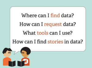
One event that stood out to me calls for a group to kickstart the writing of a data-driven journalism handbook. Led by the Open Knowledge Foundation and the European Journalism Centre, the project’s goal is to create a handbook that will “get aspiring data journalists started with everything from finding and requesting data they need, using off the shelf tools for data analysis and visualisation, how to hunt for stories in big databases, how to use data to augment stories, and plenty more.”

Data journalism has quickly become a popular field yet many reporters are still in the dark about it. How do you go about getting the data? What do you do once you have the data? A perfect resource would be the data journalism handbook, but since it hasn’t been written yet, I came up with a list of six blogs that should definitely be added to your bookmarks tab, whether you’re looking for inspiration, basic skills, or advanced knowledge.

The first three are below and the last half will be published on Monday.

ProPublica Nerd Blog

ProPublica is constantly creating amazing tools using data journalism. In the last year, they’ve created apps that delve into topics such as education and healthcare. On the Nerd Blog, members of ProPublica’s News apps desk not only explain the latest apps and how to use them but also how the team created them. I highly recommend you check out the post, “Scraping for Journalism: A Guide for Collecting Data.” Dan Nguyena ProPublica news developer, gives a step-by-step explanation of how the team created itsDollars for Docs app and shows readers exactly what tools to use to recreate the app (or even make another one.)

The Guardian’s Data Blog

Almost every week, The Guardian is rolling out stories and graphics based on data journalism, many of which are highlighted on its Data Blog, making it a great place to go for inspiration. For example, take a look at their story on where the super poor are in the US. It includes maps and charts, all derived from a ton of data. While the site is aimed at already experienced data journalists, it is a great place for all levels to go and see what the experts in the field are doing.

Data Journalism Blog

The Data Journalism Blog isn’t specifically attached to any one news organization but instead acts more as an overall resource for data journalists. The site, led by multimedia journalist Marianne Bouchart, not only displays examples of great graphics, but it also provides how-tos, guides, and interviews with other data journalists. If you’re looking for a new concept to try out or where the next data journalism seminar will be held, I’d recommend visiting this blog.

Don’t forget to check back on Monday for Part 2: 6 Data Journalism Blogs To Bookmark.

The Data Journalism Handbook at #MozFest 2011 in London

The following post is from Jonathan Gray, Community Coordinator at the Open Knowledge Foundation.

With the Mozilla Festival approaching fast, we’re getting really excited about getting stuck into drafting the Data Journalism Handbook, in a series of sessions run by the Open Knowledge Foundation and the European Journalism Centre.

As we blogged about last month, a group of leading data journalists, developers and others are meeting to kickstart work on the handbook, which will aim to get aspiring data journalists started with everything from finding and requesting data they need, using off the shelf tools for data analysis and visualisation, how to hunt for stories in big databases, how to use data to augment stories, and plenty more.

We’ve got a stellar line up of contributors confirmed, including:

Here’s a sneak preview of our draft table of contents:

  • Introduction
    • What is data journalism?
    • Why is it important?
    • How is it done?
    • Examples, case studies and interviews
      • Data powered stories
      • Data served with stories
      • Data driven applications
    • Making the case for data journalism
      • Measuring impact
      • Sustainability and business models
    • The purpose of this book
    • Add to this book
    • Share this book
  • Getting data
    • Where does data live?
      • Open data portals
      • Social data services
      • Research data
    • Asking for data
      • Freedom of Information laws
      • Helpful public servants
      • Open data initiatives
    • Getting your own data
      • Scraping data
      • Crowdsourcing data
      • Forms, spreadsheets and maps
  • Understanding data
    • Data literacy
    • Working with data
    • Tools for analysing data
    • Putting data into context
    • Annotating data
  • Delivering data
    • Knowing the law
    • Publishing data
    • Visualising data
    • Data driven applications
    • From datasets to stories
  • Appendix
    • Further resources

If you’re interested in contributing you can either:

  1. Come and find us at the Mozilla Festival in London this weekend!
  2. Contribute material virtually! You can pitch in your ideas via the public data-driven-journalismmailing list, via the #ddj hashtag on Twitter, or by sending an email to bounegru@ejc.net.

We hope to see you there!