Tips on building chat bots from Quartz’s John Keefe

When talking to John Keefe, Product Manager & Bot Developer at Quartz, he encourages the journalism community to experiment with chat bots and try different tools. In this video, he shares some tips and tricks with us on what platforms to use and how journalists can build chat bots themselves.

Building chat bots is not as hard as it seems!
I would say, just give it a try!


______________________________________________________________________________________________


Michaela Gruber is a journalism and media management student, based in Vienna, Austria. During her studies she spent a semester abroad in France, where she started working for HEI-DA.

As the company’s communication officer, she is in charge of the Data Journalism Blog and several social media activities. This year, Michaela was HEI-DA’s editor covering the Data Journalism Awards in Lisbon, Portugal.


My Year of Data: working data to the extreme?

At the Data Journalism Blog, we admire people who take on a challenge for the sake of open data. This month we found someone who really take the data love to the extreme and decided to collect as much data about himself as humanly possible.

Walking in the steps of Nicholas Feltron, who is famous for publishing yearly reports that visualise his own personal data, US statistician Chris Volinsky started his experiment on 16 November 2011 on his blog “My Year of Data”.

The aim of this project fits very well the approaching new year’s resolutions: Volinsky is using his online platform as a log in his journey to an healthier lifestyle.

Volinsky explains that measuring his behavior on a daily basis would ultimately help change the behavior itself.

A great social experiment then that will try to figure out whether publishing personal data on the open web could influence our daily routine and help us change our bad habits. But a great data project too that promises some good visualisations opportunities!

Volinsky will open source the data, making it public in case anyone else wants to analyze it.

His first post was quite compelling and self-explainatory so we thought we should feature it here and ask your comment on this unusual enterprise…

Me.asured

My name is Chris. I am 40 years old. I am 5’9 1/2″ and weigh 174 pounds. I walked 9,048 steps and have consumed 1,406 calories today (so far).

Why am I telling you all this?  This is my first entry in what (I hope) will be a year long experiment with self-measurement.   I’m calling it My Year of Data.  The plan is to record and publish as much of my “daily data” as I can.  This includes things I do, foods I eat, how I feel, and almost anything else I can think of.   I’ve created the blog to document my experience and progress.

I came up with the idea recently when I realized that right now I am heavier than I have ever been in my life.  Not by alot, mind you.   Roughly, I have gained about 1 pound per year for about the last  15 years.   For those of you who know me, I dont think you would call me overweight.  But if you go to your favorite BMI calculator, and enter in my stats above I have a BMI of 25.3, which officially classifies as overweight.

What I also realized is that in previous attempts to lose weight, I have been most successful when I keep a log of my weight daily.  By knowing that I was going to have a weigh-in every day, it made me conscious – every day – of what I ate, since I did not want a bad measurement the next morning.   Similarly, if I tracked my exercise patterns, it made me want to exercise more.

In other words, for me there is kind of a Heisenberg’s Uncertainty Principle of health.  The fact that I was measuring my behavior would change the behavior itself.

Additionally, the more public I am with my efforts, the more successful they are.  If I declare to my wife on Sunday “I plan to eat really healthy this week!”, then I am more likely to follow through.  The public declaration of an intent makes it harder to blow it off.

So, putting it all together, and I figured I would go to the next logical extreme via a grand experiment.  I plan to collect, analyze, and share as much data about myself as possible, for a one year period.  I will open source the data, making it public in case anyone else wants to analyze it.   I’ll try to set goals and document my progress towards them.  You dont get more public with your goals than putting them on a blog!

Part of the fun for me will be the data (I am a statistician after all).   I’m hoping there will be interesting trends to find and things to learn about myself – and maybe more generally about health. [Read more…]


Tell us what you think of this project in the comment section. If you’ve come across a similar experiment, we’d like to hear about it so share along!

15 Well Designed Twitter Infographics


FLASHUSER

Infographics are probably the best way to show different statistics ( social media, internet marketing, online advertising etc. ) in a pleasant and enjoyable form. The infographic, in most cases, communicates complex datas in a simple and understandable fashion. With a few words and lot of stylish, fun images a well designed infographic for sure will remain for a long period of time in your memory.

Because I enjoyed much of using Twitter, I assembled some of the best infographics around this social media network. Some of them are funny, while others can help you in your Twitter bussiness process.

Sit back in your comfortable chair and enjoy this colorful list of Twitter infographics 2011. For a full-size version please click on each image or visit the source author website.

1. A Visual History of Twitter

Source: Mashable

infographic-graphics-twitter_history


2. Twitter Facts and Figures

Source: Touchagency

twitter-facts-figures

[Read more…]


Are You Addicted to Your Mobile Phone [Infographic]


INFOGRAPHICS SHOWCASE 

This UK-based infographic asks if you are addicted to your mobile phone.  They say that 83% of people own mobile phones, and I am thinking they are talking about the population of the UK, because no way for the whole world, you know?  Of that 83%, 35% own smartphones.  Of the people who own cell phones, about half of them admit to be addicted to their devices.  Scary. [Read more…]


TOP 10 INFOGRAPHICS

AWESOME INFOGRAPHICS

Editor’s note: Here is a top 10 of the best data visualisations according to the blog Awesome Infographics, and they are pretty good indeed! Now we want to hear about you: what is your top data visualisation? Have you come across a stunning infographic lately? Tell us in the comment section..

ONE

Visualising Alcohol Use: What Percentage of the U.S. Drinks Regularly?

Neck it Infographic

Brought to you by Phlebotomist.net


TWO

The World’s Resources by Country

Cool Infographics

Credit: British Geological Survey


THREE

A HAND DRAWN infographic. Non of that inDesign bullshit for this guy.

Hand Drawn Infographic


FOUR

The Trilogy Meter

Trilogy Meter

FIVE

The Jedi Trainer’s Guide to Employee Management

Star Wars Infographic

Thanks to www.MindFlash.com for this one. [Read more…]


How tall are our world leaders? [Visualised]

THE GUARDIAN’S DATA BLOG – By 

It seems we like our political giants to be just that – giants – according to new research. See how they compare in the height stakes
• Get the data


World leaders’ heights: click image for graphic

Stature really does matter according to a new scientific paper published today in Social Science Quarterly.

Here at the Datablog we thought this was an opportunity too good to pass up. How tall really are our world leaders and how do they compare?

Psychologists from Texas Tech University found in a study that almost two-thirds of participants showed a preference to draw larger figures when asked to draw images of leaders. An evolutionary throwback has been suggested as the root of this. Nic Fleming writes today:

It is not for nothing that top politicians are known as political giants or “big beasts”. Voters see tall politicians as better suited for leadership, according to a survey of how people visualise their leaders. Psychologists believe the bias may stem from an evolved preference for physically imposing chiefs who could dominate enemies.

David Cameron and Barack Obama certainly fit the profile at 6ft 1in and have both beaten shorter candidates in past elections – Gordon Brownat 5ft 11ins and John McCain at 5ft 8ins. [Read more…]

Free seminar on data visualization for journalists: “Are you coming?”

” – Hey! Are you coming to the free seminar on data visualisation for journalists this Thursday?

– Where is it?

– Everywhere! I mean, anywhere you like, it’s broadcast live on the internet at 4pm UK time.

– hell, yeah, I’ll come! Who’s talking?

– Only some big names in data journalism: Xaquín G.V. from The New York Times, Annamarie Cumiskey from the Bureau of Investigative Journalism, Mar Cabra of the International Consortium of Investigative Journalists – ICIJ, and David Cabo of Pro Bono Público

– Pro Bono Publico? Is that held in Spain then?

– Yep, It’s happening in Madrid at Medialab-Prado, a program of the Department of Arts of the City Council. You should check out their website, they have some really interesting stuff in terms of arts and visualisations.

– Great!

– If you want more information, take a look at the schedule here. The conference will be conducted in Spanish and English and will be translated live.

– That’s gonna be interesting 😉 Will I be able to ask some questions at the end?

– There will be some discussion afterwards but I don’t know whether the online audience will be able to join in. A workgroup on data journalism will also be launched during the event, seeking to bring together professionals interested in data visualisations, from journalists to graphic designers, who will then meet regularly at Medialab-Prado.

– Looking forward to see how it turns out.. Thanks for the info, speak to you on Thursday! You will write something on the Data Journalism Blog about this right?

– Sure! I might just copy and paste this conversation though.. 🙂

– You should! ”


Data visualisation: in defence of bad graphics

THE GUARDIAN’S DATABLOG – By 

Well, not really – but there is a backlash gathering steam against web data visualisations. Is it deserved?

Most popular infographics

Most popular infographics by Alberto Antoniazzi

Are most online data visualisations, well, just not very good?

It’s an issue we grapple with a lot – and some of you may have noticed a recent backlash against many of the most common data visualisations online.

Poor Wordle – it gets the brunt of it. It was designed as an academic exercise that has turned into a common way of showing word frequencies (and yes, we are guilty of using it) – an online sensation. There’s nothing like ubiquitousness to turn people against you.

In the last week alone, New York Times senior software architect Jacob Harris has called for an end to word clouds, describing them as the “mullets of the Internet“. Although it has used them to great effect here.

While on Poynter, the line is that “People are tired of bad infographics, so make good ones

Awesomely bad infographics
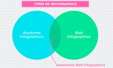
Awesomely bad infographics from How to Interactive Design Photograph: How To Interactive Design

Grace Dobush has written a great post explaining how to produce clear graphics, but can’t resist a cry for reason.

What’s the big deal? Everybody’s doing it, right? If you put [Infographic] in a blog post title, people are going to click on it, because they straight up can’t get enough of that crap. Flowcharts for determining what recipe you should make for dinner tonight! Venn diagrams for nerdy jokes! Pie charts for statistics that don’t actually make any sense! I have just one question—are you trying to make Edward Tufte cry?

Oh and there has also been a call for a pogrom of online data visualisersfrom Gizmodo’s Jesus Diaz:

The number of design-deficient morons making these is so ridiculous that you can fill an island with them. I’d do that. And then nuke it

A little extreme, no?

There has definitely been a shift. A few years ago, the only free data visualisation tools were clunky things that could barely produce a decent line chart, so the explosion in people just getting on and doing it themselves was liberating. Now, there’s a move back towards actually making things look, er, nice. [Read more…]


Twitter: Is It All About Timing? [Infographic]

SOCIALMOUTHS (Original post can be found here)

Yes, it feels good to talk about Twitter after spending a full week discussing Facebook’s major announcement. And why not, a little bit of Google+ too.

By the way, I was just reading today’s post from Jeff Bullasand I’m happy to see that even when Facebook hijacked the Internet, Google+ was able to grow nearly 9 million in 2 days. That’s pretty impressive.

But like I said, let’s please talk about Twitter for a change.

This infographic from Lemon.ly talks about Twitter timing and I thought I’d share it with you because it seems to be a regular concern. One of the questions I often get from clients and readers is “What is the best time to Tweet?” and while I think there is no one-size-fits-all kind of answer for this, at least this data lets you visualize a trend.

For example in my case, I agree with the AM timeframe but in the PM, I find that I get the most activity and best results between 3 and 5pm. I also agree with the usage percentage by day of the week although one of my favorite days to spend on Twitter are Fridays and according to this analysis it doesn’t get the action Tuesdays get. Like I said, that’s just me, the point is that you might have your own preferences.

The important thing is that you allow yourself to test the waters.

That’s not all on the infographic, there are other interesting numbers like how many Tweets happen per second or what was the hottest event. Let’s take a look at it and share your thoughts in the comments section.

Twitter timing infographic

Infographic courtesy of Lemon.ly

Over To You

What do you think? What are YOUR best times to tweet? Are you more active on certain days of the week? Share your comments!