Tips on news product prototypes from Bella Hurrell

We asked Bella Hurrell, Deputy Editor of the BBC News Visual Journalism Team, about what makes a good product prototype and what are the challenges that you have to face when building them. In this video, she shares with us the tools that the BBC uses for building their prototypes and what their vision is.

Build quick and dirty prototypes that you can test with people. Don’t invest huge amounts of time in something if you are not that sure about it […] and give up when it is a good time to do it!


______________________________________________________________________________________________


Michaela Gruber is a journalism and media management student, based in Vienna, Austria. During her studies she spent a semester abroad in France, where she started working for HEI-DA.

As the company’s communication officer, she is in charge of the Data Journalism Blog and several social media activities. This year, Michaela was HEI-DA’s editor covering the Data Journalism Awards in Lisbon, Portugal.


Tips on building chat bots from Quartz’s John Keefe

When talking to John Keefe, Product Manager & Bot Developer at Quartz, he encourages the journalism community to experiment with chat bots and try different tools. In this video, he shares some tips and tricks with us on what platforms to use and how journalists can build chat bots themselves.

Building chat bots is not as hard as it seems!
I would say, just give it a try!


______________________________________________________________________________________________


Michaela Gruber is a journalism and media management student, based in Vienna, Austria. During her studies she spent a semester abroad in France, where she started working for HEI-DA.

As the company’s communication officer, she is in charge of the Data Journalism Blog and several social media activities. This year, Michaela was HEI-DA’s editor covering the Data Journalism Awards in Lisbon, Portugal.


The future of news is not what you think and no, you might not be getting ready for it the right way

This article was originally published on the Data Journalism Awards Medium Publication managed by the Global Editors Network. You can find the original version right here.

_______________________________________________________________________________________________________________________


Editors, reporters and, anyone in news today: how prepared are you for what is coming? Really. There is a lot of talk right now on new practices and new technologies that may or may not shape the future of journalism but are we all really properly getting ready? Esra Dogramaci, member of the Data Journalism Awards 2017 jury and now working as Senior Editor on Digital Initiatives at DW in Berlin, Germany, thinks we are not. The Data Journalism Awards 2017 submission deadline is on 10 April.


Esra Dogramaci, Senior Editor on Digital Initiatives at DW, Photo: Krisztian Juhasz


Before joining DW, Esra Dogramaci worked at the BBC in London and Al Jazeera English, amongst others. She discusses here the preconceived ideas people have about the future of journalism and how we might be getting it all wrong. She also shares some good tips on how to better prepare for the journalism practices of the future as well as share with us her vision of how the world of news could learn from the realm of television entertainment.


What do you think most people get wrong when describing the future of journalism?


There are plenty of people happy to ruminate on the future of journalism — some highly qualified such as the Reuters Institute and the Tow Center who make annual predictions and reports based on data and patterns while others go with much less than that. Inevitably, people get giddy about technology — what can we do with virtual reality (VR), augmented reality (AR), artificial intelligence (AI), personalisation (not being talked about so much anymore), chatbots, the future of mobile and so on. However with all this looking forward to where journalism is headed (or rather how technology is evolving and, how can journalism keep pace with it), are we actually setting ourselves and journalism students up with all that is needed for this digital future? I think the answer is no.


What is, according to you, a more adequate description (or prediction) of the future of news?


If we’re talking about a digital future, the journalists of tomorrow are not equipped with the digital currency they will need.

Technology definitely matters but it’s not so useful when you don’t have people who understand it or can build and implement appropriate strategy to bridge journalism in a digital age. Middle or senior management types for instance, are less likely to know how to approach Snapchat, which they would be less likely to use, than a high school teenager who is using it as a social sharing tool or their primary source of news.

So if we aren’t actually:

1. Listening to our audience and knowing who they are and how they use these technologies, and

2. Bringing in people who know how to use these tools that speak to and with the audience,

…the efforts are going to be laughable at worst and dismissed at best.

In essence, technology and those who know how to use, develop and iterate it go together. That’s the future of news. We should be looking forward with technology, but we’ve also got to look back at the people coming through the system that will inherit and step into the – hopefully relevant – foundations we’re building now.


“Are we actually setting ourselves and journalism students up with all that is needed for this digital future?”


When looking at the evolution of journalism practices over the past few years, which ones fascinate you the most?


There are two things that stand out. The first is analytics and the second is the devolution of power, both points are interrelated.

Data analytics have really transformed non-linear journalism. Its instantly measurable, helping people make editorial decisions but also question and understand why content you thought would perform doesn’t. Data allows us to really understand our audience, and come up with content that not just resonates with them but how to package content that they will engage with. For instance a website audience is not going to be the same as your TV audience (TV is typically older and watches longer content but again the data will tell specifics), so clipping a TV package and sticking it on Facebook or YouTube isn’t optimal and suggests to your audience that you don’t understand these platforms and more importantly, them. They will go to another news provider that does.

An example of this was a project where it was traditionally assumed [in one of my previous teams] that the audience was very interested in Palestinian-Israeli conflict and so a lot of stories were delivered about it. However, we discovered through the numbers, on a consistent basis, that the audience wasn’t as interested as assumed, rather people were more into the conflicts in Syria, Yemen as well as Morocco and Algeria stories. These stories and audiences may not have traditionally registered on top of the editorial agenda because of what was historically thought to be in the audiences interest, but our data was suggesting we needed to pay more attention to the coverage in these areas.

Now, that being said, it’s still stunning to see how little analytics are used day to day. There still seems to be a monopoly on the numbers rather than integration into newsrooms. There are a plethora of tools available in making informed editorial or data decisions but generally editors don’t understand them or follow metrics that are not useful because they don’t know how to interrogate the data, or we hear things like ‘I’m an editor, I’ve been doing this for x years, I know better.’

Fortunately though, about 80–90% of editors I find are keen to understand this data-driven decision-making world and once you sit down and explain things, they become great advocates. Ian Katz at BBC Newsnight, Carey Clark at BBC HardTalk are two editors who embody this.

The second area is devolving power. The best performing digital teams are when not all decision-making is consolidated at the top, and you really give people time and space to figure out problems, test new ideas without the pressure always to publish. That’s a very different model to traditional hierarchical or vertical journalism structures. Its an area of change and letting go of power. But empowering the team empowers leaders as well.

An example of this is a team I worked with where all decisions and initiatives went through a social media editor. As a result, there was a bottleneck, and frustration for things not being done and generally being late to the mark on delivering stories and being relevant on platform as competitors were overtaking. What we did is decentralise control — we asked the team what platforms they’d like to take responsibility for (in addition to day to day tasks) and together came up with objectives and a proposition to deliver on those. The result? Significant growth across the board, increase in engagement but perhaps most importantly, a happier team. That’s what most people are looking for: recognition, responsibility, autonomy. If you can keep your team happy, they are going to be motivated and the results will follow.


Global Headaches: the 10 biggest issues facing Donald Trump, by CNN


Do you have any stories in mind that represent best what you think the future of newsmaking will look like?


CNN digital did this great Global Headaches project ahead of the US elections last year.

The project was on site (meaning that traffic was coming to the site and not a third party platform), made for mobile which would presumably reflect an audience coming mainly from mobile, used broadcast journalists and personalities as well as regular newsgathering, with an element of gamification. Each scenario had an onward journey which then takes your reader out of the game element and into the story.


Example from the “onward journey” with the CNN “Global Headaches” project


This isn’t a crazy high tech innovation but it is something that would have been much harder to pull off say 5 years ago. This example is multifaceted and making use of the tools we have available today in a smart way. It demonstrates that CNN can speak to the way their audience is consuming content while fulfilling its journalistic remit.

Examples like this doesn’t mean we should be abandoning long form text for instance and going purely for video driven or interactive stories. The Reuters Institute found last year (in their report The Future of Online News Video) that there is oversaturation of video in publishing and that text is still relevant. So, I would caution against throwing the text baby out with the bathwater, which then comes down to two things:

  1. Know your audience and do so by bringing analytics into the newsroom (it’s still slightly mind boggling the number of newsrooms who do not have any analytics in the editorial process)
  2. Come up with a product that you love and that works. The best of these innovations are multidisciplinary and do something simple using the relevant tools we have, that are accessible today. There’s no use investing in a VR project if the majority of your audiences lack the headsets to experience it.


Do you think news organisations are well equipped for this digital future?


Yes and no. There are the speedboats like Quartz, AJ+, NowThis, Vox, who can pivot quickly and innovate versus the bigger media tankers that turn very slowly. One question I get asked quite a bit is “what’s the most important element in digital change”. The answer is leadership. There needs to be someone(s) who understands, supports and pushes change, otherwise everyone down the ranks will continue to struggle and face resistance.

I truly believe in looking at the people who are on the ground, rolling up their sleeves and getting the work done, trying, failing, succeeding, and who keep persevering — versus always deferring to editors who have been in place for say 10 years to lead the way. Those people in the trenches are the ones we should be shining the light on and listening to. They are much closer to the audience and can give you usable insights that also go beyond numbers.

If I could name a few, people like Carol Olona, Maryam Ghanbarzadeh at the BBC, Alaa Batayneh or Fatma Naib, at Al Jazeera, Jacqui Maher at Conde Nast, need to be paid attention to. You may not see them at conferences or showcased much but by having people like them in place, news organisations are well equipped for a digital future.


Do you see some places in the world (some specific organisations maybe?) that are actually doing better than others on that front?


The World Economic Forum wouldn’t traditionally be associated as being a digital media organisation, but a few years ago they started to invest in social media and develop an audience that normally would not be interested in them. They take data and make it relevant and accessible for low cost, bite size social consumption.

Take this recent video for example:


Your brain without exercise, a video by the World Economic Forum
And also this related one:


Best of 2016 social video by the World Economic Forum


There is also this NYT video of Simone Biles made ahead of the 2016 summer Olympics which then has the option of taking you to an onward site journey.

The Financial Times hasn’t been afraid of digital either. You see them taking interesting risks which might go over a lot of people’s heads but the point is they’re trying. Like in their project “Build your own Kraft Heinz takeover”.


Then there are the regular suspects — AJ+ isn’t trying to do everything, they’re trying to be relevant for a defined audience on the platforms that audience uses. Similarly, Channel 4 News isn’t pumping out every story they do on social, but deliberately going for emotionally charged stories rather than straight reporting as well as some play with visualising data.


What would you like to see more of in newsrooms today which would actually prepare staff better for what’s coming?


When you’re hiring new staff, assign them digital functions and projects rather than putting them on the traditional newsroom treadmill. A lot of organisations have entry level schemes and this could easily be incorporated into that model. That demonstrates that digital is a priority from the outset. You could also create in house lightning attachments, say a six-week rotation at the end of which you’re expected to deliver something ready for publishing, driven by digital. My City University students were able to come up with a data visualization in less than an hour, and put together a social video made on mobile in 45 minutes (social or mobile video wasn’t even on the course but I snuck it in). Six weeks in a newsroom is plenty of time for something substantial.

Also, have the right tools in place and ensure that everyone is educated on the numbers. Reach and views for instance get thrown around a lot- they are big easy numbers to capture and comprehend, but we need to make a distinction between what is good for PR versus actionable metrics in the newsroom. As more people clue into what matters, I do think (and we see in certain places like Newswhip for instance) where success is based on engagement, interactions and watchtime rather than views, impressions or reach.

Finally and obviously, its devolution of power and more risk taking. Make people better by empowering them — that means carve out the time and space to experiment without the pressure to deliver or publish. When you are continually driving staff against deadlines, creativity suffers. Fortunately there are so many third party tools and analytics that will very quickly tell you what’s working and what’s not, contributing to a much more efficient newsroom freeing up valuable time to think and experiment. Building multi disciplinary teams is a good step in this direction. DW is experimenting with a “lab like” concept bringing together editorial, technical and digital folks in an effort to bring the best of all worlds together and see what magic they come up with.


From your experience teaching social and digital journalism at City University London, what can you say about the way the younger generation of journalists is being trained for the future? Do they realise what’s at stake?


At the beginning of term, I heard quite a few students say that digital didn’t matter, it wasn’t “real journalism” and that they were taking the class merely because it was perceived as an “easy pass”. That’s because the overall coursework, emphasized magazine and newspaper journalism. At the end of the term, and almost on a weekly basis since, my former students write to me about either digital projects they have done, digital jobs they are going for or how something we went over in the class has led to another opportunity.

There remains a major emphasis on traditional broadcast journalism — TV, radio, print, but very little for digital. That’s not something to fault students on. Digital is changing constantly but teaching staff mainly reflect the expertise of the industry, and that expertise is traditional. While there are a lot of digital professionals, it does not come close to the level of expertise and experience currently on offer at institutions training the next journalist generation. That being said organisations like Axel Springer have journalism academies where all of their instructors, are working full time in media and can translate the day to day relevance into the classroom. That’s more of the kind of thing we need to have.

The students I think do realise what’s at stake because a lot of those journalism jobs they’re applying for all require some level of digital literacy. Sure everyone might watch a YouTube video but what happens when an Editor asks you why a news video has been uploaded and monetised by other users elsewhere. Would you know what to do?


What could be done to improve the educational system in the UK and beyond? Simply make journalism courses more digitally focussed?


There is nothing that will compel places to change but reputation. If students are leaving institutions because what they are learning is not preparing them to meet the demands of the industry they’re choosing to go into, word will spread sooner than later. There will surely be visionary institutions who ‘get it’ and adapt, some are there already.

‘Smart’ places will build in digital basics so students can have the confidence to hit the ground running. I see this in a lot of digital job requirements. It’s a given that anyone starting in journalism in 2017 has basic social media literacy. Beyond that everything is a bonus — how can you file from a mobile phone, can you interpret complex data and tell a story with it. Then, are you paying attention to analytics?

As Chris Moran (Guardian) had pointed out:


“staff blame the stupid internet for low page views on a piece…but credit the quality of the journalism when one hits the jackpot.”

We need a much more sophisticated understanding beyond yes/no answers to points like these.

A lot of media houses have academies or training centres expected also to bridge digital gaps. The caution there is that the trainings they offer when it comes to things beyond CMS, uploading video, etc., is that other digital knowledge seem to fall in the “nice to know” rather than “you need this” category. The best thing is to find the in-house talents who know what they’re talking about and get them to lead the way.


Another recurrent question when talking about our digital future is the question of business models for news organisations. As the latter are under continual financial strain, you actually think we should get inspiration from the entertainment industry. Can you elaborate on this idea?


Yes. The entertainment industry always has a much larger creative capacity and funding so they are able to take more risks with less at stake. That’s where we should be looking and seeing what the obvious news applications could be rather than trying to build our own innovations all the time. Most news houses just cannot compete with entertainment budgets. Jimmy Fallon showcased Google Tilt brush in January 2016:


https://www.youtube.com/watch?time_continue=2&v=Dzy7ydbEyIk


I then saw it in November 2016 at a Google News event but have yet to see anyone use it in a meaningful news application. It doesn’t necessarily mean that all these things will be picked up on, but it does mean we should keep a finger on the pulse of what’s possible. Matt Danzico, now setting up a Digital News Studio at NBC is in a unique position. He’s in the same building as Late Night, SNL, and others. That means he has access to all the funky things entertainment is coming up with and can think about news applications for it.

Similarly, how can news organisations think about teaming up with Amazon or Netflix for instance and start to make their content more accessible? These media giants have the capacity to push creative boundaries and invest, and news organisations have their journalistic expertise to offer in that relationship. That’s very relevant in this time of “fake news”.


You have recently been appointed Senior Editor of Digital at DW in Berlin. Can you tell us more about what this position entails and the type of projects you’ll be doing? How different is it from what you’ve done in the past at the BBC and Al Jazeera for example?


DW is in a position familiar to many broadcasters, and that is a slight shift away from linear broadcasting to a considerable foray into digital. The difference is that DW is not starting from zero, with plenty of good (and bad) examples around to learn from. The first thing is to set a good digital foundation — getting the right tools in house and bringing people along on the digital journey — in a nutshell increasing literacy and comfort with digital. Once that is done I think you’ll see a very sharp learning curve and a lot more ambitious digital projects and initiatives coming from DW.

We’re very lucky that we have a new Editor in Chief, Ines Pohl and new head of news, Richard Walker, both infused with ideas and energy of making a great digital leap. Complementary to that we have a new digital strategy coming from the DG’s office which I’ve been involved with in addition to a new DW “lab like” concept, as I mentioned before. A lot of people might not know how big DW is — there are 30 language services and English is the largest of those, so getting all systems firing digitally is no small task.

Compared to BBC or AJ, the scope and scale of the task is of course much bigger. At AJ we had a lot of free range in the beginning because no one was doing what we did, at the BBC, there was much more process involved, less risk taking. Based on those experiences, DW is somewhere in the middle, a good balance. 2017 could be the year where stars align for DW. There are approximately 12 parliamentary or national elections in Europe and DW knows this landscape well. So bringing together the news opportunities, a willingness to evolve and invest in something new along with leadership that can really drive it, I think DW will be turning heads soon.


marianne-bouchart

Marianne Bouchart is the founder and director of HEI-DA, a nonprofit organisation promoting news innovation, the future of data journalism and open data. She runs data journalism programmes in various regions around the world as well as HEI-DA’s Sensor Journalism Toolkit project and manages the Data Journalism Awards competition.

Before launching HEI-DA, Marianne spent 10 years in London where she worked as a web producer, data journalism and graphics editor for Bloomberg News, amongst others. She created the Data Journalism Blog in 2011 and gives lectures at journalism schools, in the UK and in France.


A data journalist’s microguide to environmental data

This article was originally published on the Data Journalism Awards Medium Publication managed by the Global Editors Network. You can find the original version right here.

_______________________________________________________________________________________________________________________


Lessons learned from an online discussion with experts

The COP23 conference is right round the corner (do I hear “climate change”?) and many data journalists around the world may wonder: How do you go about reporting on environmental data?


With the recent onslaught of hurricanes, such as Harvey, Irma, and Maria, and wildfires in Spain, Portugal and California, data journalists have been working hard to interpret scientific data, as well as getting creative to make it reader friendly.

The COP23 (do I hear climate change?) also serves as a great opportunity for data journalists to take a step back and ask:

What is the best way of reporting on data related to the environment? Where do you find the data in the first place? How do you make it relatable to the public and which challenges do you face along the way?

From top left to bottom right: Kate Marvel of NASA GISS (USA), James Anderson of Global Forest Watch (USA), Rina Tsubaki of European Forest Institute (Spain), Gustavo Faleiros of InfoAmazonia (Brazil), Elisabetta Tola of Formicablu (Italy), and Tim Meko of The Washington Post (USA)


We gathered seven amazing experts on the Data Journalism Awards Slack team on 5 October 2017 to tackle these questions. Tim Meko of The Washington Post (USA), Gustavo Faleiros of InfoAmazonia (Brazil), Rina Tsubaki of European Forest Institute (Spain), Kate Marvel of NASA GISS (USA), Elisabetta Tola of Formicablu (Italy), Octavia Payne and James Anderson of Global Forest Watch (USA), all took part in the discussion.

Here is a recap of what we’ve learned including tips and useful links.


Environmental data comes in many formats…only known by scientists


When it comes to working with environmental data, both journalists and scientists seem to be facing challenges. The main issue seems not to come from scarcity of data but rather from what journalists can do with it, as Elisabetta Tola of Formicablu (Italy) explained:

‘Things are still quite complicated because we have more data available than before but it is often difficult to interpret and to use with journalistic tools’, she said.

There also seems to be a gap between the speed at which data formats evolve in that area and how fast journalists learn how to work with these formats.

‘I think we are still in a moment where we know just a little about data formats. We know about spreadsheets and geodata, but then there are all these other formats, used only by scientists. And I am not really sure how we could use those’, said Gustavo Faleiros of InfoAmazonia (Brazil).

Environmental data should be more accessible and easy to interpret and scientists and journalists should be encouraged to work hand-in-hand more often. The existing incentive structure makes that hard: ‘Scientists don’t get paid or promoted for talking to journalists, let alone helping process data’, said Kate Marvel of NASA GISS (USA).


So what could be done to make things better?


“We need to open up more channels between journalists and scientists: find more effective ways of communicating’, said Elisabetta Tola of Formicablu.

We also need more collaboration not just among data journalism folks, but with larger communities.

‘Really, it is a question of rebuilding trust in media and journalism’, said Rina Tsubaki of European Forest Institute.

‘I think personalising stories, making them hyper-local and relevant, and keeping the whole process very transparent and open are key’, said James Anderson of Global Forest Watch.

Indeed, there seems to be a need to go further than just showing the data: ‘People feel powerless when presented with giant complex environmental or health problems. It would be great if reporting could go one step further and start to indicate ‘what’s the call to action’. That may involve protecting themselves, engaging government, responding to businesses’, said James Anderson of Global Forest Watch.

Top idea raised during the discussion: “It would be great to have something like Hacks&Hackers where scientists and journalists could work together. Building trust between these communities would improve the quality of environmental reporting but also the reward, at least in terms of public recognition, of scientists work.” Suggested by Elisabetta Tola of Formicablu.


To make environmental data more ‘relatable’, add a human angle to your story


As the use of environmental data has become much more mainstream, at least in American media markets, audiences can interact more directly with the data than ever before.

‘But we will have to find ways to keep innovating, to keep people’s attention, possibly with much more personalised data stories (what does the data say about your city, your life in particular, for example)’, said James Anderson of Global Forest Watch.

‘Characters! People respond to narratives, not data. Even abstract climate change concepts can be made engaging if they’re embedded in a story’, said Kate Marvel of NASA GISS.

For example, this project by Datasketch, shows how Bogotá has changed radically in the last 30 years. ‘One of the main transformations’, the website says ‘is in the forestation of the city as many of the trees with which the citizens grew have disappeared’.

This project by Datasketch, shows how Bogotá has changed radically in the last 30 years and include citizen’s stories of trees


With this project, Juan Pablo Marín and his team attached citizen stories to specific trees in their city. They mapped 1.2 million trees and enabled users to explore narrated stories by other citizens on a web app.

‘I like any citizen science efforts, because that gets a community of passionate people involved in actually collecting the data. They have a stake in it’, James Anderson of Global Forest Watch argued.

He pointed out to this citizen science project where scientists are tracking forest pests through people’s social media posts.

One more idea for engaging storytelling on climate change: Using art to create a beautiful and visual interactive:
Illustrated Graphs: Using Art to Enliven Scientific Data by Science Friday
Shared by Rina Tsubaki of European Forest Institute


Tips on how to deal with climate change sceptics


‘Climate denial isn’t about science — we can’t just assume that more information will change minds’, said Kate Marvel of NASA GISS.

Most experts seem to agree. ‘It often is more of a tribal or cultural reaction, so more information might not stick. I personally think using language other than ‘climate change’, but keeping the message (and call to action to regulate emissions) can work’, said James Anderson of Global Forest Watch.

A great article about that, by Hiroko Tabuchi, and published by The New York Times earlier this year can be found here: In America’s Heartland, Discussing Climate Change Without Saying ‘Climate Change’

‘Keeping a high quality and a very transparent process can help people who look for information with an open mind or at least a critical attitude’, Elisabetta Tola of Formicablu added.

A great initiative where scientists are verifying media’s accuracy:
Climate Feedback
Shared by Rina Tsubaki of European Forest Institute


Places to find data on the environment

The Planet OS Datahub makes it easy to build data-driven applications and analyses by providing consistent, programmatic access to high-quality datasets from the world’s leading providers.

AQICN looks at air pollution in the world with a real-time air quality index.

Aqueduct by the World Resources Institute, for mapping water risk and floods around the world.

The Earth Observing System Data and Information System (EOSDIS) by NASA provides data from various sources — satellites, aircraft, field measurements, and various other programs.

FAOSTAT provides free access to food and agriculture data for over 245 countries and territories and covers all FAO regional groupings from 1961 to the most recent year available.

Global Forest Watch offers the latest data, technology and tools that empower people everywhere to better protect forests.

The Global Land Cover Facility (GLCF) provides earth science data and products to help everyone to better understand global environmental systems. In particular, the GLCF develops and distributes remotely sensed satellite data and products that explain land cover from the local to global scales.

Google Earth Engine’s timelapse tool is useful for satellite imagery, enables you to map changes over time.

Planet Labs is also great for local imagery and monitoring. Their website feature practical examples of where their maps and satellite images were used by news organisations.


News from our community: In a few months, James Anderson and the team at Global Forest Watch will launch an initiative called Resource Watch which will work as an aggregator and tackle a broader set of environmental issues.

“It was inspired by the idea that environmental issues intersect — for example forests affect water supply, and fires affect air quality. We wanted people to be able to see how interconnected these things are,” said Anderson.


What to do if there is no reliable data: the case of non-transparent government


It is not always easy or straightforward to get data on the environment, and the example of Nigeria was brought about during our discussion by a member of the DJA Slack team.

‘This is because of hypocrisy in governance’, a member argued.

‘I wish to say that press freedom is guaranteed in Nigeria on paper but not in reality.

You find that those in charge of information or data management are the first line of gatekeepers that will make it practically impossible for journalists to access such data.

I can tell you that, in Nigeria, there is no accurate data on forestry, population figure and so on’.

So what is the way out? Here are some tips from our experts:

‘I would try using some external, no official sources. You can try satellite imagery by NASA or Planet Labs or even Google, then distribute via Google Earth or their Google News Lab. Also you can download deforestation, forest fires and other datasets from sites of University of Maryland or the CGIAR Terra-i initiative’, Gustavo Faleiros of InfoAmazonia suggested.

Here is an example:

Nigeria DMSP Visible Data By NOAA/NGDC Earth Observation Group

‘I think with non-transparent governments, it is sometimes useful to play both an “inside game” (work with the government to slowly [publish] more and more data under their own banner) and an “outside game” (start providing competing data that is better, and it will raise the bar for what people [should] expect)’, said James Anderson of Global Forest Watch.

‘It’s a really tough question. We’ve worked with six countries in the Congo Basin to have them improve their data collection, quality-control, and sharing. They now have key land data in a publicly-available portal. But it took two decades of hard work to build that partnership’, he added.

‘I think this is exactly the case when a good connection with local scientists can help’, said Elisabetta Tola of Formicablu. ‘There are often passionate scientists who really wish to see their data out. Especially if they feel it could be of use to the community. I started working on data about seismic safety over five years ago. I am still struggling to get the data that is hidden in tons of drawers and offices. I know it’s there’, she added.

‘For non-transparent governments, connect with people who are behind facilitating negotiations for programmes like REDD to get insider view’, added Rina Tsubaki of European Forest Institute.

CARTO is the platform for turning location data into business outcomes.


What tools do you use when reporting on environmental data?


Here is what our data journalism community said they played with on a regular basis:

CARTO enriches your location data with versatile, relevant datasets, such as demographics and census, and advanced algorithms, all drawn from CARTO’s own Data Observatory and offered as Data as a Service.

QGIS is a free and open source geographic information system. It enables you to create, edit, visualise, analyse and publish geospatial information.

OpenStreetMap is a map of the world, created by members of the public and free to use under an open licence.

Google Earth Pro and Google Earth Engine help you create maps with advanced tools on PC, Mac, or Linux.

Datawrapper, an open source tool helping everyone to create simple, correct and embeddable charts in minutes.

R, Shiny and Leaflet with plugins were used to make these heatmaps of distribution of tree species in Bogotá.

D3js, a JavaScript library for visualizing data with HTML, SVG, and CSS.

Flourish makes it easy to turn your spreadsheets into world-class responsive visualisations, maps, interactives and presentations. It is also free for journalists.


Great examples of data journalism about the environment we’ve come across lately


How Much Warmer Was Your City in 2015?
By K.K. Rebecca Lai for The New York Times
Interactive chart showing high and low temperatures and precipitation for 3,116 cities around the world.
(shared by Gustavo Faleiros of InfoAmazonia)


What temperature in Bengaluru tells about global warming
By Shree DN for Citizen Matters
Temperature in Bengaluru was the highest ever in 2015. And February was the hottest. Do we need more proof of global warming?
(shared by Shree DN of Citizen Matters in India)


Data Science and Climate Change: An Audience Visualization
By Hannah Chapple for Affinio Blog
Climate change has already been a huge scientific and political topic in 2017. In 2016, one major win for climate change supporters was the ratifying of the Paris Agreement, an international landmark agreement to limit global warming.
(shared by Rina Tsubaki of European Forest Institute)


Google’s Street View cars can collect air pollution data, too
By Maria Gallucci for Mashable
“On the question of compelling environmental stories to prioritize, (this was a bit earlier in the thread) I feel like hyper-local air quality (what is happening on your street?) is powerful stuff. People care about what their family breathes in, and its an urgent health crisis. Google StreetView cars are now mapping this type of pollution in some places.”
(shared by James Anderson of Global Forest Watch)


This Is How Climate Change Will Shift the World’s Cities
By Brian Kahn for Climate Central
Billions of people call cities home, and those cities are going to get a lot hotter because of climate change.
(shared by Rina Tsubaki of European Forest Institute)


Treepedia :: MIT Senseable City Lab
Exploring the Green Canopy in cities around the world
(shared by Rina Tsubaki of European Forest Institute)


Losing Ground
By ProPublica and The Lens
Scientists say one of the greatest environmental and economic disasters in the nation’s history — the rapid land loss occurring in the Mississippi Delta — is rushing toward a catastrophic conclusion. ProPublica and The Lens explore why it’s happening and what we’ll all lose if nothing is done to stop it.
(shared by Elisabetta Tola of Formicablu)


Watergrabbing
A Story of Water, looks into the water-hoarding phenomenon. Every story explains a specific theme (transboundary waters, dams, hoarding for political and economic purposes), and shows the players involved, country-by-country. Take time to read and discover what water grabbing means. So that water can become a right for each country and every person.
(shared by Elisabetta Tola of Formicablu)


Ice and sky
By Wild-Touch
Discover the history and learn about climate changes — the interactive documentary
(shared by Gustavo Faleiros of InfoAmazonia)


Extreme Weather
By Vischange.org
The resources in this toolkit will allow communicators to effectively communicate extreme weather using strategically framed visuals and narratives. Watch the video to see it in action!
(shared by Rina Tsubaki of European Forest Institute)

Plus, there is a new version of Bear 71 available for all browsers:
Bear 71 VR
Explore the intersection of humans, nature and technology in the interactive documentary. Questioning how we see the world through the lens of technology, this story blurs the lines between the wild world, and the wired one.
(shared by Gustavo Faleiros of InfoAmazonia)


To see the full discussion, check out previous ones and take part in future ones, join the Data Journalism Awards community on Slack!


marianne-bouchart

Marianne Bouchart is the founder and director of HEI-DA, a nonprofit organisation promoting news innovation, the future of data journalism and open data. She runs data journalism programmes in various regions around the world as well as HEI-DA’s Sensor Journalism Toolkit project and manages the Data Journalism Awards competition.

Before launching HEI-DA, Marianne spent 10 years in London where she worked as a web producer, data journalism and graphics editor for Bloomberg News, amongst others. She created the Data Journalism Blog in 2011 and gives lectures at journalism schools, in the UK and in France.


Holding the powerful accountable, using data

This article was originally published on the Data Journalism Awards Medium Publication managed by the Global Editors Network. You can find the original version right here.


From left to right: screenshots of Fact Check: Trump And Clinton Debate For The First Time (NPR, USA), Database of Assets of Serbian Politicians (KRIK, Serbia), and Ctrl+X (ABRAJI, Brazil)


It is referred to as one of the main goals of modern journalism, and yet, in many parts of the world, holding the powerful accountable causes a great amount of threats and challenges.

How do you go about investigating corruption and finding the data that your government or powerful individuals want to keep hidden? What issues do most data journalists face when working on such investigations and how do they tackle them?

As season 7 of the Data Journalism Awards competition starts this fall, we’ve set up a group discussion on Slack last week and gathered Amita Kelly of NPR (USA), Jelena Vasić of KRIK (Serbia) and Tiago Mali of ABRAJI (Brazil) to discuss the challenges of holding the powerful accountable using data. The three of them gave us great insights on the state of data journalism across Eastern Europe and the Americas.


From left to right: Amita Kelly of NPR (USA), Tiago Mali of ABRAJI (Brazil) and Jelena Vasić of KRIK (Serbia)


In Brazil, the political and judiciary systems seem to go hand-in-hand against freedom of speech


“There is a perception, amongst the politicians and the judiciary system, that they don’t have to be accountable,” said Tiago Mali, project coordinator at The Brazilian Association of Investigative Journalism (ABRAJI) in Brazil.

“The checks and balances are too weak and the judges are often close to the politicians. So many times the first instance judges favour censorship against the media to preserve the politicians. They help each other against freedom of speech.”

In September 2017, the mayor of Betim, a city in Minas Gerais, sued a website that published an investigation against him, Mali explained. The journalist who worked on the story also received threatening calls.

The team at ABRAJI realised that part of the problem was that the judiciary system was not held accountable. They started to expose judges, lawsuits and decisions that aimed at censoring the media.

“It’s our way to increase society’s pressure on them and to shed a light on their misbehaviour,” Mali said.

“We haven’t been directly threatened here in ABRAJI, but we report on cases of many journalists that are being constantly threatened.”


The project Ctrl+X is a database that gathers lawsuits in which people, politicians or companies try to remove content from the internet and hide information from Brazilian audience.


A Brazilian project denounces politicians trying to remove information from the public eye


ABRAJI won a Data Journalism Awards prize in June 2017 for their project Ctrl+X which scraped thousands of lawsuits and catalogued close to 2500 filed by Brazilian politicians who were trying to hide information from the public eye.

“We started because we realised there were too many cases of politicians pulling their weight to silence journalists in courts. We knew of former presidents, governors, and mayors using the judiciary system to prevent the publication of news about them they were not too comfortable with— a practice that we assumed had died with the dictatorship in the 80’s,” Tiago Mali said.

“We didn’t know then how many cases they were amounting to, so we did what every good journalist should do in such a situation: we started the count ourselves.”

In the beginning, in 2014, ABRAJI asked media lawyers and media organisations to provide them with details on the lawsuits filed against them. This work had some impact on the 2014 elections, but not everyone was willing or had time to cooperate.

So the team wanted to go further. In 2015 and 2016, ABRAJI developed scraping tools to parse the many court websites in Brazil for this sort of lawsuits. “As we improved our system, we started to count the cases not in dozens, but in thousands,” Tiago Mali said. “We cannot say that we were not surprised by this.”

“Since its publication, CTRL+X has not only provided insightful data on freedom of expression, but also made their data available for other media to report on the transparency issue. It was crucial that this data be of use for the 2016 election,” said Yolanda Ma, editor of Data Journalism China and jury member of the Data Journalism Awards competition.


Journalists who investigate politicians’ wrongdoings in Serbia face multiple threats


Screenshot of the story by KRIK investigating Serbia’s Defense Minister, Aleksandar Vulin


In September 2017, Serbia’s Defense Minister, Aleksandar Vulin has been at the heart of an investigation by KRIK, the Crime and Corruption Reporting Network in Serbia. He told the country’s anti-corruption agency that his wife’s aunt from Canada lent the couple more than €200,000 to buy their Belgrade apartment, but did not manage to submit convincing evidence to support his claim.

“Vulin’s political party then started publishing official statements against KRIK’s editor, and this for several days,” said Jelena Vasić, journalist at KRIK. They allegedly said that “KRIK’s editor Stevan Dojcinovic was a ‘drug addict who needs to be tested for drugs’, and accused him of being paid by foreigners to attack the minister.”

The political party also rudely attacked every public figure which stood for KRIK’s defence.

After this incident, EU institutions informed Belgrade that they will be tracking the behaviour of Serbia’s officials towards media organisations during the accession process.

But this is not an isolated incident for KRIK. Last July, the home of Dragana Peco, award-winning KRIK’s investigative reporter, was broken into, and her belongings turned over, Jelena Vasić explained alleging to foul play. “KRIK journalists have also received death threats on social media,” she said.


KRIK created the most comprehensive online database of assets of Serbian politicians


A Serbian database of politicians assets


KRIK won a Data Journalism Awards 2017 prize last June for creating the most comprehensive database of assets of Serbian politicians, which currently consists of property cards of all ministers of Serbian government and all Serbian presidential candidates running in the 2017 Elections.

The database was launched to help Serbian citizens to better understand who the people running their country are and promote greater transparency.

Each profile contains information about the apartments, houses, cars and companies of current ministers or presidential candidates, and details about how they came to possess them.

“What KRIK did with their database project went beyond simply opening data up for examination; they opened minds,”said Paul Radu, executive director of the Organized Crime and Corruption Reporting Project (OCCRP), also member of the Data Journalism Awards 2017 jury.

“Their work allowed people in Serbia, where open access to data is limited, to see what wealth their politicians had accumulated. The publication of the database sparked investigations by the Serbian Anti-Corruption Agency. At the same time, KRIK journalists were monitored and recorded, and the organisation subjected to smear campaigns. But they persevered in the name of public accountability and transparency.”

The Online Database of Assets of Serbian Politicians attracted a lot of attention. No other organisation in Serbian had ever gone to such depth to investigate this subject as KRIK did.

This database has contributed to higher government transparency and now, details on politicians that would otherwise be hidden are in the public domain.


Journalists in the USA also get their share of challenges


It is no secret that trying to enforce transparency from prominent figures is an uphill battle in the US, barely six month ago, the current President elusive tax returns were a hot topic. “We find that it varies a lot with who is in power and what agency we are looking at,” said Amita Kelly, digital editor for NPR.

“Some are much more transparent and have very detailed policy papers, for example, that can be picked apart. Our challenge in the 2016 election was that with the increasing use of digital and social media by campaigns and candidates, it was often difficult to parse what is truly a policy versus an opinion.”

Has Trump’s election changed the way journalists hold the powerful accountable in the USA?

Amita Kelly argued there have always been difficulties with getting to the center of what the government or corporations are doing:

“I think what changed during the Trump campaign was that his policy proposals or political stances evolved very much over the course of the campaign and his presidency,” Kelly said.


A fact-checking project on political debates in the USA


NPR’s politics team, with help from reporters and editors who cover national security, immigration, business, foreign policy and more, live annotated the debate between Trump and Clinton back in September 2016.


Kelly’s team won a Data Journalism Awards prize last June for their project Fact Check: Trump And Clinton Debate For The First Time, which was the culmination of their day-to-day fact-checking efforts, but on a largerscale due to its live aspect and the number of reporters involved.

“We relied a lot on our journalists’ body of expertise to fact check statements from the campaign and the President — either to confirm what they said or more often, counter things they said with correct information”, Kelly argued. “So it was less a matter of difficulty in finding the information, but more about what we do with the information that’s getting out there.”

Kennet Cukier, senior editor for digital at The Economist, and member of the Data Journalism Awards 2017 jury, said of the project:“In a world of fake news, one of the most important tasks of journalism is to respond to spin or outright lies with truth quickly and simply — and with sources.”

“NPR did a thoughtful, novel and effective job at checking both US presidential candidates’ statements. The outlet verified, criticised or enriched on candidates points in a way that marshalled data and facts. It shows how the ethos of journalism for truth can be embedded into code to create a new way to present news events with responsible criticism just alongside it.”


How do you face and tackle threats during such investigations?


All three organisations have systems in place to cope with attacks, intimidation or threats towards journalists.

KRIK has developed a system of defence in situations when they are publicly attacked or when there is a smear campaign against them. “Threats have never stopped us,” Jelena Vasić said.

“We immediately write to all our donors, partners, national and international journalists’ associations, and public figures to tell them what is happening and ask them to give us official statements. Then we publish all of those statements, one by one on our website, so our readers can see that we have the support of professionals and of the community.”

KRIK also frequently ask their readers on social media for financial support, using this kind of incidents to expand their crowdfunding community and show that people of Serbia are on their side. This is not without reminding us of ProPublica’s “We’re not shutting up” campaign last year.

“We have made a special page on our website where we record (in reverse chronology) every attack on KRIK,” Vasić added.


For additional security, they also have special procedures: journalists working on a story can only talk to their editor about it, KRIK staff also use Signal for telephone communications and encrypted emails.

Tiago Mali of ABRAJI pointed out that journalists facing threat shouldn’t do so on their own.

“It’s important that we unite to defend ourselves against them,” he said. “In Abraji, we monitor these threats and try to investigate aggressions against journalists. The spirit is: if you mess with one, you mess with all.”

The Brazilian organisation also has a project in place called Tim Lopes (named after a journalist that was killed in 2002) where journalists from all over Brazil investigate the deaths of other journalists.

NPR have a system in place to handle threats depending on the level. “We of course get a lot of social media threats that we have to choose whether to engage or not,” Amita Kelly said. “And some of our reporters felt threatened at campaign rallies, etc. But we are very lucky that it is not a persistent issue.”


How do you get hold of the data that your government or powerful individuals want to keep hidden?


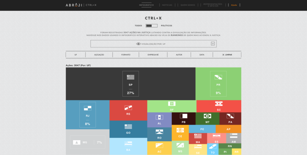
For ABRAJI it all started with regularly scraping the judiciary system for lawsuits. “The problem is that there is no flag or anything structured in a lawsuit that tells you it is about censorship or content removal,” Tiago Mali said.

“So we have tried and improved different queries that get us closer to the lawsuits we are looking for. As we collect thousands of these lawsuits, we read every single one of them and sort and classify the ones related to the project. It’s a time-consuming process we automatised step by step.”

The team at ABRAJI now wants to work with machine learning for sorting and classifying the lawsuits. “We want to build an algorithm that makes everything automatically and we would use our time only to review these work” Mali said. “This would be a tremendous upgrade in efficiency but we still lack the funds to build this structure.”

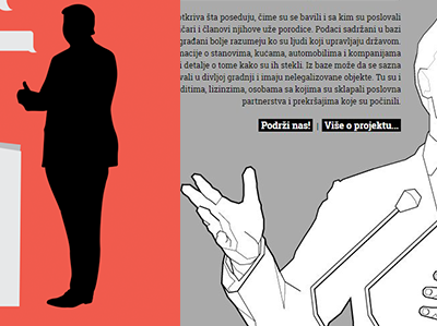
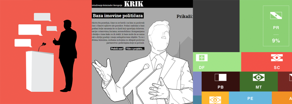
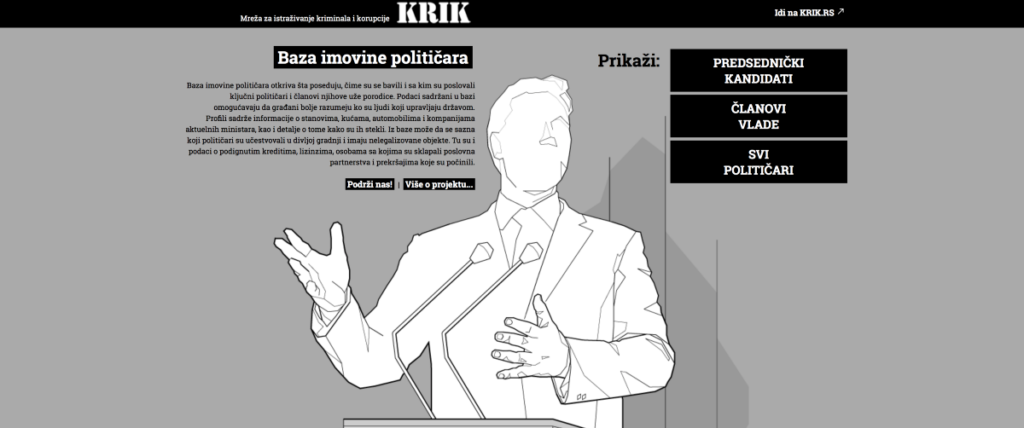
For their database of assets of Serbian politicians, KRIK has used company, criminal, court, and financial records, but also land registry records, sales contracts, loan and mortgages contracts from Serbia and other countries such as Montenegro, Bosnia and Herzegovina, Croatia, Italy, Czech Republic (and even offshore zone — Delaware, UAE, and Cyprus).

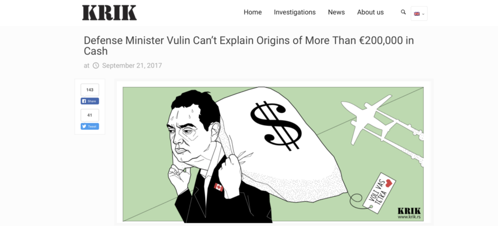
“We have used FOI requests very often in this project,” Jelena Vasić said. “Major difficulties came from state institutions which stopped replying to our FOI requests, but at the same time they were revealing all details from those requests to politicians and pro-government media, which then used it in smear campaigns against KRIK.”

“In situations like this one, we talk to the Commissioner for Information of Public Importance and also write on our website and social media about the institutions that are not replying to our FOI requests. Despite all the efforts of the authorities to disable us from obtaining important information, we have managed to get to the majority of documents we needed.”


There is good impact, and there is bad impact


When investigating wrongdoing, trying to bring forward what is kept hidden or denouncing corruption, news teams aim for positive impact.

“Since the very beginning, we wanted to provide data so there could be more journalistic stories on how the politicians and judges are harming freedom of expression in Brazil,” Tiago Mali said.

“We managed to achieve this goal.”

Because Ctrl+X provided insightful data, freedom of expression, a subject normally ignored by Brazilian media, managed to made the news. At the end of the 2016 electoral campaign, more than 200 articles about politicians trying to hide information had been published in Brazilian media using the project’s data. All major Brazilian newspapers, relevant radios and a TV show ran stories on freedom of expression with their information.

Yet sometimes, an investigative project end up changing the law, and not necessarily for the better, as it was the case in Serbia:

“Because of our investigation, the Serbian Land Registry has changed the way of replying to FOI requests” Jelena Vasić said. “They have decided that every response from their office should get approval from the headquarters in Belgrade, which was not the case before.”

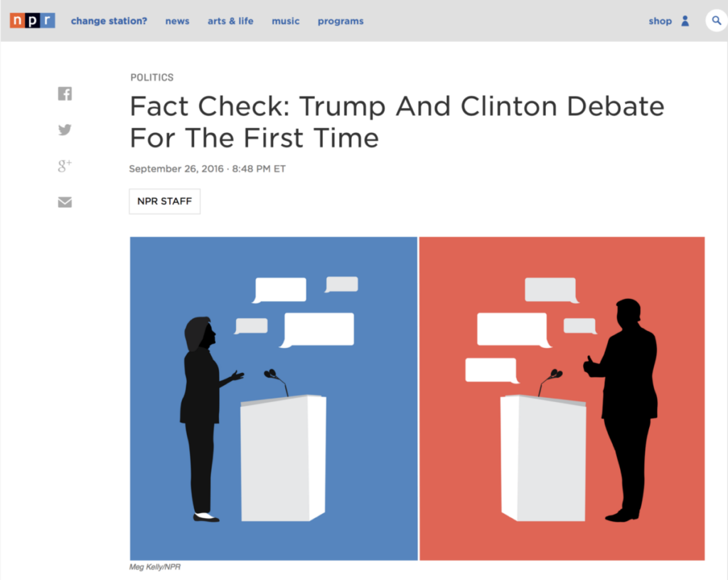
As for NPR, they’ve noticed a real hunger for fact checks and stories that seek the truth on government leaders. “Our debate fact check was the story with the highest traffic ever on npr.org with something like 20+ million views and people stayed on the story something like 20 minutes, which mean they actually read it,” Amita Kelly said.


What could be done to make the job of holding the powerful accountable easier for journalists?


Approve and enforce Freedom of Information Laws, that’s what Tiago Mali argues. “Here in Brazil, a big shift happened after the approval of our FOIA. When you don’t need to rely on the willingness of the powerful to give you information (because a law says so), everything becomes much easier.”

“I think it would be very useful if international institutions could react every time a reporter is exposed to public attacks, because here in Serbia our government is afraid of international pressure” Jelena Vasić added.

For Amita Kelly, it is definitely about pushing for more transparency all around, including laws such as the Freedom of Information Act they have in the U.S. where journalists can request government information. She also thinks news organisations should invest “in allowing reporters to get to know a beat”. Covering an area for a long time helps to develop invaluable sources and expertise.


Bonus: tools and resources used in investigative projects


During our Slack discussion, Tiago Mali of ABRAJI revealed they used Parsehub for the CTRL+X project. It is a tool that easily extracts data from any website.

“We have worked with a lot of high-end tools here, programming, etc. But, still, I think there is no faster way to organise the information you work hard to collect than a spreadsheet. Sometimes the spreadsheet has to be a bigger database, a SQL or something you need R to deal with. But still, being able to make queries and organise your thoughts is really important to the investigation.”

Jelena Vasić loves to use companies search website poslovna.rs (similar to Open Corporates) and also Facebook Graph.

“We used different online sources, and were searching through different databases: Orbis and Lexis databases containing millions of entries of companies worldwide that also contain information on shareholders, directors and subsidiaries of companies.

Vasić also pointed at different local business registries online in Serbia, Bosnia and Herzegovina, Montenegro, Czech Republic and local land registries in Serbia, Montenegro, Croatia.

Google Docs is simple but has been amazing for collaboration,” Amita Kelly added. “At one point we had up to 50 people across the network in one document commenting on a live transcript.


To see the full discussion, check out previous ones and take part in future ones, join the DJA community on Slack!

Over the past six years, the Global Editors Network has organised the Data Journalism Awards competition to celebrate and credit outstanding work in the field of data-driven journalism worldwide. To see the full list of winners, read about the categories, join the competition yourself, go to our website.


marianne-bouchartMarianne Bouchart is the founder and director of HEI-DA, a nonprofit organisation promoting news innovation, the future of data journalism and open data. She runs data journalism programmes in various regions around the world as well as HEI-DA’s Sensor Journalism Toolkit project and manages the Data Journalism Awards competition.

Before launching HEI-DA, Marianne spent 10 years in London where she worked as a web producer, data journalism and graphics editor for Bloomberg News, amongst others. She created the Data Journalism Blog in 2011 and gives lectures at journalism schools, in the UK and in France.


Building a data journalism tools library

I’ve been working in data journalism since 2012. And one of the biggest personal challenges I still face is balancing between learning new tools, become more proficient with older ones, and not missing deadlines because I am spending too much time learning how to use data journalism tools.

When I started as a data journalism student, I began filling in a spreadsheet with links to inspiring tools I wanted to use and learn. I collected these from mailing lists, tweets, blogs and friends’ suggestions. At first, the spreadsheet was simply an ugly dump of links that I used as a student, then as a freelancer, then as a data journalist and data expert at Silk. A month ago I decided to turn it into something useful for other data journalists as well: an interactive and searchable database of data journalism tools. I knew that there were already many resources listing hundreds of (data) journalism tools. But all the ones I saw were lacking the data structure that would make it easy (and beautiful) to sift through the information.

01102015-Silk3

Silk.co is a platform for publishing, visualizing and sharing data on the Web. I realized that this was also the best tool to publish my data journalism tools’ database.  

On Silk I could:

  • quickly upload a spreadsheet to organize the information in an interactive database
  • visualize information about the tools, either as individual entries in galleries or tables or as a chart showing types of tools and other data
  • have individual profiles for each tool
  • generate inline filters that each time would allow me to find the tool I needed.

The project went live two weeks ago. You can find it at data-journalism-tools.silk.co.  I am regularly updating the Data Journalism Tools Silk, adding about 10 new tools every week. You can go to the website to check it out, or you can also “follow” it to receive free updates via email every time something new is added.

01102015-Silk2

Just as this Data Journalism Tools Silk is intended for the community, it will greatly benefit from the community’s input. For this, I’ve made a Google Form so that anyone can suggest a favourite tool.

The key thing for me is that adding real structure to data adds tremendous power to whatever presentation vector you choose to deploy. There are blogs and lists that contain many, many more journalism tools than this one. But by adding structure to each tool and putting it onto its own structured Web page, we can unlock the power of the data as a filtering, visualization and discovery tool. More structured data equals more discovery.


Alice Corona is an Italian data journalist. She received an MA of data journalism MA in The Netherlands and is currently a data journalism lead at the data and web publishing platform Silk.co. Here she regularly creates data-driven projects like “Through The Gender Lens: Analysis of 6,000 Movies”,  “Playboy, Then and Now”, “Women at the International Film Festivals” and “Patents by the National Security Agency” You can email her at alice@silk.co.

Semantic Web and what it means for data journalism

I’ve found myself increasingly interested by the semantic web in recent months, particularly in how it could be applied to data journalism. While the concept is still somewhat in its infancy, the potential it holds to quickly find data — and abstract it into a format usable by visualizations — is something that all data journalists should take note of.

Imagine the Internet as one big decentralized database, with important information explicitly tagged — instead of just a big collection of linked text files, organized on the larger document level, such as it currently is. In the foreseeable future, journalists wanting to answer a question will simply have to supply this database with a SQL-like query, instead of digging through a boatload of content or writing scrapers. Projects like Freebase and Wikipedia’s burgeoning “Datapedia” provide some clues as to the power of this notion — already, the semantic components of Wikipedia make it incredibly easy to answer a wide variety of questions in this manner.

Take, for example, the following bit of SPARQL, a commonly used semantic web query language:

SELECT ?country ?competitors WHERE {
?s foaf:page ?country .
?s rdf:type .
?s "2012"^^ .
?s dbpprop:competitors ?competitors
} order by desc(?competitors)

If used on DBPedia (a dataset cloning Wikipedia that attempts to make its data usable as semantic web constructs), this fairly straight-forward 6-line query will return a JSON object listing all countries participating in the London 2012 Olympics and the number of athletes they’re sending. Go ahead — try pasting the above snippet into a DBpedia SPARQL query editor, such as the one at live.dbpedia.org/sparql. To accomplish a similar feat would take hours of scraping or data gathering. Because it can provide results in JSON, CSV, XML or whatever strikes your fancy, the output can then be supplied to some piece of visualization, whether that’s simply a table or something more complex like a bar chart.

One nice thing about SPARQL is that a lot of the terminology becomes self-evident once you get the hang of it. For instance, if you want to find the properties of the OlympicResult ontology, you merely have to visit the URL in the rdf:type declaration. That will also link to other related ontologies and you can thus find the definitions you need to construct a successful query. For instance, try going to dbpedia.org/page/Canada_at_the_2012_Summer_Olympics, which is the page I used to derive most of the ontologies and properties for the above query. From that page, you learn that entities in the “olympic result” ontology are assigned a “dbpprop:games” property (I.e., the year of the games) and a “dbpprop:competitors” property (I.e., the number of competitors, a.k.a., your pay dirt).

Here’s another, more complex SPARQL query, taken from DBpedia’s documentation:

SELECT DISTINCT ?player {
?s foaf:page ?player.
?s rdf:type .
?s dbpedia2:position ?position .
?s ?club .
?club ?cap .
?s ?place .
?place ?population ?pop.
OPTIONAL {?s ?tricot.}
Filter (?population in (, , ))
Filter (xsd:int(?pop) >10000000 ) .
Filter (xsd:int(?cap) Filter (?position = "Goalkeeper"@en || ?position = || ?position = )
} Limit 1000

This selects all pages describing a “player”, of type “SoccerPlayer”, with position “goalkeeper”, playing for a club with a stadium capacity of less than 40,000 and born in a country with a population of greater than 10 million. Producing such a list without semantic web would be mind-numbingly difficult and would require a very complex scraping routine.

Some limitations

That said, there are some limitations to this. The first is that the amount of well-structured semantic web data out there is limited — at least in comparison with non-semantic web data — though that is growing all the time. Wikipedia/DBpedia seems to be the most useful resource for this by far at the moment, though it’s worth noting that semantic web data from Wikipedia suffers from the same problems that all data from Wikipedia suffers from — namely, the fact that it’s edited by anonymous users. In other words, if something’s incorrect on Wikipedia, it’ll also be wrong in the semantic web resource. Another aspect of this is that Wikipedia data changes really quickly, which means that the official DBpedia endpoint becomes outdated really quickly. As a result, it’s often better to use live.dbpedia.org, which enables a continuous synchronization between Wikipedia and DBpedia.

The other thing you have to watch out for is data tampering. If your visualization is hooked up to a data source with little editorial oversight and the ability of users to edit data, the possibility always exist that one of those users will realize that data set is hooked up to your live visualization on a newspaper website somewhere, and will thus try to tamper with the data in order to make it full of profanity or whatnot. As such, while semantic web data from DBpedia might be a good way of getting the initial result, saving that result as a static object within your script afterwards might be the safest course of action.

Data for dummies

After spending the past seven months studying data, I’ve learnt at least one important lesson: data journalism doesn’t have to be impossibly hard. While there are plenty of things about data journalism which will always go straight over my head – there are also a lot of easy techniques, formulas and programmes. So here are my top 5 data recommendations, for dummies.

Continue reading “Data for dummies”

Data Visualisation vs. Text

Simon Rogers has mapped data which ranked 754 beaches around Great Britain for the Guardian Data Store. The visualisation uses a satellite map of the UK, onto which Simon has marked every beach in its correct geographical location. The dots are colour coded to clearly denote the ranking the beach received from the 2012 Good Beach Guide, green representing ‘Recommended’, purple meaning ‘Guideline’, yellow meaning ‘Basic’ and red indicating that the beach failed to reach the Beach Guide’s standards. Users can click on individual dots to get the names of each beach and its ranking.

In this way an enormous mass of information is presented in a small space. It is also presented in a clear and comprehendible way. Users can spend as long as they like ‘reading’ the map and obtain as much or as little information as they wish to from it.

Underneath the map, Simon has written out all 754 beaches, with their ranking alongside it. As he has done so, we can easily compare the use of text to tell a data story with a visualisation. The text takes up significantly more room. It is much harder to find the individual beaches you are interested in and takes more energy and effort to scroll up and down in order to find a particular beach. The sheer mass of information presented in the text makes the story seem like a drag, rather than a fun exploration of the British coastline, as is felt by the visualisation.

However, underneath the map Simon has highlighted key features and findings of the data. He writes: “The report rated 516 out of 754 (68%) UK bathing beaches as having excellent water quality – up 8% on last year. That compares well to 2010, when it rated 421 of 769 beaches as excellent.”

It is not clear from the visualisation alone how many beaches received each rating and it would have been time consuming and difficult for the user to individually count this. Thus text is useful to provide a summary and to highlight key findings alongside a visualisation.

This is therefore a fine example of the way in which visualisations and text complement each other, and demonstrates that, with many data stories, combining visualisation and text creates the richest, most comprehendible and informative narrative.