
As an aspiring data journalist, I was excited (and relieved) to flick through the new Data Journalism Handbook. The internet is awash with tutorials on visualising techniques and coding, but there’s a lack of documentation providing an overview of the field.
Why Data Journalism is Important
After studying Data Journalism for a year at City University I have come to appreciate the importance of having the skillset to make the most out of numbers and statistics. Many aspiring journalists still see data as something that is separate from journalism, and as something that does not interest them. In response, I have compiled some reasons why data is increasingly important:
1. Make sense of Mass Information
Having the skills to scrape, analyse, clean and present data allows journalists to present complicated and otherwise incomprehensible information in a clear way. It is an essential part of journalism to find material and present it to the public. Understanding data allows journalists to do this with large amounts of information, which would otherwise be impossible to understand.
2. New Approaches to Storytelling
Able to create infographics and visualisations, data journalists can see and present information in a new and interesting way. Stories no longer need to be linear and based solely on text. Data can be grafted into a narrative which people can read visually. Interactive elements of data visualisations allow people to explore the information presented and make sense of it in their own way.
3. Data Journalism is the Future
Understanding data now will put journalists ahead of the game. Information is increasingly being sourced and presented using data. Journalists who refuse to adapt to the modern, increasingly technological world will be unable to get the best stories, by-lines and scoops and their careers will suffer as a result.
4. Save Time
No longer must journalists pore over spread-sheets and numbers for hours when there could be a simpler way to organise the information. Being technologically savvy and knowing the skills to apply to data sets can save journalists time when cleaning, organising and making sense of data. Not making mistakes due to lack of knowledge can also save a journalist time.
5. A way to see things you might otherwise not see
Understanding large data sets can allow journalists to see significant information that they might otherwise have overlooked. Equally, some stories are best told using data visualisations as this enables people to see things that they might otherwise have been unable to understand.
6. A way to tell richer stories
Combining traditional methods of storytelling with data visualisations, infographics, video or photographs, creates richer, more interesting and detailed stories.
7. Data is an essential part of Journalism
Many journalists do not see data as a specialist and separate area of journalism, but an interwoven, essential and important element of it. It is not there to replace traditional methods of finding information, but to enhance them. The journalist that can combine a good contact book and an understanding of data will be invaluable in the future.
Making Google Spreadsheets speak intelligible JSON
Audience: Intermediate
Skills: Javascript, PHP
When collaboratively constructing datasets to be consumed by interactive graphics, a Google Spreadsheet is often where everything starts. This makes a lot of sense — the cloud-based nature of the document means it’s very accessible and doesn’t need to be emailed around to everyone with each revision, multiple people can simultaneously work on it without having to worry about syncing a bunch of changes and it’s easier to use than a relational database (or even the back-end tools to manipulate such databases; for instance, phpMyAdmin.).
However, what about when the dataset’s finished? One completed, it likely has to then be exported as a CSV and imported into a database, or, worse yet, manually reproduced in another web-consumable format — for instance, JSON.
If your dataset never changes and everyone on your team knows how to move the data from Google Spreadsheets into the web-consumable format, this might not be a problem. But what about if that data changes frequently? Or what if you’re on the development end of the project and want to start building the interactive before the dataset is complete?
Clearly what’s needed is a way to make Google Spreadsheets speak JSON. Google has two built-in ways of doing this, but neither works very well — the actual spreadsheet data is buried under several layers of metadata and, worse yet, header rows don’t map to anything. These reasons combined make it difficult to use for anything more complex than a simple list.
Luckily, a great bit of code from Rob Flaherty solves this problem quite nicely. I’ll briefly go into how to use it:
-
- First, your Google Spreadsheet needs to be “published.” Note that this doesn’t mean it’s fully available online — how visible it is reflects whatever value is selected in “Sharing” settings. In short, unless your data is set to “Public on the web,” you don’t really need to worry about anyone finding it before you publish. To make it consumable for JSON, go File, Publish to the Web… and click Start Publishing. Under “Get a link to the published data,” select “CSV (comma-separated values)” and copy the URL it gives you to the clipboard.
- Download the CSV to JSON script and upload it to a PHP-enabled directory of your webserver.
- Paste the URL from step 1 into the $feed variable.
This will work fine for a local AJAX request. However, because of AJAX’s same origin requirement, you won’t be able to consume data from the script on domains outside of the one it’s being hosted on. This is problematic if, for instance, your newspaper’s tech team won’t let you run random bits of PHP on your pages and you are thus wanting to host the above script on ScraperWiki, or if you’re wanting to create a web-service that lets your readers consume the data as JSON.
The way around this is to use JSONP, which is essentially regular JSON wrapped in a callback. This lets you use jQuery’s getJSON(); function like so:
jQuery.getJSON(’http://www.aendrew.com/csv-to-jsonp.php?callback=?’, function(response) {

//code for consuming JSON here -- JSON object returned as variable “response”

});
To do so, simply change the header value in the CSV to JSON script from “application/json” to “script/javascript” and replace the last line with the following:
echo $_GET['callback']. '(' . json_encode($newArray) . ');';
Alternately, I’ve posted a modified fork of Flaherty’s code here.
Notes:
-
- Depending on the debug level of your version of PHP, you might get warnings about array_combine(); on line 55. Place an @ in front of that function to suppress them.
- The CSV to JSON script uses the first row as column headings, which are mapped as the name of each item in the JSON response. Make sure no two column headings are identical — otherwise, the first one will be overwritten by the second.
Using SimpleBrowser to browse the Internet in PHP

Audience: intermediate coders with a knowledge of PHP
PHP provides a lot of useful tools when using it for simple webpage scraping, but one begins to see its limitations when put up against a search form or website that uses hidden server-generated fields to validate user input.

Continue reading “Using SimpleBrowser to browse the Internet in PHP”
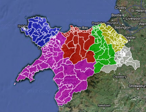
Mapping election data for North Wales
This is the data analysis behind how I, Andrew Stuart, did the data for the Daily Post interactive election map for 2012 on the website for the Daily Post, a regional daily newspaper in North Wales. I used Google Docs and Excel to work with the data we got hold of.

As a British citizen, I know that getting information for council elections is pretty difficult. How do you vote? Yes, you can vote along party lines, but they are generally dictated by national policy, wherever that may be. Generally, for local council elections, you have to wait for the information to drop through the letter box, or have a story about them.
However, Local councils really are where the stuff that we see and use on a day-to-day basis is done. Rubbish collections, inspecting where we go to eat, repairing the roads, street lighting, and planning. So, the people who decide this policy are important. And, knowing what they’re for, against, or couldn’t give two hoots about matters.
Sadly, writing individual feature pieces on 243 wards, with over 753 residents putting their names forward, for a regional paper covering 6 counties (5 of which are to have elections) is next to impossible. I say next to, because nothing is impossible.
So, when I was at the Daily Post, we decided to use the web to show who was standing where. That way, they are a quick Google search or a reference away to find out more about them. This is what we came up with:
So, how did we do it?
First, you need to gather data. This sounds easier than it is. Some council’s had a nice list of each statement of nomination so you can scroll through. Some had a good word doc for reference. Some had the images saved as PDF files, and are on the website individually. Some had three different areas of the council because the county is so big! All of them were not in the same format.
So, we have to type them out. Not the best way, but the only way. These are new candidates, and the data is not online in any sort of format I can import to Google Docs. Claire Miller for WalesOnline had to do the same thing. For every council in Wales, bar the 5 I did. I do not envy her job.
I typed all the name for a ward into the one cell in the format “Name Middle name surname (party), etc”. The comma is important. I saved three files – the online version, the reference version, and a raw backup.
Using a uniform way of typing means I can parse easily at the comma. This allows the file to be shared around different journalists, so they can cover the patches and get the story behind the story. The single cell one for online works in the info box.
The next bit was to make the map work. For this, I need the KML files. There is an easy way of doing this using ScraperWiki. That would bring all the children of each County Council into a file. What I did, however, was to save each file from mapit.mysociety.org (not that strenuous), then create individual county shapefiles in Google Earth. I then have individual maps, and joining all the wards together allows me to create a whole North Wales map.
Then, merge the two tables – the one with all the prospective councillor details and the one with the shape files into Google Fusion tables, and check for errors. The one which did flag up was Mostyn. There is a Mostyn ward in Conwy and Flintshire. The way around it? Type Mostyn, Conwy, and Mostyn Flintshire. It worked.
All you need to do then is to colour the shapefiles by county. To do this, I put the HTML colour codes in a column on the councillor list, and selected that column as the one for the colours for the polygons, and you have coloured counties.
And to get around the way of Anglesey not having elections? In the Anglesey cells, I typed no election. The info box then shows no election.
That’s how you inform 243 wards of who’s standing where, in one fell swoop, and may I say so, quite beautifully too.
This was originally posted on andrewwgstuart.com. Trinity Mirror own copyright for the cuttings used in this piece. Andrew Stuart created the map.
VISUALISATION ANALYSIS #3
Simon Rogers has published a fantastic interactive graphic for the Guardian Datastore that maps teenage pregnancy rates in England and Wales from 1998 to 2010.
The visualisation shows the conception rate of under-eighteen year olds, per 1000 women, in different counties across England and Wales. The interactive map is an ideal way to present the information, as the visualisation contains a large amount of data in a comprehensible way. From the graphic we can derive that the number of teenage pregnancies has declined in the last decade, although this varies by area.
In order to focus on a specific county the user can scroll the mouse over the map and click on a different area, labelled by county at the side of the map. Once you click on a county the line graph changes to show the counties’ change in number of teenage pregnancies by year and how this compares to the England and Wales average. This allows the user to have more detailed and specific information simply by clicking on the infographic. Thus the graphic allows users to see the more personalised, local data.
By using this tool the user can focus on various localised data, and see how they compare with each other. For example, in Wales it is apparent that poorer counties, such as Merthyr Tydfil and the South Wales Valleys, are significantly over the national average regarding the number of teenage pregnancies. In contrast, geographically close but wealthier counties like Monmouthshire and Powys are below the national average. In most cases this has not altered over the decade.
The map thus proves that in certain circumstances seeing only the larger data can give a limited understanding, as it shows a national decline in the number of teenage pregnancies but does not tell us that many individual counties have not changed significantly. In this way a graphic of this kind presents to users the ‘big picture’, in a clearer way than text alone.
The graphic also allows users to ignore information that is not of interest to them and to focus on geographical locations that are. This gives users a certain amount of control over the visualisation, as information is not decided for the user, as would be the case with textual narrative.
The interactive element of the visualisation allows users to find the story or information for themselves with no difficulty. This is more satisfying than simply being told information. At a time when the general public’s trust in journalism is low, visualisations such as this demonstrate that the journalist has not played around and sifted information but presented all of it to the user and allowed them to draw their own conclusions. In this way the user can get a more detailed, accurate and neutral understanding of the issue presented. It also breaks down the barrier between journalist and user and implies trust in the user to interpret and organise the data in an intelligent way.
The graph also uses visual symbols to organise the large amount of data. The map of England and Wales is easily recognisable, as is many of the counties. The counties that are under the national average are a light shade of blue and this gets darker as the percentage increases. The use of blue and purple makes the map visually attractive and the differences in shade easily identifiable. It is apparent that darker areas cluster together and that generally the North of England is darker than the South. In this way the user can obtain information from the visualisation by looking at it alone. The darker shade of purple stands out amongst the generally lighter shades and thus the graphic signals to the reader some of the most dramatic information. Thus, although the user is given control and the freedom to explore the data and draw their own conclusions, visual signals guide them to the most extreme data.
The orange circle that is drawn around a county when it is selected contrasts with the blue, making it clear. It also correlates with the colour of the line graph, making the visualisation easily readable.
By pressing ‘play’ the user can focus on one county and see how it breaks down by each year, as well as how the colours across the UK has changed by year, thus presenting more information.
The visualisation thus works as it presents a large amount of data comprehensibly. It allows the user to interpret and organise the data, but gives them visual signals to guide them. It also gives information for the whole country, as well as localised data, thus presenting the ‘big picture’. It is clear and easy to read and breaks down the barrier between journalist and user. It is therefore an excellent way to present the data.
How to do a good visualisation and why it’s important
Visualisations are an important tool when presenting data, and can be used to show patterns, correlations and the ‘big picture’.
Ben Fry has said that visualisations ‘answer questions in a meaningful way that makes answers accessible to others’ and Paul Bradshaw explains that ‘visualisation is the process of giving a visual form to information which is otherwise dry or impenetrable.’
Traditionally stories have been conveyed through text, and visualisations have been used to display additional or supporting information. Recently, however, improved software has allowed journalists to create sophisticated narrative visualisations that are increasingly being used as standalone stories. These can be be linear and interactive, inviting verification, new questions and alternative explanations.
Continue reading “How to do a good visualisation and why it’s important”
How to find Data
This post is for people who are new to data sourcing, or interested in Data Journalism but unsure of where to begin.
First, it is useful to start with an idea, question or hypothesis. In Story Based Enquiry Mark Lee Hunter emphasises the importance of having an idea of what you are looking for in data.
He said: “We do not think that the only issue is finding information. Instead, we think that the core task is telling the story. Stories are the cement which holds together every step of the investigative process, from conception to research, writing, quality control and publication.”
Data stories and visualisations are part of journalism and, when looking for information, a good starting place is to use traditional journalistic methods. Contacts, tip offs, interviews and research can all point you in the direction of interesting data, and of questions that could be answered by statistics. This is known as Active Data Journalism.
Manual on Excel for data journalists

The Centre for Investigative Journalism came out with a handbook this year for journalists who want to master the art of interrogating and questioning numbers competently. Being able to work with figures and investigate numbers is not a new form of journalism but a skill that all journalists can acquire.
The handbook, entitled Data Journalism or Computer Assisted Reporting (CAR), focuses on an essential tool in a data journalist’s tool belt, the spread sheet. [Read more…]
Tool of the week for journalists – Playground, to monitor social media analytics

Tool of the week: Playground, by PeopleBrowsr.
This post was first published on Journalism.co.uk
What is it? A social analytics platform which contains over 1,000 days of tweets (all 70 billion of them), Facebook activity and blog posts.
How is it of use to journalists? “Journalists can easily develop real-time insights into any story from Playground,” PeopleBrowsr UK CEO Andrew Grill explains.
Complex keyword searches can be divided by user influence, geolocation, sentiment, and virtual communities of people with shared interests and affinities.
These features – and many more – let reporters and researchers easily drill down to find the people and content driving the conversation on social networks on any subject.
Playground lets you use the data the way you want to use it. You can either export the graphs and tables that the site produces automatically or export the results in a CSV file to create your own visualisations, which could potentially make it the next favourite tool of data journalists.
Grill added:
The recent launch of our fully transparent Kred influencer platform will make it faster and easier for journalists to find key influencers in a particular community.
You can give Playground a try for the first 14 days before signing up for one of their subscriptions ($19 a month for students and journalists, $149 for organisations and companies).
Jodee Rich, the founder of PeopleBrowsr, gave an inspiring speech at the Strata Summit in September on how a TV ratings system such as Nielsen could soon be replaced by social media data thanks to the advanced online analytics that PeopleBrowsr offers.
Playground’s development is based on feedback from its community of users, which has been very responsive. Ideas can be sent to contact[@]peoplebrowsr.com or by tweeting@peoplebrowsr.