Metropolitan Police expenditure on cars is on the rise

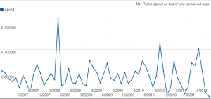
The Metropolitan Police’s expenditure on brand new unmarked cars is rising, a Freedom of Information request can reveal. In excess of £28 million was spent on new cars between December 2006 and November 2011.

Annual spending figures show that expenditure has risen from £4.8 million in 2007, to £6 million in 2010, with spend exceeding the £1 million mark in single months alone; £1.6 million was spent in April 2008 alone, and £1 million spent in August 2011. Unmarked police cars do not display any police logos and are used by police to assist in operations and responding to incidents. These figures therefore exclude any money spent on the Metropolitan Police’s marked fleet cars, and considering the cuts being made to policing across the country, the increasing spend is concerning.

When questioned about the figures, a Metropolitan Police spokesperson said:

“The MPS Fleet contains over 5,000 vehicles with a wide range of functions, capabilities and specialisms. Maintaining the fleet requires the purchase and maintenance of vehicles – some of which are without police livery. Procurement of vehicles is through a competitive tender process and framework, ensuring we obtain best value for money. Unmarked vehicles are often directly involved with or support operational activity and although not instantly recognisable to the public, play a crucial role as part of our fleet and supporting policing London.” The Metropolitan Police refused to comment on how many cars that were bought with the figures revealed, nor on specifically the type of cars that were bought.

Emma Boon, Campaign Director of the Tax Payer’s Alliance commented on the matter saying: “It’s worrying that Met police spending on fast cars increased by over a million pounds in just a couple of years. Clearly the force will need some high performance vehicles to be able to do their job properly, but these figures show spending in this area increasing, even during the recent recession. With police budgets tight, the Met must get this spending under control and ensure that they are getting the best value for taxpayers’ money”.

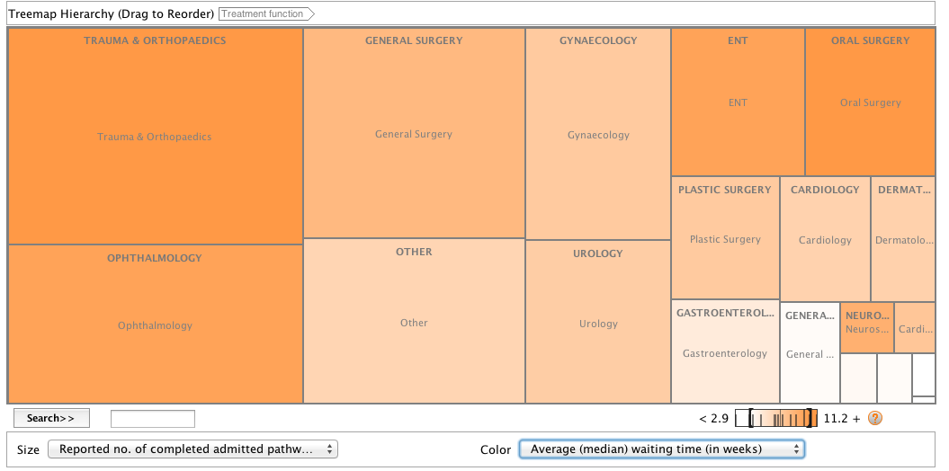
Treemap for Comparisons showing Hospital Waiting Times

Visualising data is important because it makes complicated information easy to process and understand.

Here I took some data from the Office for National Statistics website, www.ons.gov.uk. I chose to look at Hospital waiting times because it is an issue that is often reported on and I was curious as to which treatments had the longest waiting time.

I took the data and copied it into an Excel spreadsheet. I then cut it down to get rid of information that I didn’t need and that would confuse the user. I organised the data into columns, the first showing the type of treatment, the second the amount of completed treatments and operations and the third showing the average median waiting time in weeks.

Continue reading “Treemap for Comparisons showing Hospital Waiting Times”

Tool of the week for journalists – Playground, to monitor social media analytics

Tool of the week: Playground, by PeopleBrowsr.

This post was first published on Journalism.co.uk

What is it? A social analytics platform which contains over 1,000 days of tweets (all 70 billion of them), Facebook activity and blog posts.

How is it of use to journalists? “Journalists can easily develop real-time insights into any story from Playground,” PeopleBrowsr UK CEO Andrew Grill explains.

Complex keyword searches can be divided by user influence, geolocation, sentiment, and virtual communities of people with shared interests and affinities.

These features – and many more – let reporters and researchers easily drill down to find the people and content driving the conversation on social networks on any subject.

Playground lets you use the data the way you want to use it. You can either export the graphs and tables that the site produces automatically or export the results in a CSV file to create your own visualisations, which could potentially make it the next favourite tool of data journalists.

Grill added:

The recent launch of our fully transparent Kred influencer platform will make it faster and easier for journalists to find key influencers in a particular community.

You can give Playground a try for the first 14 days before signing up for one of their subscriptions ($19 a month for students and journalists, $149 for organisations and companies).

Jodee Rich, the founder of PeopleBrowsr, gave an inspiring speech at the Strata Summit in September on how a TV ratings system such as Nielsen could soon be replaced by social media data thanks to the advanced online analytics that PeopleBrowsr offers.


Playground’s development is based on feedback from its community of users, which has been very responsive. Ideas can be sent to contact[@]peoplebrowsr.com or by tweeting@peoplebrowsr.

Why journalists should hang out with hackers


JOURNOMEL.COM: By 

Editor’s note: I thought this blog post made a really good point: journalists and hackers should hang out together more. So I decided to share it with you. You can read the full article on Journomel.com.

First confesstion: I’m not very good with numbers and I don’t know how to program in Linux, so I’m naturally fearful of the super computer-savvy.

Second confession: my impression of a hacker had largely been shaped by a really mediocre 1990′s movie. Great soundtrack, but no way could I do what these folks were doing.

Fast forward 16 years and I’m a convert. Partnering with hackers is a natural fit: as more and more data is available to the public, there are stories to be told.

And despite the way they are portrayed by the media – yes, us – hackers are not in their basements dreaming up viruses to take over the world.

I’m part of a group that brought a Hacks/Hackers chapter to Ottawa, and I’m learning that when journalists and technology collide, amazing things happen.

At our first meetup in May I was surprised to hear from a hacker that he was just as thrilled to meet up with a group of hacks (not quite used to that title) as I was meeting him and hacker friends.

“What do you have to gain here?” I asked, “You can build apps, fusion tables, what do you get out of this?”

“Sure, I can build anything – but you know what stories people need to hear, and what they want to hear. You know the audience.”

Third confession: I was more than a little intimidated when I bumped into Kate Myers and Andy Carvin from NPR at a hackathon held at the Online News Association conference this September.

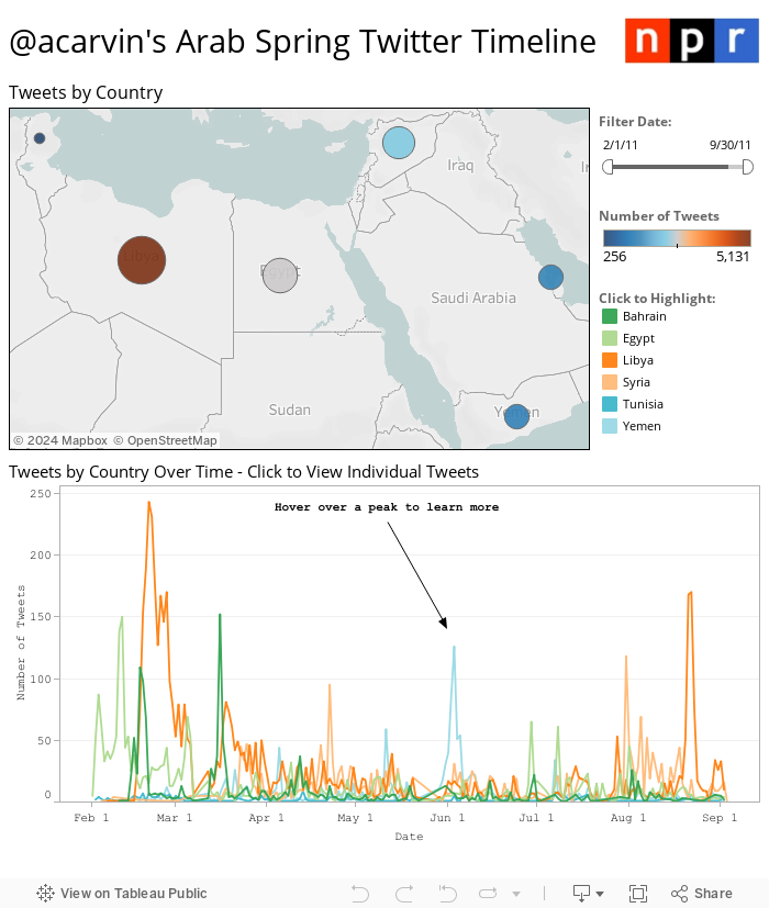
Kate is the Product Manager for Social Media Tools, and Andy is the Senior Strategist for NPR’s Social media desk. [Read more…]


75+ Tools for Visualizing your Data, CSS, Flash, jQuery, PHP

Editor’s note: Back in 2009, Tripwire magazine published this comprehensive article about data visualisation tools. Although technology has come a long way since then, most of their tips are still relevant so we thought you’d like to take a pick. You’ll find some old school know-how to bring your data to life. Enjoy!

TRIPWIRE MAGAZINE – By LARS

Most people would agree that the old adage “A picture is worth a thousand words” is also true for web based solutions. There should be no discussion – Charts and Graphs are ideal to visualize data in order to quickly deliver an overview and communicate key messages. Whatever type of data presentation you prefer or suits you data (pie charts, bubble charts, bar graphs, network diagrams etc.), there are many different options but how do you get started and what is technologically possible? In this article tripwire magazine present more than 75 Tools for Visualizing your data on a website and most of the options available will be covered. If you are aware of a tool, script etc. that deserves to be added to the list I would kindly ask you to leave a comment to everyone’s benefit.

Introduction

Images says more than a thousands words. It is common sense and wise people has followed this rule for centuries by creating illustrations of thier ideas and thoughts. Today it is easier than ever as the technology for presenting nearly any type of information as a graph or chart on a web page is getting really mature. Reading through this article you will be faced with the problem on what technology and specific implementation you should use. It is not a trivial question and I recommend that you use comments on this article to share your ideas, concerns etc. with peer readers. This way you may get the input from the community that you need to create the optimal solution.

The article has been organised into the following sections.

Section 1: How to visualize you data using Javascript-based solutions

Section 2: How to visualize you data using CSS

Section 3: How to visualize you data using Server-side Solutions

Section 4: How to visualize you data using FLASH-based solutions

Section 5: How to visualize you data using Online Tools and Services

How to visualize you data using Javascript-based solutions

jqPlot Charts and Graphs for jQuery

The feature rich jqPlot is a plotting and charting plugin for the jQuery Javascript framework. There are plenty of hooks into the core jqPlot code allowing for custom event handlers, creation of new plot types and adding canvases to the plot.

jQuery

flot – Attractive Javascript plotting for jQuery

Flot is a pure Javascript plotting library for jQuery. It produces graphical plots of arbitrary datasets on-the-fly client-side. It has been developed with focus on simple usage (all settings are optional), attractive looks and interactive features like zooming and mouse tracking.
The plugin works with Internet Explorer 6/7/8, Firefox 2.x+, Safari 3.0+, Opera 9.5+ and Konqueror 4.x+ with the HTML canvas tag (Internet Explorer where the excanvas Javascript emulation helper is used).

jQuery

jQuery Sparklines

This jQuery plugin generates sparklines (small inline charts) directly in the browser using data supplied either inline in the HTML, or via javascript all with a single line of code.
The plugin is compatible with most modern browsers and has been tested with Firefox 2+, Safari 3+, Opera 9, Google Chrome and Internet Explorer 6, 7 & 8.

jQuery

Flotr Javascript Plotting Library

Flotr is a javascript plotting library based on the Prototype Javascript Framework and has been inspired by Flot (above). [Read more…]

15 Well Designed Twitter Infographics


FLASHUSER

Infographics are probably the best way to show different statistics ( social media, internet marketing, online advertising etc. ) in a pleasant and enjoyable form. The infographic, in most cases, communicates complex datas in a simple and understandable fashion. With a few words and lot of stylish, fun images a well designed infographic for sure will remain for a long period of time in your memory.

Because I enjoyed much of using Twitter, I assembled some of the best infographics around this social media network. Some of them are funny, while others can help you in your Twitter bussiness process.

Sit back in your comfortable chair and enjoy this colorful list of Twitter infographics 2011. For a full-size version please click on each image or visit the source author website.

1. A Visual History of Twitter

Source: Mashable

infographic-graphics-twitter_history


2. Twitter Facts and Figures

Source: Touchagency

twitter-facts-figures

[Read more…]


99% v 1%: the data behind the Occupy movement – animation


THE GUARDIAN’S DATABLOG – By  and 

It has been the rallying cry of the Occupy movement for the past two months – but is the US really split 99% v 1%? As poverty and inequality reach record levels, how much richer have the rich got? This animation explains what the key data says about the state of America today

• Explore the data behind this animation and read the script


Click on the picture below to watch the video on The Guardian’s website:


Are You Addicted to Your Mobile Phone [Infographic]


INFOGRAPHICS SHOWCASE 

This UK-based infographic asks if you are addicted to your mobile phone.  They say that 83% of people own mobile phones, and I am thinking they are talking about the population of the UK, because no way for the whole world, you know?  Of that 83%, 35% own smartphones.  Of the people who own cell phones, about half of them admit to be addicted to their devices.  Scary. [Read more…]