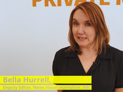
We asked Bella Hurrell, Deputy Editor of the BBC News Visual Journalism Team, about what makes a good product prototype and what are the challenges that you have to face when building them. In this video, she shares with us the tools that the BBC uses for building their prototypes and what their vision is.
Build quick and dirty prototypes that you can test with people. Don’t invest huge amounts of time in something if you are not that sure about it […] and give up when it is a good time to do it!
Michaela Gruber is a journalism and media management student, based in Vienna, Austria. During her studies she spent a semester abroad in France, where she started working for HEI-DA.
As the company’s communication officer, she is in charge of the Data Journalism Blog and several social media activities. This year, Michaela was HEI-DA’s editor covering the Data Journalism Awards in Lisbon, Portugal.
Editors, reporters and, anyone in news today: how prepared are you for what is coming? Really. There is a lot of talk right now on new practices and new technologies that may or may not shape the future of journalism but are we all really properly getting ready? Esra Dogramaci, member of the Data Journalism Awards 2017 jury and now working as Senior Editor on Digital Initiatives at DW in Berlin, Germany, thinks we are not. The Data Journalism Awards 2017 submission deadline is on 10 April.
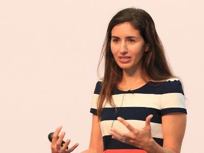
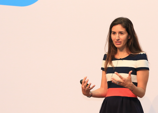
Esra Dogramaci, Senior Editor on Digital Initiatives at DW, Photo: Krisztian Juhasz
Before joining DW, Esra Dogramaci worked at the BBC in London and Al Jazeera English, amongst others. She discusses here the preconceived ideas people have about the future of journalism and how we might be getting it all wrong. She also shares some good tips on how to better prepare for the journalism practices of the future as well as share with us her vision of how the world of news could learn from the realm of television entertainment.
What do you think most people get wrong when describing the future of journalism?
There are plenty of people happy to ruminate on the future of journalism — some highly qualified such as the Reuters Institute and the Tow Center who make annual predictions and reports based on data and patterns while others go with much less than that. Inevitably, people get giddy about technology — what can we do with virtual reality (VR), augmented reality (AR), artificial intelligence (AI), personalisation (not being talked about so much anymore), chatbots, the future of mobile and so on. However with all this looking forward to where journalism is headed (or rather how technology is evolving and, how can journalism keep pace with it), are we actually setting ourselves and journalism students up with all that is needed for this digital future? I think the answer is no.
What is, according to you, a more adequate description (or prediction) of the future of news?
If we’re talking about a digital future, the journalists of tomorrow are not equipped with the digital currency they will need.
Technology definitely matters but it’s not so useful when you don’t have people who understand it or can build and implement appropriate strategy to bridge journalism in a digital age. Middle or senior management types for instance, are less likely to know how to approach Snapchat, which they would be less likely to use, than a high school teenager who is using it as a social sharing tool or their primary source of news.
So if we aren’t actually:
1. Listening to our audience and knowing who they are and how they use these technologies, and
2. Bringing in people who know how to use these tools that speak to and with the audience,
…the efforts are going to be laughable at worst and dismissed at best.
In essence, technology and those who know how to use, develop and iterate it go together. That’s the future of news. We should be looking forward with technology, but we’ve also got to look back at the people coming through the system that will inherit and step into the – hopefully relevant – foundations we’re building now.
“Are we actually setting ourselves and journalism students up with all that is needed for this digital future?”
When looking at the evolution of journalism practices over the past few years, which ones fascinate you the most?
There are two things that stand out. The first is analytics and the second is the devolution of power, both points are interrelated.
Data analytics have really transformed non-linear journalism. Its instantly measurable, helping people make editorial decisions but also question and understand why content you thought would perform doesn’t. Data allows us to really understand our audience, and come up with content that not just resonates with them but how to package content that they will engage with. For instance a website audience is not going to be the same as your TV audience (TV is typically older and watches longer content but again the data will tell specifics), so clipping a TV package and sticking it on Facebook or YouTube isn’t optimal and suggests to your audience that you don’t understand these platforms and more importantly, them. They will go to another news provider that does.
An example of this was a project where it was traditionally assumed [in one of my previous teams] that the audience was very interested in Palestinian-Israeli conflict and so a lot of stories were delivered about it. However, we discovered through the numbers, on a consistent basis, that the audience wasn’t as interested as assumed, rather people were more into the conflicts in Syria, Yemen as well as Morocco and Algeria stories. These stories and audiences may not have traditionally registered on top of the editorial agenda because of what was historically thought to be in the audiences interest, but our data was suggesting we needed to pay more attention to the coverage in these areas.
Now, that being said, it’s still stunning to see how little analytics are used day to day. There still seems to be a monopoly on the numbers rather than integration into newsrooms. There are a plethora of tools available in making informed editorial or data decisions but generally editors don’t understand them or follow metrics that are not useful because they don’t know how to interrogate the data, or we hear things like ‘I’m an editor, I’ve been doing this for x years, I know better.’
Fortunately though, about 80–90% of editors I find are keen to understand this data-driven decision-making world and once you sit down and explain things, they become great advocates. Ian Katz at BBC Newsnight, Carey Clark at BBC HardTalk are two editors who embody this.
The second area is devolving power. The best performing digital teams are when not all decision-making is consolidated at the top, and you really give people time and space to figure out problems, test new ideas without the pressure always to publish. That’s a very different model to traditional hierarchical or vertical journalism structures. Its an area of change and letting go of power. But empowering the team empowers leaders as well.
An example of this is a team I worked with where all decisions and initiatives went through a social media editor. As a result, there was a bottleneck, and frustration for things not being done and generally being late to the mark on delivering stories and being relevant on platform as competitors were overtaking. What we did is decentralise control — we asked the team what platforms they’d like to take responsibility for (in addition to day to day tasks) and together came up with objectives and a proposition to deliver on those. The result? Significant growth across the board, increase in engagement but perhaps most importantly, a happier team. That’s what most people are looking for: recognition, responsibility, autonomy. If you can keep your team happy, they are going to be motivated and the results will follow.
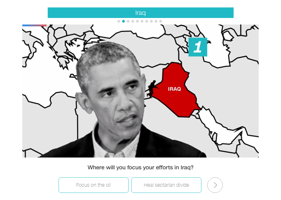
Global Headaches: the 10 biggest issues facing Donald Trump, by CNN
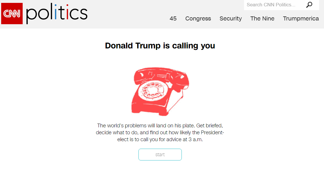
Do you have any stories in mind that represent best what you think the future of newsmaking will look like?
The project was on site (meaning that traffic was coming to the site and not a third party platform), made for mobile which would presumably reflect an audience coming mainly from mobile, used broadcast journalists and personalities as well as regular newsgathering, with an element of gamification. Each scenario had an onward journey which then takes your reader out of the game element and into the story.
Example from the “onward journey” with the CNN “Global Headaches” project
This isn’t a crazy high tech innovation but it is something that would have been much harder to pull off say 5 years ago. This example is multifaceted and making use of the tools we have available today in a smart way. It demonstrates that CNN can speak to the way their audience is consuming content while fulfilling its journalistic remit.
Examples like this doesn’t mean we should be abandoning long form text for instance and going purely for video driven or interactive stories. The Reuters Institute found last year (in their report The Future of Online News Video) that there is oversaturation of video in publishing and that text is still relevant. So, I would caution against throwing the text baby out with the bathwater, which then comes down to two things:
Know your audience and do so by bringing analytics into the newsroom (it’s still slightly mind boggling the number of newsrooms who do not have any analytics in the editorial process)
Come up with a product that you love and that works. The best of these innovations are multidisciplinary and do something simple using the relevant tools we have, that are accessible today. There’s no use investing in a VR project if the majority of your audiences lack the headsets to experience it.
Do you think news organisations are well equipped for this digital future?
Yes and no. There are the speedboats like Quartz, AJ+, NowThis, Vox, who can pivot quickly and innovate versus the bigger media tankers that turn very slowly. One question I get asked quite a bit is “what’s the most important element in digital change”. The answer is leadership. There needs to be someone(s) who understands, supports and pushes change, otherwise everyone down the ranks will continue to struggle and face resistance.
I truly believe in looking at the people who are on the ground, rolling up their sleeves and getting the work done, trying, failing, succeeding, and who keep persevering — versus always deferring to editors who have been in place for say 10 years to lead the way. Those people in the trenches are the ones we should be shining the light on and listening to. They are much closer to the audience and can give you usable insights that also go beyond numbers.
If I could name a few, people like Carol Olona, Maryam Ghanbarzadeh at the BBC, Alaa Batayneh or Fatma Naib, at Al Jazeera, Jacqui Maher at Conde Nast, need to be paid attention to. You may not see them at conferences or showcased much but by having people like them in place, news organisations are well equipped for a digital future.
Do you see some places in the world (some specific organisations maybe?) that are actually doing better than others on that front?
The World Economic Forum wouldn’t traditionally be associated as being a digital media organisation, but a few years ago they started to invest in social media and develop an audience that normally would not be interested in them. They take data and make it relevant and accessible for low cost, bite size social consumption.
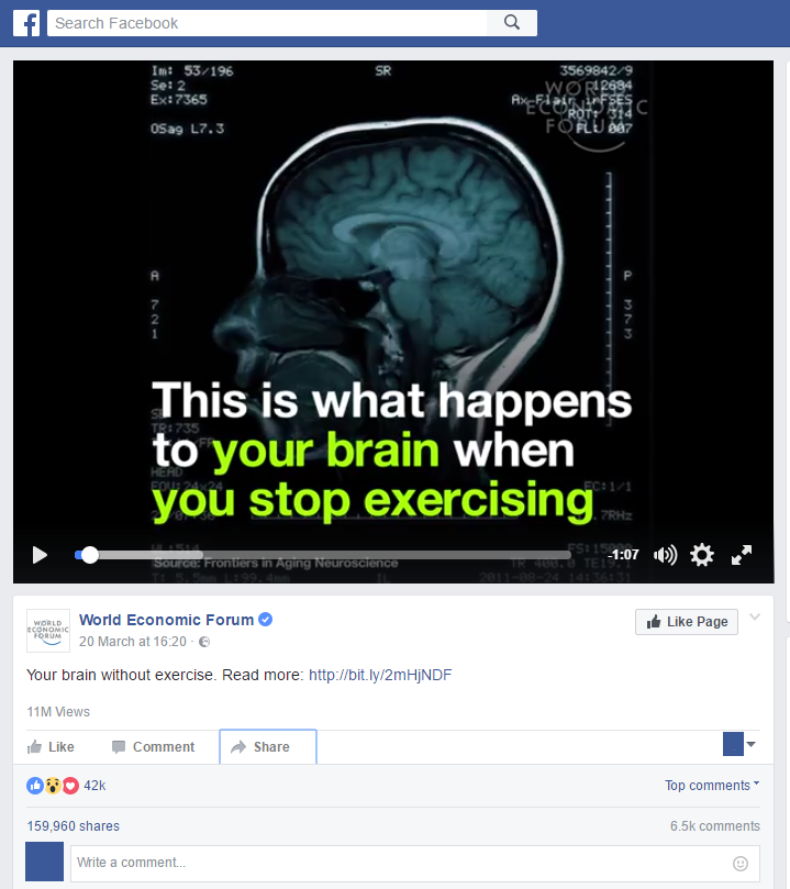
Take this recent video for example:
Your brain without exercise, a video by the World Economic Forum
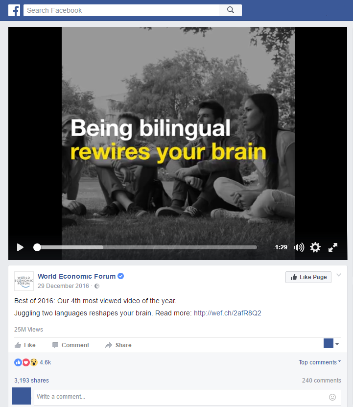
And also this related one:
Best of 2016 social video by the World Economic Forum
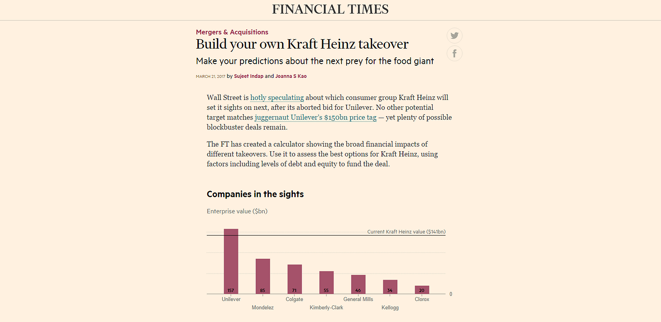
The Financial Times hasn’t been afraid of digital either. You see them taking interesting risks which might go over a lot of people’s heads but the point is they’re trying. Like in their project “Build your own Kraft Heinz takeover”.
Then there are the regular suspects — AJ+ isn’t trying to do everything, they’re trying to be relevant for a defined audience on the platforms that audience uses. Similarly, Channel 4 News isn’t pumping out every story they do on social, but deliberately going for emotionally charged stories rather than straight reporting as well as some play with visualising data.
What would you like to see more of in newsrooms today which would actually prepare staff better for what’s coming?
When you’re hiring new staff, assign them digital functions and projects rather than putting them on the traditional newsroom treadmill. A lot of organisations have entry level schemes and this could easily be incorporated into that model. That demonstrates that digital is a priority from the outset. You could also create in house lightning attachments, say a six-week rotation at the end of which you’re expected to deliver something ready for publishing, driven by digital. My City University students were able to come up with a data visualization in less than an hour, and put together a social video made on mobile in 45 minutes (social or mobile video wasn’t even on the course but I snuck it in). Six weeks in a newsroom is plenty of time for something substantial.
Also, have the right tools in place and ensure that everyone is educated on the numbers. Reach and views for instance get thrown around a lot- they are big easy numbers to capture and comprehend, but we need to make a distinction between what is good for PR versus actionable metrics in the newsroom. As more people clue into what matters, I do think (and we see in certain places like Newswhip for instance) where success is based on engagement, interactions and watchtime rather than views, impressions or reach.
Finally and obviously, its devolution of power and more risk taking. Make people better by empowering them — that means carve out the time and space to experiment without the pressure to deliver or publish. When you are continually driving staff against deadlines, creativity suffers. Fortunately there are so many third party tools and analytics that will very quickly tell you what’s working and what’s not, contributing to a much more efficient newsroom freeing up valuable time to think and experiment. Building multi disciplinary teams is a good step in this direction. DW is experimenting with a “lab like” concept bringing together editorial, technical and digital folks in an effort to bring the best of all worlds together and see what magic they come up with.
From your experience teaching social and digital journalism at City University London, what can you say about the way the younger generation of journalists is being trained for the future? Do they realise what’s at stake?
At the beginning of term, I heard quite a few students say that digital didn’t matter, it wasn’t “real journalism” and that they were taking the class merely because it was perceived as an “easy pass”. That’s because the overall coursework, emphasized magazine and newspaper journalism. At the end of the term, and almost on a weekly basis since, my former students write to me about either digital projects they have done, digital jobs they are going for or how something we went over in the class has led to another opportunity.
There remains a major emphasis on traditional broadcast journalism — TV, radio, print, but very little for digital. That’s not something to fault students on. Digital is changing constantly but teaching staff mainly reflect the expertise of the industry, and that expertise is traditional. While there are a lot of digital professionals, it does not come close to the level of expertise and experience currently on offer at institutions training the next journalist generation. That being said organisations like Axel Springer have journalism academies where all of their instructors, are working full time in media and can translate the day to day relevance into the classroom. That’s more of the kind of thing we need to have.
The students I think do realise what’s at stake because a lot of those journalism jobs they’re applying for all require some level of digital literacy. Sure everyone might watch a YouTube video but what happens when an Editor asks you why a news video has been uploaded and monetised by other users elsewhere. Would you know what to do?
What could be done to improve the educational system in the UK and beyond? Simply make journalism courses more digitally focussed?
There is nothing that will compel places to change but reputation. If students are leaving institutions because what they are learning is not preparing them to meet the demands of the industry they’re choosing to go into, word will spread sooner than later. There will surely be visionary institutions who ‘get it’ and adapt, some are there already.
‘Smart’ places will build in digital basics so students can have the confidence to hit the ground running. I see this in a lot of digital job requirements. It’s a given that anyone starting in journalism in 2017 has basic social media literacy. Beyond that everything is a bonus — how can you file from a mobile phone, can you interpret complex data and tell a story with it. Then, are you paying attention to analytics?
“staff blame the stupid internet for low page views on a piece…but credit the quality of the journalism when one hits the jackpot.”
We need a much more sophisticated understanding beyond yes/no answers to points like these.
A lot of media houses have academies or training centres expected also to bridge digital gaps. The caution there is that the trainings they offer when it comes to things beyond CMS, uploading video, etc., is that other digital knowledge seem to fall in the “nice to know” rather than “you need this” category. The best thing is to find the in-house talents who know what they’re talking about and get them to lead the way.
Another recurrent question when talking about our digital future is the question of business models for news organisations. As the latter are under continual financial strain, you actually think we should get inspiration from the entertainment industry. Can you elaborate on this idea?
Yes. The entertainment industry always has a much larger creative capacity and funding so they are able to take more risks with less at stake. That’s where we should be looking and seeing what the obvious news applications could be rather than trying to build our own innovations all the time. Most news houses just cannot compete with entertainment budgets. Jimmy Fallon showcased Google Tilt brush in January 2016:
I then saw it in November 2016 at a Google News event but have yet to see anyone use it in a meaningful news application. It doesn’t necessarily mean that all these things will be picked up on, but it does mean we should keep a finger on the pulse of what’s possible. Matt Danzico, now setting up a Digital News Studio at NBC is in a unique position. He’s in the same building as Late Night, SNL, and others. That means he has access to all the funky things entertainment is coming up with and can think about news applications for it.
Similarly, how can news organisations think about teaming up with Amazon or Netflix for instance and start to make their content more accessible? These media giants have the capacity to push creative boundaries and invest, and news organisations have their journalistic expertise to offer in that relationship. That’s very relevant in this time of “fake news”.
You have recently been appointed Senior Editor of Digital at DW in Berlin. Can you tell us more about what this position entails and the type of projects you’ll be doing? How different is it from what you’ve done in the past at the BBC and Al Jazeera for example?
DW is in a position familiar to many broadcasters, and that is a slight shift away from linear broadcasting to a considerable foray into digital. The difference is that DW is not starting from zero, with plenty of good (and bad) examples around to learn from. The first thing is to set a good digital foundation — getting the right tools in house and bringing people along on the digital journey — in a nutshell increasing literacy and comfort with digital. Once that is done I think you’ll see a very sharp learning curve and a lot more ambitious digital projects and initiatives coming from DW.
We’re very lucky that we have a new Editor in Chief, Ines Pohl and new head of news, Richard Walker, both infused with ideas and energy of making a great digital leap. Complementary to that we have a new digital strategy coming from the DG’s office which I’ve been involved with in addition to a new DW “lab like” concept, as I mentioned before. A lot of people might not know how big DW is — there are 30 language services and English is the largest of those, so getting all systems firing digitally is no small task.
Compared to BBC or AJ, the scope and scale of the task is of course much bigger. At AJ we had a lot of free range in the beginning because no one was doing what we did, at the BBC, there was much more process involved, less risk taking. Based on those experiences, DW is somewhere in the middle, a good balance. 2017 could be the year where stars align for DW. There are approximately 12 parliamentary or national elections in Europe and DW knows this landscape well. So bringing together the news opportunities, a willingness to evolve and invest in something new along with leadership that can really drive it, I think DW will be turning heads soon.
Marianne Bouchart is the founder and director of HEI-DA, a nonprofit organisation promoting news innovation, the future of data journalism and open data. She runs data journalism programmes in various regions around the world as well as HEI-DA’s Sensor Journalism Toolkit project and manages the Data Journalism Awards competition.
Before launching HEI-DA, Marianne spent 10 years in London where she worked as a web producer, data journalism and graphics editor for Bloomberg News, amongst others. She created the Data Journalism Blog in 2011 and gives lectures at journalism schools, in the UK and in France.
Lessons learned from an online discussion with experts
The COP23 conference is right round the corner (do I hear “climate change”?) and many data journalists around the world may wonder: How do you go about reporting on environmental data?
With the recent onslaught of hurricanes, such as Harvey, Irma, and Maria, and wildfires in Spain, Portugal and California, data journalists have been working hard to interpret scientific data, as well as getting creative to make it reader friendly.
The COP23 (do I hear climate change?) also serves as a great opportunity for data journalists to take a step back and ask:
What is the best way of reporting on data related to the environment? Where do you find the data in the first place? How do you make it relatable to the public and which challenges do you face along the way?
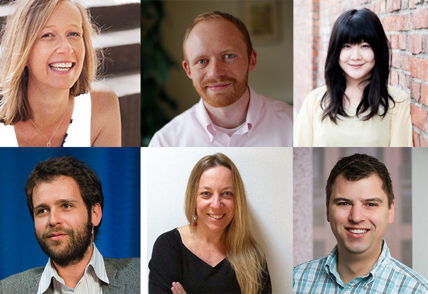
From top left to bottom right: Kate Marvel of NASA GISS (USA), James Anderson of Global Forest Watch (USA), Rina Tsubaki of European Forest Institute (Spain), Gustavo Faleiros of InfoAmazonia (Brazil), Elisabetta Tola of Formicablu (Italy), and Tim Meko of The Washington Post (USA)
Here is a recap of what we’ve learned including tips and useful links.
Environmental data comes in many formats…only known by scientists
When it comes to working with environmental data, both journalists and scientists seem to be facing challenges. The main issue seems not to come from scarcity of data but rather from what journalists can do with it, as Elisabetta Tola of Formicablu (Italy) explained:
‘Things are still quite complicated because we have more data available than before but it is often difficult to interpret and to use with journalistic tools’, she said.
There also seems to be a gap between the speed at which data formats evolve in that area and how fast journalists learn how to work with these formats.
‘I think we are still in a moment where we know just a little about data formats. We know about spreadsheets and geodata, but then there are all these other formats, used only by scientists. And I am not really sure how we could use those’, said Gustavo Faleiros of InfoAmazonia (Brazil).
Environmental data should be more accessible and easy to interpret and scientists and journalists should be encouraged to work hand-in-hand more often. The existing incentive structure makes that hard: ‘Scientists don’t get paid or promoted for talking to journalists, let alone helping process data’, said Kate Marvel of NASA GISS (USA).
So what could be done to make things better?
“We need to open up more channels between journalists and scientists: find more effective ways of communicating’, said Elisabetta Tola of Formicablu.
We also need more collaboration not just among data journalism folks, but with larger communities.
‘Really, it is a question of rebuilding trust in media and journalism’, said Rina Tsubaki of European Forest Institute.
‘I think personalising stories, making them hyper-local and relevant, and keeping the whole process very transparent and open are key’, said James Anderson of Global Forest Watch.
Indeed, there seems to be a need to go further than just showing the data: ‘People feel powerless when presented with giant complex environmental or health problems. It would be great if reporting could go one step further and start to indicate ‘what’s the call to action’. That may involve protecting themselves, engaging government, responding to businesses’, said James Anderson of Global Forest Watch.
Top idea raised during the discussion: “It would be great to have something like Hacks&Hackers where scientists and journalists could work together. Building trust between these communities would improve the quality of environmental reporting but also the reward, at least in terms of public recognition, of scientists work.” Suggested by Elisabetta Tola of Formicablu.
To make environmental data more ‘relatable’, add a human angle to your story
As the use of environmental data has become much more mainstream, at least in American media markets, audiences can interact more directly with the data than ever before.
‘But we will have to find ways to keep innovating, to keep people’s attention, possibly with much more personalised data stories (what does the data say about your city, your life in particular, for example)’, said James Anderson of Global Forest Watch.
‘Characters! People respond to narratives, not data. Even abstract climate change concepts can be made engaging if they’re embedded in a story’, said Kate Marvel of NASA GISS.
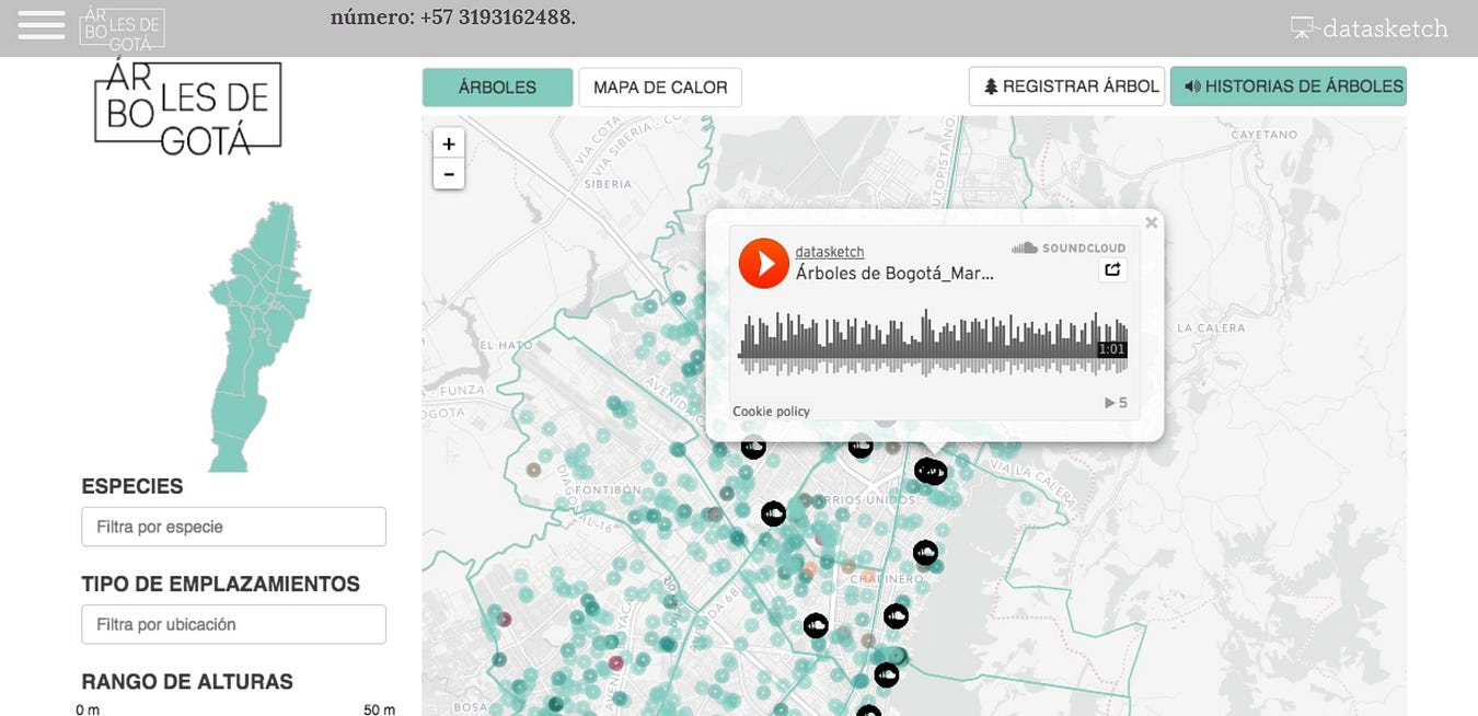
For example, this project by Datasketch, shows how Bogotá has changed radically in the last 30 years. ‘One of the main transformations’, the website says ‘is in the forestation of the city as many of the trees with which the citizens grew have disappeared’.
This project by Datasketch, shows how Bogotá has changed radically in the last 30 years and include citizen’s stories of trees
With this project, Juan Pablo Marín and his team attached citizen stories to specific trees in their city. They mapped 1.2 million trees and enabled users to explore narrated stories by other citizens on a web app.
‘I like any citizen science efforts, because that gets a community of passionate people involved in actually collecting the data. They have a stake in it’, James Anderson of Global Forest Watch argued.
He pointed out to this citizen science project where scientists are tracking forest pests through people’s social media posts.
One more idea for engaging storytelling on climate change: Using art to create a beautiful and visual interactive: Illustrated Graphs: Using Art to Enliven Scientific Data by Science Friday
Shared by Rina Tsubaki of European Forest Institute
Tips on how to deal with climate change sceptics
‘Climate denial isn’t about science — we can’t just assume that more information will change minds’, said Kate Marvel of NASA GISS.
Most experts seem to agree. ‘It often is more of a tribal or cultural reaction, so more information might not stick. I personally think using language other than ‘climate change’, but keeping the message (and call to action to regulate emissions) can work’, said James Anderson of Global Forest Watch.
‘Keeping a high quality and a very transparent process can help people who look for information with an open mind or at least a critical attitude’, Elisabetta Tola of Formicablu added.
A great initiative where scientists are verifying media’s accuracy: Climate Feedback
Shared by Rina Tsubaki of European Forest Institute
Places to find data on the environment
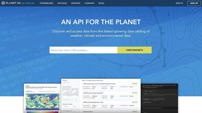
The Planet OS Datahub makes it easy to build data-driven applications and analyses by providing consistent, programmatic access to high-quality datasets from the world’s leading providers.
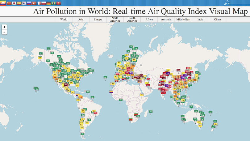
AQICN looks at air pollution in the world with a real-time air quality index.
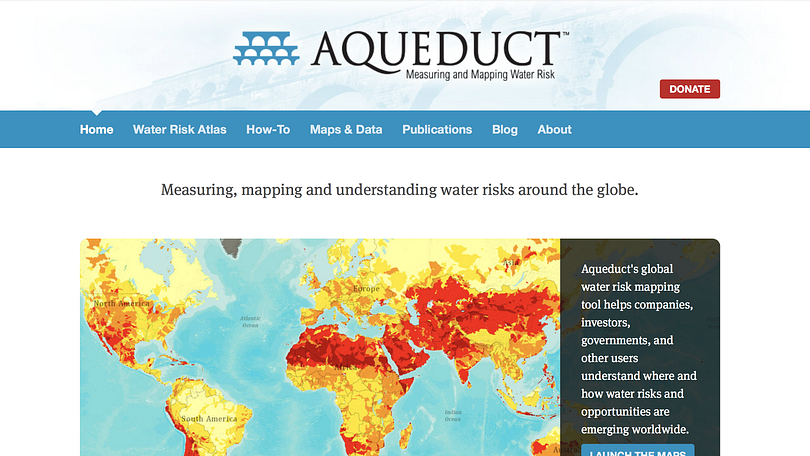
Aqueduct by the World Resources Institute, for mapping water risk and floods around the world.
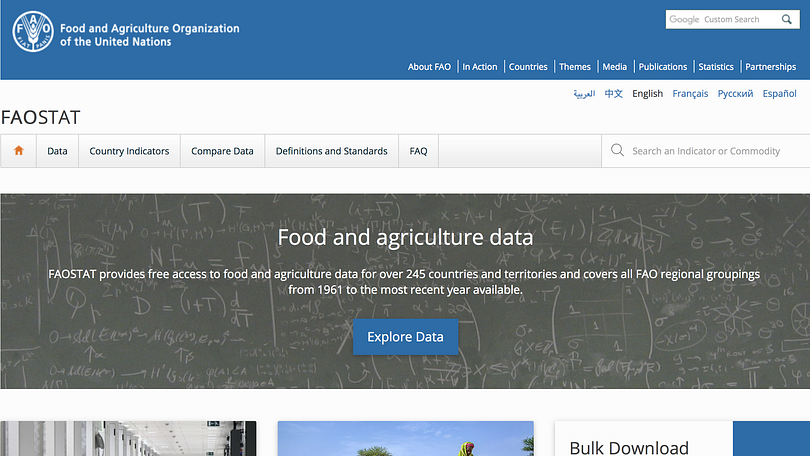
FAOSTAT provides free access to food and agriculture data for over 245 countries and territories and covers all FAO regional groupings from 1961 to the most recent year available.
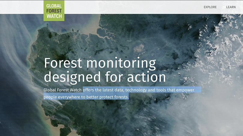
Global Forest Watch offers the latest data, technology and tools that empower people everywhere to better protect forests.
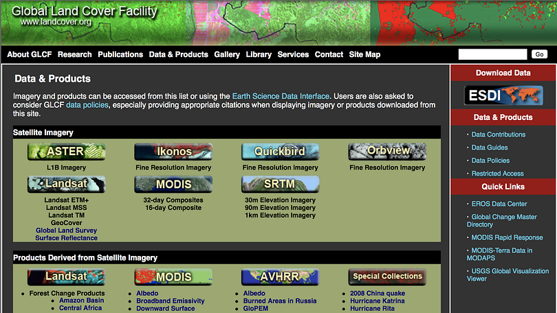
The Global Land Cover Facility (GLCF) provides earth science data and products to help everyone to better understand global environmental systems. In particular, the GLCF develops and distributes remotely sensed satellite data and products that explain land cover from the local to global scales.
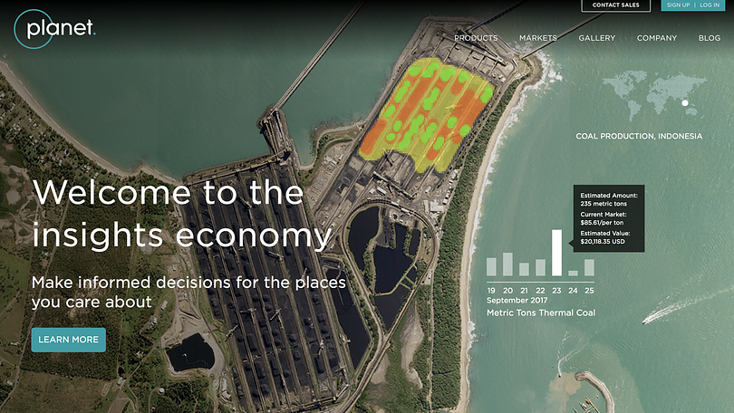
Planet Labs is also great for local imagery and monitoring. Their website feature practical examples of where their maps and satellite images were used by news organisations.
News from our community: In a few months, James Anderson and the team at Global Forest Watch will launch an initiative called Resource Watch which will work as an aggregator and tackle a broader set of environmental issues.
“It was inspired by the idea that environmental issues intersect — for example forests affect water supply, and fires affect air quality. We wanted people to be able to see how interconnected these things are,” said Anderson.
What to do if there is no reliable data: the case of non-transparent government
It is not always easy or straightforward to get data on the environment, and the example of Nigeria was brought about during our discussion by a member of the DJA Slack team.
‘This is because of hypocrisy in governance’, a member argued.
‘I wish to say that press freedom is guaranteed in Nigeria on paper but not in reality.
You find that those in charge of information or data management are the first line of gatekeepers that will make it practically impossible for journalists to access such data.
I can tell you that, in Nigeria, there is no accurate data on forestry, population figure and so on’.
So what is the way out? Here are some tips from our experts:
‘I would try using some external, no official sources. You can try satellite imagery by NASA or Planet Labs or even Google, then distribute via Google Earth or their Google News Lab. Also you can download deforestation, forest fires and other datasets from sites of University of Maryland or the CGIAR Terra-i initiative’, Gustavo Faleiros of InfoAmazonia suggested.
‘I think with non-transparent governments, it is sometimes useful to play both an “inside game” (work with the government to slowly [publish] more and more data under their own banner) and an “outside game” (start providing competing data that is better, and it will raise the bar for what people [should] expect)’, said James Anderson of Global Forest Watch.
‘It’s a really tough question. We’ve worked with six countries in the Congo Basin to have them improve their data collection, quality-control, and sharing. They now have key land data in a publicly-available portal. But it took two decades of hard work to build that partnership’, he added.
‘I think this is exactly the case when a good connection with local scientists can help’, said Elisabetta Tola of Formicablu. ‘There are often passionate scientists who really wish to see their data out. Especially if they feel it could be of use to the community. I started working on data about seismic safety over five years ago. I am still struggling to get the data that is hidden in tons of drawers and offices. I know it’s there’, she added.
‘For non-transparent governments, connect with people who are behind facilitating negotiations for programmes like REDD to get insider view’, added Rina Tsubaki of European Forest Institute.
CARTO is the platform for turning location data into business outcomes.
What tools do you use when reporting on environmental data?
Here is what our data journalism community said they played with on a regular basis:
CARTO enriches your location data with versatile, relevant datasets, such as demographics and census, and advanced algorithms, all drawn from CARTO’s own Data Observatory and offered as Data as a Service.
QGIS is a free and open source geographic information system. It enables you to create, edit, visualise, analyse and publish geospatial information.
OpenStreetMap is a map of the world, created by members of the public and free to use under an open licence.
Datawrapper, an open source tool helping everyone to create simple, correct and embeddable charts in minutes.
R, Shiny and Leaflet with plugins were used to make these heatmaps of distribution of tree species in Bogotá.
D3js, a JavaScript library for visualizing data with HTML, SVG, and CSS.
Flourish makes it easy to turn your spreadsheets into world-class responsive visualisations, maps, interactives and presentations. It is also free for journalists.
Great examples of data journalism about the environment we’ve come across lately
How Much Warmer Was Your City in 2015?
By K.K. Rebecca Lai for The New York Times
Interactive chart showing high and low temperatures and precipitation for 3,116 cities around the world.
(shared by Gustavo Faleiros of InfoAmazonia)
What temperature in Bengaluru tells about global warming
By Shree DN for Citizen Matters
Temperature in Bengaluru was the highest ever in 2015. And February was the hottest. Do we need more proof of global warming?
(shared by Shree DN of Citizen Matters in India)
Data Science and Climate Change: An Audience Visualization
By Hannah Chapple for Affinio Blog
Climate change has already been a huge scientific and political topic in 2017. In 2016, one major win for climate change supporters was the ratifying of the Paris Agreement, an international landmark agreement to limit global warming.
(shared by Rina Tsubaki of European Forest Institute)
Google’s Street View cars can collect air pollution data, too
By Maria Gallucci for Mashable
“On the question of compelling environmental stories to prioritize, (this was a bit earlier in the thread) I feel like hyper-local air quality (what is happening on your street?) is powerful stuff. People care about what their family breathes in, and its an urgent health crisis. Google StreetView cars are now mapping this type of pollution in some places.”
(shared by James Anderson of Global Forest Watch)
This Is How Climate Change Will Shift the World’s Cities
By Brian Kahn for Climate Central
Billions of people call cities home, and those cities are going to get a lot hotter because of climate change.
(shared by Rina Tsubaki of European Forest Institute)
Treepedia :: MIT Senseable City Lab Exploring the Green Canopy in cities around the world
(shared by Rina Tsubaki of European Forest Institute)
Losing Ground
By ProPublica and The Lens
Scientists say one of the greatest environmental and economic disasters in the nation’s history — the rapid land loss occurring in the Mississippi Delta — is rushing toward a catastrophic conclusion. ProPublica and The Lens explore why it’s happening and what we’ll all lose if nothing is done to stop it.
(shared by Elisabetta Tola of Formicablu)
Watergrabbing
A Story of Water, looks into the water-hoarding phenomenon. Every story explains a specific theme (transboundary waters, dams, hoarding for political and economic purposes), and shows the players involved, country-by-country. Take time to read and discover what water grabbing means. So that water can become a right for each country and every person.
(shared by Elisabetta Tola of Formicablu)
Ice and sky
By Wild-Touch
Discover the history and learn about climate changes — the interactive documentary
(shared by Gustavo Faleiros of InfoAmazonia)
Extreme Weather
By Vischange.org
The resources in this toolkit will allow communicators to effectively communicate extreme weather using strategically framed visuals and narratives. Watch the video to see it in action!
(shared by Rina Tsubaki of European Forest Institute)
Plus, there is a new version of Bear 71 available for all browsers: Bear 71 VR
Explore the intersection of humans, nature and technology in the interactive documentary. Questioning how we see the world through the lens of technology, this story blurs the lines between the wild world, and the wired one.
(shared by Gustavo Faleiros of InfoAmazonia)
Marianne Bouchart is the founder and director of HEI-DA, a nonprofit organisation promoting news innovation, the future of data journalism and open data. She runs data journalism programmes in various regions around the world as well as HEI-DA’s Sensor Journalism Toolkit project and manages the Data Journalism Awards competition.
Before launching HEI-DA, Marianne spent 10 years in London where she worked as a web producer, data journalism and graphics editor for Bloomberg News, amongst others. She created the Data Journalism Blog in 2011 and gives lectures at journalism schools, in the UK and in France.
I’ve been working in data journalism since 2012. And one of the biggest personal challenges I still face is balancing between learning new tools, become more proficient with older ones, and not missing deadlines because I am spending too much time learning how to use data journalism tools.
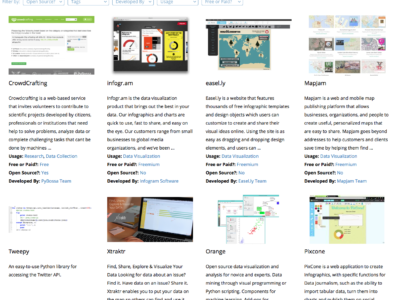
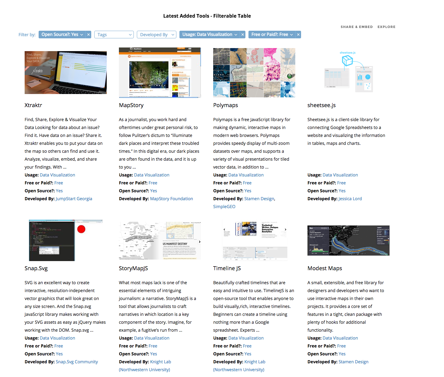
When I started as a data journalism student, I began filling in a spreadsheet with links to inspiring tools I wanted to use and learn. I collected these from mailing lists, tweets, blogs and friends’ suggestions. At first, the spreadsheet was simply an ugly dump of links that I used as a student, then as a freelancer, then as a data journalist and data expert at Silk. A month ago I decided to turn it into something useful for other data journalists as well: an interactive and searchable database of data journalism tools. I knew that there were already many resources listing hundreds of (data) journalism tools. But all the ones I saw were lacking the data structure that would make it easy (and beautiful) to sift through the information.
Silk.co is a platform for publishing, visualizing and sharing data on the Web. I realized that this was also the best tool to publish my data journalism tools’ database.
On Silk I could:
quickly upload a spreadsheet to organize the information in an interactive database
visualize information about the tools, either as individual entries in galleries or tables or as a chart showing types of tools and other data
have individual profiles for each tool
generate inline filters that each time would allow me to find the tool I needed.
The project went live two weeks ago. You can find it at data-journalism-tools.silk.co. I am regularly updating the Data Journalism Tools Silk, adding about 10 new tools every week. You can go to the website to check it out, or you can also “follow” it to receive free updates via email every time something new is added.
Just as this Data Journalism Tools Silk is intended for the community, it will greatly benefit from the community’s input. For this, I’ve made a Google Form so that anyone can suggest a favourite tool.
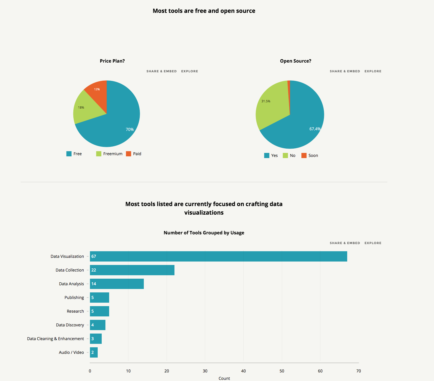
The key thing for me is that adding real structure to data adds tremendous power to whatever presentation vector you choose to deploy. There are blogs and lists that contain many, many more journalism tools than this one. But by adding structure to each tool and putting it onto its own structured Web page, we can unlock the power of the data as a filtering, visualization and discovery tool. More structured data equals more discovery.
From navigating the Web in entirely new ways to seeing where in the world twitters are coming from, data visualization tools are changing the way we view content. We found the following 16 apps both visually stunning and delightfully useful.
Visualize Your Network with Fidg’t Fidg’t is a desktop application that aims to let you visualize your network and its predisposition for different types of things like music and photos. Currently, the service has integrated with Flickr and last.fm, so for example, Fidg’t might show you if your network is attracted or repelled by Coldplay, or if it has a predisposition to taking photos of their weekend partying. As the service expands to support other networks (they suggest integrations with Facebook, digg, del.icio.us, and several others are in the works), this one could become very interesting.
See Where Flickr Photos are Coming From Flickrvision combines Google Maps and Flickr to provide a real-time view of where in the world Flickr photos are being uploaded from. You can then enlarge the photo or go directly to the user’s Flickr page.
See Where Twitters are Coming From
From the maker of Flickrvision (David Troy) comes Twittervision, which, you guessed it, shows where in the world the most recent Twitters are coming from. Troy has taken things one step further with Twitter vision and has given each user a page where you can see all of their location updates.
New Ways to Visualize Real-Time Activity on Digg Digg Labs offers three different ways to visualize activity in real-time on the site, building on the original Digg Spy feature.
BigSpy places stories at the top of the screen as they are dugg. Stories with more diggs show up in a bigger font, and next to each one you can see the number of diggs in red:

 Michaela Gruber is a journalism and media management student, based in Vienna, Austria. During her studies she spent a semester abroad in France, where she started working for HEI-DA.