Looking back on some tumultuous years in journalism, including Donald Trump’s campaign against fake news and the rise of the digital area, we asked Jimmy Wales, founder of Wikipedia and WikiTribune, five quick questions about his view on the current state of trust in journalism.
How would you describe the state of trust in journalism?
Journalism has been under huge financial pressure for a few years and somehow lost its way. However, trust is now starting to get back after the public realized that quality journalism matters.
Access to Wikipedia is free. Does that mean that trust is free?
Trust is about honesty and this does not really cost anything. The other way round, money can corrupt honesty.
How do you go about Fake News?
We have to manage them with trust. In the mainstream and quality media we’ve got to do all things right and share transcripts, audios, … things to prove what we are saying. Only this way we can restore trust and show the people that we are not simply making something up.
How do you verify data for Wikipedia?
We verify the data with very old-fashioned techniques, like transcripts, interviews and documents. All of this is very old-fashioned journalism. If you look at later techniques, data journalism, for instance, is a very important tool in journalism of the modern world. So much can be learned from large sets of data, particularly financial contributions to politicians. It is a rich source of very good information.
How do you see the future of journalism?
I am optimistic about journalism in the future because it is a core function in society. And even if the transition from digital business models has been very difficult, I do not think that the public does not care about the truth anymore. They do. We just have to find models to make it work!
Michaela Gruber is a journalism and media management student, based in Vienna, Austria. During her studies she spent a semester abroad in France, where she started working for HEI-DA.
As the company’s communication officer, she is in charge of the Data Journalism Blog and several social media activities. This year, Michaela was HEI-DA’s editor covering the Data Journalism Awards in Lisbon, Portugal.
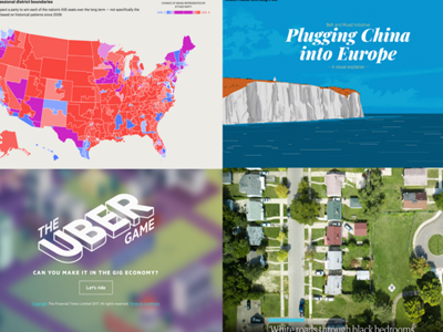
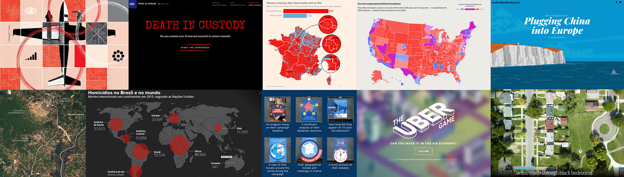
After a year of hard work, collecting and sifting through hundreds of data projects from around the world, the news is finally out. The thirteen winners (and one honourable mention) of the Data Journalism Awards 2018 competition were announced on 31 May in Lisbon. Together they are the best of what the world of data journalism had to offer in the past year. They also teach us a lot about the state of data journalism.
All of the work I have done over the past few months has given me a pretty good perspective of what’s going on in the world of data journalism. Managing the Data Journalism Awards competition is probably the greatest way to find out what everybody has been up to and to discover amazing projects from all over the world.
And today I want to share some of this with you! Most of the examples you will see in this article are projects that either won or got shortlisted for the Data Journalism Awards 2018 competition.
When a news organisation submits a project, they have to fill in a form asking them to describe their work, but also how they made it, what technology they used, what methodology… And all of this information is published on the website for everyone to see.
So if you‘re reading this article in the hope of finding some inspiration for your next project, as I am confident you are, then here is a good tip: on top of all of the examples I will show you here, you can take a look at all of the 630 projects from all over the world which were submitted this year, right on the competition website. You’re welcome.
So what have we learned this year by going through hundreds of data journalism projects from around the world? What are the trends we’ve spotted?
Data journalism is still spreading internationally
And this is great news. We see more and more projects from countries that have never applied before, and this is a great indicator of the way journalists worldwide, regardless of their background, regardless of how accessible data is in their country, regardless of how data literate they are, are trying to tell stories with data.
Some topics are more popular than others
One of the first things we look at when we get the list of projects each year, is what topics did people tackle? And what we’ve learned from that is that some topics are more attractive than others.
Whether that’s because it is just easier to find data on them, or it’s easier to visualise things related to those topics, or it’s just the kind of big stories that everyone expects to see data on each year, we can’t really know for all of them. It’s probably a good mixture of all of this.
The refugee crises
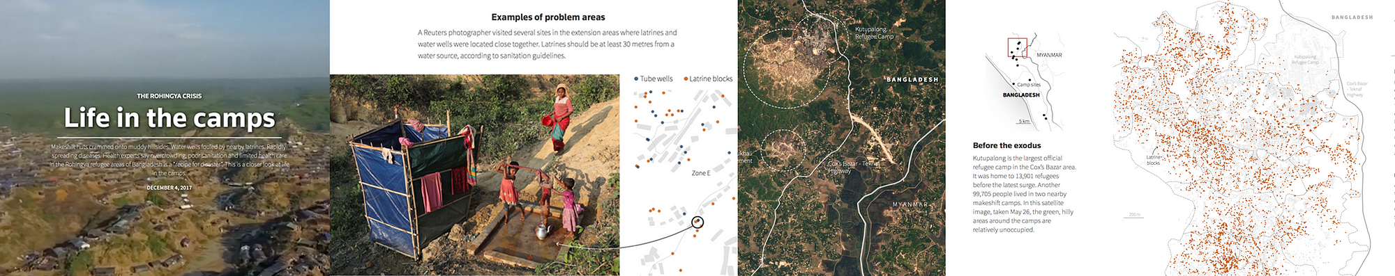
The first recurrent topic that we’ve seen this past year is the refugee crises. And a great example of that is this project by Reuters called ‘Life in the camps’, which won the award for Data visualisation of the year at the Data Journalism Awards 2018.
This graphic provided the first detailed look at the dire living conditions inside the Rohingya refugee camps in Cox’s Bazar. Using satellite imagery and data, the graphic documented the rapid expansion and lack of infrastructure in the largest camp cluster, Kutupalong. Makeshift toilets sit next to wells that are too shallow, contaminating water supply.
This project incorporates data-driven graphics, photo and video. Reuters gained access to data from a group of aid agencies working together to document the location of infrastructure throughout the Kutupalong camp by using handheld GPS devices on the ground. The graphics team recognised that parts of the data set could be used to analyse the accessibility of basic water and sanitation facilities. After some preliminary analysis, they were able to see that some areas had water pumps located too close to makeshift toilets, raising major health issues.
They displayed this information in a narrative graphic format with each water pump and temporary latrine marked by a dot and overlaid on a diagram of the camp footprint. They compared these locations to the U.N.’s basic guidelines to illustrate the potential health risks. Reuters photographers then used these coordinates to visit specific sites and document real examples of latrines and water pumps in close proximity to each other.
Technologies used for this project: HTML, CSS, Javascript, QGIS and Illustrator.
Elections/Politics
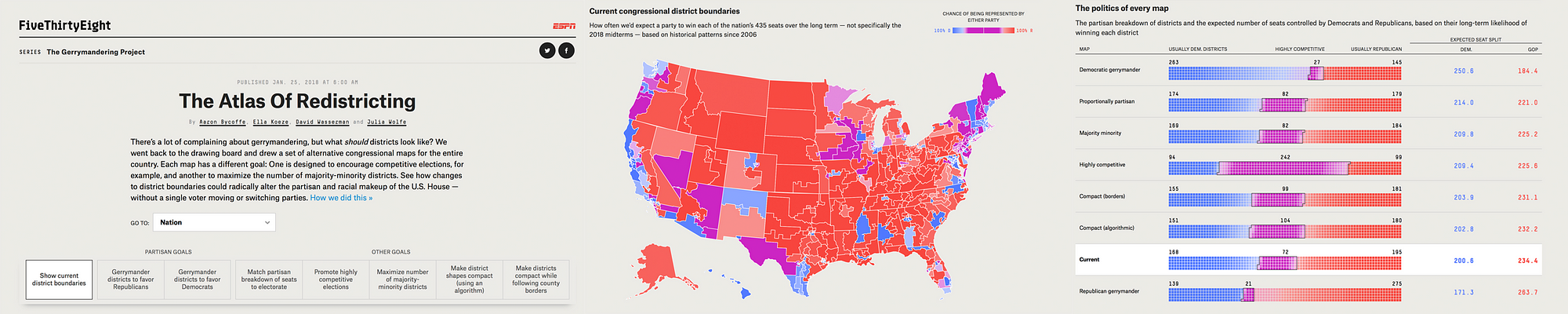
Next topic that came up a lot this year was politics, and more specifically, anything related to recent elections, not just in the US, but also in many other countries. One great example of that was the Data Journalism Awards 2018 ‘News data app of the year’ award winner, ‘The atlas of redistricting’, by FiveThirtyEight in the US.
There’s a lot of complaining about gerrymandering (the process of manipulating the boundaries of an electoral constituency so as to favour one party or class) and its effects on US politics. But a fundamental question is often missing from the conversation: What should political boundaries look like? There are a number of possible approaches to drawing districts, and each involves tradeoffs. For this project, the team at FiveThirtyEight looked at seven different redistricting schemes; and to quantify their tradeoffs and evaluate their political implications, they actually redrew every congressional district in the U.S. seven times. The Atlas of redistricting allows readers to explore each of these approaches — both for the nation as a whole and for their home state.
The scope of this project really makes it unique. No other news organization covering gerrymandering has taken on a project of this size before.
To make it happen, they took precinct-level presidential election results from 2012 and 2016 and reallocated them to 2010 Census voting districts. That enabled them to add more up-to-date political data to a free online redistricting tool called Dave’s Redistricting App. Once the data was in the app, they started the long process of drawing and redrawing all the districts in the country. Then, they downloaded their district boundaries from the app, analysed their political, racial and geometric characteristics, and ultimately evaluated the tradeoffs of the different redistricting approaches. Sources for data included Ryne Rohla/Decision Desk HQ, U.S. Census Bureau, and Brian Olson.
Technologies used for this project: Ruby, PostGIS, Dave’s Redistricting App, Node, D3
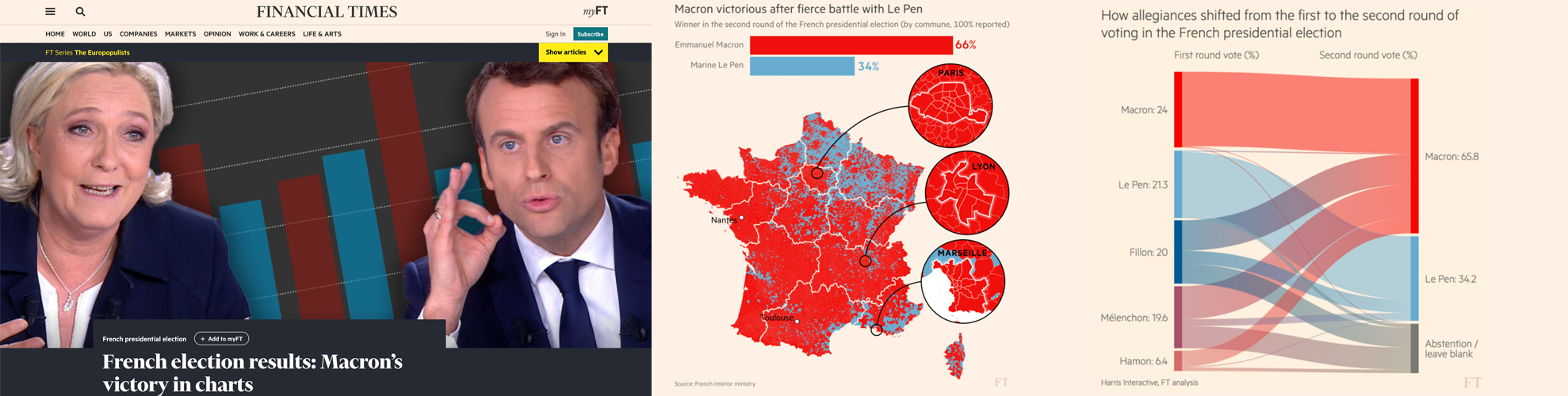
An other great example of how politics and elections were covered this year comes from the Financial Times. It is called ‘French election results: Macron’s victory in charts’ and was shortlisted for the Data Journalism Awards 2018 competition.
Let’s say it, elections are a must for all data news teams around the world. That’s probably the topic where the audience is the most used to seeing data combined with maps, graphics and analysis.
Throughout 2017 and 2018, the Financial Times became an expert in:
producing rapid-response overnight analyses of elections,
leveraging their data collection and visualisation skills to turn around insightful and visually striking reports on several elections across Europe,
responding faster than other news organisations both in the UK and even those based in the countries where these elections have taken place.
Over and above simply providing the top-line results, they have focused on adding insight by identifying and explaining voting patterns, highlighting significant associations between the characteristics of people and places, and the political causes they support.
To deliver this, the team developed highly versatile skills in data scraping and cleaning. They also have carried out ‘election rehearsals’ — practice runs of election night to make sure their workflows for obtaining, cleaning and visualising data were all polished, and robust to avoid any glitches that might come up on the night of the count.
The work has demonstrably paid off, with readers from continental Europe outnumbering those from Britain and the United States — typically far larger audiences for the FT — for the data team’s analyses of the French, German and Italian elections.
For each election, the team identified official data sources at the most granular possible level, with the guidance of local academic experts and the FT’s network of correspondents.
R scripts were written in advance to scrape the electoral results services in real time and attach them to the static, pre-sourced demographic data.
Scraping and analysis was primarily conducted in R, with most final projection graphics created in D3 — often adapting the Financial Times’ Visual Vocabulary library of data visualisation formats.
Technologies used for this project: R, D3.
Crime
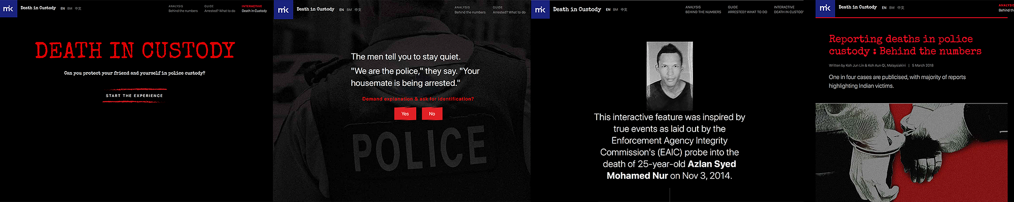
The last topic that I wanted to mention that was also recurrent this past year is crime. And to illustrate this, I’ve picked a project called ‘Deaths in custody’ by Malaysiakini in Malaysia.
This is an analysis of how deaths in police custody are reported, something that various teams around the world have been looking at recently. The team at Malaysiakini compared 15 years of official police statistics with data collected by a human rights organisation, called Suaram. The latter is the sole and most comprehensive tracker of publicised deaths in police custody in the country.
The journalists behind this project found that overall, deaths in Malaysian police custody are underreported, with one in four deaths being reported to the media or to Suaram.
They also highlight the important role that families of victims play in holding the police accountable and pushing to investigate the deaths. They created an interactive news game and a guide on what to do if somebody is arrested, both of which accompany the main article, taking inspiration from The Uber game that the Financial Times developed in 2017.
The game puts players in the shoes of a friend who is entangled in a custodial dilemma between a victim and the police. Along the way, there are fact boxes that teach players about their rights in custody. The real-life case that the game is based on is revealed at the end of the game.
Technologies used for this project: Tabula, OpenRefine, Google Sheets, HTML, CSS, Javascript, UI-Kit Framework, Adobe Photoshop.
We’ve changed the way we do maps
Another thing that we’ve learned by looking at all these data journalism projects is that we have changed the way we do maps.
Some newsrooms are really getting better at it. Maps are more interactive, more granular, prettier too, and integrated as part of a narrative instead of standing on their own, making us think that more and more journalists don’t do maps for the sake of doing maps, but for good reasons.
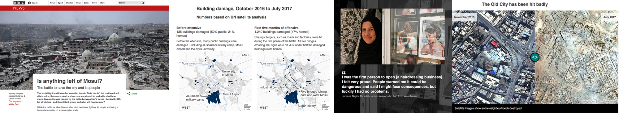
An example of how data journalists have made use of maps this past year is this piece by the BBC called ‘Is anything left of Mosul?’
It is a visually-led piece on the devastation caused to Mosul, Iraq, as a result of the battle to rid the city of Islamic State (IS). The piece not only gives people a full picture of the devastating scale of destruction, it also connects them to the real people who live in the city — essential when trying to tell stories from places people may not instantly relate to.
It was also designed mobile-first, giving users on small screens the full, in-depth experience. The feature uses the latest data from Unosat, allowing the BBC team to map in detail which buildings had suffered damage over time, telling the narrative of the war through four maps.
The feature incorporates interactive sliders to show the contrast of life before the conflict and after — a way of giving the audience an element of control over the storytelling.
They also used the latest data from the UNHCR, which told them where and when displaced people in Iraq had fled to and from. They mapped this data using QGIS’ heatmapping software and visualised it using their in-house Google Maps Chrome extension. They produced three heatmaps of Mosul at different phases of the battle, again telling a narrative of how the fighting had shifted to residential targets as the war went on.
The project got nearly half a million page views over several days in English. They also translated the feature into 10 other languages for BBC World Service audiences around the world.
Technologies used for this project: QGIS mapping software, Microsoft Excel, Adobe Illustrator, HTML, CSS, Javascript, Planet satellite imagery, DigitalGlobe images
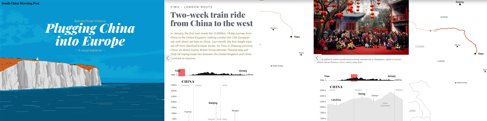
Another example of how the data journalism community has changed the way it does maps, is this interactive piece by the South China Morning Post called ‘China’s Belt and Road Initiative’.
The aim of this infographic is to provide context to the railway initiative linking China to the West.
They combined classic long-form storytelling with maps, graphs, diagrams of land elevations, infrastructure and risk-measurement charts, motion graphics, user interaction, and other media. The variety of techniques were selected to prevent the extensive data from appearing overwhelming. The split screen on the desktop version meant readers could refer to the route as they read the narrative.
We are not talking about boring static maps anymore. And this is an example of how new teams around the world, and not just in western countries, are aiming for more interactivity, and a better user journey through data stories, even when the topic is complex. It is thanks to the interactivity of the piece and the diversity of elements put together that the experience becomes enticing.
They used data from the Economist Intelligence Unit (EIU). Using Google Earth, they plotted and traced the path of each initiative to obtain height profiles and elevations to explain the extreme geographical environments and conditions.
Technologies used for this project: Adobe Creative Suite (Illustrator, Photoshop…), QGIS Brackets io Corel Painter, Microsoft Excel, Javascript, Canvas, JQuery, HTML, CSS — CSS3, Json, CSV, SVG.
New innovative data storytelling practices have arrived
Another thing we saw was that data teams around the world are finding new ways to tell stories. New innovative storytelling practices have arrived and are being used more and more.
Machine learning
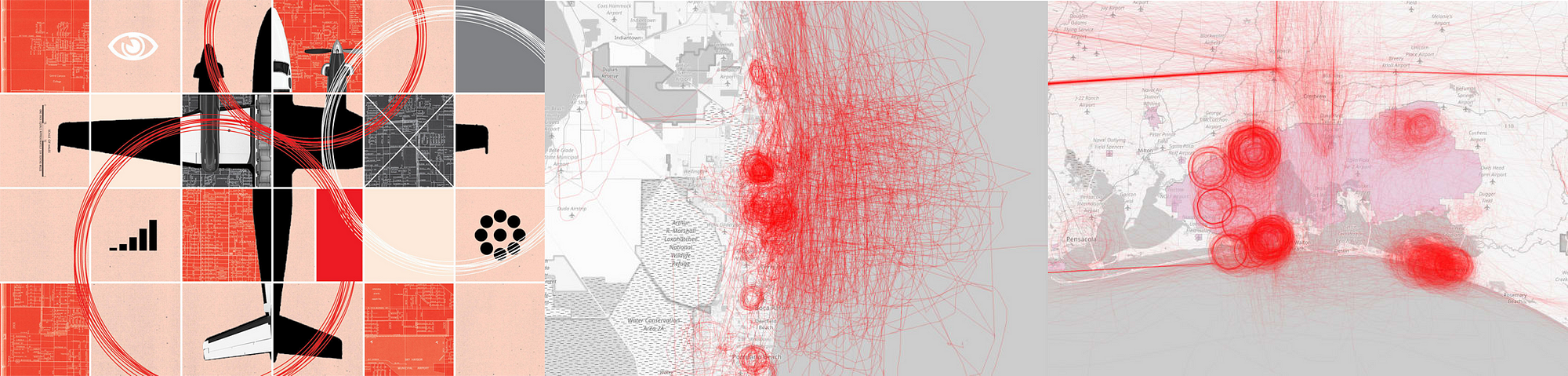
It is probably the most used term in current conversations about news innovation. It has also been used recently to help create data-driven projects, such as ‘Hidden Spy Planes’ by BuzzFeed News in the US, the winner of the JSK Fellowships award for innovation in data journalism at this year’s Data Journalism Awards.
This project revealed the activities of aircrafts that their operators didn’t want to discuss, opening the lid on a black box of covert aerial surveillance by agencies of the US government, the military and its contractors, and local law enforcement agencies.
Some of these spy planes employed sophisticated surveillance technologies including devices to locate and track cell phones and satellite phones, or survey Wi-Fi networks.
Before these stories came out, most Americans would have been unaware of the extent and sophistication of these operations. Without employing machine learning to identify aircraft engaged in aerial surveillance, the activities of many of aircraft deploying these devices would have remained hidden.
In recent years, there has been much discussion about the potential of machine learning and artificial intelligence in journalism, largely centered on classifying and organising content with a CMS, on fact-checking for example.
There have been relatively few stories that have used machine learning as a core tool for reporting, which is why this project is an important landmark.
Technologies used for this project: R, RStudio, PostgreSQL, PostGIS, QGIS, PostGIS, OpenStreetMap
Drone journalism
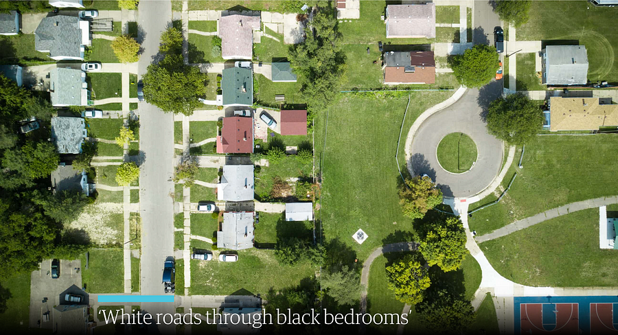
Another innovative storytelling practice that we’ve noticed is drone journalism, and here is an example called ‘Roads to nowhere’ from The Guardian.
It is an investigation using drone technology, historical research and analysis, interviews, as well as photomosaic visualizations.
It was a project that specifically looked at infrastructure in the US and the root causes of how cities have been designed with segregation and separation as a fundamental principle. It shows through a variety of means how Redlining and the interstate highway system were in part tools to disenfranchise African-Americans.
People are still living with this segregation to this day.
Most of the photos and all of the videos were taken by drone in this project. This is innovative in that it is really the only way to truly appreciate some of the micro-scale planning decisions taken in urban communities throughout the US.
Technologies used for this project: DJI Mavic Pro drone, a Canon 5Diii camera to take the photos, Shorthand, Adobe Photoshop. Knightlab’s Juxtapos tool to make it come to life with the slide tool
AR
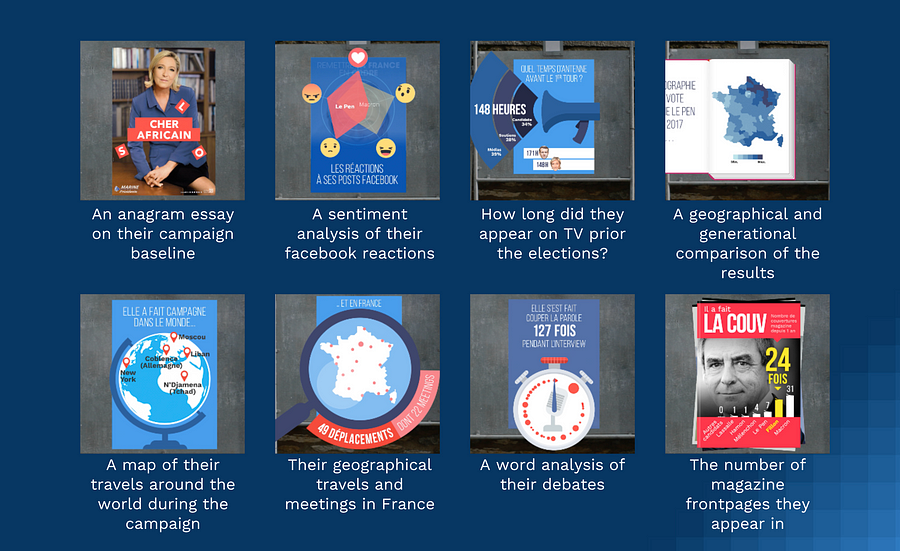
Another innovative technique that has a lot of people talking at the moment is Augmented Reality, and to illustrate this in the context of data journalism, I am bringing you this project called ExtraPol by WeDoData in France.
Extrapol is an augmented reality app (iOS and Android) that was launched a month before the French presidential campaign in April 2017. Everyday, official candidates posters could be turned into new live data visualisations to inform the audience on the candidates. This data journalism project treated 30 topics in data such as: their geographical travels in France during the campaign, the cumulated number of years they have ruled a political mandate, etc.
This is probably the first ephemeral daily data journalism news app which uses augmented reality. This was the first time that real life materials, the official candidates posters, were ‘hacked’ to fact news on the politicians.
Technologies used for this project: Python, Javascript, HTML, CSS, PHP, jsFeat, TrackingWorker, Vuforia, GL Matrix, Open CV, Three.js, Adobe Illustrator, After Effect and Photoshop
Newsgames
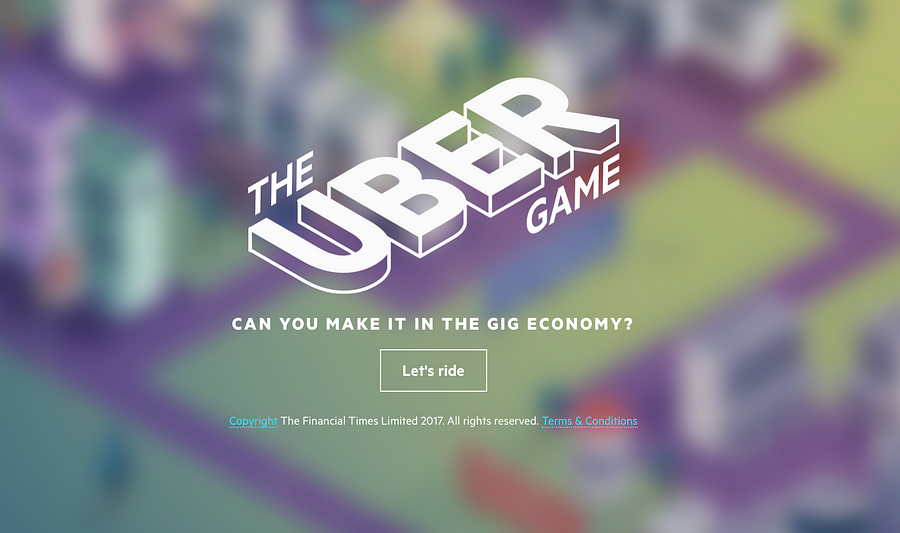
They aren’t a new trend, but more and more newsrooms are playing with this. And this example, called ‘The Uber Game’ by the Financial Times in the UK, has been a key player in the field this year, inspiring news teams around the world…
This game puts you into the shoes of a full-time Uber driver. Based on real reporting, including dozens of interviews with Uber drivers in San Francisco, it aims to convey an emotional understanding of what it is like to try to make a living in the gig economy.
It is an innovative attempt to present data reporting in a new, interactive format. It was the third-most read by pageviews throughout 2017.
Roughly two-thirds of people who started the game finished it — even though this takes around 10 minutes and an average of 67 clicks.
Technologies used for this project: Ink to script the game, inkjs, anime.js, CSS, SCSS, NodeJS, Postgres database, Zeit Micro, Heroku 1X dynos, Standard-0 size Heroku Postgres database, Framer, Affinity Designer
Collaborations are still a big thing
And many organisations worldwide have had a go at it, in many regions around the world.
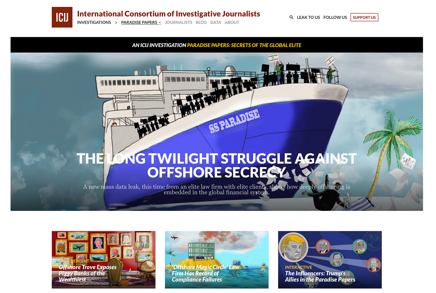
Paradise Papers
Of course we have the Paradise Papers investigation (pictured above) coordinated by the ICIJ with 380 journalists worldwide.
Based on a massive leak, it exposes secret tax machinations of some of the world’s most powerful people and corporations. The project revealed offshore interests and activities of more than 120 politicians and world leaders, including Queen Elizabeth II, and 13 advisers, major donors and members of U.S. President Donald J. Trump’s administration. It exposed the tax engineering of more than 100 multinational corporations, including Apple, Nike, Glencore and Allergan, and much more.
The leak, at 13.4 million records, was even bigger in terms of the number of records than the Panama Papers, and technically even more complex to manage.
The record set came from an array of sources from 19 secrecy jurisdictions. It also contained more than 110,000 files in database or spreadsheet formats (excel, CSVs and SQL). ICIJ’s data unit used reverse-engineering techniques to reconstruct corporate databases. The team scraped the records in the files and created a database with information of companies and individuals behind them.
The team then used ‘fuzzy matching’ techniques and other algorithms to compare the names of the people and companies in all these databases to lists of individuals and companies of interest, including prominent politicians and America’s 500 largest publicly traded corporations.
Technologies used for this project:
For data extraction and analysis: Talend Open Studio for Big Data, SQL Server, PostgreSQL, Python (nltk, beautifulsoup, pandas, csvkit, fuzzywuzzy), Google Maps API, Open Street Maps API, Microsoft Excel, Tesseract, RapidMiner, Extract
For the collaborative platforms: Linkurious, Neo4j, Apache Solr, Apache Tika, Blacklight, Xemx, Oxwall, MySQL and Semaphor.
For the interactive products: JavaScript, Webpack, Node.js, D3.js, Vue.js, Leaflet.js and HTML.
For security and sources protection: GPG, VeraCrypt, Tor, Tails, Google Authenticator, SSL (client certificates) and OpenVPN.
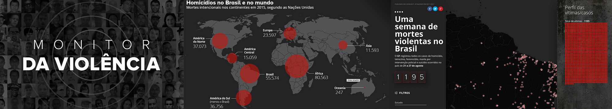
Monitor da violencia
Now here is an other collaborative project that you may not know of but is also quite impressive. It is called ‘Monitor da Violencia’, and it won the Microsoft award for public choice at this year’s Data Journalism Awards. It was done by G1 in Brazil, in collaboration with the Center for the Study of Violence at University of São Paulo (the largest university in Brazil) and the Brazilian Forum of Public Security (one of the most respected public security NGOs in Brazil).
This project is an unprecedented partnership which tackles violence in Brazil. To make it possible, G1 staff reporters all over Brazil kept track of violent deaths through the course of one week. Most of these are crimes that generally become forgotten — cases of homicides, robberies, deaths by police intervention, and suicides. There were 1,195 deaths in this period — one every 8 minutes on average.
All these stories have been cleared and written by more than 230 journalists spread throughout Brazil. This is a small sample — compared to the 60,000 annual homicide rate — but it represents a picture of the violence in Brazil.
The project aims at showing the faces of the victims; trying to understand the causes of this epidemic of deaths. As a first step, a news piece was written for each one of the violent deaths. An interactive map, complete with search filters, showed the locations of the crimes as well as the victim’s photos.
The second step was a collective and collaborative effort to find the names of unidentified people. A campaign was launched, including online, on TV and social media, so that people could help identify many of the victims.
A database was assembled from scratch, containing information such as the victims’ name, age, race, and gender. Also, the day, time, weapon used, and the exact location of the crime, among others.
Technologies used for this project: HTML, CSS, Javascript, Google Sheets, CARTO
Onwards and upwards for data journalism in 2018
The jury of the Data Journalism Awards, presided over by Paul Steiger, selected 13 winners (and one honorable mention) out of the 86 finalists for this year’s competition, and you can find the entire list, accompanied by comments from jury members, on the Data Journalism Awards website.
The insights I’ve listed in this article today show us that not only is the field ever-growing, it is also more impactful than ever, with many winning projects bringing change in their country.
Congratulations again to all of the winners, shortlisted projects, but also to all the journalists, news programmers, and NGOs pushing boundaries so that hard-to-reach data becomes engaging and impactful projects for news audiences.
Now in its seventh year, the Data Journalism Awards was launched in 2012. In the first edition, it received close to 200 projects. Over the years it has grown to become the first international awards recognising outstanding work in the field of data journalism, receiving the highest amount of submissions in the history of the competition in 2018.
Marianne Bouchart is the founder and director of HEI-DA, a nonprofit organisation promoting news innovation, the future of data journalism and open data. She runs data journalism programmes in various regions around the world as well as HEI-DA’s Sensor Journalism Toolkit project and manages the Data Journalism Awards competition.
Before launching HEI-DA, Marianne spent 10 years in London where she worked as a web producer, data journalism and graphics editor for Bloomberg News, amongst others. She created the Data Journalism Blog in 2011 and gives lectures at journalism schools, in the UK and in France.
Peter Aldhous of BuzzFeed News and Simon Rogers of the Google News Initiative discuss the power of machine learning in journalism, and tell us more about the groundbreaking work they’ve done in the field, dispensing some tips along the way.
Machine learning is a subset of AI and one of the biggest technology revolutions hitting the news industry right now. Many journalists are getting excited about it because of the amount of work they could get done using machine learning algorithms (to scrape, analyse or track data for example). They enable them to do tasks they couldn’t before, but it also raises a lot of questions about ethics and the ‘reliance on robots’.
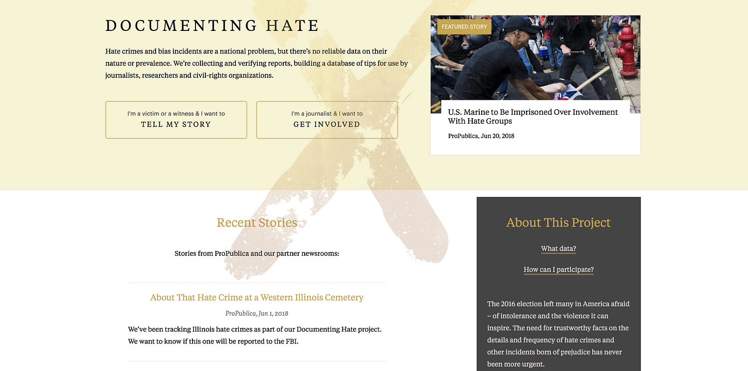
Peter Aldhous is the brain behind BuzzFeed News’s machine learning project ‘Hidden Spy Planes’. The investigation revealed how US airspace is buzzing with surveillance aircraft operated for law enforcement and the military, from planes tracking drug traffickers to those testing new spying technology. Simon Rogers is data editor for Google (who’s also been contributing to some great work on machine learning, including ProPublica’s Documenting Hate project which provides trustworthy facts on the details and frequency of hate crimes).
What is it about AI that gets journalists so interested? How can it be used in data journalism?
Peter Aldhous: I think the term AI is used way too widely, and is mostly used because it sounds very impressive. When you say ‘intelligence’, mostly people think of higher human cognitive functions like holding a conversation, and sci-fi style androids.
But as reporters, we’re often interested in finding the interesting things from a mass of data, text, or images that’s too big to go through manually. That’s something that computers, trained in the right way, can do well.
And I think machine learning is a much more descriptive and less pretentious label for that than AI.
Simon Rogers: There is a big gap between what we’ve been doing and the common perception of self aware machines. I look at it as getting algorithms to do some of the more tedious work.
Why and when should journalists use machine learning?
P.A.: As a reporter, only when it’s the right tool for the job — which likely means not very often. Rachel Shorey of The New York Times was really good on this in our panel on machine learning at the NICAR conference in Chicago in March 2018.
She said things that have solved some problems almost as well as machine learning in a fraction of the time:
– Making a collection of text easily searchable;
– Asking a subject area expert what they actually care about and building a simple filter or keyword alert;
– Using standard statistical sampling techniques.
What kind of ethical/security issues does the use of machine learning in journalism rise?
P.A.: I’m very wary of using machine learning for predictions of future events. I think data journalism got its fingers burned in the 2016 election, failing to stress the uncertainty around the predictions being made.
There’s maybe also a danger that we get dazzled by machine learning, and want to use it because it seems cool, and forget our role as watchdogs reporting on how companies and government agencies are using these tools.
I see much more need for reporting on algorithmic accountability than for reporters using machine learning themselves (although being able to do something makes it easier to understand, and possible to reverse engineer.)
If you can’t explain how your algorithm works to an editor or to your audience, then I think there’s a fundamental problem with transparency.
I’m also wary of the black box aspect of some machine learning approaches, especially neural nets. If you can’t explain how your algorithm works to an editor or to your audience, then I think there’s a fundamental problem with transparency.
S.R.: I agree with this — we’re playing in quite an interesting minefield at the moment. It has lots of attractions but we are only really scratching the surface of what’s possible.
But I do think the ethics of what we’re doing at this level are different to, say, developing a machine that can make a phone call to someone.
‘This Shadowy Company Is Flying Spy Planes Over US Cities’ by BuzzFeed News
What tools out there you would recommend in order to run a machine learning project?
P.A.: I work in R. Also good libraries in Python, if that’s your religion. But the more difficult part was processing the data, thinking about how to process the data to give the algorithm more to work with. This was key for my planes project. I calculated variables including turning rates, area of bounding box around flights, and then worked with the distribution of these for each planes, broken into bins. So I actually had 8 ‘steer’ variables.
This ‘feature engineering’ is often the difference between something that works, and something that fails, according to real experts (I don’t claim to be one of those). More explanation of what I did can be found on Github.
There is simply no reliable national data on hate crimes in the US. So ProPublica created the Documenting Hate project.
S.R.: This is the big change in AI — the way it has become so much easier to use. So, Google hat on, we have some tools. And you can get journalist credits for them.
With Documenting Hate, we were concerned about having too much confidence in machine learning ie restricting what we were looking for to make sure it was correct.
ProPublica’s Scott Klein referred to it as an ‘over eager student’, selecting things that weren’t right. That’s why our focus is on locations and names. Even though we could potentially widen that out significantly
P.A.: I don’t think I would ever want to rely on machine learning for reporting. To my mind, its classifications need to be ground-truthed. I saw the random forest model used in the ‘Hidden Spy Planes’ story as a quick screen for interesting planes, which then required extensive reporting with public records and interviews.
What advice do you have for people who’d like to use machine learning in their upcoming data journalism projects?
P.A.: Make sure that it is the right tool for the job. Put time into the feature engineering, and consult with experts.
You may or may not need subject matter expert; at this point, I probably know more about spy planes than most people who will talk about them, so I didn’t need that. I meant an expert in processing data to give an algorithm more to work with.
Don’t do machine learning because it seems cool.
Use an algorithm that you understand, and that you can explain to your editors and audience.
Right tool for the job? Much of the time, it isn’t.
Don’t do this because it seems cool. Chase Davis was really good in the NICAR 2018 panel on when machine learning is the right tool:
Is our task repetitive and boring?
Could an intern do it?
If you actually asked an intern to do it, would you feel an overwhelming sense of guilt and shame?
If so, you might have a classification problem. And many hard problems in data journalism are classification problems in disguise.
We need to do algorithmic accountability reporting on ourselves! Propublica has been great on this:
But as we use the same techniques, we need to hold ourselves to account
S.R.: Yep — this is the thing that could become the biggest issue in working with machine learning.
What would you say is the biggest challenge when working on a machine learning project: the building of the algorithm, or the checking of the results to make sure it’s correct, the reporting around it or something else?
P.A.: Definitely not building the algorithm. But all of the other stuff, plus feature engineering.
S.R.: We made a list:
We wanted to be sure, so we cut stuff out.
We still need to manually delete things that don’t fit.
Critical when thinking about projects like this — the map is not the territory! Easy to conflate amount of coverage with amount of hate crimes. Be careful.
Always important to have stop words. Entity extractors are like overeager A students and grab things like ‘person: Man’ and ‘thing: Hate Crime’ which might be true but aren’t useful for readers.
Positive thing: it isn’t just examples of hate crimes it also pulls in news about groups that combat hate crimes and support vandalized mosques, etc.
It’s just a start: more potential around say, types of crimes.
I fear we may see media companies use it as a tool to cut costs by replacing reporters with computers that will do some, but not all, of what a good reporter can do, and to further enforce the filter bubbles in which consumers of news find themselves.
Hopes & wishes for the future of machine learning in news?
P.A.: I hope we’re going to see great examples of algorithmic accountability reporting, working out how big tech and government are using AI to influence us by reverse engineering what they’re doing.
Julia Angwin and Jeff Larson’s new startup will be one to watch on this:
I fear we may see media companies use it as a tool to cut costs by replacing reporters with computers that will do some, but not all, of what a good reporter can do, and to further enforce the filter bubbles in which consumers of news find themselves.
Here’s a provocative article on subject matter experts versus dumb algorithms:
Peter Aldhous tells us the story behind his project ‘Hidden Spy Planes’:
‘Back in 2016 we published a story documenting four months of flights by surveillance planes operated by FBI and Dept of Homeland Security.
I wondered what else was out there, looking down on us. And I realised that I could use aspects of flight patterns to train an algorithm on the known FBI and DHS planes to look for others. It found a lot of interesting stuff, a grab bag of which mentioned in this story.
But also, US Marshals hunting drug cartel kingpins in Mexico, and a military contractor flying an NSA-built cell phone tracker.’
Should all this data be made public?
Interestingly, the military were pretty responsive to us, and made no arguments that we should not publish. Certain parts of the Department of Justice were less pleased. But the information I used was all in the public, and could have been masked from flight the main flight tracking sites. (Actually DEA does this.)
US Marshals operations in Mexico are very controversial. We strongly feel that highlighting this was in the public interest.
About the random forest model used in BuzzFeed’s project:
Random forest is basically a consensus of decision tree statistical classifiers. The data journalism team was me, all of the software was free and open source. So it was just my time.
The machine learning part is trivial. Just a few lines of code.
If you had had a team to help with this, what kinds of people would you have included?
Get someone with experience to advise. I had excellent advice from an academic data scientist who preferred not to be acknowledged. I did all the analysis, but his insights into how to go about feature engineering were crucial.
Marianne Bouchart is the founder and director of HEI-DA, a nonprofit organisation promoting news innovation, the future of data journalism and open data. She runs data journalism programmes in various regions around the world as well as HEI-DA’s Sensor Journalism Toolkit project and manages the Data Journalism Awards competition.
Before launching HEI-DA, Marianne spent 10 years in London where she worked as a web producer, data journalism and graphics editor for Bloomberg News, amongst others. She created the Data Journalism Blog in 2011 and gives lectures at journalism schools, in the UK and in France.
Editors, reporters and, anyone in news today: how prepared are you for what is coming? Really. There is a lot of talk right now on new practices and new technologies that may or may not shape the future of journalism but are we all really properly getting ready? Esra Dogramaci, member of the Data Journalism Awards 2017 jury and now working as Senior Editor on Digital Initiatives at DW in Berlin, Germany, thinks we are not. The Data Journalism Awards 2017 submission deadline is on 10 April.
Esra Dogramaci, Senior Editor on Digital Initiatives at DW, Photo: Krisztian Juhasz
Before joining DW, Esra Dogramaci worked at the BBC in London and Al Jazeera English, amongst others. She discusses here the preconceived ideas people have about the future of journalism and how we might be getting it all wrong. She also shares some good tips on how to better prepare for the journalism practices of the future as well as share with us her vision of how the world of news could learn from the realm of television entertainment.
What do you think most people get wrong when describing the future of journalism?
There are plenty of people happy to ruminate on the future of journalism — some highly qualified such as the Reuters Institute and the Tow Center who make annual predictions and reports based on data and patterns while others go with much less than that. Inevitably, people get giddy about technology — what can we do with virtual reality (VR), augmented reality (AR), artificial intelligence (AI), personalisation (not being talked about so much anymore), chatbots, the future of mobile and so on. However with all this looking forward to where journalism is headed (or rather how technology is evolving and, how can journalism keep pace with it), are we actually setting ourselves and journalism students up with all that is needed for this digital future? I think the answer is no.
What is, according to you, a more adequate description (or prediction) of the future of news?
If we’re talking about a digital future, the journalists of tomorrow are not equipped with the digital currency they will need.
Technology definitely matters but it’s not so useful when you don’t have people who understand it or can build and implement appropriate strategy to bridge journalism in a digital age. Middle or senior management types for instance, are less likely to know how to approach Snapchat, which they would be less likely to use, than a high school teenager who is using it as a social sharing tool or their primary source of news.
So if we aren’t actually:
1. Listening to our audience and knowing who they are and how they use these technologies, and
2. Bringing in people who know how to use these tools that speak to and with the audience,
…the efforts are going to be laughable at worst and dismissed at best.
In essence, technology and those who know how to use, develop and iterate it go together. That’s the future of news. We should be looking forward with technology, but we’ve also got to look back at the people coming through the system that will inherit and step into the – hopefully relevant – foundations we’re building now.
“Are we actually setting ourselves and journalism students up with all that is needed for this digital future?”
When looking at the evolution of journalism practices over the past few years, which ones fascinate you the most?
There are two things that stand out. The first is analytics and the second is the devolution of power, both points are interrelated.
Data analytics have really transformed non-linear journalism. Its instantly measurable, helping people make editorial decisions but also question and understand why content you thought would perform doesn’t. Data allows us to really understand our audience, and come up with content that not just resonates with them but how to package content that they will engage with. For instance a website audience is not going to be the same as your TV audience (TV is typically older and watches longer content but again the data will tell specifics), so clipping a TV package and sticking it on Facebook or YouTube isn’t optimal and suggests to your audience that you don’t understand these platforms and more importantly, them. They will go to another news provider that does.
An example of this was a project where it was traditionally assumed [in one of my previous teams] that the audience was very interested in Palestinian-Israeli conflict and so a lot of stories were delivered about it. However, we discovered through the numbers, on a consistent basis, that the audience wasn’t as interested as assumed, rather people were more into the conflicts in Syria, Yemen as well as Morocco and Algeria stories. These stories and audiences may not have traditionally registered on top of the editorial agenda because of what was historically thought to be in the audiences interest, but our data was suggesting we needed to pay more attention to the coverage in these areas.
Now, that being said, it’s still stunning to see how little analytics are used day to day. There still seems to be a monopoly on the numbers rather than integration into newsrooms. There are a plethora of tools available in making informed editorial or data decisions but generally editors don’t understand them or follow metrics that are not useful because they don’t know how to interrogate the data, or we hear things like ‘I’m an editor, I’ve been doing this for x years, I know better.’
Fortunately though, about 80–90% of editors I find are keen to understand this data-driven decision-making world and once you sit down and explain things, they become great advocates. Ian Katz at BBC Newsnight, Carey Clark at BBC HardTalk are two editors who embody this.
The second area is devolving power. The best performing digital teams are when not all decision-making is consolidated at the top, and you really give people time and space to figure out problems, test new ideas without the pressure always to publish. That’s a very different model to traditional hierarchical or vertical journalism structures. Its an area of change and letting go of power. But empowering the team empowers leaders as well.
An example of this is a team I worked with where all decisions and initiatives went through a social media editor. As a result, there was a bottleneck, and frustration for things not being done and generally being late to the mark on delivering stories and being relevant on platform as competitors were overtaking. What we did is decentralise control — we asked the team what platforms they’d like to take responsibility for (in addition to day to day tasks) and together came up with objectives and a proposition to deliver on those. The result? Significant growth across the board, increase in engagement but perhaps most importantly, a happier team. That’s what most people are looking for: recognition, responsibility, autonomy. If you can keep your team happy, they are going to be motivated and the results will follow.
Global Headaches: the 10 biggest issues facing Donald Trump, by CNN
Do you have any stories in mind that represent best what you think the future of newsmaking will look like?
The project was on site (meaning that traffic was coming to the site and not a third party platform), made for mobile which would presumably reflect an audience coming mainly from mobile, used broadcast journalists and personalities as well as regular newsgathering, with an element of gamification. Each scenario had an onward journey which then takes your reader out of the game element and into the story.
Example from the “onward journey” with the CNN “Global Headaches” project
This isn’t a crazy high tech innovation but it is something that would have been much harder to pull off say 5 years ago. This example is multifaceted and making use of the tools we have available today in a smart way. It demonstrates that CNN can speak to the way their audience is consuming content while fulfilling its journalistic remit.
Examples like this doesn’t mean we should be abandoning long form text for instance and going purely for video driven or interactive stories. The Reuters Institute found last year (in their report The Future of Online News Video) that there is oversaturation of video in publishing and that text is still relevant. So, I would caution against throwing the text baby out with the bathwater, which then comes down to two things:
Know your audience and do so by bringing analytics into the newsroom (it’s still slightly mind boggling the number of newsrooms who do not have any analytics in the editorial process)
Come up with a product that you love and that works. The best of these innovations are multidisciplinary and do something simple using the relevant tools we have, that are accessible today. There’s no use investing in a VR project if the majority of your audiences lack the headsets to experience it.
Do you think news organisations are well equipped for this digital future?
Yes and no. There are the speedboats like Quartz, AJ+, NowThis, Vox, who can pivot quickly and innovate versus the bigger media tankers that turn very slowly. One question I get asked quite a bit is “what’s the most important element in digital change”. The answer is leadership. There needs to be someone(s) who understands, supports and pushes change, otherwise everyone down the ranks will continue to struggle and face resistance.
I truly believe in looking at the people who are on the ground, rolling up their sleeves and getting the work done, trying, failing, succeeding, and who keep persevering — versus always deferring to editors who have been in place for say 10 years to lead the way. Those people in the trenches are the ones we should be shining the light on and listening to. They are much closer to the audience and can give you usable insights that also go beyond numbers.
If I could name a few, people like Carol Olona, Maryam Ghanbarzadeh at the BBC, Alaa Batayneh or Fatma Naib, at Al Jazeera, Jacqui Maher at Conde Nast, need to be paid attention to. You may not see them at conferences or showcased much but by having people like them in place, news organisations are well equipped for a digital future.
Do you see some places in the world (some specific organisations maybe?) that are actually doing better than others on that front?
The World Economic Forum wouldn’t traditionally be associated as being a digital media organisation, but a few years ago they started to invest in social media and develop an audience that normally would not be interested in them. They take data and make it relevant and accessible for low cost, bite size social consumption.
Take this recent video for example:
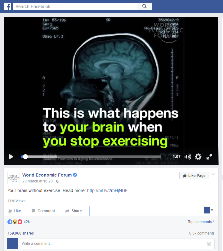
Your brain without exercise, a video by the World Economic Forum
And also this related one:
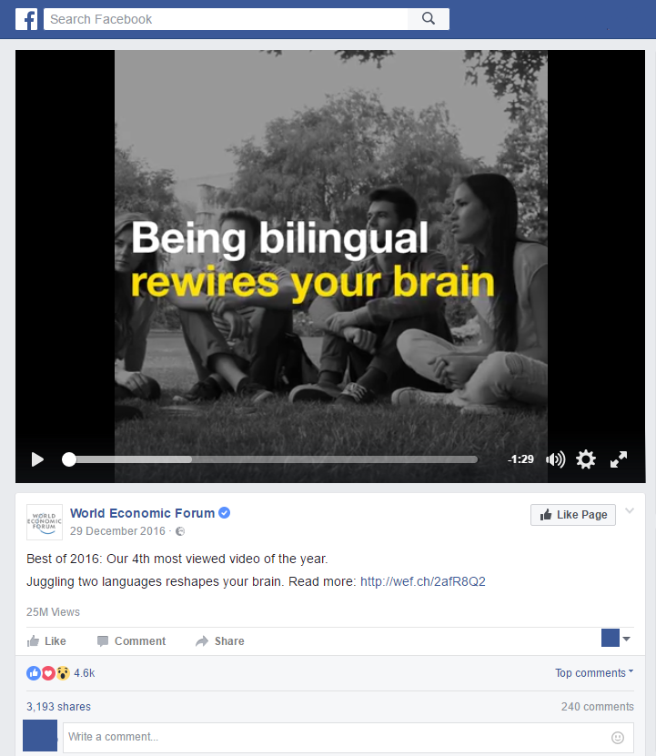
Best of 2016 social video by the World Economic Forum
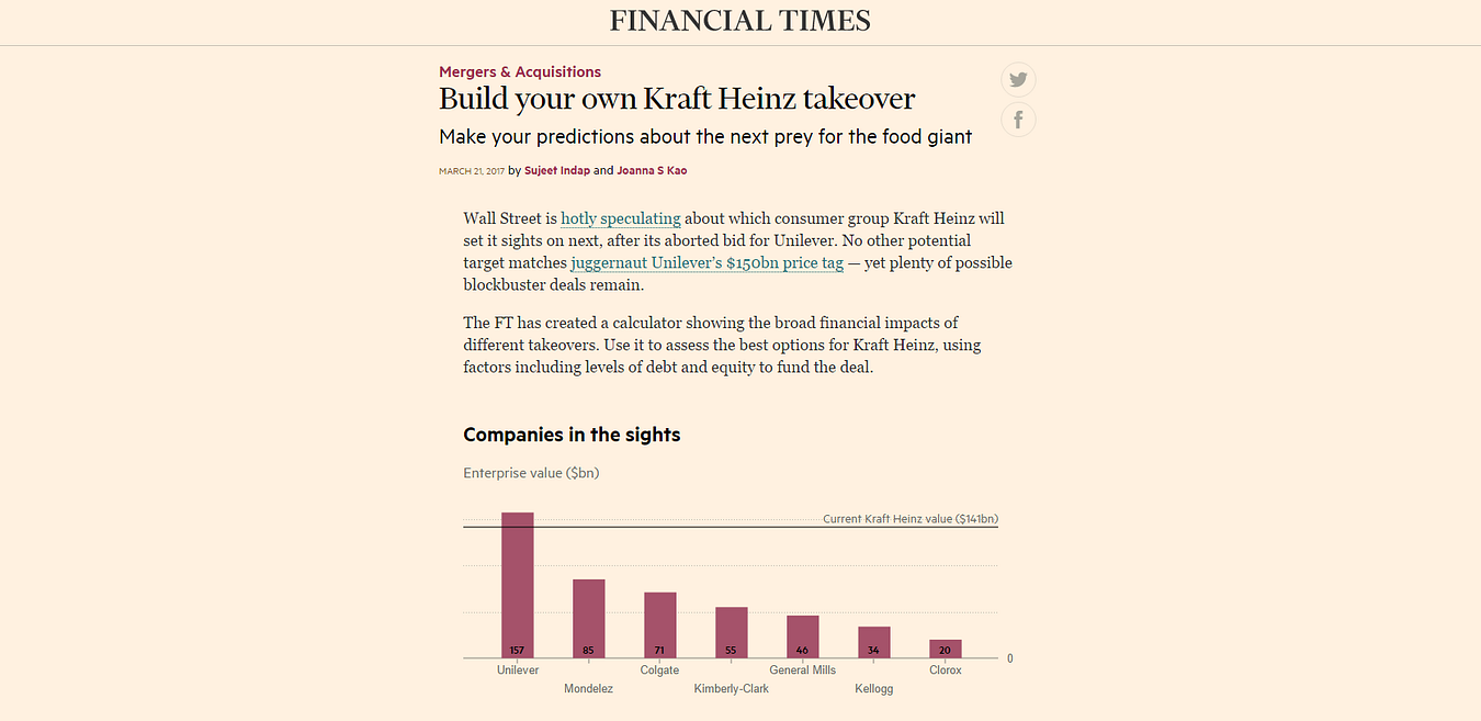
The Financial Times hasn’t been afraid of digital either. You see them taking interesting risks which might go over a lot of people’s heads but the point is they’re trying. Like in their project “Build your own Kraft Heinz takeover”.
Then there are the regular suspects — AJ+ isn’t trying to do everything, they’re trying to be relevant for a defined audience on the platforms that audience uses. Similarly, Channel 4 News isn’t pumping out every story they do on social, but deliberately going for emotionally charged stories rather than straight reporting as well as some play with visualising data.
What would you like to see more of in newsrooms today which would actually prepare staff better for what’s coming?
When you’re hiring new staff, assign them digital functions and projects rather than putting them on the traditional newsroom treadmill. A lot of organisations have entry level schemes and this could easily be incorporated into that model. That demonstrates that digital is a priority from the outset. You could also create in house lightning attachments, say a six-week rotation at the end of which you’re expected to deliver something ready for publishing, driven by digital. My City University students were able to come up with a data visualization in less than an hour, and put together a social video made on mobile in 45 minutes (social or mobile video wasn’t even on the course but I snuck it in). Six weeks in a newsroom is plenty of time for something substantial.
Also, have the right tools in place and ensure that everyone is educated on the numbers. Reach and views for instance get thrown around a lot- they are big easy numbers to capture and comprehend, but we need to make a distinction between what is good for PR versus actionable metrics in the newsroom. As more people clue into what matters, I do think (and we see in certain places like Newswhip for instance) where success is based on engagement, interactions and watchtime rather than views, impressions or reach.
Finally and obviously, its devolution of power and more risk taking. Make people better by empowering them — that means carve out the time and space to experiment without the pressure to deliver or publish. When you are continually driving staff against deadlines, creativity suffers. Fortunately there are so many third party tools and analytics that will very quickly tell you what’s working and what’s not, contributing to a much more efficient newsroom freeing up valuable time to think and experiment. Building multi disciplinary teams is a good step in this direction. DW is experimenting with a “lab like” concept bringing together editorial, technical and digital folks in an effort to bring the best of all worlds together and see what magic they come up with.
From your experience teaching social and digital journalism at City University London, what can you say about the way the younger generation of journalists is being trained for the future? Do they realise what’s at stake?
At the beginning of term, I heard quite a few students say that digital didn’t matter, it wasn’t “real journalism” and that they were taking the class merely because it was perceived as an “easy pass”. That’s because the overall coursework, emphasized magazine and newspaper journalism. At the end of the term, and almost on a weekly basis since, my former students write to me about either digital projects they have done, digital jobs they are going for or how something we went over in the class has led to another opportunity.
There remains a major emphasis on traditional broadcast journalism — TV, radio, print, but very little for digital. That’s not something to fault students on. Digital is changing constantly but teaching staff mainly reflect the expertise of the industry, and that expertise is traditional. While there are a lot of digital professionals, it does not come close to the level of expertise and experience currently on offer at institutions training the next journalist generation. That being said organisations like Axel Springer have journalism academies where all of their instructors, are working full time in media and can translate the day to day relevance into the classroom. That’s more of the kind of thing we need to have.
The students I think do realise what’s at stake because a lot of those journalism jobs they’re applying for all require some level of digital literacy. Sure everyone might watch a YouTube video but what happens when an Editor asks you why a news video has been uploaded and monetised by other users elsewhere. Would you know what to do?
What could be done to improve the educational system in the UK and beyond? Simply make journalism courses more digitally focussed?
There is nothing that will compel places to change but reputation. If students are leaving institutions because what they are learning is not preparing them to meet the demands of the industry they’re choosing to go into, word will spread sooner than later. There will surely be visionary institutions who ‘get it’ and adapt, some are there already.
‘Smart’ places will build in digital basics so students can have the confidence to hit the ground running. I see this in a lot of digital job requirements. It’s a given that anyone starting in journalism in 2017 has basic social media literacy. Beyond that everything is a bonus — how can you file from a mobile phone, can you interpret complex data and tell a story with it. Then, are you paying attention to analytics?
“staff blame the stupid internet for low page views on a piece…but credit the quality of the journalism when one hits the jackpot.”
We need a much more sophisticated understanding beyond yes/no answers to points like these.
A lot of media houses have academies or training centres expected also to bridge digital gaps. The caution there is that the trainings they offer when it comes to things beyond CMS, uploading video, etc., is that other digital knowledge seem to fall in the “nice to know” rather than “you need this” category. The best thing is to find the in-house talents who know what they’re talking about and get them to lead the way.
Another recurrent question when talking about our digital future is the question of business models for news organisations. As the latter are under continual financial strain, you actually think we should get inspiration from the entertainment industry. Can you elaborate on this idea?
Yes. The entertainment industry always has a much larger creative capacity and funding so they are able to take more risks with less at stake. That’s where we should be looking and seeing what the obvious news applications could be rather than trying to build our own innovations all the time. Most news houses just cannot compete with entertainment budgets. Jimmy Fallon showcased Google Tilt brush in January 2016:
I then saw it in November 2016 at a Google News event but have yet to see anyone use it in a meaningful news application. It doesn’t necessarily mean that all these things will be picked up on, but it does mean we should keep a finger on the pulse of what’s possible. Matt Danzico, now setting up a Digital News Studio at NBC is in a unique position. He’s in the same building as Late Night, SNL, and others. That means he has access to all the funky things entertainment is coming up with and can think about news applications for it.
Similarly, how can news organisations think about teaming up with Amazon or Netflix for instance and start to make their content more accessible? These media giants have the capacity to push creative boundaries and invest, and news organisations have their journalistic expertise to offer in that relationship. That’s very relevant in this time of “fake news”.
You have recently been appointed Senior Editor of Digital at DW in Berlin. Can you tell us more about what this position entails and the type of projects you’ll be doing? How different is it from what you’ve done in the past at the BBC and Al Jazeera for example?
DW is in a position familiar to many broadcasters, and that is a slight shift away from linear broadcasting to a considerable foray into digital. The difference is that DW is not starting from zero, with plenty of good (and bad) examples around to learn from. The first thing is to set a good digital foundation — getting the right tools in house and bringing people along on the digital journey — in a nutshell increasing literacy and comfort with digital. Once that is done I think you’ll see a very sharp learning curve and a lot more ambitious digital projects and initiatives coming from DW.
We’re very lucky that we have a new Editor in Chief, Ines Pohl and new head of news, Richard Walker, both infused with ideas and energy of making a great digital leap. Complementary to that we have a new digital strategy coming from the DG’s office which I’ve been involved with in addition to a new DW “lab like” concept, as I mentioned before. A lot of people might not know how big DW is — there are 30 language services and English is the largest of those, so getting all systems firing digitally is no small task.
Compared to BBC or AJ, the scope and scale of the task is of course much bigger. At AJ we had a lot of free range in the beginning because no one was doing what we did, at the BBC, there was much more process involved, less risk taking. Based on those experiences, DW is somewhere in the middle, a good balance. 2017 could be the year where stars align for DW. There are approximately 12 parliamentary or national elections in Europe and DW knows this landscape well. So bringing together the news opportunities, a willingness to evolve and invest in something new along with leadership that can really drive it, I think DW will be turning heads soon.
Marianne Bouchart is the founder and director of HEI-DA, a nonprofit organisation promoting news innovation, the future of data journalism and open data. She runs data journalism programmes in various regions around the world as well as HEI-DA’s Sensor Journalism Toolkit project and manages the Data Journalism Awards competition.
Before launching HEI-DA, Marianne spent 10 years in London where she worked as a web producer, data journalism and graphics editor for Bloomberg News, amongst others. She created the Data Journalism Blog in 2011 and gives lectures at journalism schools, in the UK and in France.
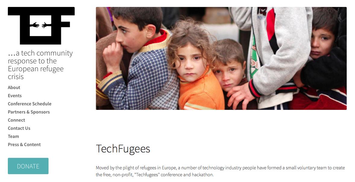
Today is the day of the TechFugees conference in London, an exciting, absolutely free and nonprofit event organised by TechCrunch editor-at-large Mike Butcher to find technology solutions to the refugee crisis.
“Moved by the plight of refugees in Europe, a number of technology industry people have formed a small voluntary team to create the free, non-profit, “Techfugees” conference and hackathon.” — Mike Butcher
In just a few weeks, the Techfugees Facebook Group and Twitter account have exploded. Over 700 people from the tech community signed up to the event proving there is clearly a huge desire amongst the tech community to get involved.
Tech engineers, entrepreneurs and startups together with NGOs and other agencies will gather at SkillsMatter HQ in London to address the crisis in ways where the technology world can bring its considerable firepower.
Hei-Da and the Data Journalism Blog support this event and I will be talking at the conference about our initiative, how data journalism has been used to cover the refugee crisis, what challenges news organisations face to get data on the crisis and what technology solutions there could be to facilitate data gathering, publishing and storytelling on the ground.
Andrew Rininsland, senior developer at The Times and Sunday Times, also contributor of the DJB, will also tell us about his experience of the Techfugees Hackathon happening on Friday, October 2nd in London (tickets still available here).
Marianne is the founder and director of Hei-Da.org, a not-for-profit organisation based in London, UK, that specialises in open data driven projects and innovative storytelling. She also created the Data Journalism Blog back in 2011 and used to work as the Web Producer EMEA, Graphics and Data Journalism Editor for Bloomberg News. Passionate about innovative story telling, she teaches data journalism at the University of Westminster and University of the Arts, London.
Dan Sinker, a 2008 Knight Fellow, is joining Mozilla to lead the Knight-Mozilla News Technology Partnership.
The program is funded by the Knight Foundation and run by Mozilla, makers of the Firefox web browser. The goal is to help create deeper collaboration between journalists and technologists through a series of design challenges like this one in San Francisco last spring, learning labs and a fellowship program that puts developers in residence at newsrooms around the world. This year, the partner newsrooms for fellows are Al Jazeera, the BBC, the Guardian, Die Zeit and the Boston Globe. [Read more…]


 Michaela Gruber is a journalism and media management student, based in Vienna, Austria. During her studies she spent a semester abroad in France, where she started working for HEI-DA.