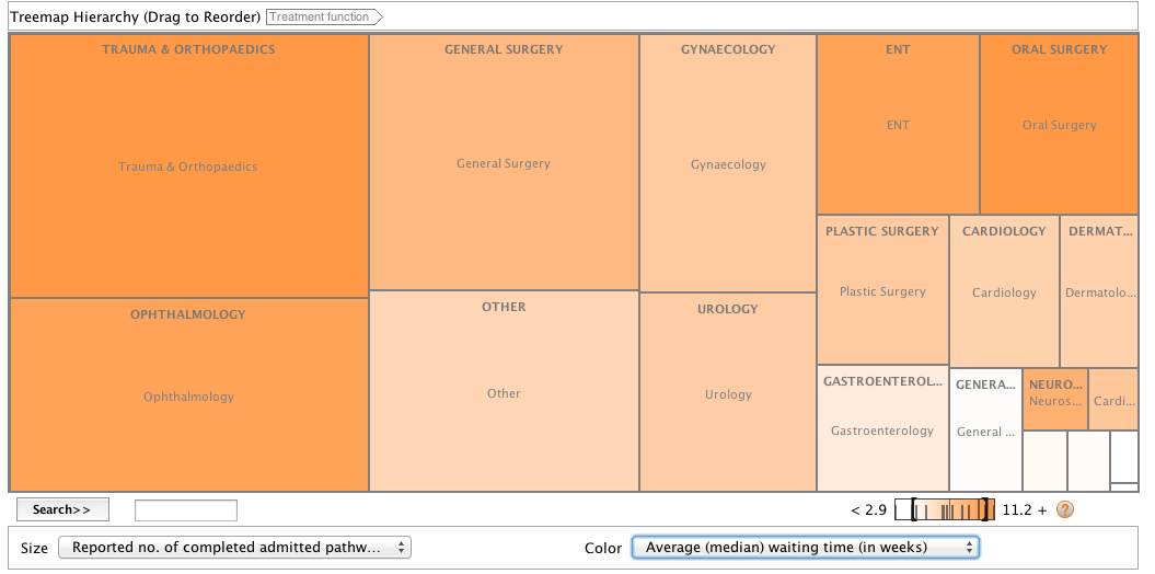
 Visualising data is important because it makes complicated information easy to process and understand.
Here I took some data from the Office for National Statistics website, www.ons.gov.uk. I chose to look at Hospital waiting times because it is an issue that is often reported on and I was curious as to which treatments had the longest waiting time.
I took the data and copied it into an Excel spreadsheet. I then cut it down to get rid of information that I didn’t need and that would confuse the user. I organised the data into columns, the first showing the type of treatment, the second the amount of completed treatments and operations and the third showing the average median waiting time in weeks.
Continue reading “Treemap for Comparisons showing Hospital Waiting Times”
