How to find Data

This post is for people who are new to data sourcing, or interested in Data Journalism but unsure of where to begin.

First, it is useful to start with an idea, question or hypothesis. In Story Based Enquiry Mark Lee Hunter emphasises the importance of having an idea of what you are looking for in data.

He said: “We do not think that the only issue is finding information. Instead, we think that the core task is telling the story. Stories are the cement which holds together every step of the investigative process, from conception to research, writing, quality control and publication.”

Data stories and visualisations are part of journalism and, when looking for information, a good starting place is to use traditional journalistic methods. Contacts, tip offs, interviews and research can all point you in the direction of interesting data, and of questions that could be answered by statistics. This is known as Active Data Journalism.

Continue reading “How to find Data”

Visualisation showing patients detained under the Mental Health Act 1983

Here I have created a visualisation showing patients detained under the Mental Health Act 1983 over the last six years.

I took statistics from the mental health pages of the NHS website and downloaded them into an Excel spreadsheet. I then cleaned the data, taking out any information that was unnecessary and that would confuse the image. I rearranged the columns, data and information and made it easier to understand and clearer, visually.

I then experimented with Many Eyes, Google Docs and Excel graphs to create the visualisation. I tried other ways of presenting the image, in a pie chart and a line graph, but found that the bar chart worked best.

The information is broken down by gender as well as by type of hospital; NHS Facilities and Independent hospitals. The graph shows that more men have been detained under the mental health act than women, on a year by year basis. This is consistent with both NHS Facilities and Independent Hospitals. The number of men detained has also gone up marginally in the last two years, though has stayed relatively consistent over the last six years.

This is interesting because statistics have indicated that more women than men are diagnosed with mental health disorders, such as depression and anxiety. However, when it comes to severe cases, where patients are legally detained due to mental illness, men are significantly more likely to be affected.


Infographics in sport: an interactive guide to Super Bowl history

Data journalism has enjoyed increasing exposure both within and without journalistic circles in recent years. One of the most visible examples of this has been the proliferation of infographics – a broad term covering a variety of visual story-telling tools and techniques. The quality of infographics you will find online today is very wide ranging, but increasingly some of the best examples have come from analysis of sporting events.

One such example is this effort, shown below, created by Phil Nottingham. This infographic allows users to view key statistics from every Super Bowl in NFL history, right back to Super Bowl I, where the Green Bay Packers beat the Kansas City Chiefs by 35 points to 10 at the Coliseum in 1967.

Super Bowl XXV saw the Giants overturn a 9 point deficit to beat the Bills


Interactivity is often key to the success of an infographic, particularly when it is not being used to communicate a news story. In this example, users can engage with the tool by choosing from which Super Bowl to view key statistics.

If you’re a Colts fan, simply select the team and you can then either dissect the defeat to the Saints, or scour the success over the Bears back in 2007. Alternatively, if you’re a neutral, or just want a more holistic experience, browse by year rather than team, and pore over any match-up from Super Bowl I to last year’s clash between the Packers and the Steelers.

For every year, a comprehensive list of statistics allows the user to see how the respective teams fared in offense and defense, with data shown for a whole host of factors, including rushing, first downs, fumbles and interceptions.

As well as the individual stats, users can get a clear idea of how a match progressed through the infographic’s main panel. Here, the teams’ scores are plotted over the course of the match, which provides a great way of reliving some of the great comebacks. Take Super Bowl XXV for example, where the chart shows the Giants’ yellow line well below the Bills’ line in the second quarter, but then soaring up and overtaking in the dying minutes.

Since the turn of the millennium, the number of people providing statistical analysis of sporting events has grown enormously, and below are two more of the Data Blog’s favourite sports infographics (they’re both from the world of football (soccer), but I assure you this is because of their brilliance, rather than any underlying bias):

  • Using Tableau Public, Graham MacAree created this spectacularly detailed visual analysis of Chelsea FC’s match against Norwich on 27 August last year. Users can see exactly where each Chelsea player directed every one of their passes, at what point in the game each one was played and whether or not it was complete.
  • The guys at Visual Evolution have put together this fascinating infographic illustrating the nationalities of football’s top 100 earners (based on their annual salaries), breaking the figures down to show – among other things – which leagues and clubs have most representatives in the top 100, the average age of the top earners and the number of homes Wayne Rooney could buy in his home district of Croxteth with his year’s pay packet.

How journalists can use Backbone to create data-driven projects

POYNTER – By Erik Hinton

Single page apps are great solutions for data journalism. By offloading the complexity from backends and servers, journalists can build rich programs and graphics out of just Javascript, HTML and CSS. In fact, these “backends” can shrink to a vanishing point. We can use Twitter in place of a database. Or we can get even simpler and store (static) data in JS/JSON/XML files.

We can make news apps without having to touch a server or write any Ruby, Python or PHP. This is important. It allows data journalists to focus on developing their stories instead of configuring servers. The time and effort to launch an interactive application is reduced to the point where it becomes feasible for journalistic outlets of all sizes to make applications for both long-term pieces and breaking news.

Using JavaScript frameworks to manage one-page apps

There is something of a disconnect between traditional software development models and those of deadline-driven news. In a more server-side oriented development scheme, we would write a program on our computers, set up a server somewhere, configure it to run the app, transfer the data to some database on the server, make sure it can handle the load of a lot of people looking at it and then finally release it. In the newsroom, we have limited time. [Read more…]

Data Journalism – a new career


Monastic Musings Too – By Sister Edith

I had never heard of Data Journalism until a few weeks ago. I’m still not entirely sure I understand what it means – but there are seemingly job openings for Data Journalists.  Plenty of them.

What makes a person a data journalist? The ability to deal with data.  At first I thought this must be pretty simple: take a statistics class, learn the basics of data interpretation.  Want to know more? Take more statistics classes.  That was a social scientist‘s point of view – and it’s not true for data journalism.

Statistics vs Data Journalism

A data journalist definitely needs to know basic statistics.  No competent data journalist would confuse a proportion with a percentage, and then report that prices (or profits) had increased 1300%.  A data journalist understands the meaning of statistical significance, can accurately interpret reports of scientific research, and is energized, rather than terrified, but the presence of numbers.

The difference between the professions is found in the auxiliary skills.  A social scientist – the group most commonly compared to data journalists – expects to define variables, collect data that no one has collected before, or create unique data sets.  Even social scientists who specialize in secondary analysis – working with data collected by governments, international agencies, or public data sets – are interested primarily in exploring theories or evaluating which academic perspective is more likely to be true. So they study research methods, marinate themselves in the intricacies of social theories, and garner all the tools of academic discourse.

The data journalist does not expect or want to be the creator of data – although she may well aspire to be the one who combined existing data in new ways to generate a new perspective.  The data journalist needs all the skills of any journalist – tracking down all angles of a story, gathering the particular details and forming a coherent narrative that is supported by the facts of the situation.  For a data journalist, those facts are data – usually numbers – gathered by local, statewide, national, international governmental bodies as well as many non-profit agencies and dozens – hundreds – of public relations and advertising firms.  Oh yes – there’s also the data being generated by your cell phone,Facebook or Linked-In, your computer use and Google click-through, and the like.

Skills of the Data Journalist

Beyond the basics of statistics – understanding a frequency distribution table or a research report – the data journalist is an organizer of existing data.  They pursue topics not data sets or research agendas.  Rather than a long academic review of the literature on an issue like religious freedom or the psychological impact of unemployment, the data journalist wants to discover and create an underlying plot line, and support it with data from government reports, social scientists’ research projects, economic projections, and more. [Read more…]


Web 2.0 tools for data journalists [SLIDES]


David Herzog is an associate Professor at Missouri School of Journalism. He also serves as the academic adviser to the National Institute for Computer-Assisted Reporting (NICAR), a joint program of the Missouri School of Journalism and Investigative Reporters and Editors, Inc., a global association of journalists.

He recently gave a presentation about new online tools for data journalism and we thought it would be nice to publish the slides on the DJB and to get your opinion.

Here is how Herzog introduced his presentation on his blog back in June 2011:

“I started putting together a slideshow about free data journalism web tools for a group of visiting television and newspaper reporters from South Korea.The number of free Web 2.0 tools is booming and continues to change as new services appear and others die. Remember Swivel, the data visualization service? Used by The Huffington Post, Cleveland Plain Dealer and The Baltimore Sun? Gone. So proceed with caution when using any of these tools. Make sure you keep an original copy of your data.

As you can see in my presentation, there are Web 2.0 tools for every stage of the data game: obtaining, cleaning, analyzing and visualizing.”

Nato operations in Libya: data journalism breaks down which country does what

THE GUARDIAN’S DATA BLOG – By 

How many Nato attacks took place over Libya – and what did they hit? Here’s the most comprehensive analysis yet of who did what
• Get the data

Nato in Libya graphic


Nato‘s Libya operations have cost millions and involved thousands of airmen and sailors. But who’s contributed to Operation Unified Protector? That’s the official name for the attacks on the Gadaffi regime’s bases and tanks by Nato aircraft and ships, plus the enforcement of the no-fly zone and the arms embargo.

We have been monitoring the Nato situation updates which are released each day and give details of the operations – key targets hit, sorties flown and ships boarded.


Occupy protests around the world: full list visualised

THE GUARDIAN’S DATA BLOG – By 

The Occupy protests have spread from Wall Street to London to Bogota. See the full list – and help us add more
• 
Get the data


“951 cities in 82 countries” has become the standard definition of the scale of the Occupy protests around the world this weekend, following on from the Occupy Wall Street and Madrid demonstrations that have shaped public debate in the past month.

We wanted to list exactly where protests have taken place as part of theOccupy movement – and see exactly what is happening where around the globe. [Read more…]

Visweek 2011 is upon us!

VISUALIZATION BLOG


The annual IEEE Visualization, IEEE Information Visualization and IEEE Visual Analytics Science and Technology conferences – together known as IEEE Visweekwill be held in Providence, RI from October 23rd to October 28th.The detailed conference program is spectacular and can be downloaded here.Some of the new events this year are under the Professional’s Compass category. It includes a Blind date lunch (where one can meet some researcher they have never met and learn about each others research), Meet the Editors (where one can meet editors from the top graphics and visualization journals), Lunch with the Leaders session (an opportunity to meet famous researchers in the field) and Meet the faculty/postdoc candidates (especially geared towards individuals looking for a postdoctoral position or a faculty position). I think this is an excellent idea and hope that the event is a hit at the conference.

I am also eagerly looking forward towards the two collocated symposia – IEEE Biological Data Visualization (popularly known as biovis) and IEEE LDAV (Large data analysis and visualization).  Their excellent programs are out and I’d encourage you to take a look at them.

The tutorials this year look great and I am particularly looking forward to the tutorial on Perception and Cognition for Visualization, Visual Data Analysis and Computer Graphics by Bernice Rogowitz. Here is anoutline for the tutorial that can be found on her website. She was one of the first people to recommend that people STOP using the rainbow color map.

The telling stories with data workshop too looks great and will be a continuation of the great tutorial held by the same group last year. I am eagerly looking forward to it. [Read more…]

Data visualisation: in defence of bad graphics

THE GUARDIAN’S DATABLOG – By 

Well, not really – but there is a backlash gathering steam against web data visualisations. Is it deserved?

Most popular infographics

Most popular infographics by Alberto Antoniazzi

Are most online data visualisations, well, just not very good?

It’s an issue we grapple with a lot – and some of you may have noticed a recent backlash against many of the most common data visualisations online.

Poor Wordle – it gets the brunt of it. It was designed as an academic exercise that has turned into a common way of showing word frequencies (and yes, we are guilty of using it) – an online sensation. There’s nothing like ubiquitousness to turn people against you.

In the last week alone, New York Times senior software architect Jacob Harris has called for an end to word clouds, describing them as the “mullets of the Internet“. Although it has used them to great effect here.

While on Poynter, the line is that “People are tired of bad infographics, so make good ones

Awesomely bad infographics
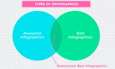
Awesomely bad infographics from How to Interactive Design Photograph: How To Interactive Design

Grace Dobush has written a great post explaining how to produce clear graphics, but can’t resist a cry for reason.

What’s the big deal? Everybody’s doing it, right? If you put [Infographic] in a blog post title, people are going to click on it, because they straight up can’t get enough of that crap. Flowcharts for determining what recipe you should make for dinner tonight! Venn diagrams for nerdy jokes! Pie charts for statistics that don’t actually make any sense! I have just one question—are you trying to make Edward Tufte cry?

Oh and there has also been a call for a pogrom of online data visualisersfrom Gizmodo’s Jesus Diaz:

The number of design-deficient morons making these is so ridiculous that you can fill an island with them. I’d do that. And then nuke it

A little extreme, no?

There has definitely been a shift. A few years ago, the only free data visualisation tools were clunky things that could barely produce a decent line chart, so the explosion in people just getting on and doing it themselves was liberating. Now, there’s a move back towards actually making things look, er, nice. [Read more…]