7 ways to get data out of PDFs

HELP ME INVESTIGATE – By  Paul Bradshaw

A frequent obstacle in data journalism is when the information you want to analyse is locked away in a PDF. Here are 6 ways to tackle that problem – with space for a 7th:

1) For simple PDFs: Google Docs’ conversion facility


Google Docs recently added a feature that allows you to convert a PDF to a ‘Google document’ when you upload it. It’s pretty powerful, and about the simplest way you can extract information.


It does not work, however, if the PDF was generated by scanning – in other words if it is an image, rather than a document that has been converted to PDF.


2) For scanned documents and pulling out key players: Document Cloud


Document Cloud is a tool for journalists to convert PDFs to text. It will also add ‘semantic’ information along the way, such as what organisations, people and ‘entities’ such as dates and locations are mentioned within it, and there are some useful features that allow you to present documents for others to comment on.


The good news is that it works very well with scanned documents, using Optical Character Recognition (OCR). The bad news is that you need to ask permission to use it, so if you don’t work as a professional journalist you may not be able to use it. Still, there’s no harm in asking. [Read more…]


Nato operations in Libya: data journalism breaks down which country does what

THE GUARDIAN – By 

How much is each Nato country contributing to operations in Libya? Here’s the most comprehensive analysis yet of who is doing what
• Get the data

Nato in Libya graphic

Nato operations in Libya, data journalism breaks them down. Click image for full graphic

Nato‘s Libya operations are costing millions and involving thousands of airmen and sailors. But who’s contributing to Operation Unified Protector? That’s the official name for the attacks on the Gadaffi regime’s bases and tanks by Nato aircraft and ships, plus the enforcement of the no-fly zone and the arms embargo.

Data journalism can help us find out. Nato, which has been running operations in Libya since the beginning of April, doesn’t give out details of individual member’s efforts so we went to each country’s defence ministry direct to find out for ourselves.

We wanted to know the answers to some specific questions, ending at the end of the first week of May. We set some very specific parameters: details for the first week of operations, operations taking place week commencing 2 May and totals for the whole operation, ending 5 May. We asked each country:

• How many aircraft, ships and military personnel are in the region?
• How many attacks and sorties has each country been involved in?
• Which base are they operating from?

By combining official responses, scraping the defence ministry websites of each country and news reports, we assembled the most complete breakdown of the Nato operation yet published. [Read more…]

#Sparktweets: Wall Street Journal visualising data in tweets

NEWS:REWIRED – by Sarah Marshall

The Wall Street Journal has started using data visualisation (albeit in a fairly simple form) in tweets, using an online tool called Sparkblocks. The tweets are being called “sparktweets”.

And other so-called sparktweets have since been created:

We tracked the use of the hashtag #sparktweets using Hashtags.org:

Zach Seward’s blog explains how the Wall Street Journal’s unemployment sparktweet came about. He says that the team first tried using Unicode to display graphics in tweets, but found there were problems when viewing on Macs. [Read more…]

16 Awesome Data Visualization Tools

MASHABLE – by 

From navigating the Web in entirely new ways to seeing where in the world twitters are coming from, data visualization tools are changing the way we view content. We found the following 16 apps both visually stunning and delightfully useful.

Visualize Your Network with Fidg’t
Fidg’t is a desktop application that aims to let you visualize your network and its predisposition for different types of things like music and photos. Currently, the service has integrated with Flickr and last.fm, so for example, Fidg’t might show you if your network is attracted or repelled by Coldplay, or if it has a predisposition to taking photos of their weekend partying. As the service expands to support other networks (they suggest integrations with Facebook, digg, del.icio.us, and several others are in the works), this one could become very interesting.

See Where Flickr Photos are Coming From
Flickrvision combines Google Maps and Flickr to provide a real-time view of where in the world Flickr photos are being uploaded from. You can then enlarge the photo or go directly to the user’s Flickr page.

See Where Twitters are Coming From
From the maker of Flickrvision (David Troy) comes Twittervision, which, you guessed it, shows where in the world the most recent Twitters are coming from. Troy has taken things one step further with Twitter vision and has given each user a page where you can see all of their location updates.

New Ways to Visualize Real-Time Activity on Digg
Digg Labs offers three different ways to visualize activity in real-time on the site, building on the original Digg Spy feature.

BigSpy places stories at the top of the screen as they are dugg. Stories with more diggs show up in a bigger font, and next to each one you can see the number of diggs in red:

[Read more…]

Ad Agency Bloodline [Infographic]

AGENCY SPY

The Barbarian Group has been busy with some pretty interesting projects as of late and here’s yet another notch on the totem. The digital shop sent us this ambitious effort that marks a team-up with newly launched Aquent unit Vitamin Talent and is essentially a lovely visual display of the ad business (including the seven major holding companies and stats on the rest) through its 180 some-odd year history. We’d like to provide you with a worthy enough synopsis for this infographic, but it wouldn’t do it any justice. See full image here and original post from Agency Spy here

Interested in data-driven journalism? Get your voice heard!

The DJB supports good causes and when we heard that the European Journalism Center was doing this survey on data-driven journalism, we couldn’t help but blog about it! By getting involved and answering the survey you could not only win 100€ worth of amazon vouchers  but you would also make a good contribution to the future of data journalism. What a great feeling… No need to say we’ve all done it, what are YOU waiting for?

by  Liliana Bounegru from EJC

The European Journalism Centre (EJC) in collaboration with Mirko Lorenz (Deutshe Welle) created a survey that aims to gather the opinion of journalists on the emerging practice of data-driven journalism and understand their training needs in this field.

Data has always been used as a source for reporting especially by investigative journalists and will play an increasingly important role in journalism in the future. Data-driven investigative operations in the past however involved a lot of resources and time. With the increasing pressure on newsrooms to be more time and cost efficient, they remained a marginal practice.

Why data-driven journalism?

Data-driven journalism enables journalists and media outlets to produce value and revenues without requiring the large investments of time and resources that data-driven investigative operations required in the past, thus holding the potential to more evenly distribute this practice across newsrooms. This is partly due to the increasing availability of open data catalogues which reduces the time required for journalists to get their hands on valuable data, and of free and open tools for data interrogation and visualization that lend themselves to non-expert use, which make data-driven reporting easier to undertake. The most notable data journalism operation in Europe, the Guardian Data Blog, works mainly with Excel or Google spreadsheets and free tools for data interrogation and visualization, and was until not long ago a one-man show, using the potential of crowdsourcing for data analysis at times.

How to understand what journalists need?

To enable more journalists and newsrooms across Europe to tap into the potential of data-driven journalism, the European Journalism Centre plans to organize a series of trainings this year and in the coming year. To understand what journalists need in order to practice data journalism, we created a survey. The survey has 16 questions asking for their opinion on data journalism, aspects of working with data in their newsrooms, and what they are interested in learning.

Answer the survey and get your voice heard!

We’ve had a good start: in a bit over one week over 80 journalists responded. If you are a journalist we would be grateful if you took 10 minutes of your time to take the survey and help us understand what is useful for journalists in order to organize trainings that fit real needs. To say thank you one of the entries will win a 100€ Amazon gift voucher.

The insights from this survey will be made feely available. We would much appreciate also help with tweeting, blogging or forwarding this to relevant people you might know.


DATA VISUALISING THE STORY OF FOOD AND EMOTION

OWNI.eu by EKATERINA YUDIN

How do we even begin to visualize and draw connections between the intimately complex relationship that exists between food and emotion? Here is a great article by Ekaterina Yudin that we picked for its compelling data visualisations. You can find the original version on the Masters of Media website, otherwise read on! It is worth it.

Can we discover patterns amongst global food trends and global emotional trends? Could data visualization help us weave a story, and make use of the complex streams of data surrounding food and its consumption, to reveal insights otherwise invisible to the naked eye? And why would we try to do so in the first place?

To begin, let’s just establish that one has an ambitious appetite.

For our group information visualization project we have set out to measure global food sentiment. The main objective of our project matches the very definition of information visualization first put forth by Card et al. (1999) – of using computer-supported, interactive, visual representations of data to amplify cognition, where the main goal of insight is discovery, decision making (as investigated in my last post), and explanation. Our mission is to gauge and visualize, in real-time, the planet’s feelings towards particular foods using Twitter data; does pizza make everyone happy, do salads make people sad, does cake comfort us? Will there be an accordance of food with nations?

Setting the visualization in the backdrop of country GDP and obesity levels we can begin to ponder how the social, political and cultural issues will play out and what reflections of globalization will emerge. Will richer countries be more obese? It should be noted that being restricted to English language tweets for now creates a huge bias in our visualization, and one should keep in mind that the snapshot of data will obviously not be completely representative of the entire world; for example, in developing countries it’s most probable that only rich/modern people speak English AND use Twitter at the same time.

The relationships between all the variables is already an enigmatic one, particularly when each carry their own layers of baggage, so a narrative of complexity emerges even before the visualization can be realized. Incidentally this is the story the data is already beginning to weave, which makes it a perfect calling for data visualization to reduce the complexity, present it in a meaningful way we can understand and use its power of storytelling to understand our puzzling relationships towards food — a story worth discovering.

WHY FOOD?

Food is at the core of our daily survival, with broad-ranging effects on personal health, and a particularly hot topic these days with everyone having some opinion about it — after all, everyone needs it, which makes food intrinsically emotional. So it is no surprise that a wealth of conversations emerge about food when today’s increased citizen interest, health focus and demand for a transparent food industry collide; to top it off, this is all happening amidst concerns of food security, shortages, rising food prices, obesity, hunger, addiction and diseases. With data related to food increasingly open, the benefits of using data visualization, as well as the empowerment that access to layers of hidden information produces, is already being explored on the web.

A brief survey of food visualizations reveal: the ten most carnivorous countries, world hunger visualization, how the U.S.A was much thinner not that long go, snacks available in middle and high school vending machines, calories per dollar, driving is why you’re fat, where Twinkies come from, and so on.

Health issues related to food run high in the corpus of visualizations and it is no surprise. With improved access to information about food (sources, ingredients, effects, consumption statistics, etc.) presented in a visually engaging way, we can begin to distill the essential changes that could then impact our food-purchasing choices, enable better health, and enhance the design of an open food movement. [An additional reel of 60 food/health infographics can be found here].

Food is not just a lifestyle that is essential and important to the world. It can also be one of the most effective ways to reshape health, poverty issues, and relationships; and because it touches all facets of life, it shouldn’t be treated as just a lifestyle’y sort of thing. –Nicola Twilley (FoodandTechConnect Interview)

What’s the insight worth?

Beyond helping discover new understandings amidst a profoundly complicated world where massive amounts of information create a problem of scaling, a great visualization can help create a shared view of a situation and align people on needed action — it can often make people realize they are more similar than different, and that they agree more than they disagree. And it is precisely via stories — which are compelling and have always been used to convey information, experiences, ideas and cultural values — that we can begin to better understand the world and transform the interdependent factors of food and sentiment discussions into a visual form that makes sense. In this way, food – a naturally social phenomenon — can become our lens that reveals patterns in society.

A multitude of blogs, projects and companies such as GOOD’s Food StudiesFood+Tech Connect,The Foodprint Project, innovation series like the interactive future of food research) and lest not forget Jamie Oliver’s food revolution, to name just a few, propel the exploration, understanding and the reshaping of conversation about food, health and technology today and in the future. (Food+Tech Connect, 2011). But it is the newest wave of infographics and data visualizations that seek to draw our attention to epidemics such as food shortages and obesity by illustrating meaning in the numbers for people to truly see and understand the implications.


A WEB OF FEELINGS

We also can’t entirely separate feelings from food. People consistently experience varying emotional levels (see Natalie’s post on this very subject) and these play key roles in our daily decision-making. Emotions, too, have now begun to be mapped out in visualizations ranging from a mapping of a nation’s well being to a view of the world mean happiness.


Taking food and emotion together we come to understand that this data of the everyday paints a picture and hyper-digitizes life in a way that self-portraits and global portraits of food consumption patterns begin to emerge. As psychology researchers have shown us, people are capable of a diverse range of emotions. And because food provides a sense of place – a soothing and comforting feeling — it makes food evoke strong emotions that tie it right back to the people (Resnick, 2009).

Now that we spend a majority of our time online, our feelings and raw emotion, too, find their way to the web. We can visualize this phenomenon with projects like We Feel Fine, which taps into our and other people’s emotions by scanning the blogosphere and mapping the entire range of human emotions (thereby essentially painting a picture of international human emotion), I want you to want me, which explores the complex relationship on love and hope amongst people, Lovelines, which illuminates the emotional landscape between love and hate, and The Whale Hunt, which explores death and anxiety.

What all these visualizations have in common is the critical component of an emotional aesthetic — the display of people’s bubbling feelings that are often removed from visualizations but is the very human aspect we tend to remember. This is in line with Gert Nielsen’s philosophy that he shared with the audience at the Wireless Stories conference early last month — that you can’t take the human being out of the visualization or else you take out the emotion, too; the key, it seems, is data should ‘enrich’ the human stuff and the powerful human stories that are waiting to be captured and told.

MAKING DISCOVERIES AND SPREADING AWARENESS IN A SEA OF DATA

Which brings us to our data deluge world. We’re increasingly dependent on data while perpetually creating it at the same time. But creating data isn’t the question (at least not for Western and emerging countries, whereas producing relevant data for developing countries is still quite a challenge) – it’s whether someone is paying attention to the data, and whether someone is using the data usefully in an even larger question (Resnick, 2009).

The age of data accessibility, information [sharing], and connectivity allows people, cultures and institutions to share and influence each other daily via a plethora of broadcast platforms available on the web; these function as a public shout box for daily chatter, emotional self-expression, social interaction, and commiseration. Twitter – the social media network, twenty-four-hour news site and conversation platform that connects those with access across the world — is also the chosen data pool for our project. It’s a place to share just as much as it is to peek into other lives and conversations. And precisely because it’s a place where millions of people express feelings and opinions about every issue that the distillation of knowledge from this huge amount of unstructured data becomes a challenging task. In this case visualization can serve to extend the digital landscape to better understand broadcasts of human interaction. Our digital lives, and conversations within them, are full of traces we leave behind.  But by transcoding and mapping these into visual images, representations, and associations, we can begin to comprehend meanings and associations.

Twitter is also a narrative domain, and serves as a platform for Web 2.0 storytelling – the telling of stories using Web 2.0 tools, technologies, and strategies (Alexander & Levine, 2008). Alexander and Levine (2008) distinguish such web 2.0 projects as having features of micro-content (small chunks of content, with each chunk conveying a primary idea or concept) and social media (platforms that are structured around people). With the number of distributed discussions across Twitter, a new environment for storytelling emerges — one we will explore to uncover and analyze global patterns amongst conversations surrounding food sentiment.

SO WHAT’S THE FOOD + EMOTION STORY?

As put forth by Segel & Heer (2009), each data point has a story behind it in the same way that every character in a book has a past, present, and future, with interactions and relationships that exist between the data points themselves. Thus, to reveal information and stories hiding behind the data we can turn to the storytelling potential of data visualization, where visualization can serve to create new stories and insights that can ultimately function in place of a written story. These new types of stories — ones that are made possible by data visualization — empower an open door for the free exploration and filtering of visual data, which according to Ben Shneiderman also allow people to become more engaged (NYTimes, 2011).

To date, the storytelling potential of data visualization has been explored and popularized by news organizations such as the NY Times and the Guardian, where visualizations of news data are used to convince us of something (humanize us), compel us to action, enlighten us with new information, or force us to question our own preconceptions (Yau, 2008). There is a growing sense of the importance of making complex data visually comprehensible and this was the very motivation behind our project; of linking food and emotion sentiment with country GDP and obesity to see if insightful patterns emerge using this new visual language. With our visualization still in progress, and data still dispersed, I’m still wondering what’s the story and what could the story of our visualization become? Will the visualization of our data streams produce something insightful? What will we be able to say about how people feel towards foods in different countries? At this point it’s only a matter of time until we dig deeper into the complexities of our real world data ti understand the (food <–> emotion) <–> (income <–> obesity) paradox.

This post was originally published on Masters of Media

Photo Credits: The New York TimesR. Veenhoven, World Database of Happiness, Trend in Nations, Erasmus University RotterdamWorld Food ProgramGOOD and HyperaktA Wing, A prayer, Zut Alors, Inc. and GOOD, and Flickr CC Kokotron

References:

Alexander, B. & Levine, A. (2008). “Web 2.0 Storytelling: Emergence of a New Genre”. Web. Educause. Accessed on 19/04/11

Card, K.S., Mackinlay, J. D., & Shneiderman, B. (1999). “Readings in Information Visualization, using vision to think”. Morgan Kaufmann, Cal. USA.

Resnick, M. (2009). “The Moveable Feast of Memory”. Web. PsychologyToday.com. Accessed on 20/04/11

Segel, E. & Heer, J. (2010). “Narrative Visualization: Telling Stories with Data”.

Singer, N. (2011). “When the Data Struts Its Stuff”. Web. NYTimes.com. Accessed on 19/04/11

Yau, N. (2008). “Great Data Visualization Tells a Great Story”. Web. FlowingData.com. Accessed on 20/04/11


Breaking Bin Laden: visualizing the power of a single tweet

The shape of rumours on Twitter by Social Flow


SOCIAL FLOW

A full hour before the formal announcement of Bin-Laden’s death, Keith Urbahn posted his speculation on the emergency presidential address. Little did he know that this Tweet would trigger an avalanche of reactions, Retweets and conversations that would beat mainstream media as well as the White House announcement.

Keith Urbahn wasn’t the first to speculate Bin Laden’s death, but he was the one who gained the most trust from the network. Why did this happen?

Before May 1st, not even the smartest of machine learning algorithms could have predicted Keith Urbahn’s online relevancy score, or his potential to spark an incredibly viral information flow. While politicos “in the know” certainly knew him or of him, his previous interactions and size and nature of his social graph did little to reflect his potential to generate thousands of people’s willingness to trust within a matter of minutes.

While connections, authority, trust and persuasiveness play a key role in influencing others, they are only part of a complex set of dynamics that affect people’s perception of a person, a piece of information or a product. Timing, initiating a network effect at the right time, and frankly, a dash of pure luck matter equally. [Read more…]


10 CHARTS ABOUT SEX [Infographics]

OWNI.EU

Data journalism can make sense out of very complicated and sometimes uncommon information. But some creative minds came up with really good data visualisation regarding our daily life activities and in this instance: Sex. So here is an article from OWNI.eu, originally published on OkCupid’s blog, dealing with many aspects of our tumultuous sex life. . . Enjoy!

This was one of the first infographics ever made:

Later remembered as “the map that made a nation cry”, it depicts Napoleon’s failed invasion of Russia in 1812. The wide tan swath shows his Grande Armée, almost half a million strong, marching East to Moscow; the black trickle shows the few who straggled back. It’s an elegant fusion of geography, time, and temperature into a single statement of military disaster.

Of course, using modern tools of analysis, like circles and the color blue, we can get an even clearer picture of history:

It is our goal today to create graphics of similar concision and power, but about something more useful than war—sex.

All the data below, even the most personal stuff, has been gleaned from real user activity on OkCupid. Some of it our users have told us outright by answering match questions; some of it we’ve had to learn from observation.

Other than the unifying theme, sex, there’s no big point or thesis to this post: just comparisons, correlations, and quirky trends.

Chart #1

We found this by crossing the match questions Do you like to exercise? and Is it difficult for you to have an orgasm?, and, as you can see, women who don’t like working out report twice the orgasm problems of women who do.

Chart #2

Here, we took a single question—Is your ideal sex rough or gentle?—and scraped people’s profile text for the words that most correlated to each answer. Here are word clouds for women and men in their 20s.

The text is basically Hot Topic versus, I dunno, Burberry. But beyond the words the interesting thing is how men’s and women’s preferences change with age:

This dataset only includes single people, of course, but I was still very surprised at how many old men like it rough. Looks like I’m going to have to rethink a cherished part of my worldview.

Chart #3

The odds shown in this chart, and the others like it later in the post, are odds “in favor”—in this case, odds in favor of being into giving oral sex. The higher a group’s odds, the more into it they are.

Since so much sexual slang involves meat—”hot dog,” “sausage,” “burger,” “beef injection,” “another beef injection,” and so on—I thought this would be a fine occasion to point out that there are plenty of veggie alternatives:

Vegetarian-Friendly Sex Slang
Peeling the banana.
Tossing the salad.
Squeezing the melons.
Zeroing in on a grown man’s nuts and nutsack.
Putting Monsanto in yoursanto.
Ordering the split pea soup.
Sorry, that’s got ham.

Cornholing others.

Charts #4 & #5

Frequent tweeters have shorter real-life relationships than everyone else, probably via some bit.ly hack. Unfortunately, we have no way to tell who’s dumping who here; whether the twitterati are more annoying or just more flighty than everyone else. There is also this:

If someone tweets every day, it’s 2-to-1 that they’re #ingthemselves just as often. Like the “shorter relationships” thing, this is true across all age and gender groups.

Chart #6:

In the Bible, in between the part where Reuben kills a he-goat so he can dip some clothes in the blood of the he-goat and where Judah tries to give Tamar a goat but decides maybe she should be burned to death instead, God kills a man named Onan because Onan intentionally spills his seed on the ground.

(1) Thou shalt not whack off. (2) Mo goats mo problems.

Life lessons! From the Iron Age!

Charts #7 & #8

This bubble chart, plotting body type, sex drive, and self-confidence, is dynamic—you can use the slider at the bottom change it. As you can see as you move the control from left to right, a woman’s sexuality peaks in her twenties, holds more or less steady for twenty years, and then falls to the floor. And while sex drive waxes and wanes, self-confidence steadily grows.

Remember, the women themselves select their body-descriptions; the bubbles show the size of each group. Though many of the words are just a shade of meaning apart, there are dramatic differences in the traits of the people who choose them. Go through the animation and compare full-figured to curvy orskinny to thin.

It’s particularly interesting to isolate skinny—a deprecating way to say something generally considered positive (being thin)—and curvy—an empowering way to say something generally considered negative (being heavy). Here are those bubbles’ complete paths across the graph:

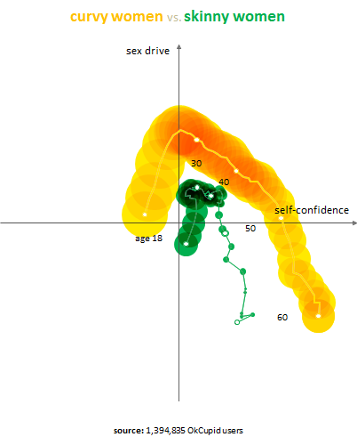
Curvy women pass skinny ones in self-confidence at age 29 and never look back. They also consistently have the highest sex drive among the groups. Curvy, as a word, has the strongest sensual overtones of all our self-descriptions. So we’re getting a little insight into the real-world implications of a label.

This is the “complete path” plot for men:

Things to notice: (1) almost no men choose curvy or full-figured as self-descriptions, so those words aren’t plotted here; (2) men of all body types have roughly the same peak sex drive; (3) and the thing that matters most for guys is simply to not be overweight. The other four body types are clustered relatively together at most ages.

Chart #9

For this chart, we took our own data and mixed it with a little outside stuff: college tuitions from U.S. News & World Report.

Generally speaking, the more your parents are paying for your education, the more horny you are. If only Freud were still around to help us understand; instead we have psychology majors, those Adidas shower sandals, and darkness.

You can think of the dotted best-fit line as dividing the good sex-ed values (above the line) from the bad ones (below). The line also gives us a handy sliding scale: given a 36-week school year and the average partner, every $2,000 spent on your college tuition is an extra time you could be having sex that year.

Chart #10

The correlation between sex and money is robust for colleges, but it gets even stronger when extended to entire nations.

We were amazed at this result—money seems to be a more powerful influence on sex drive than culture or even religion.

You have, for example, Portugal, Oman, Slovenia, and Taiwan within a few pixels of each other on the right side of the graph, and Syria, Sri Lanka, and Guatemala almost stacked on the left, and all of them sit along the trend line.

—-

This post was originally published on OkCupid’s blog

Photo Credits: OkCupid and Flickr CC HikingArtist.com


Data Journalism: The Story So Far

DATA MINER UK – by Nicola Hughes

Such a great article on the story of data journalism by Nicola Hughes that we decided to put it all! Get the original article on Data Miner UK

[youtube 3YcZ3Zqk0a8]

And here’s what Tim Berner-Lee, founder of the internet, said regarding the subject of data journalism:

Journalists need to be data-savvy… [it’s] going to be about poring over data and equipping yourself with the tools to analyse it and picking out what’s interesting. And keeping it in perspective, helping people out by really seeing where it all fits together, and what’s going on in the country

How the Media Handle Data:

Data has sprung onto the journalistic platform of late in the form of the Iraq War Logs (mapped by The Guardian), the MP’s expenses (bought by The Telegraph) and the leaked US Embassy Cables (visualized by Der Spiegel). What strikes me about these big hitters is the existence of the data is a story in itself. Which is why they had to be covered. And how they can be sold to an editor. These data events force the journalistic platform into handling large amounts of data. The leaks are stories so there’s your headline before you start actually looking for stories. In fact, the Fleet Street Blues blog pointed out the sorry lack of stories from such a rich source of data, noting the quick turn to headlines about Wikileaks and Assange.

Der Spiegel - The US Embassy Dispatches
Der Spiegel – The US Embassy Dispatches


So journalism so far has had to handle large data dumps which has spurred on the area of data journalism. But they also serve to highlight the fact that the journalistic platform as yet cannot handle data. Not the steady stream of public data eking out of government offices and public bodies. What has caught the attention of news organizations is social media. And that’s a steady stream of useful information. But again, all that’s permitted is some fancy graphics hammered out by programmers who are glad to be dealing with something more challenging than picture galleries (here’s an example of how  CNN used twitter data).

So infographics (see the Stanford project: Journalism in the Age of Data) and interactives (e.g. New York Times: A Peek into Netflix Queues) have been the keystone from which the journalism data platform is being built. But there are stories and not just pictures to be found in data. There are strange goings-on that need to be unearthed. And there are players outside of the newsroom doing just that.

How the Data Journalists Handle Data:

Data, before it was made sociable or leakable, was the beat of the computer-assisted-reporters (CAR). They date as far back as 1989 with the setting up of the National Institute for Computer-Assisted Reporting in the States. Which is soon to be followed by the European Centre for Computer Assisted Reporting. The french group, OWNI, are the latest (and coolest) revolutionaries when it comes to new age journalism and are exploring the data avenues with aplomb. CAR then morphed into Hacks/Hackers when reporters realized that computers were tools that every journalist should use for reporting. There’s no such thing as telephone-assisted-reporting.  So some whacky journalists (myself now included) decided to pair up with developers to see what can be done with web data.

This now seems to be catching on in the newsroom. The Chicago Tribune has a data center, to name just one. In fact, the data center at the Texas Tribune drives the majority of the sites traffic. Data journalism is growing alongside the growing availability of data and the tools that can be used to extract, refine and probe it. However, at the core of any data driven story is the journalist. And what needs to be fostered now, I would argue, is the data nose of a (any) journalist. Journalism, in its purest form, is interrogation. The world of data is an untapped goldmine and what’s lacking now is the data acumen to get digging. There are Pulitzers embedded in the data strata which can be struck with little use of heavy machinery. Data driven journalism and indeed CAR has been around long before social media, web 2.0 and even the internet. One of the earliest examples of computer assisted reporting was in 1967, after riots in Detroit, when Philip Meyer used survey research, analyzed on a mainframe computer, to show that people who had attended college were equally likely to have rioted as were high school dropouts. This turned the publics’ attention to the pervasive racial discrimination in policing and housing in Detroit.

Where Data Fits into Journalism:

I’ve been looking at the States and the broadsheets reputation for investigative journalism has produced some real gems. What stuck me, by looking at news data over the Atlantic, is that data journalism has been seeded earlier and possibly more prolifically than in the UK. I’m not sure if it’s more established but I suspect so (but not by a wide margin). For example, at the end of 2004, the then Dallas Morning News analyzed the school test scores of the Texas Assessment of Knowledge and Skills and uncovered one school’s alleged cheating on standardized tests. This then turned into a story on cheating across the state. The Seattle Times piece of 2008, logging and landslides, revealed how a logging company was blatantly allowed to clear-cut unstable slopes. Not only did they produce and interactive but the beauty of data journalism (which is becoming a trend) is to write about how the investigation was uncovered using the requested data.

The Seattle Times: Landslides in the Upper Chehalis River Basin


Newspapers in the US are clearly beginning to realize that data is a commodity for which you can buy trust from your consumer. The need for speed seems to be diminishing as social media gets there first, and viewers turn to the web for richer information. News in the sense of something new to you, is being condensed into 140 character alerts, newsletters, status updates and things that go bing on your mobile device. News companies are starting to think about news online as exploratory information that speaks to the individual (which is web 2.0). So the The New York Times has mapped the census data in its project “Mapping America: Every City, Every Block”. The Los Angeles Times has also added crime data so that its readers are informed citizens not just site surfers. My personal heros are the investigative reporters at ProPublica who not only partner with mainstream news outlets for projects like Dollars for Doctors, they also blog about the new tools they’re using to dig the data. Proof the US is heading down the data mine is the fact that Pulitzer finalists for local journalism included a two year data dig by the Las Vegas Sun into preventable medical mistakes in Las Vegas hospitals.

Lessons in Data Journalism:

Another sign that data journalism is on the up is the recent uptake at teaching centres for the next generation journalist. Here in the UK, City University has introduced an MA in Interactive Journalism which includes a module in data journalism. Across the pond, the US is again ahead of the game with Columbia University offering a duel masters’ in Computer Science and Journalism. Words from the journalism underground are now muttering terms like Goolge Refine, Ruby and Scraperwiki. O’Reilly Radar has talked about data journalism.

The beauty of the social and semantic web is that I can learn from the journalists working with data, the miners carving out the pathways I intend to follow. They share what they do. Big shot correspondents get a blog on the news site. Data journalists don’t, but they blog because they know that collaboration and information is the key to selling what it is they do (e.g Anthony DeBarros, database editor at USA Today). They are still trying to sell damned good journalism to the media sector!  Multimedia journalists for local news are getting it (e.g David Higgerson, Trinity Mirror Regionals). Even grassroots community bloggers are at it (e.g. Joseph Stashko of Blog Preston). Looks like data journalism is working its way from the bottom up.

Back in Business:

Here are two interesting articles relating to the growing area of data and data journalism as a business. Please have a look: Data is the New Oil and News organizations must become hubs of trusted data in a market seeking (and valuing) trust.