
A batch of stats may ostensibly seem dry – but I was having a ponder about the benefits of using data to bring depth to a topical news story. And if by magic, one cropped up, that could definitely do with some spreadsheet-based wizardry to soup it up.
The Human Fertilisation and Embryology Authority (HFEA), which will soon be absorbed by the Care Quality Commission, is launching a new drive for donors.
The HFEA want the public to think of donating eggs and sperm in the same light as blood or organ donation; and by the way, there are 18 million Brits currently on the national donor register. They hope a new strategy group will raise awareness and help strip some of the donor taboo away.
A chronic donor shortage is, they say, forcing some women to go abroad for treatment, sometimes to unregulated clinics.
Recent efforts to raise donor levels include an substantial rise in the amount of compensation given to donors for loss of their earnings.
So I thought I’d look through the HFEA’s vast bank of data. How many willing donors are there at the moment? How many DIs (donor inseminations) happen each year?
Firstly donor registrations have risen slightly of late, after a dip. The number of men donating, however, has barely risen since the early 1990s.
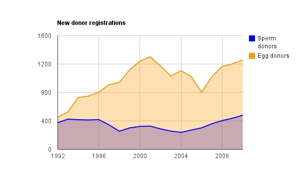
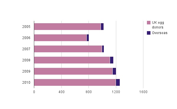
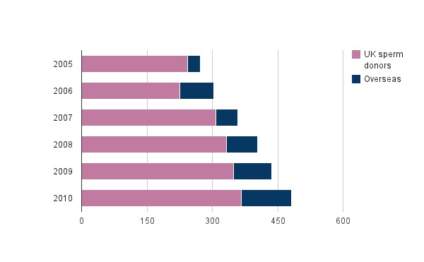
Interestingly, not all these donors are from the UK; the figures include those who donated overseas and whose sperm or eggs were imported to the UK plus those who donated in the UK but technically live abroad. Overseas donors are on the upward trajectory;
To be honest, I was expecting to see far more dramatic patterns. Shock-horror headlines would have you believe there’s been a wholesale collapse in donor registrations, when in fact there has been a long-term lift.
But, and it’s a big but, this trend needs to be be placed in the context of more women waiting for donations. To quote the HFEA…
The number of women treated has increased steadily since the early 1990s.
In 1992 a touch over 14000 women received IVF treatment – now it’s around 40000.
Not all women require a donation – in fact the vast majority don’t. However, it’s widely believed that the trend towards older motherhood is raising demand for donors; since the proportion of women requiring donations increases with age.
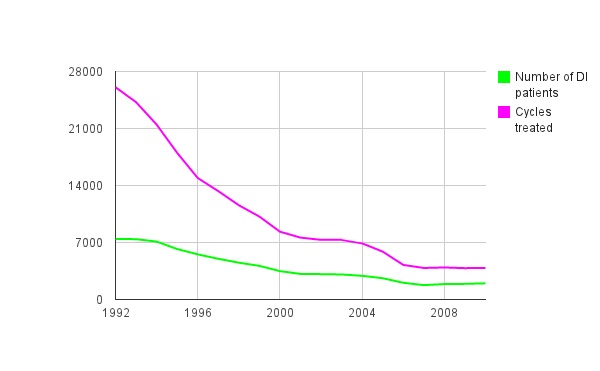
In 2010, 1,985 women had donor insemination (DI) treatment, receiving 3,878 cycles of treatment; an increase of 0.8% on 2009.
But over time, the decline in DI treatments is significant. Even more stark when you consider the swelling ranks of women requiring donations.
Also remember that some of these DIs will happen as a result of a donation from a friend or family member – not all women who need a donation will be treated with sperm or eggs from the general reserve of donors.
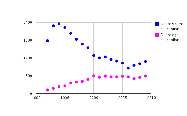
Conceptions via DI – which, it must be remembered, won’t all result in live births – are interesting plotted on a chart. Contrast the patterns with the inexorable decline in the chart above;
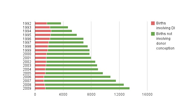
This graphic shows IVF births; the overall number conceived through DI has stay fairly stable but has free-falled in terms of overall proportion.
What these stats don’t tell us is the why. We know that the changes of laws on anonymity have stifled the growth of donor levels – but what of the other trends? They, I think, warrant some further (non-data) investigation.