1. Tell the reader what the data means
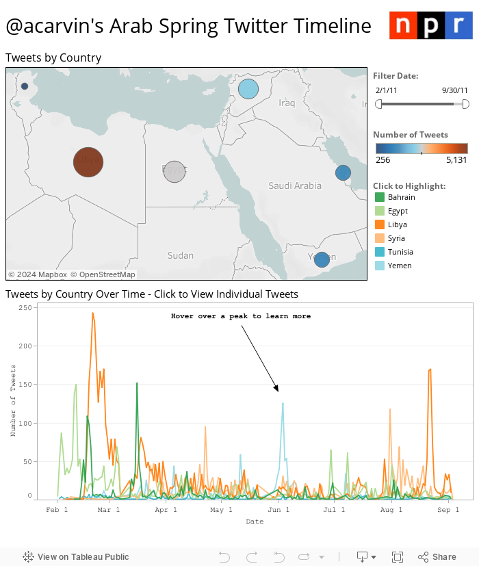
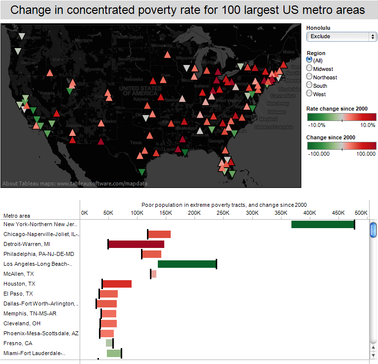
Tools like Tableau make it really easy to make exploratory visualisations, giving the user the ability to sift through the data and localise it to themselves. However, as tempting as this can be, the role of the data journalist it to tell the reader what the data means — if you have a dataset that includes the entire country but only a handful of locations are relevant to your story, an exploratory map isn’t the best approach. Aim for explanatory visualisations.
2. Simple is usually better
A quick glance through the examples page of d3js.org reveals a wealth of different and unusual ways to visualise data. While there are definitely occasions where an exotic visualisation method communicates the data more effectively than a simple line or pie chart, these are really rather rare. The Economist’s use of series charts to efficiently summarise an entire article in a tiny space demonstrates how effective the “classic” visualisation types are — there’s a reason they’ve stood the test of time (The Economist’s incredibly clear descriptions and simple writing style also really help here). Meanwhile, I don’t think I’ve ever gained any insights from a streamgraph, pretty as they are.
3. Code for quality
News moves really quickly, which can make it exceptionally difficult to code for quality over speed. Nevertheless, all aspects of your data visualisation need to work — a bug causing a minor element like a tooltip to not update or report the wrong data can at best reduce reader confidence, or at worst, taint a long and costly investigation, possibly even leading to libel proceedings. This is made all the more difficult by the fact that JavaScript is what’s referred to as a “weakly typed” language, meaning that variable types (strings, numbers, objects, et cetera) can mutate over the course of a script’s execution without throwing errors — for instance, `Number(a + b)` will either return the sum of `a` and `b` or the concatenated value of those two variables (e.g., `’1’ + ‘2’ = ‘12’`), depending on whether they’re strings or numbers to begin with. This can be incredibly difficult to discover and troubleshoot. Fortunately, projects like Flow and TypeScript seek to add type annotations to JavaScript, effectively solving this problem (My recent open source project, generator-strong-d3, makes it really easy to scaffold a D3 project using either of these). Another way to improve code quality is to provide automated tests, which are a bit more work at the outset but will prevent bugs from cropping up as you get frantic towards deadline. “Test-Driven Development” (TDD) is a good practise to get into as it encourages you to write tests at the very beginning and then develop until those pass. It’s also a lot faster than writing tests later (or not at all, i.e., “cowboy coding”) once you get the hang of it, as you can save a lot of time avoiding the “make a change, refresh, manually execute a behaviour, evaluate output, repeat” cycle.
Ændrew Rininsland is a senior newsroom developer at The Times and Sunday Times and all-around data visualisation enthusiast. In addition to Axis, he’s the lead developer for Doctop.js, generator-strong-d3, Github.js and a ludicrous number of other projects. His work has also been featured by The Guardian, The Economist and the Hackney Citizen, and he recently contributed a chapter to Data Journalism: Mapping the Future?, edited by John Mair and Damian Radcliffe and published by Abramis. Follow him on Twitter and GitHub at @aendrew.


