OWNI.eu by EKATERINA YUDIN
How do we even begin to visualize and draw connections between the intimately complex relationship that exists between food and emotion? Here is a great article by Ekaterina Yudin that we picked for its compelling data visualisations. You can find the original version on the Masters of Media website, otherwise read on! It is worth it.
Can we discover patterns amongst global food trends and global emotional trends? Could data visualization help us weave a story, and make use of the complex streams of data surrounding food and its consumption, to reveal insights otherwise invisible to the naked eye? And why would we try to do so in the first place?
To begin, let’s just establish that one has an ambitious appetite.
For our group information visualization project we have set out to measure global food sentiment. The main objective of our project matches the very definition of information visualization first put forth by Card et al. (1999) – of using computer-supported, interactive, visual representations of data to amplify cognition, where the main goal of insight is discovery, decision making (as investigated in my last post), and explanation. Our mission is to gauge and visualize, in real-time, the planet’s feelings towards particular foods using Twitter data; does pizza make everyone happy, do salads make people sad, does cake comfort us? Will there be an accordance of food with nations?

Setting the visualization in the backdrop of country GDP and obesity levels we can begin to ponder how the social, political and cultural issues will play out and what reflections of globalization will emerge. Will richer countries be more obese? It should be noted that being restricted to English language tweets for now creates a huge bias in our visualization, and one should keep in mind that the snapshot of data will obviously not be completely representative of the entire world; for example, in developing countries it’s most probable that only rich/modern people speak English AND use Twitter at the same time.
The relationships between all the variables is already an enigmatic one, particularly when each carry their own layers of baggage, so a narrative of complexity emerges even before the visualization can be realized. Incidentally this is the story the data is already beginning to weave, which makes it a perfect calling for data visualization to reduce the complexity, present it in a meaningful way we can understand and use its power of storytelling to understand our puzzling relationships towards food — a story worth discovering.
WHY FOOD?
Food is at the core of our daily survival, with broad-ranging effects on personal health, and a particularly hot topic these days with everyone having some opinion about it — after all, everyone needs it, which makes food intrinsically emotional. So it is no surprise that a wealth of conversations emerge about food when today’s increased citizen interest, health focus and demand for a transparent food industry collide; to top it off, this is all happening amidst concerns of food security, shortages, rising food prices, obesity, hunger, addiction and diseases. With data related to food increasingly open, the benefits of using data visualization, as well as the empowerment that access to layers of hidden information produces, is already being explored on the web.
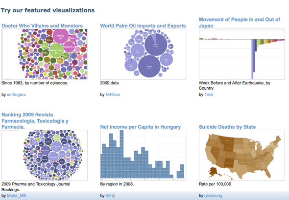
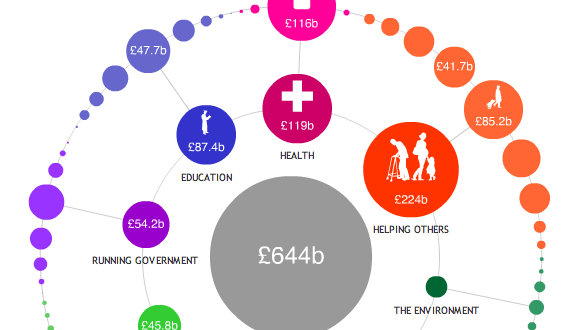
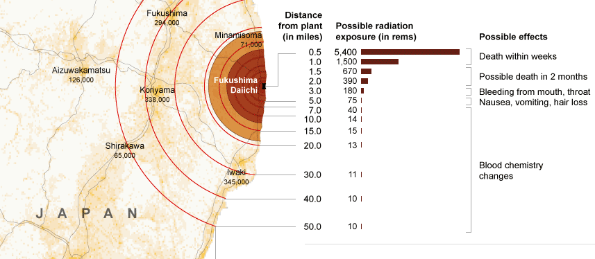
A brief survey of food visualizations reveal: the ten most carnivorous countries, world hunger visualization, how the U.S.A was much thinner not that long go, snacks available in middle and high school vending machines, calories per dollar, driving is why you’re fat, where Twinkies come from, and so on.


Health issues related to food run high in the corpus of visualizations and it is no surprise. With improved access to information about food (sources, ingredients, effects, consumption statistics, etc.) presented in a visually engaging way, we can begin to distill the essential changes that could then impact our food-purchasing choices, enable better health, and enhance the design of an open food movement. [An additional reel of 60 food/health infographics can be found here].
Food is not just a lifestyle that is essential and important to the world. It can also be one of the most effective ways to reshape health, poverty issues, and relationships; and because it touches all facets of life, it shouldn’t be treated as just a lifestyle’y sort of thing. –Nicola Twilley (FoodandTechConnect Interview)
What’s the insight worth?
Beyond helping discover new understandings amidst a profoundly complicated world where massive amounts of information create a problem of scaling, a great visualization can help create a shared view of a situation and align people on needed action — it can often make people realize they are more similar than different, and that they agree more than they disagree. And it is precisely via stories — which are compelling and have always been used to convey information, experiences, ideas and cultural values — that we can begin to better understand the world and transform the interdependent factors of food and sentiment discussions into a visual form that makes sense. In this way, food – a naturally social phenomenon — can become our lens that reveals patterns in society.
A multitude of blogs, projects and companies such as GOOD’s Food Studies, Food+Tech Connect,The Foodprint Project, innovation series like the interactive future of food research) and lest not forget Jamie Oliver’s food revolution, to name just a few, propel the exploration, understanding and the reshaping of conversation about food, health and technology today and in the future. (Food+Tech Connect, 2011). But it is the newest wave of infographics and data visualizations that seek to draw our attention to epidemics such as food shortages and obesity by illustrating meaning in the numbers for people to truly see and understand the implications.
A WEB OF FEELINGS
We also can’t entirely separate feelings from food. People consistently experience varying emotional levels (see Natalie’s post on this very subject) and these play key roles in our daily decision-making. Emotions, too, have now begun to be mapped out in visualizations ranging from a mapping of a nation’s well being to a view of the world mean happiness.


Taking food and emotion together we come to understand that this data of the everyday paints a picture and hyper-digitizes life in a way that self-portraits and global portraits of food consumption patterns begin to emerge. As psychology researchers have shown us, people are capable of a diverse range of emotions. And because food provides a sense of place – a soothing and comforting feeling — it makes food evoke strong emotions that tie it right back to the people (Resnick, 2009).
Now that we spend a majority of our time online, our feelings and raw emotion, too, find their way to the web. We can visualize this phenomenon with projects like We Feel Fine, which taps into our and other people’s emotions by scanning the blogosphere and mapping the entire range of human emotions (thereby essentially painting a picture of international human emotion), I want you to want me, which explores the complex relationship on love and hope amongst people, Lovelines, which illuminates the emotional landscape between love and hate, and The Whale Hunt, which explores death and anxiety.
What all these visualizations have in common is the critical component of an emotional aesthetic — the display of people’s bubbling feelings that are often removed from visualizations but is the very human aspect we tend to remember. This is in line with Gert Nielsen’s philosophy that he shared with the audience at the Wireless Stories conference early last month — that you can’t take the human being out of the visualization or else you take out the emotion, too; the key, it seems, is data should ‘enrich’ the human stuff and the powerful human stories that are waiting to be captured and told.
MAKING DISCOVERIES AND SPREADING AWARENESS IN A SEA OF DATA
Which brings us to our data deluge world. We’re increasingly dependent on data while perpetually creating it at the same time. But creating data isn’t the question (at least not for Western and emerging countries, whereas producing relevant data for developing countries is still quite a challenge) – it’s whether someone is paying attention to the data, and whether someone is using the data usefully in an even larger question (Resnick, 2009).
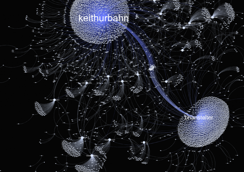
The age of data accessibility, information [sharing], and connectivity allows people, cultures and institutions to share and influence each other daily via a plethora of broadcast platforms available on the web; these function as a public shout box for daily chatter, emotional self-expression, social interaction, and commiseration. Twitter – the social media network, twenty-four-hour news site and conversation platform that connects those with access across the world — is also the chosen data pool for our project. It’s a place to share just as much as it is to peek into other lives and conversations. And precisely because it’s a place where millions of people express feelings and opinions about every issue that the distillation of knowledge from this huge amount of unstructured data becomes a challenging task. In this case visualization can serve to extend the digital landscape to better understand broadcasts of human interaction. Our digital lives, and conversations within them, are full of traces we leave behind. But by transcoding and mapping these into visual images, representations, and associations, we can begin to comprehend meanings and associations.
Twitter is also a narrative domain, and serves as a platform for Web 2.0 storytelling – the telling of stories using Web 2.0 tools, technologies, and strategies (Alexander & Levine, 2008). Alexander and Levine (2008) distinguish such web 2.0 projects as having features of micro-content (small chunks of content, with each chunk conveying a primary idea or concept) and social media (platforms that are structured around people). With the number of distributed discussions across Twitter, a new environment for storytelling emerges — one we will explore to uncover and analyze global patterns amongst conversations surrounding food sentiment.
SO WHAT’S THE FOOD + EMOTION STORY?

As put forth by Segel & Heer (2009), each data point has a story behind it in the same way that every character in a book has a past, present, and future, with interactions and relationships that exist between the data points themselves. Thus, to reveal information and stories hiding behind the data we can turn to the storytelling potential of data visualization, where visualization can serve to create new stories and insights that can ultimately function in place of a written story. These new types of stories — ones that are made possible by data visualization — empower an open door for the free exploration and filtering of visual data, which according to Ben Shneiderman also allow people to become more engaged (NYTimes, 2011).
To date, the storytelling potential of data visualization has been explored and popularized by news organizations such as the NY Times and the Guardian, where visualizations of news data are used to convince us of something (humanize us), compel us to action, enlighten us with new information, or force us to question our own preconceptions (Yau, 2008). There is a growing sense of the importance of making complex data visually comprehensible and this was the very motivation behind our project; of linking food and emotion sentiment with country GDP and obesity to see if insightful patterns emerge using this new visual language. With our visualization still in progress, and data still dispersed, I’m still wondering what’s the story and what could the story of our visualization become? Will the visualization of our data streams produce something insightful? What will we be able to say about how people feel towards foods in different countries? At this point it’s only a matter of time until we dig deeper into the complexities of our real world data ti understand the (food <–> emotion) <–> (income <–> obesity) paradox.
—
This post was originally published on Masters of Media
Photo Credits: The New York Times, R. Veenhoven, World Database of Happiness, Trend in Nations, Erasmus University Rotterdam, World Food Program, GOOD and Hyperakt, A Wing, A prayer, Zut Alors, Inc. and GOOD, and Flickr CC Kokotron
References:
Alexander, B. & Levine, A. (2008). “Web 2.0 Storytelling: Emergence of a New Genre”. Web. Educause. Accessed on 19/04/11
Card, K.S., Mackinlay, J. D., & Shneiderman, B. (1999). “Readings in Information Visualization, using vision to think”. Morgan Kaufmann, Cal. USA.
Resnick, M. (2009). “The Moveable Feast of Memory”. Web. PsychologyToday.com. Accessed on 20/04/11
Segel, E. & Heer, J. (2010). “Narrative Visualization: Telling Stories with Data”.
Singer, N. (2011). “When the Data Struts Its Stuff”. Web. NYTimes.com. Accessed on 19/04/11
Yau, N. (2008). “Great Data Visualization Tells a Great Story”. Web. FlowingData.com. Accessed on 20/04/11


