INTERACTIVE MAP + How-to: overcrowding in London


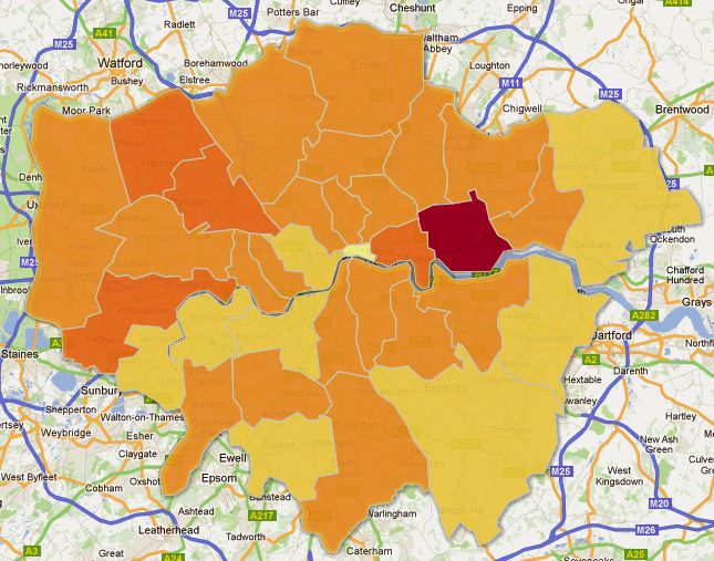
This heat map, produced on Google Fusion Tables presents the levels of overcrowding in London, as in 2010. The data was published by the London datastore in March 2012 and presented figures for both the base figure (number of houses overcrowded) and that number as a percentage of the whole borough. The information mapped here is the percentage figures, however, the map is interactive, and clicking on each borough will give you the base figure information.

Overcrowding for the purposes of this data set is defined by the ‘bedroom standard’, explained on the London Datastore website:

‘Bedroom standard’ is used as an indicator of occupation density. A standard number of bedrooms is allocated to each household in accordance with its age/sex/marital status composition and the relationship of the members to one another. A separate bedroom is allocated to each married or cohabiting couple, any other person aged 21 or over, each pair of adolescents aged 10 – 20 of the same sex, and each pair of children under 10. Any unpaired person aged 10 – 20 is paired, if possible with a child under 10 of the same sex, or, if that is not possible, he or she is given a separate bedroom, as is any unpaired child under 10. This standard is then compared with the actual number of bedrooms (including bed-sitters) available for the sole use of the household, and differences are tabulated. Bedrooms converted to other uses are not counted as available unless they have been denoted as bedrooms by the informants; bedrooms not actually in use are counted unless uninhabitable.

Overcrowding figures include households with at least one bedroom too few.

The map clearly shows that the borough of Newham has the worst overcrowding situation with 17.9 per cent of households in the borough overcrowded; a figure of 506 households. However, the borough with the highest base rate figure was Enfield, with 670 households being overcrowded, 7.1 per cent of the borough.

In July 2011, Shelter Housing charity announced that their analysis of the English Housing Survey revealed that 391,000 children (24 per cent) in London suffered from overcrowding, which they said was an 18 per cent rise since 2008. Unfortunately the data provided by the Datastore did not break down the data into person specification categories, however, it is clear from the figures that overcrowding in London is a growing problem.

The Fusion Map was created by importing data from a spreadsheet into Google Fusion Tables and then merging this data with KML shape files for London, to get the heat map effect. Each Borough has an identification code, which my original data did not have, so I had to input this manually for each borough in my original data set before merging the two files – this provides a point of reference for the merge, so there are two identical pieces of information for each row to match up with.

I then chose the column I wanted the map to represent, in this case the percentage data. To get the map to show a range of colours related to the data, I set the map to have what are called “buckets”, this is the range of numbers represented by each colour. I then modified the colours I wanted to use with a system called colorbrewer, which allows you to customize colours showing specific colour ranges for heat maps. Finally I modified the information windows for each borough to show specifically the information I wanted, and in the style I wanted – this takes a small amount of HTML know-how.

I hope you enjoy this data map, and are inspired to create your own maps using Google Fusion in the future.

 

Data and the London Mayoral elections – let the data help you decide

The Guardian’s Data Store have compiled a catalogue of all the data to do with London, to give readers an objective and overall view of what is happening in the capital.
Polly Curtis’ reality check on 12 April, pins Boris Johnson and Ken Livingstone against each other and asks, “Who is right on police numbers?” She then outlines the Met police figures for London, highlighting what each party have claimed. Polly’s verdict:

Johnson’s campaign is correct in claiming that police officer numbers have risen over his term, albeit only by 2.4% if you take the baseline to be the March 2008, closest to when he was elected in May. But Labour is right that since 2009, the last year that Livingstone budgeted for, numbers have fallen overall by 1.17%.

An interactive map of the number of cycle and pedestrian road casualties offers in insight into road traffic accident hotspots across London. The map produced by ITO World for campaigning group See Me, Save Me, gathers together a decade of road casualty data from the Department for Transport called Stats19. The map distinguishes between pedestrians and cyclists and divides them up between those who were hit by Heavy Goods Vehicles (HGV) and those that weren’t. It also shows the age of the pedestrian or cyclist and the year of the accident. The stand first of the map asks, “With transport a key issue in the mayoral election, what patterns does this map show?”

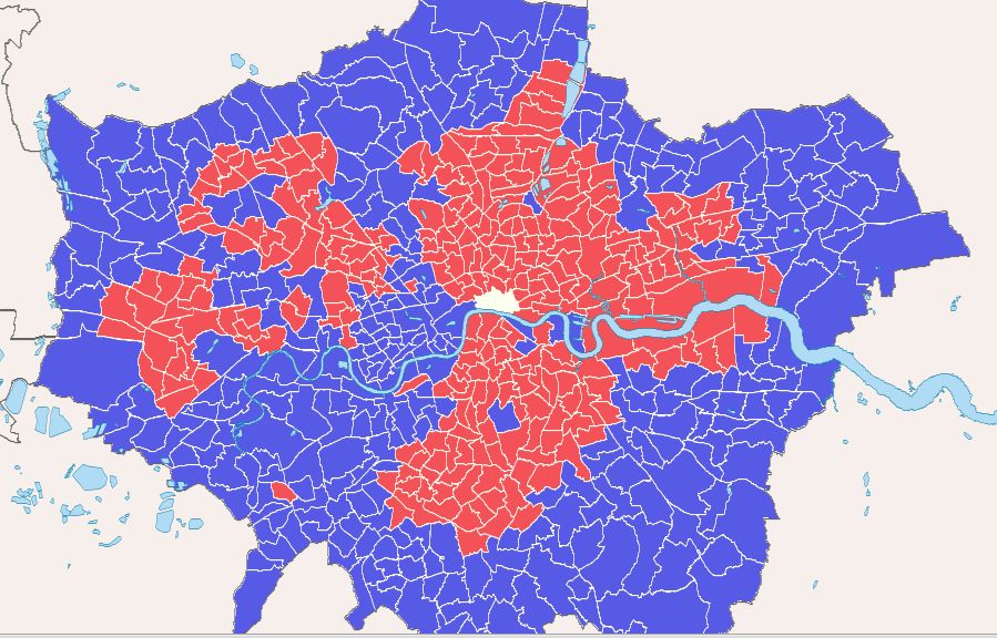
In addition to showing a map of poverty and deprivation in London, data behind health, education and crime, the Data Store have also created a map showing how London voted in the last Mayoral elections, to give an overview of the Conservative and Labour areas across the capital.

Looking into data and presenting them as maps and infographics can show the bigger context behind a story and make figures more accessible. The Guardian Data stores compilation of London Data allows readers to get an objective view of their city before making decisions on who to vote for this coming Thursday 3 May. Take a look at the data for yourself at http://www.guardian.co.uk/uk/series/london-the-data before voting begins in a couple of days!

How much does society actually mix?

The Office for National Statistics recently released results from the Citizenship Survey, conducted by the Department for Communities and Local Government for 2010-2011. The survey aimed to find out the level of integration in the UK between different ethnic and religious groups. The data was categorised by locations that people are likely to mix, for example at the shops, within schools, at work and within the home. Continue reading “How much does society actually mix?”

Metropolitan Police expenditure on cars is on the rise

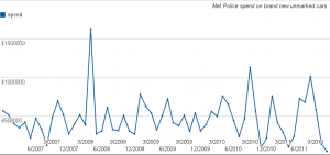
The Metropolitan Police’s expenditure on brand new unmarked cars is rising, a Freedom of Information request can reveal. In excess of £28 million was spent on new cars between December 2006 and November 2011.

Annual spending figures show that expenditure has risen from £4.8 million in 2007, to £6 million in 2010, with spend exceeding the £1 million mark in single months alone; £1.6 million was spent in April 2008 alone, and £1 million spent in August 2011. Unmarked police cars do not display any police logos and are used by police to assist in operations and responding to incidents. These figures therefore exclude any money spent on the Metropolitan Police’s marked fleet cars, and considering the cuts being made to policing across the country, the increasing spend is concerning.

When questioned about the figures, a Metropolitan Police spokesperson said:

“The MPS Fleet contains over 5,000 vehicles with a wide range of functions, capabilities and specialisms. Maintaining the fleet requires the purchase and maintenance of vehicles – some of which are without police livery. Procurement of vehicles is through a competitive tender process and framework, ensuring we obtain best value for money. Unmarked vehicles are often directly involved with or support operational activity and although not instantly recognisable to the public, play a crucial role as part of our fleet and supporting policing London.” The Metropolitan Police refused to comment on how many cars that were bought with the figures revealed, nor on specifically the type of cars that were bought.

Emma Boon, Campaign Director of the Tax Payer’s Alliance commented on the matter saying: “It’s worrying that Met police spending on fast cars increased by over a million pounds in just a couple of years. Clearly the force will need some high performance vehicles to be able to do their job properly, but these figures show spending in this area increasing, even during the recent recession. With police budgets tight, the Met must get this spending under control and ensure that they are getting the best value for taxpayers’ money”.

What’s next for the DJB? [Letter from the NEW editors]

Hello DJB Community,

If you’ve noticed a lull in activity here at the Data Journalism Blog over the last couple of weeks, it’s because the site has been undergoing a few changes. Marianne has got the DJB to where it is single-handedly but now that she has other commitments we (Neha-Tamara Patel and John Burn-Murdoch) will be taking over editorial responsibilities – don’t worry, Marianne will be keeping an eye on our progress! (You can read her final post here)
We are aspiring data-journalists studying on City University’s MA Interactive Journalism course, and along with our class-mates we aim to continue the DJB’s peerless coverage of data-driven journalism.

As far as content is concerned we will be trying not to stray from the formula that has worked so well thus far, although we have plans for a couple of new additions. The two areas on which we aim to focus are highlighting the best data-visualisations on the web, and building a strong online community here at datajournalismblog.com.

Alongside these aims we will continue to showcase developments in the field of data journalism, be it through interviews with leading data journalists, guides to using software or reviews of new data-related tools and applications.

Another section will look at the life-cycle of a data-driven news story, as we bring you updates on a series of ongoing investigations into topics including public spending, education, health and crime statistics.

As always, we would love to hear what you think about our plans, and we welcome comments on any of the above as well as thoughts on the site in general!

John and Neha