How tall are our world leaders? [Visualised]

THE GUARDIAN’S DATA BLOG – By 

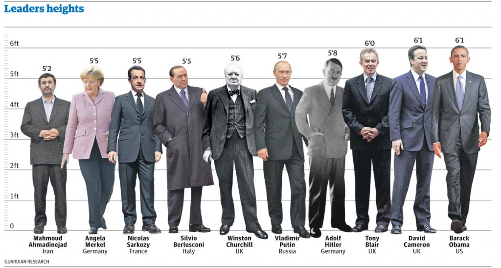
It seems we like our political giants to be just that – giants – according to new research. See how they compare in the height stakes
• Get the data


World leaders’ heights: click image for graphic

Stature really does matter according to a new scientific paper published today in Social Science Quarterly.

Here at the Datablog we thought this was an opportunity too good to pass up. How tall really are our world leaders and how do they compare?

Psychologists from Texas Tech University found in a study that almost two-thirds of participants showed a preference to draw larger figures when asked to draw images of leaders. An evolutionary throwback has been suggested as the root of this. Nic Fleming writes today:

It is not for nothing that top politicians are known as political giants or “big beasts”. Voters see tall politicians as better suited for leadership, according to a survey of how people visualise their leaders. Psychologists believe the bias may stem from an evolved preference for physically imposing chiefs who could dominate enemies.

David Cameron and Barack Obama certainly fit the profile at 6ft 1in and have both beaten shorter candidates in past elections – Gordon Brownat 5ft 11ins and John McCain at 5ft 8ins. [Read more…]

Data visualisation: in defence of bad graphics

THE GUARDIAN’S DATABLOG – By 

Well, not really – but there is a backlash gathering steam against web data visualisations. Is it deserved?

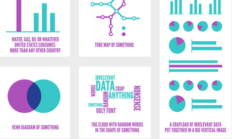
Most popular infographics

Most popular infographics by Alberto Antoniazzi

Are most online data visualisations, well, just not very good?

It’s an issue we grapple with a lot – and some of you may have noticed a recent backlash against many of the most common data visualisations online.

Poor Wordle – it gets the brunt of it. It was designed as an academic exercise that has turned into a common way of showing word frequencies (and yes, we are guilty of using it) – an online sensation. There’s nothing like ubiquitousness to turn people against you.

In the last week alone, New York Times senior software architect Jacob Harris has called for an end to word clouds, describing them as the “mullets of the Internet“. Although it has used them to great effect here.

While on Poynter, the line is that “People are tired of bad infographics, so make good ones

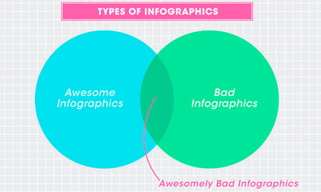
Awesomely bad infographicsAwesomely bad infographics from How to Interactive Design Photograph: How To Interactive Design

Grace Dobush has written a great post explaining how to produce clear graphics, but can’t resist a cry for reason.

What’s the big deal? Everybody’s doing it, right? If you put [Infographic] in a blog post title, people are going to click on it, because they straight up can’t get enough of that crap. Flowcharts for determining what recipe you should make for dinner tonight! Venn diagrams for nerdy jokes! Pie charts for statistics that don’t actually make any sense! I have just one question—are you trying to make Edward Tufte cry?

Oh and there has also been a call for a pogrom of online data visualisersfrom Gizmodo’s Jesus Diaz:

The number of design-deficient morons making these is so ridiculous that you can fill an island with them. I’d do that. And then nuke it

A little extreme, no?

There has definitely been a shift. A few years ago, the only free data visualisation tools were clunky things that could barely produce a decent line chart, so the explosion in people just getting on and doing it themselves was liberating. Now, there’s a move back towards actually making things look, er, nice. [Read more…]


The work of data journalism: Find, clean, analyze, create … repeat

O’REILLY RADAR – By 

Data journalism has rounded an important corner: The discussion is no longer if it should be done, but rather how journalists can find and extract stories from datasets.

Of course, a dedicated focus on the “how” doesn’t guarantee execution. Stories don’t magically float out of spreadsheets, and data rarely arrives in a pristine form. Data journalism — like all journalism — requires a lot of grunt work.

With that in mind, I got in touch with Simon Rogers, editor of The Guardian’s Datablog and a speaker at next week’s Strata Summit, to discuss the nuts and bolts of data journalism. The Guardian has been at the forefront of data-driven storytelling, so its process warrants attention — and perhaps even full-fledged duplication.

Our interview follows.

What’s involved in creating a data-centric story?


Simon RogersSimon Rogers: It’s really 90% perspiration. There’s a whole process to making the data work and getting to a position where you can get stories out of it. It goes like this:

  • We locate the data or receive it from a variety of sources — from breaking news stories, government data, journalists’ research and so on.
  • We then start looking at what we can do with the data. Do we need to mash it up with another dataset? How can we show changes over time?
  • Spreadsheets often have to be seriously tidied up — all those extraneous columns and weirdly merged cells really don’t help. And that’s assuming it’s not a PDF, the worst format for data known to humankind.
  • Now we’re getting there. Next up we can actually start to perform the calculations that will tell us if there’s a story or not.
  • At the end of that process is the output. Will it be a story or a graphic or a visualisation? What tools will we use?

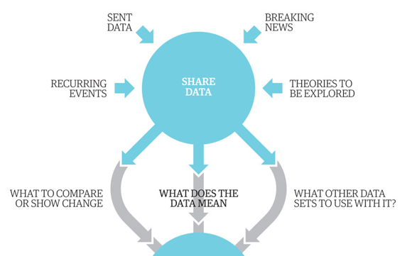
We’ve actually produced a graphic (of how we make graphics) that shows the process we go through:


Guardian data journalism process
Partial screenshot of “Data journalism broken down.” Click to see the full graphic.

What is the most common mistake data journalists make?

Simon Rogers: There’s a tendency to spend months fiddling around [Read more…]


Data journalism at the Guardian: what is it and how do we do it?

Data journalism. What is it and how is it changing? Photograph: Alamy

The Guardian’s Data Blog – By 

Simon Rogers: Our 10 point guide to data journalism and how it’s changing

Here’s an interesting thing: data journalism is becoming part of the establishment. Not in an Oxbridge elite kind of way (although here’s some data on that) but in the way it is becoming the industry standard.

Two years ago, when we launched the Datablog, all this was new. People still asked if getting stories from data was really journalism and not everyone had seen Adrian Holovaty’s riposte. But once you’ve hadMPs expenses and Wikileaks, the startling thing is that no-one asks those questions anymore. Instead, they want to know, “how do we do it?”

Meanwhile every day brings newer and more innovative journalists into the field, and with them new skills and techniques. So, not only is data journalism changing in itself, it’s changing journalism too.

These are some of the threads from my recent talks I thought it would be good to put in one place – especially now we’ve got an honourable mention in the Knight Batten award for journalistic innovation. This is about how we do it at the Guardian. In 10 brief points.

1. It may be trendy but it’s not new

Nightingale graphic
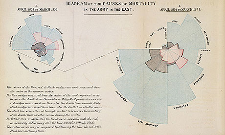
Florence Nightingale's 'coxcomb' diagram on mortality in the army


Data journalism has been around as long as there’s been data – certainly at least since Florence Nightingale’s famous graphics and report into the conditions faced by British soldiers of 1858. The first ever edition of the Guardian‘s news coverage was dominated by a large (leaked) table listing every school in Manchester, its costs and pupil numbers. [Read more…]


Phone hacking resignation statements: visualised and listed

THE GUARDIAN DATA STORE – By

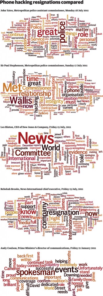
Andy Coulson, Rebekah Brooks, LesHinton, Met Commissioner Sir Paul Stephenson and now John Yates – see what their resignation statements had in common

Get the data

News of the World phone hacking resignations - as a Wordle

The News of the World phone hacking scandal has prompted resignation after resignation, and with each one has come with a statement issued to the press.

So far, we have had five major resignations in the wake of the scandal:

• Andy Coulson, Prime Minister’s director of communications, Friday 21 January 2011 | full statement
• Rebekah Brooks, News International chief executive, Friday 15 July, 2011 | full statement
Les Hinton, CEO of Dow Jones & Company, Friday 15 July, 2011 | full statement
• Sir Paul Stephenson, Metropolitan police commissioner, Sunday 17 July 2011 | full statement
• John Yates, Metropolitan police assistant commissioner, Monday 18 July, 2011 | full statement

And with each statement, the language has been carefully planned and calibrated to say exactly what resignee wants to get across to the world. [Read more…]

Data journalism – is it worth it?

IN PUBLISHING – By Paul Bradshaw

Whether it is the desire to replicate the enormous sales successes of the MPs’ expenses and WikiLeaks revelations, or publishers wanting to expand into selling data services, it seems everyone wants to do something with data. The only question, writes Paul Bradshaw, is: where to start?

When Simon Rogers first asked to publish data on the Guardian website, someone asked: “Who on earth would want to look at a spreadsheet online?” It turned out that over 100,000 people would regularly hit the website to do just that. One person’s audit, it seemed, was another’s sticky content. And the past few years have seen data transformed from conversation killer to hot topic – in both newsroom and boardroom.

Tapping into development talent

For some publishers, the advantage of a data-driven approach to news production is that it allows them to tap into latent development talent within the readership. The Guardian and the New York Times are among an increasing number of media organisations to publish APIs – Application Programming Interfaces – that allow web developers to build new products with their content and – equally importantly – the data surrounding it. In return, the new services can carry advertising sold by the publisher, drive new traffic to the original site, or act as market research to demonstrate demand for a more developed proposition (as happened, for example, with the Guardian’s mobile app).

To stimulate this development, organisations organise ‘Hack Days’ where developers are invited to spend a day or a weekend creating quick editorial ‘hacks’. The investment is minimal when compared to the cost of doing everything in-house: a small amount of staff time, and a lot of pizza.

Hack day events have led to all sorts of outcomes from personalised mobile editions, applications which would alert people to events and route them to the location, even a tool which suggests recipes based on an image uploaded by the user. The Guardian say they benefit from “being able to reach new markets that we might not otherwise find. We grow our vertical ad network through high quality partners [taking part in hack days]. We’re also able to offer our end users innovative, clever and useful interactive services provided by experts outside of our domain.” [Read more…]

Nato operations in Libya: data journalism breaks down which country does what

THE GUARDIAN – By 

How much is each Nato country contributing to operations in Libya? Here’s the most comprehensive analysis yet of who is doing what
• Get the data

Nato in Libya graphic

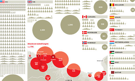
Nato operations in Libya, data journalism breaks them down. Click image for full graphic

Nato‘s Libya operations are costing millions and involving thousands of airmen and sailors. But who’s contributing to Operation Unified Protector? That’s the official name for the attacks on the Gadaffi regime’s bases and tanks by Nato aircraft and ships, plus the enforcement of the no-fly zone and the arms embargo.

Data journalism can help us find out. Nato, which has been running operations in Libya since the beginning of April, doesn’t give out details of individual member’s efforts so we went to each country’s defence ministry direct to find out for ourselves.

We wanted to know the answers to some specific questions, ending at the end of the first week of May. We set some very specific parameters: details for the first week of operations, operations taking place week commencing 2 May and totals for the whole operation, ending 5 May. We asked each country:

• How many aircraft, ships and military personnel are in the region?
• How many attacks and sorties has each country been involved in?
• Which base are they operating from?

By combining official responses, scraping the defence ministry websites of each country and news reports, we assembled the most complete breakdown of the Nato operation yet published. [Read more…]

Simon Rogers, guardian of the Data Store [VIDEO]

The Guardian is one of the most respected newspaper when it comes to data journalism and data visualizations. Their website has a section dedicated to data where people can enjoy beautiful infographics made by the likes of David McCandless and other data visionaries.

We met with Simon at his Guardian’s desk to talk about the Data Blog and the impact of Wikileaks on journalism. Look out for his tips on good data visualizations!

[vimeo 27072059]