The convergence of big data, baseball and pizza at Strata

SPLUNK BLOG – By Paul Wilke

Last week, I was fortunate enough to attend the Strata Big Data Conference in New York. With the conference spanning four days, two hotels, and over 400 attendees one thing stood out… big data is a hot topic!

Splunk was featured in two sessions. On Tuesday, Splunk CIO Doug Harr was part of a panel discussion on the changing role of the CIO, where he and the panel (which included CIOs from Batchtags, Accenture and Revolution Analytics) pointed out that the CIO  role is changing and expanding. The function has evolved into one of the most crucial positions in corporations focusing on sustainable growth.

On Friday Splunk Product Manager Jake Flomenberg took the stage with Denise Hemke from Salesforce.com to talk about gleaning new insights from massive amounts of machine data. Denise highlighted how at Salesforce a Chatter group is devoted to sharing ideas on how they work with Splunk so they can make the most of Splunk solutions. To highlight the usefulness of big data in a way that just about everyone could relate to, Jake showed how Splunk could be used to find the average price of pizza in New York City – definitely an example of using data for food, not evil!

Jake also gave a great interview at the conference, which you can see here:

[youtube RNGWPg27JVw]

Overall, a great crowd and very strong topics. One of my favorite sessions was current New York Mets’ executive Paul DePodesta talking about the big data behind Moneyball. It’s a shame the Mets aren’t taking it to heart this season. As the Splunk t-shirts we handed out at Strata say, “A petabyte of data is a terrible thing to waste”.

Read the original post on Splunk Blog here.

Strata NY 2011 [Day 1]: The Human Scale of Big Data [VIDEO]

strata911Memorial.jpg

This post was written by Mimi Rojanasakul on Infosthetics.com. She is an artist and designer based in New York, currently pursuing her MFA in Communications Design at Pratt Institute. Say hello or follow her@mimiosity.
The 2011 Strata Conference in New York City kicked off on Thursday with a brief introduction byO’Reilly’s own Ed Dumbill. He ventures a bold assessment of the present social condition and how data science plays into it: the growth of our networks, government, and information feel as if they are slipping out of our control, evolving like a living organism. Despite this, Dumbill is optimistic, placing the hope to navigate this new “synthetic world” on the emerging role of the data scientist. And so sets the stage for the speakers to follow.

The first keynote comes from Rachel Sterne, New York City’s first Chief Digital Officer and a who’s who in the digital media world since her early twenties. Though there was some of the expected bureaucratic language, examples of what was being done with the city’s open data showed very real progress being made in making parts of government more accessible and allowing the public to engage more directly in their community. New York City is uniquely situated for a project of this nature, and the individual citizens are a key factor – densely packed in and cheerfully tagging, tweeting, and looking for someone to share their thoughts with (or perhaps gripe to). Through NYC Digital’s app-building competitions, hackathons, and more accessible web presence, New Yorkers are able to compose their own useful narratives or tools – from finding parking to restaurants on the verge of closing from health code violations. By the people and for the people — or at least an encouraging start.

strataNYCMap.jpg[ New York City evacuation zone map was shared with other parties to protect against heavy internet traffic taking down any individual site ]

On matters of a completely different spatial scale, we turn to Jon Jenkins of NASA’s SETI Institute and Co-Investigator of the Kepler mission. The Kepler satellite, launched in July of 2009, boasts a 100,000 pixel camera that checks for tiny planets blocking a star’s luminescence for over 145,000 stars in its fixed gaze, snapping a photo every 30 minutes with bated breath for potential candidates. As of February 2011, over 1200 planetary candidates were identified. Despite the cosmic scale of Kepler’s investigations, Jenkins’ communicates with a Carl-Sagan-like sense of wonder that is difficult not to get swept up in. Video renderings of distant solar system fly-bys show worlds not unlike our own, a reminder that the motives for some of our greatest accomplishments come from an innate, irrepressible curiosity.

strataKeplerFOV.jpg[ Photo and graphic representation of Kepler’s field of vision ]
strataKeplerSuns.jpg[ Recently discovered planet with two suns ]

Amazon’s John Rauser begins his own talk with a different story about staring at the sky. It’s 1750, Germany, and Tobias Mayer is about to discover the libration (wobble) in the Moon. Rauser argues that it was Mayer’s combination of “engineering sense” and mathematic abilities that allowed him to make the first baby steps toward establishing what we now know as data science. While an earlier presenter,Randy Lea of Teradata, focused mostly on the technological advancements made in the field of big data analytics, Rauser emphasized the human characteristics demanded for this career. Along with the more obvious need for programming fluency and applied math, he cites writing and communication as the first major difference in mediocracy and excellence, along with a strong, self-critical skepticism and passionate curiosity. These last three virtues could just as easily be transplanted into any other field, and judging from the applause and approving tweets, the relevancy clearly struck a nerve with the crowd.

From a design perspective, the obvious continuation to so many of these presentations was the successful visual communication of all this data. My aesthetic cravings immediately subside when Jer Thorp, current Data Artist in Residence at the New York Times, takes the stage. His presentation walks us through a commission to design an algorithm for Michael Arad’s 9/11 memorial that would place names according to the victims’ relationships to one another. Though clustering the 2900 names and 1400 adjacency requests was at first an issue of optimization-by-algorithm, manual typographic layout and human judgement was still necessary to achieve the aesthetic perfection needed. Thorp also made a great point about visualizations not only being an end-product, but a valuable part of the creative process earlier on.

strata911RelationshipViz.jpg[ Early visualization of density of relationships ]


[vimeo 23444105]

WTC Names Arrangement Tool from blprnt on Vimeo.

[ Processing tool built to arrange the name clusters by algorithm and by hand ]


To be honest, I was skeptical at first of the decision to cluster the names by association rather than simple alphabetization — an unnecessary gimmick for what should be a uncomplicated, moving experience. Part of the power of the Vietnam Memorial was its expression of the enormous magnitude of human casualties with simple typographics, while its logical organization provided map and key for those purposefully looking for one name. But as Thorp explained these adjacencies in context, the beauty of the reasoning began to unfold. First, it is a matter of new ways of understanding. We do not browse, we search. And collecting and visualizing our identity based on our social networks has become second nature. It has the potential to tell stories about each individual’s lives that go beyond the individual experience, creating a physical and imagined space to extend this unifying connectivity.

Overall, it was a humanizing first experience with professional “big data.” Coming from a background in art and design, you could say I had some apprehensions about my ability to understand the myriad of technical disciplines represented at Strata. Despite this, the experience so far has been of unexpected delights — a keenly curated look at where we are with data today.

I admit this first post was low on data visualizations, but there were plenty of interface and graphics talks in the afternoon sessions to share in the next posts. Stay tuned!

Strata Summit 2011: Generating Stories From Data [VIDEO]

As the world of data expands, new challenges arise. The complexity of some datasets can be overwhelming for journalists across the globe who “dig” for a story without the technical skills. Narrative Science’s Kristian Hammond addressed this challenge during last week’s Strata Summit in New York in a presentation about a software platform that helps write stories out of numbers…

[youtube P9hJJCOeIB4]


Strata Summit 2011: The US Government’s Big Data Opportunity [VIDEO]

So the Strata Summit happened last week and blew our data minds with new ideas and incredible speeches from the best people in the data world. One of the highlights we particularly liked was the conversation about the future of open government data in the US.

Here is a video where Aneesh Chopra, the US Federal Chief Technology Officer, deputy CTO Chris Vein, and Tim O’Reilly, founder and CEO of O’Reilly Media, discuss Obama’s latest visit to New York and the opportunities that big datasets could set for the future…

[youtube 4wdkk9B7qec]

More info on the speakers (from O’Reilly website):

Photo of Aneesh Chopra

Aneesh Chopra

Federal Office of Science and Technology Policy

Chopra serves as the Federal Chief Technology Officer. In this role, Chopra promotes technological innovation to help the country meet its goals from job creation, to reducing health-care costs, to protecting the homeland. Prior to his confirmation, he served as Virginia’s Secretary of Technology. He lead the Commonwealth’s strategy to effectively leverage technology in government reform, to promote Virginia’s innovation agenda, and to foster technology-related economic development. Previously, he worked as Managing Director with the Advisory Board Company, leading the firm’s Financial Leadership Council and the Working Council for Health Plan Executives.

Photo of Chris Vein

Chris Vein

Office of Science and Technology Policy

Chris Vein is the Deputy U.S. Chief Technology Officer for Government Innovation in the White House Office of Science and Technology Policy. In this role, Chris searches for those with transformative ideas, convenes those inside and outside government to explore and test them, and catalyzes the results into a national action plan. .Prior to joining the White House, Chris was the Chief Information Officer (CIO) for the City and County of San Francisco (City) where he led the City in becoming a national force in the application of new media platforms, use of open source applications, creation of new models for expanding digital inclusion, emphasizing “green” technology, and transforming government. This year, Chris was again named to the top 50 public sector CIOs by InformationWeek Magazine. He has been named to Government Technology Magazine’s Top 25: Dreamers, Doers, and Drivers and honored as the Community Broadband Visionary of the Year by the National Association of Telecommunications Officers and Advisors (NATOA). Chris is a sought-after commentator and speaker, quoted in a wide range of news sources from the Economist to Inc. Magazine. In past work lives, Chris has worked in the public sector at Science Applications International Corporation (SAIC), for the American Psychological Association, and in a nonpolitical role, at the White House supporting three Presidents of the United States.

Photo of Tim O'Reilly

Tim O’Reilly

O’Reilly Media, Inc.

Tim O’Reilly is the founder and CEO of O’Reilly Media, Inc., thought by many to be the best computer book publisher in the world. O’Reilly Media also hosts conferences on technology topics, including the O’Reilly Open Source Convention, the Web 2.0 SummitStrata: The Business of Data, and many others. O’Reilly’s Make: magazine and Maker Faire has been compared to the West Coast Computer Faire, which launched the personal computer revolution. Tim’s blog, O’Reilly Radar, “watches the alpha geeks” to determine emerging technology trends, and serves as a platform for advocacy about issues of importance to the technical community. Tim is also a partner atO’Reilly AlphaTech Ventures, O’Reilly’s early stage venture firm, and is on the board of Safari Books Online.

The work of data journalism: Find, clean, analyze, create … repeat

O’REILLY RADAR – By 

Data journalism has rounded an important corner: The discussion is no longer if it should be done, but rather how journalists can find and extract stories from datasets.

Of course, a dedicated focus on the “how” doesn’t guarantee execution. Stories don’t magically float out of spreadsheets, and data rarely arrives in a pristine form. Data journalism — like all journalism — requires a lot of grunt work.

With that in mind, I got in touch with Simon Rogers, editor of The Guardian’s Datablog and a speaker at next week’s Strata Summit, to discuss the nuts and bolts of data journalism. The Guardian has been at the forefront of data-driven storytelling, so its process warrants attention — and perhaps even full-fledged duplication.

Our interview follows.

What’s involved in creating a data-centric story?


Simon RogersSimon Rogers: It’s really 90% perspiration. There’s a whole process to making the data work and getting to a position where you can get stories out of it. It goes like this:

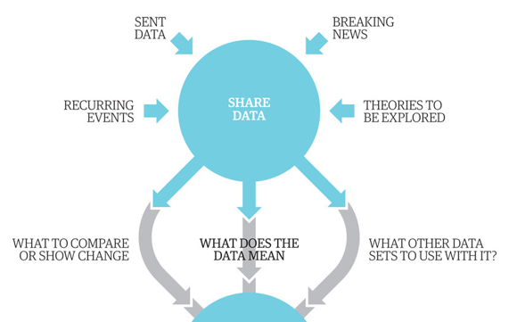
  • We locate the data or receive it from a variety of sources — from breaking news stories, government data, journalists’ research and so on.
  • We then start looking at what we can do with the data. Do we need to mash it up with another dataset? How can we show changes over time?
  • Spreadsheets often have to be seriously tidied up — all those extraneous columns and weirdly merged cells really don’t help. And that’s assuming it’s not a PDF, the worst format for data known to humankind.
  • Now we’re getting there. Next up we can actually start to perform the calculations that will tell us if there’s a story or not.
  • At the end of that process is the output. Will it be a story or a graphic or a visualisation? What tools will we use?

We’ve actually produced a graphic (of how we make graphics) that shows the process we go through:


Guardian data journalism process
Partial screenshot of “Data journalism broken down.” Click to see the full graphic.

What is the most common mistake data journalists make?

Simon Rogers: There’s a tendency to spend months fiddling around [Read more…]


Data journalism, data tools, and the newsroom stack

O’REILLY RADAR – By 

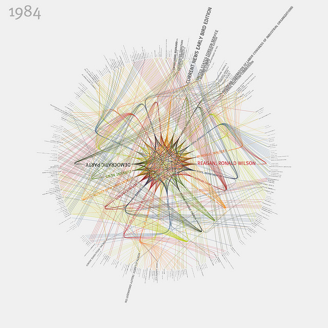
New York Times 365/360 - 1984 (in color) By blprnt_van

MIT’s recent Civic Media Conference and the latest batch of Knight News Challenge winners made one reality crystal clear: as a new era of technology-fueled transparency, innovation and open government dawns, it won’t depend on any single CIO or federal program. It will be driven by a distributed community of media, nonprofits, academics and civic advocates focused on better outcomes, more informed communities and the new news, whatever form it is delivered in.

The themes that unite this class of Knight News Challenge winners were data journalism and platforms for civic connections. Each theme draws from central realities of the information ecosystems of today. Newsrooms and citizens are confronted by unprecedented amounts of data and an expanded number of news sources, including a social web populated by our friends, family and colleagues. Newsrooms, the traditional hosts for information gathering and dissemination, are now part of a flattened environment for news, where news breaks first on social networks, is curated by a combination of professionals and amateurs, and then analyzed and synthesized into contextualized journalism.


Data journalism and data tools


In an age of information abundance, journalists and citizens alike all need better tools, whether we’re curating the samizdat of the 21st century in the Middle East, like Andy Carvin, processing a late night data dump, or looking for the best way to visualize water quality to a nation of consumers. As we grapple with the consumption challenges presented by this deluge of data, new publishing platforms are also empowering us to gather, refine, analyze and share data ourselves, turning it into information. [Read more…]

Dating with data

O’REILLY RADAR – By 


OkCupid is a free dating site with seven million users. The site’s blog, OkTrends, mines data from those users to tackle important subjects like “The case for an older woman” and “The REAL ‘stuff white people like’.”

Beyond clever headlines, OkCupid also uses an unusual pedigree to separate itself from the dating site pack: The business was founded by four Harvard-educated mathematicians.

“It probably scared people when they first heard that four math majors were starting a dating site,” said CEO Sam Yagan during a recent interview. But the founders’ backgrounds greatly influenced how they approached the problem of dating.

“A lot of other dating sites are based on psychology,” Yagan said. “The fundamental premise of a site like eHarmony is that they know the answer. Our approach to dating isn’t that there’s some psychological theory that will be the answer to all your problems. We think that dating is a problem to be solved using data and analytics. There is no magic formula that can help everyone to find love. Instead, we bring value by building a decent-sized platform that allows people to provide information that helps us to customize a match algorithm to each person’s needs.”

OkCupid works by having users state basic preferences and answering questions like “Is it wrong to spank a child who’s been bad?” Users are matched based on the overlap of their answers and how important each question is to both users.

Yagan said data was built into the business model from the beginning. “We knew from the time we started the company that the data we were generating would have three purposes: helping us match people up, attracting advertisers since that was the core of our revenue model, and that the data would also be interesting socially.” [Read more…]