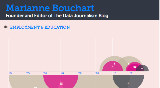
Editor’s note: As data journalists, designers or other data enthusiasts, what a better way to show off your skills than with an infographic resume? Here is a very useful article by Mashable’s Erica Swallow introducing four very interesting tools to make your profile stand out! Show us your infographic resume in our Data Art Corner. The best examples will be featured in the DJB’s front page next month!

MASHABLE – By Erica Swallow
As a freelancer or job seeker, it is important to have a resume that stands out among the rest — one of the more visually pleasing options on the market today is the infographic resume.
An infographic resume enables a job seeker to better visualize his or her career history, education and skills.
Unfortunately, not everyone is a graphic designer, and whipping up a professional-looking infographic resume can be a difficult task for the technically unskilled job seeker. For those of us not talented in design, it can also be costly to hire an experienced designer to toil over a career-centric infographic.
Luckily, a number of companies are picking up on this growing trend and building apps to enable the average job seeker to create a beautiful resume.
To spruce up your resume, check out these four tools for creating an infographic CV. If you’ve seen other tools on the market, let us know about them in the comments below.

Vizualize.me is a new app that turns a user’s LinkedIn profile information into a beautiful, web-based infographic.
After creating an account and connecting via LinkedIn, a user can edit his or her profile summary, work experience, education, links, skills, interests, languages, stats, recommendations and awards. And voila, astunning infographic is created.
The company’s vision is to “be the future of resumes.” Lofty goal, but completely viable, given that its iteration of the resume is much more compelling than the simple, black-and-white paper version that currently rules the world.

Re.vu, a newer name on the market, is another app that enables a user to pull in and edit his or her LinkedIn data to produce a stylish web-based infographic.
The infographic layout focuses on the user’s name, title, biography, social links and career timeline — it also enables a user to add more graphics, including stats, skill evolution, proficiencies, quotes and interests over time.
Besides the career timeline that is fully generated via the LinkedIn connection, the other graphics can be a bit tedious to create, as all of the details must be entered manually.
In the end, though, a very attractive infographic resume emerges. This is, by far, the most visually pleasing option of all of the apps we reviewed.

Based on a user’s imported LinkedIn data, Kinzaa creates a data-driven infographic resume that focuses on a user’s skills and job responsibilities throughout his or her work history.
The tool is still in beta, so it can be a bit wonky at times — but if you’re looking for a tool that helps outline exactly how you’ve divided your time in previous positions, this may be your tool of choice.
Unlike other tools, it also features a section outlining the user’s personality and work environment preferences. Details such as preferences on company size, job security, challenge level, culture, decision-making speed and more are outlined in the personality section, while the work environment section focuses on the user’s work-day length, team size, noise level, dress code and travel preferences.

Brazen Careerist, the career management resource for young professionals, launched a new Facebook application in September that generates an infographic resume from a user’s Facebook, Twitter and LinkedIn information.
After a user authorizes the app to access his or her Facebook and LinkedIn data, the app creates an infographic resume with a unique URL — for example, my infographic resume is located atbrazen.me/u/ericaswallow.
The infographic features a user’s honors, years of experience, recommendations, network reach, degree information, specialty keywords, career timeline, social links and LinkedIn profile image.
The app also creates a “Career Portfolio” section which features badges awarded based on a user’s Facebook, Twitter and LinkedIn achievements. Upon signing up for the app, I earned eight badges, including “social media ninja,” “team player” and “CEO in training.” While badges are a nice addition, they aren’t compelling enough to keep me coming back to the app.


