Visualising data is important because it makes complicated information easy to process and understand.
Here I took some data from the Office for National Statistics website, www.ons.gov.uk. I chose to look at Hospital waiting times because it is an issue that is often reported on and I was curious as to which treatments had the longest waiting time.
I took the data and copied it into an Excel spreadsheet. I then cut it down to get rid of information that I didn’t need and that would confuse the user. I organised the data into columns, the first showing the type of treatment, the second the amount of completed treatments and operations and the third showing the average median waiting time in weeks.
If you’ve noticed a lull in activity here at the Data Journalism Blog over the last couple of weeks, it’s because the site has been undergoing a few changes. Marianne has got the DJB to where it is single-handedly but now that she has other commitments we (Neha-Tamara Patel and John Burn-Murdoch) will be taking over editorial responsibilities – don’t worry, Marianne will be keeping an eye on our progress! (You can read her final post here)
We are aspiring data-journalists studying on City University’s MA Interactive Journalism course, and along with our class-mates we aim to continue the DJB’s peerless coverage of data-driven journalism.
As far as content is concerned we will be trying not to stray from the formula that has worked so well thus far, although we have plans for a couple of new additions. The two areas on which we aim to focus are highlighting the best data-visualisations on the web, and building a strong online community here at datajournalismblog.com.
Alongside these aims we will continue to showcase developments in the field of data journalism, be it through interviews with leading data journalists, guides to using software or reviews of new data-related tools and applications.
Another section will look at the life-cycle of a data-driven news story, as we bring you updates on a series of ongoing investigations into topics including public spending, education, health and crime statistics.
As always, we would love to hear what you think about our plans, and we welcome comments on any of the above as well as thoughts on the site in general!
The XCity Award was set up in 2011 to mark the 25th anniversary of XCity magazine, a publication made by postgraduate students in Magazine Journalism from City University, London. It aims at recognising “outstanding contributions to journalism made in the past year by alumni.”
Simon Rogers, editor of The Guardian’s Data Blog won the inaugural prize last year and one of this year’s shortlisted alumni is…well, myself! (Data Journalism Blog editor Marianne Bouchart)
I had a lovely chat with Natasha Wynarczyk about my work for the Data Journalism Blog and a profile was published on the XCity website today. Other nominees include Wannabe Hacks founder Ben Whitelaw and Ramita Navai, who reported on human rights abuses in Syria. Compelling stories about the six nominees as well as further information on the award can be found on their website.
Here is the link to my story and let’s keep our fingers crossed until 22 March when the winner of the £500 prize will be announced on their website.
Data journalism has enjoyed increasing exposure both within and without journalistic circles in recent years. One of the most visible examples of this has been the proliferation of infographics – a broad term covering a variety of visual story-telling tools and techniques. The quality of infographics you will find online today is very wide ranging, but increasingly some of the best examples have come from analysis of sporting events.
One such example is this effort, shown below, created by Phil Nottingham. This infographic allows users to view key statistics from every Super Bowl in NFL history, right back to Super Bowl I, where the Green Bay Packers beat the Kansas City Chiefs by 35 points to 10 at the Coliseum in 1967.
Interactivity is often key to the success of an infographic, particularly when it is not being used to communicate a news story. In this example, users can engage with the tool by choosing from which Super Bowl to view key statistics.
If you’re a Colts fan, simply select the team and you can then either dissect the defeat to the Saints, or scour the success over the Bears back in 2007. Alternatively, if you’re a neutral, or just want a more holistic experience, browse by year rather than team, and pore over any match-up from Super Bowl I to last year’s clash between the Packers and the Steelers.
For every year, a comprehensive list of statistics allows the user to see how the respective teams fared in offense and defense, with data shown for a whole host of factors, including rushing, first downs, fumbles and interceptions.
As well as the individual stats, users can get a clear idea of how a match progressed through the infographic’s main panel. Here, the teams’ scores are plotted over the course of the match, which provides a great way of reliving some of the great comebacks. Take Super Bowl XXV for example, where the chart shows the Giants’ yellow line well below the Bills’ line in the second quarter, but then soaring up and overtaking in the dying minutes.
Since the turn of the millennium, the number of people providing statistical analysis of sporting events has grown enormously, and below are two more of the Data Blog’s favourite sports infographics (they’re both from the world of football (soccer), but I assure you this is because of their brilliance, rather than any underlying bias):
Using Tableau Public, Graham MacAree created this spectacularly detailed visual analysis of Chelsea FC’s match against Norwich on 27 August last year. Users can see exactly where each Chelsea player directed every one of their passes, at what point in the game each one was played and whether or not it was complete.
The guys at Visual Evolution have put together this fascinating infographic illustrating the nationalities of football’s top 100 earners (based on their annual salaries), breaking the figures down to show – among other things – which leagues and clubs have most representatives in the top 100, the average age of the top earners and the number of homes Wayne Rooney could buy in his home district of Croxteth with his year’s pay packet.
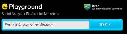
What is it? A social analytics platform which contains over 1,000 days of tweets (all 70 billion of them), Facebook activity and blog posts.
How is it of use to journalists? “Journalists can easily develop real-time insights into any story from Playground,” PeopleBrowsr UK CEO Andrew Grill explains.
Complex keyword searches can be divided by user influence, geolocation, sentiment, and virtual communities of people with shared interests and affinities.
These features – and many more – let reporters and researchers easily drill down to find the people and content driving the conversation on social networks on any subject.
Playground lets you use the data the way you want to use it. You can either export the graphs and tables that the site produces automatically or export the results in a CSV file to create your own visualisations, which could potentially make it the next favourite tool of data journalists.
Grill added:
The recent launch of our fully transparent Kred influencer platform will make it faster and easier for journalists to find key influencers in a particular community.
You can give Playground a try for the first 14 days before signing up for one of their subscriptions ($19 a month for students and journalists, $149 for organisations and companies).
Jodee Rich, the founder of PeopleBrowsr, gave an inspiring speech at the Strata Summit in September on how a TV ratings system such as Nielsen could soon be replaced by social media data thanks to the advanced online analytics that PeopleBrowsr offers.
Playground’s development is based on feedback from its community of users, which has been very responsive. Ideas can be sent to contact[@]peoplebrowsr.com or by tweeting@peoplebrowsr.
Editor’s Note: This is the second part of a post from 10,000 Words. Find the first one here which included the Guardian’s Data Blog, Pro Publica and your very own Data Journalism Blog…
Last week, I started a list of six data journalism blogs you should take note of. The post stemmed from a project some journalists are leading to develop a data-driven journalism handbook that covers all aspects of the field. This weekend, thanks to a massive effort by attendees at the Mozilla Festival in London, the project morphed from the bare bones of an idea into something very tangible.
In just two days, 55 contributors, from organizations such as the New York Times, the Guardian and Medill School of Journalism, were able to draft 60 pages, 20,000 words, and six chapters of the handbook. The goal is to have a comprehensive draft completed by the end of the year, said Liliana Bounegru of the European Journalism Centre, which is co-sponsoring production of the handbook. If you’re interested in contributing, email Bounegru at bounegru@ejc.net. You can see what the group has so far atbit.ly/ddjbook.
Since the handbook is still being tweaked, why not check out these data journalism blogs?
Open Like the Guardian, the New York Times is widely known for its spectacular use of data journalism and news apps. Open is written by the news organization’s developers, highlighting hacking events and describing general news of interest to the bloggers.
Data Desk The Los Angeles Times is at the forefront of data journalism, with its Data Desk blog covering topics from crime to the Lakers to vehicle complaints. Everything on the site is a great example of how to use data to find and craft stories that will matter to your readers. One project I highly recommend you take a look at is mapping LA’s neighborhoods. It is something that could be replicated in almost any town and would grab your audience’s’ attention.
News Apps Blog
The News Apps blog is where developers from the Chicago Tribune discuss “matters of interest” and give their tips and suggestions on how to make some of the stunning maps and apps that appear in the paper. This is one of, if not the, place to go to see what experts in the field are talking about.
As he told me when he came into our San Francisco studio earlier this week,Reputation.com CEO & Founder Michael Fertik is “ecstatic” about our new reputation economy. In today’s Web 3.0 personal data rich economy, reputation is replacing cash, Fertik believes. And he is confident that his company, Reputation.com, is well placed to become the new rating index of this digital ecosystem.
But Fertik isn’t ecstatic about the way in which new online products, such as facial recognition technology, are exploiting the privacy of online consumers. Arguing that “data is the new oil,” Fertik believes that the only people not benefitting from today’s social economy are consumers themselves. Rather than government legislation, however, the solution, Fertik told me, are more start-up entrepreneurs like himself providing paid products that empower consumers in our Web 3.0 world of pervasive personalized data.
This is the second and final part of my interview with Fertik. Yesterday, he explained to me why people will pay for privacy.
Simon Rogers: Our 10 point guide to data journalism and how it’s changing
Here’s an interesting thing: data journalism is becoming part of the establishment. Not in an Oxbridge elite kind of way (although here’s some data on that) but in the way it is becoming the industry standard.
Two years ago, when we launched the Datablog, all this was new. People still asked if getting stories from data was really journalism and not everyone had seen Adrian Holovaty’s riposte. But once you’ve hadMPs expenses and Wikileaks, the startling thing is that no-one asks those questions anymore. Instead, they want to know, “how do we do it?”
Meanwhile every day brings newer and more innovative journalists into the field, and with them new skills and techniques. So, not only is data journalism changing in itself, it’s changing journalism too.
Jason Kitcat is the foundation coordinator at the Open Knowledge Foundation. In this interview, he tackles the meaning of “open knowledge”, the role of his organisation and the future of data journalism. What is YOUR opinion? Please comment!
Yesterday, the U.S. Department of Education’s Office of Civil Rights released a data set— the most comprehensive to date — documenting student access to advanced classes and special programs in public high schools. Shorthanded as the Civil Rights survey, the information tracks the availability of offerings, like Advanced Placement courses, gifted-and-talented programs, and higher-level math and science classes, that studies suggest are important factors for educational attainment — and for success later in life.
ProPublica reporters used the Ed data to produce a story package, “The Opportunity Gap,” that analyzes the OCR info and other federal education data; their analysis found among other things that, overall and unsurprisingly, high-poverty schools are less likely than their wealthier counterparts to have students enrolled in those beneficial programs. The achievement gap, the data suggest, isn’t just about students’ educational attainment; it’s also about the educational opportunities provided to those students in the first place. And it’s individual states that are making the policy decisions that affect the quality of those opportunities. ProPublica’s analysis, says senior editor Eric Umansky, is aimed at answering one key question: “Are states giving their kids a fair shake?”
The fact that the OCR data set is relatively comprehensive — reporting on districts with more than 3,000 students, it covers 85,000 schools, and around 75 percent of all public high schoolers in the U.S. — means that the OCR data set is also enormous. And while ProPublica’s text-based takes on the info have done precisely the thing you’d want them to do — find surprises, find trends, make it meaningful, make it human — the outfit’s reporters wanted to go beyond the database-to-narrative formula with the OCR trove. Their solution: a news app that encourages, even more than your typical app, public participation. And that looks to Facebook for social integration. [Read more…]

 Visualising data is important because it makes complicated information easy to process and understand.


