This is what the best of data journalism looks like

This article was originally published on the Data Journalism Awards Medium Publication managed by the Global Editors Network. You can find the original version right here.

________________________________________________________________________________________________


After a year of hard work, collecting and sifting through hundreds of data projects from around the world, the news is finally out. The thirteen winners (and one honourable mention) of the Data Journalism Awards 2018 competition were announced on 31 May in Lisbon. Together they are the best of what the world of data journalism had to offer in the past year. They also teach us a lot about the state of data journalism.


All of the work I have done over the past few months has given me a pretty good perspective of what’s going on in the world of data journalism. Managing the Data Journalism Awards competition is probably the greatest way to find out what everybody has been up to and to discover amazing projects from all over the world.

And today I want to share some of this with you! Most of the examples you will see in this article are projects that either won or got shortlisted for the Data Journalism Awards 2018 competition.

When a news organisation submits a project, they have to fill in a form asking them to describe their work, but also how they made it, what technology they used, what methodology… And all of this information is published on the website for everyone to see.

So if you‘re reading this article in the hope of finding some inspiration for your next project, as I am confident you are, then here is a good tip: on top of all of the examples I will show you here, you can take a look at all of the 630 projects from all over the world which were submitted this year, right on the competition website. You’re welcome.

So what have we learned this year by going through hundreds of data journalism projects from around the world? What are the trends we’ve spotted?


Data journalism is still spreading internationally

And this is great news. We see more and more projects from countries that have never applied before, and this is a great indicator of the way journalists worldwide, regardless of their background, regardless of how accessible data is in their country, regardless of how data literate they are, are trying to tell stories with data.


Some topics are more popular than others

One of the first things we look at when we get the list of projects each year, is what topics did people tackle? And what we’ve learned from that is that some topics are more attractive than others.

Whether that’s because it is just easier to find data on them, or it’s easier to visualise things related to those topics, or it’s just the kind of big stories that everyone expects to see data on each year, we can’t really know for all of them. It’s probably a good mixture of all of this.


The refugee crises

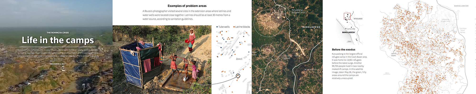
The first recurrent topic that we’ve seen this past year is the refugee crises. And a great example of that is this project by Reuters called ‘Life in the camps’, which won the award for Data visualisation of the year at the Data Journalism Awards 2018.

This graphic provided the first detailed look at the dire living conditions inside the Rohingya refugee camps in Cox’s Bazar. Using satellite imagery and data, the graphic documented the rapid expansion and lack of infrastructure in the largest camp cluster, Kutupalong. Makeshift toilets sit next to wells that are too shallow, contaminating water supply.

This project incorporates data-driven graphics, photo and video. Reuters gained access to data from a group of aid agencies working together to document the location of infrastructure throughout the Kutupalong camp by using handheld GPS devices on the ground. The graphics team recognised that parts of the data set could be used to analyse the accessibility of basic water and sanitation facilities. After some preliminary analysis, they were able to see that some areas had water pumps located too close to makeshift toilets, raising major health issues.

They displayed this information in a narrative graphic format with each water pump and temporary latrine marked by a dot and overlaid on a diagram of the camp footprint. They compared these locations to the U.N.’s basic guidelines to illustrate the potential health risks. Reuters photographers then used these coordinates to visit specific sites and document real examples of latrines and water pumps in close proximity to each other.

Technologies used for this project: HTML, CSS, Javascript, QGIS and Illustrator.


Elections/Politics

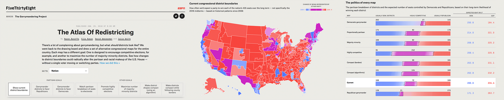
Next topic that came up a lot this year was politics, and more specifically, anything related to recent elections, not just in the US, but also in many other countries. One great example of that was the Data Journalism Awards 2018 ‘News data app of the year’ award winner, ‘The atlas of redistricting’, by FiveThirtyEight in the US.

There’s a lot of complaining about gerrymandering (the process of manipulating the boundaries of an electoral constituency so as to favour one party or class) and its effects on US politics. But a fundamental question is often missing from the conversation: What should political boundaries look like? There are a number of possible approaches to drawing districts, and each involves tradeoffs. For this project, the team at FiveThirtyEight looked at seven different redistricting schemes; and to quantify their tradeoffs and evaluate their political implications, they actually redrew every congressional district in the U.S. seven times. The Atlas of redistricting allows readers to explore each of these approaches — both for the nation as a whole and for their home state.

The scope of this project really makes it unique. No other news organization covering gerrymandering has taken on a project of this size before.

To make it happen, they took precinct-level presidential election results from 2012 and 2016 and reallocated them to 2010 Census voting districts. That enabled them to add more up-to-date political data to a free online redistricting tool called Dave’s Redistricting App. Once the data was in the app, they started the long process of drawing and redrawing all the districts in the country. Then, they downloaded their district boundaries from the app, analysed their political, racial and geometric characteristics, and ultimately evaluated the tradeoffs of the different redistricting approaches. Sources for data included Ryne Rohla/Decision Desk HQ, U.S. Census Bureau, and Brian Olson.

Technologies used for this project: Ruby, PostGIS, Dave’s Redistricting App, Node, D3


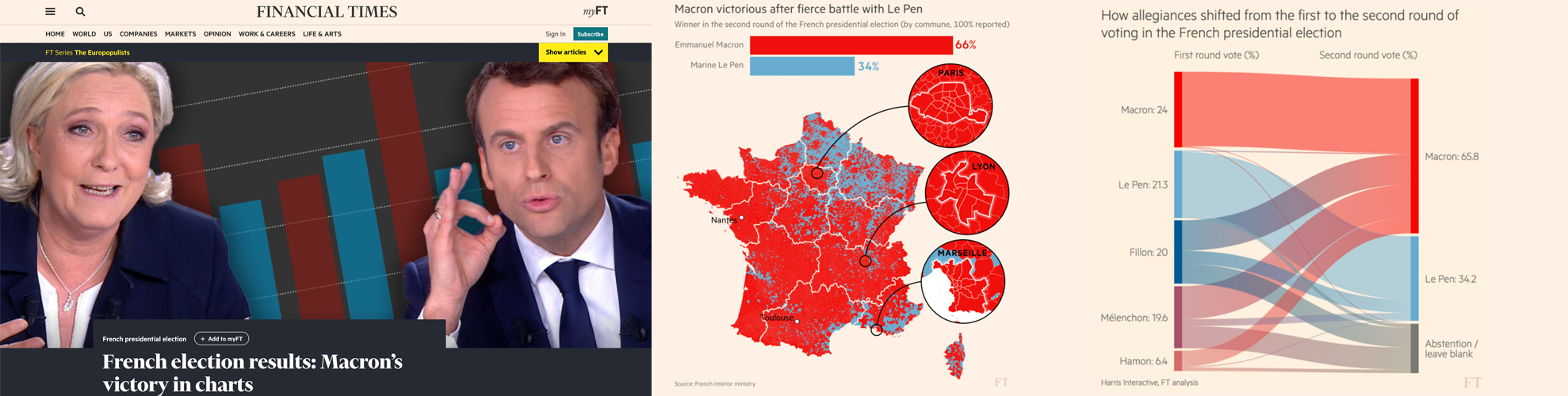
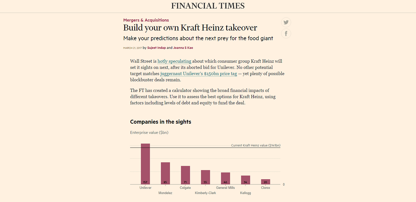
An other great example of how politics and elections were covered this year comes from the Financial Times. It is called ‘French election results: Macron’s victory in charts’ and was shortlisted for the Data Journalism Awards 2018 competition.

Let’s say it, elections are a must for all data news teams around the world. That’s probably the topic where the audience is the most used to seeing data combined with maps, graphics and analysis.

Throughout 2017 and 2018, the Financial Times became an expert in:

  • producing rapid-response overnight analyses of elections,
  • leveraging their data collection and visualisation skills to turn around insightful and visually striking reports on several elections across Europe,
  • responding faster than other news organisations both in the UK and even those based in the countries where these elections have taken place.

Over and above simply providing the top-line results, they have focused on adding insight by identifying and explaining voting patterns, highlighting significant associations between the characteristics of people and places, and the political causes they support.

To deliver this, the team developed highly versatile skills in data scraping and cleaning. They also have carried out ‘election rehearsals’ — practice runs of election night to make sure their workflows for obtaining, cleaning and visualising data were all polished, and robust to avoid any glitches that might come up on the night of the count.

The work has demonstrably paid off, with readers from continental Europe outnumbering those from Britain and the United States — typically far larger audiences for the FT — for the data team’s analyses of the French, German and Italian elections.

For each election, the team identified official data sources at the most granular possible level, with the guidance of local academic experts and the FT’s network of correspondents.

R scripts were written in advance to scrape the electoral results services in real time and attach them to the static, pre-sourced demographic data.

Scraping and analysis was primarily conducted in R, with most final projection graphics created in D3 — often adapting the Financial Times’ Visual Vocabulary library of data visualisation formats.

Technologies used for this project: R, D3.


Crime

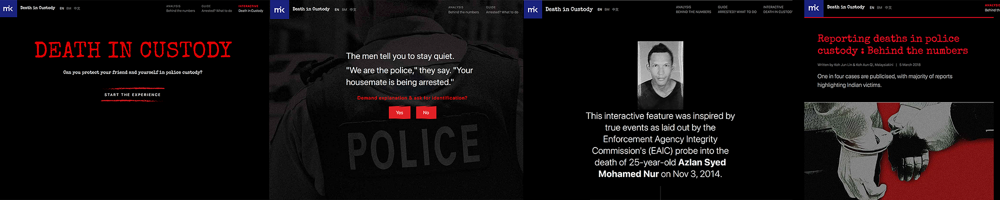
The last topic that I wanted to mention that was also recurrent this past year is crime. And to illustrate this, I’ve picked a project called ‘Deaths in custody’ by Malaysiakini in Malaysia.

This is an analysis of how deaths in police custody are reported, something that various teams around the world have been looking at recently. The team at Malaysiakini compared 15 years of official police statistics with data collected by a human rights organisation, called Suaram. The latter is the sole and most comprehensive tracker of publicised deaths in police custody in the country.

The journalists behind this project found that overall, deaths in Malaysian police custody are underreported, with one in four deaths being reported to the media or to Suaram.

They also highlight the important role that families of victims play in holding the police accountable and pushing to investigate the deaths. They created an interactive news game and a guide on what to do if somebody is arrested, both of which accompany the main article, taking inspiration from The Uber game that the Financial Times developed in 2017.

The game puts players in the shoes of a friend who is entangled in a custodial dilemma between a victim and the police. Along the way, there are fact boxes that teach players about their rights in custody. The real-life case that the game is based on is revealed at the end of the game.

Technologies used for this project: Tabula, OpenRefine, Google Sheets, HTML, CSS, Javascript, UI-Kit Framework, Adobe Photoshop.


We’ve changed the way we do maps

Another thing that we’ve learned by looking at all these data journalism projects is that we have changed the way we do maps.

Some newsrooms are really getting better at it. Maps are more interactive, more granular, prettier too, and integrated as part of a narrative instead of standing on their own, making us think that more and more journalists don’t do maps for the sake of doing maps, but for good reasons.


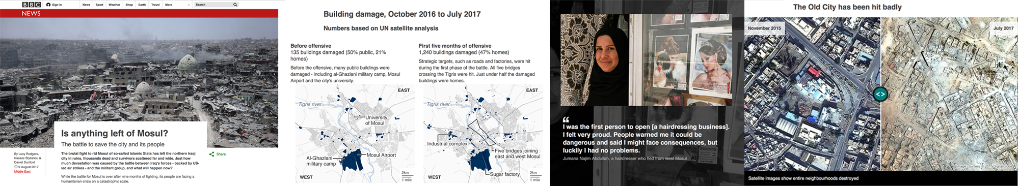
An example of how data journalists have made use of maps this past year is this piece by the BBC called ‘Is anything left of Mosul?’

It is a visually-led piece on the devastation caused to Mosul, Iraq, as a result of the battle to rid the city of Islamic State (IS). The piece not only gives people a full picture of the devastating scale of destruction, it also connects them to the real people who live in the city — essential when trying to tell stories from places people may not instantly relate to.

It was also designed mobile-first, giving users on small screens the full, in-depth experience. The feature uses the latest data from Unosat, allowing the BBC team to map in detail which buildings had suffered damage over time, telling the narrative of the war through four maps.

The feature incorporates interactive sliders to show the contrast of life before the conflict and after — a way of giving the audience an element of control over the storytelling.

They also used the latest data from the UNHCR, which told them where and when displaced people in Iraq had fled to and from. They mapped this data using QGIS’ heatmapping software and visualised it using their in-house Google Maps Chrome extension. They produced three heatmaps of Mosul at different phases of the battle, again telling a narrative of how the fighting had shifted to residential targets as the war went on.

The project got nearly half a million page views over several days in English. They also translated the feature into 10 other languages for BBC World Service audiences around the world.

Technologies used for this project: QGIS mapping software, Microsoft Excel, Adobe Illustrator, HTML, CSS, Javascript, Planet satellite imagery, DigitalGlobe images


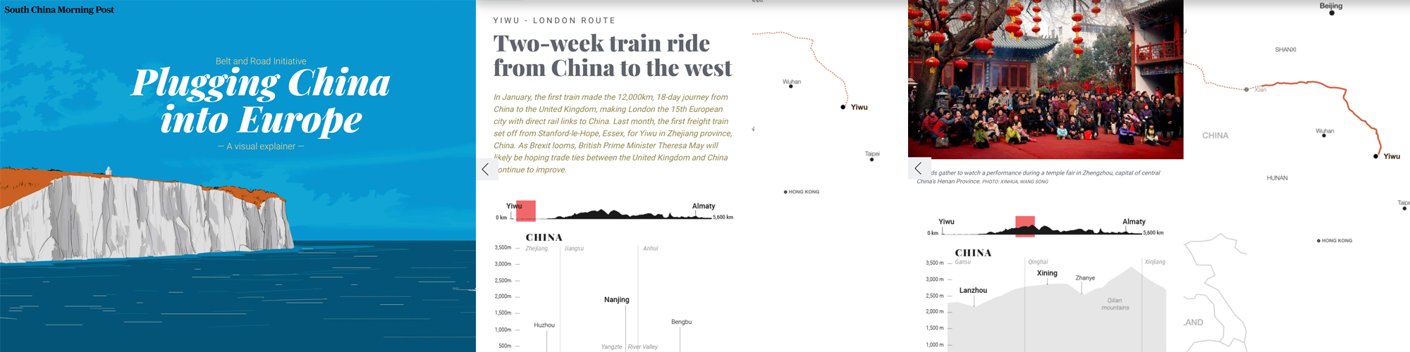
Another example of how the data journalism community has changed the way it does maps, is this interactive piece by the South China Morning Post called ‘China’s Belt and Road Initiative’.

The aim of this infographic is to provide context to the railway initiative linking China to the West.

They combined classic long-form storytelling with maps, graphs, diagrams of land elevations, infrastructure and risk-measurement charts, motion graphics, user interaction, and other media. The variety of techniques were selected to prevent the extensive data from appearing overwhelming. The split screen on the desktop version meant readers could refer to the route as they read the narrative.

We are not talking about boring static maps anymore. And this is an example of how new teams around the world, and not just in western countries, are aiming for more interactivity, and a better user journey through data stories, even when the topic is complex. It is thanks to the interactivity of the piece and the diversity of elements put together that the experience becomes enticing.

They used data from the Economist Intelligence Unit (EIU). Using Google Earth, they plotted and traced the path of each initiative to obtain height profiles and elevations to explain the extreme geographical environments and conditions.

Technologies used for this project: Adobe Creative Suite (Illustrator, Photoshop…), QGIS Brackets io Corel Painter, Microsoft Excel, Javascript, Canvas, JQuery, HTML, CSS — CSS3, Json, CSV, SVG.


New innovative data storytelling practices have arrived

Another thing we saw was that data teams around the world are finding new ways to tell stories. New innovative storytelling practices have arrived and are being used more and more.


Machine learning

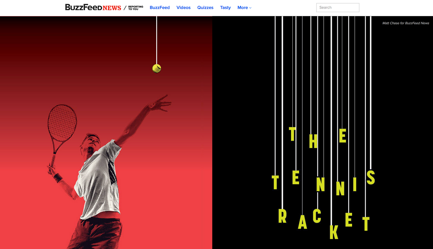
It is probably the most used term in current conversations about news innovation. It has also been used recently to help create data-driven projects, such as ‘Hidden Spy Planes’ by BuzzFeed News in the US, the winner of the JSK Fellowships award for innovation in data journalism at this year’s Data Journalism Awards.

This project revealed the activities of aircrafts that their operators didn’t want to discuss, opening the lid on a black box of covert aerial surveillance by agencies of the US government, the military and its contractors, and local law enforcement agencies.

Some of these spy planes employed sophisticated surveillance technologies including devices to locate and track cell phones and satellite phones, or survey Wi-Fi networks.

Before these stories came out, most Americans would have been unaware of the extent and sophistication of these operations. Without employing machine learning to identify aircraft engaged in aerial surveillance, the activities of many of aircraft deploying these devices would have remained hidden.

In recent years, there has been much discussion about the potential of machine learning and artificial intelligence in journalism, largely centered on classifying and organising content with a CMS, on fact-checking for example.

There have been relatively few stories that have used machine learning as a core tool for reporting, which is why this project is an important landmark.

Technologies used for this project: R, RStudio, PostgreSQL, PostGIS, QGIS, PostGIS, OpenStreetMap


Drone journalism

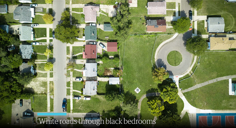
Another innovative storytelling practice that we’ve noticed is drone journalism, and here is an example called ‘Roads to nowhere’ from The Guardian.

It is an investigation using drone technology, historical research and analysis, interviews, as well as photomosaic visualizations.

It was a project that specifically looked at infrastructure in the US and the root causes of how cities have been designed with segregation and separation as a fundamental principle. It shows through a variety of means how Redlining and the interstate highway system were in part tools to disenfranchise African-Americans.

People are still living with this segregation to this day.

Most of the photos and all of the videos were taken by drone in this project. This is innovative in that it is really the only way to truly appreciate some of the micro-scale planning decisions taken in urban communities throughout the US.

Technologies used for this project: DJI Mavic Pro drone, a Canon 5Diii camera to take the photos, Shorthand, Adobe Photoshop. Knightlab’s Juxtapos tool to make it come to life with the slide tool


AR

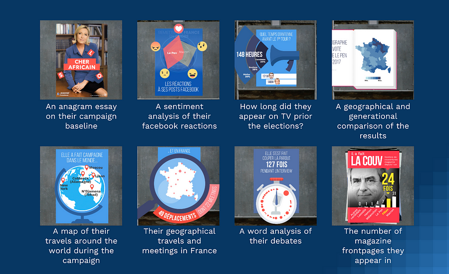
Another innovative technique that has a lot of people talking at the moment is Augmented Reality, and to illustrate this in the context of data journalism, I am bringing you this project called ExtraPol by WeDoData in France.

Extrapol is an augmented reality app (iOS and Android) that was launched a month before the French presidential campaign in April 2017. Everyday, official candidates posters could be turned into new live data visualisations to inform the audience on the candidates. This data journalism project treated 30 topics in data such as: their geographical travels in France during the campaign, the cumulated number of years they have ruled a political mandate, etc.

This is probably the first ephemeral daily data journalism news app which uses augmented reality. This was the first time that real life materials, the official candidates posters, were ‘hacked’ to fact news on the politicians.

Technologies used for this project: Python, Javascript, HTML, CSS, PHP, jsFeat, TrackingWorker, Vuforia, GL Matrix, Open CV, Three.js, Adobe Illustrator, After Effect and Photoshop


Newsgames

They aren’t a new trend, but more and more newsrooms are playing with this. And this example, called ‘The Uber Game’ by the Financial Times in the UK, has been a key player in the field this year, inspiring news teams around the world…

This game puts you into the shoes of a full-time Uber driver. Based on real reporting, including dozens of interviews with Uber drivers in San Francisco, it aims to convey an emotional understanding of what it is like to try to make a living in the gig economy.

It is an innovative attempt to present data reporting in a new, interactive format. It was the third-most read by pageviews throughout 2017.

Roughly two-thirds of people who started the game finished it — even though this takes around 10 minutes and an average of 67 clicks.

Technologies used for this project: Ink to script the game, inkjs, anime.js, CSS, SCSS, NodeJS, Postgres database, Zeit Micro, Heroku 1X dynos, Standard-0 size Heroku Postgres database, Framer, Affinity Designer


Collaborations are still a big thing

And many organisations worldwide have had a go at it, in many regions around the world.
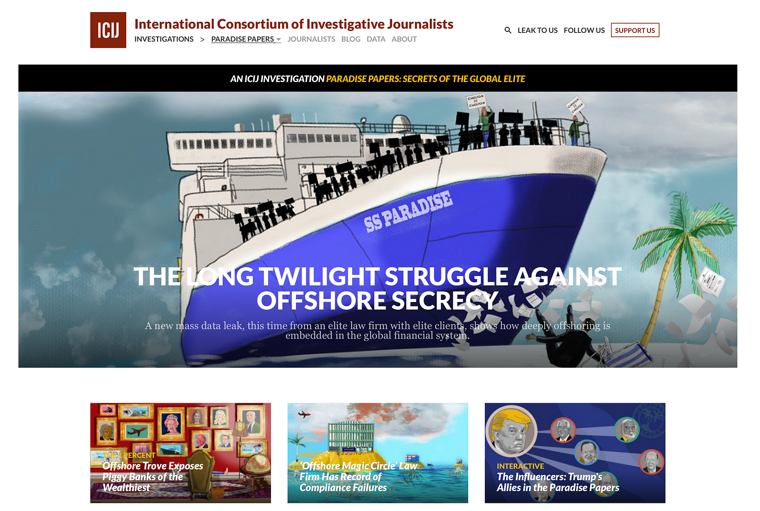
Paradise Papers

Of course we have the Paradise Papers investigation (pictured above) coordinated by the ICIJ with 380 journalists worldwide.

Based on a massive leak, it exposes secret tax machinations of some of the world’s most powerful people and corporations. The project revealed offshore interests and activities of more than 120 politicians and world leaders, including Queen Elizabeth II, and 13 advisers, major donors and members of U.S. President Donald J. Trump’s administration. It exposed the tax engineering of more than 100 multinational corporations, including Apple, Nike, Glencore and Allergan, and much more.

If you want to know more about how this was done, go to the Data Journalism Awards 2018 website where that information is published.

The leak, at 13.4 million records, was even bigger in terms of the number of records than the Panama Papers, and technically even more complex to manage.

The record set came from an array of sources from 19 secrecy jurisdictions. It also contained more than 110,000 files in database or spreadsheet formats (excel, CSVs and SQL). ICIJ’s data unit used reverse-engineering techniques to reconstruct corporate databases. The team scraped the records in the files and created a database with information of companies and individuals behind them.

The team then used ‘fuzzy matching’ techniques and other algorithms to compare the names of the people and companies in all these databases to lists of individuals and companies of interest, including prominent politicians and America’s 500 largest publicly traded corporations.


Technologies used for this project:

  • For data extraction and analysis: Talend Open Studio for Big Data, SQL Server, PostgreSQL, Python (nltk, beautifulsoup, pandas, csvkit, fuzzywuzzy), Google Maps API, Open Street Maps API, Microsoft Excel, Tesseract, RapidMiner, Extract
  • For the collaborative platforms: Linkurious, Neo4j, Apache Solr, Apache Tika, Blacklight, Xemx, Oxwall, MySQL and Semaphor.
  • For the interactive products: JavaScript, Webpack, Node.js, D3.js, Vue.js, Leaflet.js and HTML.
  • For security and sources protection: GPG, VeraCrypt, Tor, Tails, Google Authenticator, SSL (client certificates) and OpenVPN.


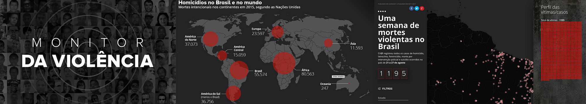
Monitor da violencia

Now here is an other collaborative project that you may not know of but is also quite impressive. It is called ‘Monitor da Violencia’, and it won the Microsoft award for public choice at this year’s Data Journalism Awards. It was done by G1 in Brazil, in collaboration with the Center for the Study of Violence at University of São Paulo (the largest university in Brazil) and the Brazilian Forum of Public Security (one of the most respected public security NGOs in Brazil).

This project is an unprecedented partnership which tackles violence in Brazil. To make it possible, G1 staff reporters all over Brazil kept track of violent deaths through the course of one week. Most of these are crimes that generally become forgotten — cases of homicides, robberies, deaths by police intervention, and suicides. There were 1,195 deaths in this period — one every 8 minutes on average.

All these stories have been cleared and written by more than 230 journalists spread throughout Brazil. This is a small sample — compared to the 60,000 annual homicide rate — but it represents a picture of the violence in Brazil.

The project aims at showing the faces of the victims; trying to understand the causes of this epidemic of deaths. As a first step, a news piece was written for each one of the violent deaths. An interactive map, complete with search filters, showed the locations of the crimes as well as the victim’s photos.

The second step was a collective and collaborative effort to find the names of unidentified people. A campaign was launched, including online, on TV and social media, so that people could help identify many of the victims.

A database was assembled from scratch, containing information such as the victims’ name, age, race, and gender. Also, the day, time, weapon used, and the exact location of the crime, among others.

Technologies used for this project: HTML, CSS, Javascript, Google Sheets, CARTO


Onwards and upwards for data journalism in 2018

The jury of the Data Journalism Awards, presided over by Paul Steiger, selected 13 winners (and one honorable mention) out of the 86 finalists for this year’s competition, and you can find the entire list, accompanied by comments from jury members, on the Data Journalism Awards website.

The insights I’ve listed in this article today show us that not only is the field ever-growing, it is also more impactful than ever, with many winning projects bringing change in their country.

Congratulations again to all of the winners, shortlisted projects, but also to all the journalists, news programmers, and NGOs pushing boundaries so that hard-to-reach data becomes engaging and impactful projects for news audiences.


The competition, organised by the Global Editors Network, with support from the Google News Initiative, the John S. and James L. Knight Foundation, Microsoft, and in partnership with Chartbeat, received 630 submissions of the highest standards from 58 countries.

Now in its seventh year, the Data Journalism Awards was launched in 2012. In the first edition, it received close to 200 projects. Over the years it has grown to become the first international awards recognising outstanding work in the field of data journalism, receiving the highest amount of submissions in the history of the competition in 2018.


marianne-bouchart

Marianne Bouchart is the founder and director of HEI-DA, a nonprofit organisation promoting news innovation, the future of data journalism and open data. She runs data journalism programmes in various regions around the world as well as HEI-DA’s Sensor Journalism Toolkit project and manages the Data Journalism Awards competition.

Before launching HEI-DA, Marianne spent 10 years in London where she worked as a web producer, data journalism and graphics editor for Bloomberg News, amongst others. She created the Data Journalism Blog in 2011 and gives lectures at journalism schools, in the UK and in France.


A data journalist’s guide to sports data

The Winter Olympics 2018 in PyeongChang, South Korea, are just a few weeks away, and the football world cup 2018 is not far off either. While many journalists around the world are preparing their coverage, we wonder: how do you get ready for these big sporting events? What’s the difference between a sports data journalism project and any other data project? Where do you find data and analytics on this topic?


From top left, clockwise: ‘The Tennis Racket’ project by BuzzFeed News, ‘Who is your Olympic body match?’ by the BBC, the ‘One-handed backhand’ project by The New York Times, and ‘Could you be an assistant referee?’ by The Times.


We’ve gathered four experts from both sides of the pond to answer these questions and share tips on how to best work with sports data in the newsroom.

Steve Doig from ASU’s Cronkite School of Journalism (US), Paula Lavigne from ESPN (US), Nassos Stylianou from the BBC (UK), and Malcolm Coles, digital publishing strategy consultant, formerly with the Telegraph and the Trinity Mirror (UK), all joined the conversation. Here is a compilation of what we’ve learned.


The main differences between sports data and other types of data

All our experts agreed that working with sports data is a little different from working with any other types of data.

Here are the four main differences they pointed out during our discussion:

  • You don’t have to have a public records fight to get it
  • The problem with sports data is that there’s such a flood of it that people are still trying to find ways to get good signal out of all the noise
  • The data is often very granular (up-to-the-minute data, or even up-to-the-second data, is quite common)
  • Fans have a huge interest in it

“Sports is the one part of a news organisation where the consumers really care about numbers. It’s a lot harder to sell a data story in other news contexts,” Steve Doig (ASU’s Cronkite School of Journalism, US).

The fastest 100m times ever. Those caught doping struck out in red.

— @jonbir90


As the example above shows, there’s a whole data ecosystem of what you can call the ‘obsessed fans’, some of whom ‘have gone on to create viable business models of gathering and adding value to the raw data’, Doig argued.


Steve Doig shared with us this glossary of some “moneyball” metrics that have been created, often by fans rather than the pros themselves


Where do you find sports data?

“In the US, certainly, the major pro sports leagues have opened up their data streams to just about anyone…and much of it can be played with using simple computer tools like Excel,” Steve Doig (ASU’s Cronkite School of Journalism, US).


Opta

Opta is the world’s leading live, detailed sports data provider. A lot of their stats are proprietary, but a lot of news organisations in the world have agreements with them.


Transfermarkt

Transfermarkt is a German-based website owned by Axel Springer that has footballing information, such as scores, results, statistics, transfer news, and fixtures.


WhoScored

WhoScored brings you live scores, match results and player ratings from the top football leagues and competitions.


Statsbomb Services

Many clubs are interested in incorporating statistics into their workflow, but few have the staff who know where to start. StatsBomb Services organises and parses all the data, delivers cutting edge visualisations and analysis, and is totally useful to journalists too.


Sport-reference websites (US)

In the US, a good source of data are the various *-Reference.com sites, with the asterisk filled in with the name of the sport, like baseball and pro football (American style).


CIES Football Observatory

Since 2013, the CIES Football Observatory has developed a powerful approach to estimate the transfer value of professional footballers on a scientific basis.


NBA Stats

The leagues themselves, such as the NBA, supply data on players, teams, scores, lineups, and more.


ESPN Cricinfo

For cricket data, ESPN cricinfo is fantastic. It gathers very granular information on all matches and series from the past few years, ordered by country or by team.


Wikipedia

Scroll down Wikipedia pages and they often have tables of data that you can grab.


Where do you find olympics data?

When it comes to the Olympic Games it is usually the Olympics Data Feed that has all the data:


The Olympic Data Feed is used by many news organisations worldwide


Alternatively, you can always look at Wikipedia, where a lot of data tables are available. For example, here is a table about the 100 metres at the Olympics:


Wikipedia offers a lot of historical data related to the olympics

“What is fantastic with Olympic Games is the very different attributes of the athletes (age, height, weight) which you do not really get with other sports,” Nassos Stylianou from the BBC (UK).

Here is a project the BBC ended up doing for the Rio Olympics:


Over 10,500 athletes out of some 11,500 in the official Olympic Data Feed (ODF) have been used in this project.


Is verification a big issue in sports data?

“Verification is tricky, but not in the same way as data verification for other topics. It could be tricky when different data organisations or websites have different methodologies in their data collection,” Nassos Stylianou from the BBC (UK).

How do you choose which data to go after?

Nassos Stylianou: From our point of view, presenting data in a way that the audience understands is key. So wherever possible really, ‘industry standards’ are great, if they are meaningful and can provide interesting stories. But sometimes, it is the analysis of that data in a slightly different way that could provide a new and interesting angle. I don’t think that is different to any other type of data journalism really. Ask the right questions of your data, ask why certain things could be happening, try to visualise them in a way that answers all these questions.


The “One race, every medalist ever” project by The New York Times


Malcolm Coles: It depends what you’re trying to achieve. Are you looking to illuminate a specific event or match? Or trying to tell a story? Even for the latter, I think something like the project ‘One race, every medalist ever’ by The New York Times is doable with just Wikipedia data. But if you wanted to tell the story of how Bolt dominates, you would need split times for every 10m and you can’t get that from Wikipedia.


Interesting examples to look at

This project below, which is video-led, is a good example of where analysis of techniques worked really well with some data.


The “One-handed backhand project” by The New York Times


And this one, is an example where the Times newspaper worked with the Football Association to build a game for their audience to show how difficult or easy it is to referee (The Wall Street Journal did a similar one with being a tennis line judge). So working with analysts really does help.


What makes a good sports data story?

Steve Doig: Much of my career has been in investigative work, so I lean towards stories that investigate problems. A good example is the ‘Tennis Racket’ investigation by Buzzfeed’s John Templon and Heidi Blake.


The Tennis Racket investigation by BuzzFeed News


I also like fun stories, which can be created out of novel use of data. I’ve always argued that data journalism in general adds evidence to stories that otherwise would be collections of anecdotes. So sports data can do the same, I think. The data at least adds weight to the arguments being made about strategies or player choices, etc.

Nassos Stylianou: I don’t think this is different from any news story really –although it can be a lot more fun! So as with data journalism in general, a [good sports data story is a] story that tells you something new in a visually engaging way.

Malcolm Coles: A good sports data story is the same as any other good story really. I’ve tended to be more interested in how you can use data to visualise a story that you would otherwise tell in lots of complicated words.

Tips on visualising sports data

Nassos Stylianou: Always think of who your audience is. Many sports fans could be used to a certain type of visualisation that makes sense to them but makes no sense to other people. If you are aiming your story in their direction, you can work with that in mind but if you want this to go beyond the sport obsessive, that’s not always the best strategy.


Malcolm Coles: I think a good visualisation is one that works on a mobile phone … I get shown this visualisation (pictured left) on the 2010 World Cup every year. It’s just fixtures data visualised — was great for its time. I get asked to build one like it every year, yet it won’t work on a mobile.

Steve Doig: Be aware of the growing number of sports analytics conferences being organized. The original, I believe, is the MIT Sloan Sports Analytics Conference held each year in Boston. About 1,800 young MBA students from all over the country (and now the world) show up trying to get hired as data analysts by sports leagues.


How do you get ready for big sports events like the Olympics, the Superbowl, or the Football World Cup?

Steve Doig: I’d say, do the same thing the on-air commentators do: gather all the relevant historical stats and be ready to use them in your stories. It’s also good to have stable of data analytics experts whose voices you can add to your stories.

Nassos Stylianou: Yep, prep well in advance. The great thing with these big events is also to build things that will work throughout the tournament.

Malcolm Coles: Try and build stuff outside of one off stories or investigations that you can reuse when the big tournament is over.


To see the full discussion, check out previous ones and take part in future ones, join the Data Journalism Awards community on Slack!

Over the past six years, the Global Editors Network has organised the Data Journalism Awards competition to celebrate and credit outstanding work in the field of data-driven journalism worldwide. To see the full list of winners, read about the categories, join the competition yourself, go to our website.


marianne-bouchart

Marianne Bouchart is the founder and director of HEI-DA, a nonprofit organisation promoting news innovation, the future of data journalism and open data. She runs data journalism programmes in various regions around the world as well as HEI-DA’s Sensor Journalism Toolkit project and manages the Data Journalism Awards competition.

Before launching HEI-DA, Marianne spent 10 years in London where she worked as a web producer, data journalism and graphics editor for Bloomberg News, amongst others. She created the Data Journalism Blog in 2011 and gives lectures at journalism schools, in the UK and in France.


Empowering women in media and data journalism

The deadline to apply to the Data Journalism Awards 2018 is fast approaching. As data journalists from around the world have just one week to gather their best data-driven work, we met with Mariana Santos, founder and co-director of Chicas Poderosas, also member of the competition jury. Her vision inspires women in Latin America and around the world. In this interview, she tells us how she wants to share her accomplishments as an innovator in digital media with other women, and to help them succeed as new media leaders.


Chicas Poderosas has been “changing the face of media, one woman at a time” since 2013. What specific skills do you think are most important for women who work in the media industry?


Depending very much in what community women work in, they need specific skills.

If we talk about Bolivia, for example, the women with whom we are working there are mainly radio communicators. They have very basic access to the internet. That is why we first trained them on the basics of how to use Facebook and Twitter, such as creating groups, using hashtags, replying and doing reports with video, audio and text. Then, we organised a 3-day hackathon to show them how to make their own audio podcast.

In other countries like Colombia, for instance, we put the emphasis on fact-checking training to show how to track social media networks, and also how to understand trends. Especially in times of elections, fact-checking is important there, as fake news have been especially spread all around social networks, and it is essential in journalism generally. 

An other skill we train women on is data-scraping, to understand how to work with data. We also organise data visualisation workshops, which are more about design and conceptualization of user journeys, as well as work on interfaces.

So, from technology, arts and journalism – everything comes together. Depending on the community we work in, we change the technology that we are using.


Why is there a difference between women and men in the media industry?


When you look at the development departments within newsrooms, most of them are made of men. I worked at the Guardian from 2010 to 2013, and in a group of 200 people working on development, we were only three women. You can find the same situation in Latin America, only it’s even worse. 

We want to change this! We want women to grab their future with their own hands, and understand that technology is not only the future but also the present.

In most training programmes, as soon as it is about technology, there will be way more men than women. Creating Chicas Poderosas, which has “women” (chicas) in its name, automatically attracted more women. We’ve created a space where they feel comfortable, where it’s ok to fail, where they are not being judged, and where they can share their doubts, questions and insecurities. A space where they can grow together and be better together.


One thing you are focusing on is the situation of women in politics and how to use data journalism to improve gender inequality in Central American governments. As you are mainly working in Brazil, can you give us an insight on what the situation is like for women over there?


From what I know, and what I’ve been feeling, the political situation is very poor. Right now you have extremely corrupted candidates who run for president. Even the former president tries to get into office again, even though he is about to be put in jail.

The situation for women is worse. They have quotas for the number of women to represent congress, parliament, and the government. But in most cases, they are actually either daughters, wifes, sisters or cousins of male presidents or males who are somehow connected to the political scheme. Therefore, they do whatever they are told to do.

That’s not what we need! With Chicas Poderosas we start a discussion in politics, asking questions such as “what does it take for women to be taken seriously in politics?”


What are you looking for when voting for projects from the Data Journalism Awards competition? 


Data journalism for me is the core of journalism and that is what I began with. What I look for are proposals that are varied, not laid back safe, not copying the great examples that are already there, projects that come up with something new. Engage me in the story! That’s the main thing.

Regardless of the story, I want to see variety. See out of the box, go out of your comfort zone and show me what you can do!


Besides teaching digital and new media skills, Chicas Poderosas offers leadership training. Why is it especially important for women?


In Latin America I see that women have a tendency to block themselves, to not believe that they can do the things they want to do, and therefore, there is a lack of women leaders. Why does a woman has to become more man-like in order to be seen as a leader? This is something we really want to change!

Women have so many skills and qualities that they often don’t use. This is really sad because they have characteristics that are really useful and needed for leadership. 


What are your main pieces of advice for women in media leadership positions? 


I’ve been meeting amazing women leaders in the media and we are trying to bring them to the New Ventures Lab that we have started a few weeks ago in St. Paulo, Brazil. We need more women role models in Latin America! We bring them to share their stories and insecurities, and we are trying to teach them to be very goal-driven.

As an entrepreneur you need to not only want but also to be able to do it. To run the extra mile and give a little bit more. Because you may have a full-time job, or a family to take care of. 

In order to strive within new media you have to think outside of the box, because journalism has changed – print is dying, digital is here to stay. We cannot think the same way as we did in print days. The same thing goes for leadership. Whether you are a man or a woman, use all your strengths and your skills in your execution of leadership.


What upcoming projects do you have at Chicas Poderosas?


The next big goal is to finish our New Ventures Lab initiative on 25 May 2018, in St Paulo, Brazil, at Google’s offices. There, ten teams will have to reach their full potential, launch and run their own businesses.

What we want to do is to have a very solid structure in terms of investigative media training. This is our main core and it will always be.

We created a network that gathers people from 11 countries in Latin America, and supports women. 


Finally, what are your favourite programmes to create graphics with?


I love making illustrations with Illustrator and animating everything in After Effects. Sometimes I like using stop-motion as well but that’s a little bit more crafty and handmade: you draw, you keep the paper, you lay it on any surface you have and take a picture of every movement you want to create. That makes a really crafty animation. It’s very time consuming but, when you don’t give me any time limitation, that’s what I love doing the most.


Michaela Gruber is a journalism and media management student, based in Vienna, Austria. During her studies she spent a semester abroad in France, where she started working for HEI-DA.

As the company’s communication officer, she is in charge of the Data Journalism Blog and several social media activities. This year, Michaela will also be HEI-DA’s editor covering the Data Journalism Awards in Lisbon, Portugal.

The future of news is not what you think and no, you might not be getting ready for it the right way

This article was originally published on the Data Journalism Awards Medium Publication managed by the Global Editors Network. You can find the original version right here.

_______________________________________________________________________________________________________________________


Editors, reporters and, anyone in news today: how prepared are you for what is coming? Really. There is a lot of talk right now on new practices and new technologies that may or may not shape the future of journalism but are we all really properly getting ready? Esra Dogramaci, member of the Data Journalism Awards 2017 jury and now working as Senior Editor on Digital Initiatives at DW in Berlin, Germany, thinks we are not. The Data Journalism Awards 2017 submission deadline is on 10 April.


Esra Dogramaci, Senior Editor on Digital Initiatives at DW, Photo: Krisztian Juhasz


Before joining DW, Esra Dogramaci worked at the BBC in London and Al Jazeera English, amongst others. She discusses here the preconceived ideas people have about the future of journalism and how we might be getting it all wrong. She also shares some good tips on how to better prepare for the journalism practices of the future as well as share with us her vision of how the world of news could learn from the realm of television entertainment.


What do you think most people get wrong when describing the future of journalism?


There are plenty of people happy to ruminate on the future of journalism — some highly qualified such as the Reuters Institute and the Tow Center who make annual predictions and reports based on data and patterns while others go with much less than that. Inevitably, people get giddy about technology — what can we do with virtual reality (VR), augmented reality (AR), artificial intelligence (AI), personalisation (not being talked about so much anymore), chatbots, the future of mobile and so on. However with all this looking forward to where journalism is headed (or rather how technology is evolving and, how can journalism keep pace with it), are we actually setting ourselves and journalism students up with all that is needed for this digital future? I think the answer is no.


What is, according to you, a more adequate description (or prediction) of the future of news?


If we’re talking about a digital future, the journalists of tomorrow are not equipped with the digital currency they will need.

Technology definitely matters but it’s not so useful when you don’t have people who understand it or can build and implement appropriate strategy to bridge journalism in a digital age. Middle or senior management types for instance, are less likely to know how to approach Snapchat, which they would be less likely to use, than a high school teenager who is using it as a social sharing tool or their primary source of news.

So if we aren’t actually:

1. Listening to our audience and knowing who they are and how they use these technologies, and

2. Bringing in people who know how to use these tools that speak to and with the audience,

…the efforts are going to be laughable at worst and dismissed at best.

In essence, technology and those who know how to use, develop and iterate it go together. That’s the future of news. We should be looking forward with technology, but we’ve also got to look back at the people coming through the system that will inherit and step into the – hopefully relevant – foundations we’re building now.


“Are we actually setting ourselves and journalism students up with all that is needed for this digital future?”


When looking at the evolution of journalism practices over the past few years, which ones fascinate you the most?


There are two things that stand out. The first is analytics and the second is the devolution of power, both points are interrelated.

Data analytics have really transformed non-linear journalism. Its instantly measurable, helping people make editorial decisions but also question and understand why content you thought would perform doesn’t. Data allows us to really understand our audience, and come up with content that not just resonates with them but how to package content that they will engage with. For instance a website audience is not going to be the same as your TV audience (TV is typically older and watches longer content but again the data will tell specifics), so clipping a TV package and sticking it on Facebook or YouTube isn’t optimal and suggests to your audience that you don’t understand these platforms and more importantly, them. They will go to another news provider that does.

An example of this was a project where it was traditionally assumed [in one of my previous teams] that the audience was very interested in Palestinian-Israeli conflict and so a lot of stories were delivered about it. However, we discovered through the numbers, on a consistent basis, that the audience wasn’t as interested as assumed, rather people were more into the conflicts in Syria, Yemen as well as Morocco and Algeria stories. These stories and audiences may not have traditionally registered on top of the editorial agenda because of what was historically thought to be in the audiences interest, but our data was suggesting we needed to pay more attention to the coverage in these areas.

Now, that being said, it’s still stunning to see how little analytics are used day to day. There still seems to be a monopoly on the numbers rather than integration into newsrooms. There are a plethora of tools available in making informed editorial or data decisions but generally editors don’t understand them or follow metrics that are not useful because they don’t know how to interrogate the data, or we hear things like ‘I’m an editor, I’ve been doing this for x years, I know better.’

Fortunately though, about 80–90% of editors I find are keen to understand this data-driven decision-making world and once you sit down and explain things, they become great advocates. Ian Katz at BBC Newsnight, Carey Clark at BBC HardTalk are two editors who embody this.

The second area is devolving power. The best performing digital teams are when not all decision-making is consolidated at the top, and you really give people time and space to figure out problems, test new ideas without the pressure always to publish. That’s a very different model to traditional hierarchical or vertical journalism structures. Its an area of change and letting go of power. But empowering the team empowers leaders as well.

An example of this is a team I worked with where all decisions and initiatives went through a social media editor. As a result, there was a bottleneck, and frustration for things not being done and generally being late to the mark on delivering stories and being relevant on platform as competitors were overtaking. What we did is decentralise control — we asked the team what platforms they’d like to take responsibility for (in addition to day to day tasks) and together came up with objectives and a proposition to deliver on those. The result? Significant growth across the board, increase in engagement but perhaps most importantly, a happier team. That’s what most people are looking for: recognition, responsibility, autonomy. If you can keep your team happy, they are going to be motivated and the results will follow.


Global Headaches: the 10 biggest issues facing Donald Trump, by CNN


Do you have any stories in mind that represent best what you think the future of newsmaking will look like?


CNN digital did this great Global Headaches project ahead of the US elections last year.

The project was on site (meaning that traffic was coming to the site and not a third party platform), made for mobile which would presumably reflect an audience coming mainly from mobile, used broadcast journalists and personalities as well as regular newsgathering, with an element of gamification. Each scenario had an onward journey which then takes your reader out of the game element and into the story.


Example from the “onward journey” with the CNN “Global Headaches” project


This isn’t a crazy high tech innovation but it is something that would have been much harder to pull off say 5 years ago. This example is multifaceted and making use of the tools we have available today in a smart way. It demonstrates that CNN can speak to the way their audience is consuming content while fulfilling its journalistic remit.

Examples like this doesn’t mean we should be abandoning long form text for instance and going purely for video driven or interactive stories. The Reuters Institute found last year (in their report The Future of Online News Video) that there is oversaturation of video in publishing and that text is still relevant. So, I would caution against throwing the text baby out with the bathwater, which then comes down to two things:

  1. Know your audience and do so by bringing analytics into the newsroom (it’s still slightly mind boggling the number of newsrooms who do not have any analytics in the editorial process)
  2. Come up with a product that you love and that works. The best of these innovations are multidisciplinary and do something simple using the relevant tools we have, that are accessible today. There’s no use investing in a VR project if the majority of your audiences lack the headsets to experience it.


Do you think news organisations are well equipped for this digital future?


Yes and no. There are the speedboats like Quartz, AJ+, NowThis, Vox, who can pivot quickly and innovate versus the bigger media tankers that turn very slowly. One question I get asked quite a bit is “what’s the most important element in digital change”. The answer is leadership. There needs to be someone(s) who understands, supports and pushes change, otherwise everyone down the ranks will continue to struggle and face resistance.

I truly believe in looking at the people who are on the ground, rolling up their sleeves and getting the work done, trying, failing, succeeding, and who keep persevering — versus always deferring to editors who have been in place for say 10 years to lead the way. Those people in the trenches are the ones we should be shining the light on and listening to. They are much closer to the audience and can give you usable insights that also go beyond numbers.

If I could name a few, people like Carol Olona, Maryam Ghanbarzadeh at the BBC, Alaa Batayneh or Fatma Naib, at Al Jazeera, Jacqui Maher at Conde Nast, need to be paid attention to. You may not see them at conferences or showcased much but by having people like them in place, news organisations are well equipped for a digital future.


Do you see some places in the world (some specific organisations maybe?) that are actually doing better than others on that front?


The World Economic Forum wouldn’t traditionally be associated as being a digital media organisation, but a few years ago they started to invest in social media and develop an audience that normally would not be interested in them. They take data and make it relevant and accessible for low cost, bite size social consumption.

Take this recent video for example:


Your brain without exercise, a video by the World Economic Forum
And also this related one:


Best of 2016 social video by the World Economic Forum


There is also this NYT video of Simone Biles made ahead of the 2016 summer Olympics which then has the option of taking you to an onward site journey.

The Financial Times hasn’t been afraid of digital either. You see them taking interesting risks which might go over a lot of people’s heads but the point is they’re trying. Like in their project “Build your own Kraft Heinz takeover”.


Then there are the regular suspects — AJ+ isn’t trying to do everything, they’re trying to be relevant for a defined audience on the platforms that audience uses. Similarly, Channel 4 News isn’t pumping out every story they do on social, but deliberately going for emotionally charged stories rather than straight reporting as well as some play with visualising data.


What would you like to see more of in newsrooms today which would actually prepare staff better for what’s coming?


When you’re hiring new staff, assign them digital functions and projects rather than putting them on the traditional newsroom treadmill. A lot of organisations have entry level schemes and this could easily be incorporated into that model. That demonstrates that digital is a priority from the outset. You could also create in house lightning attachments, say a six-week rotation at the end of which you’re expected to deliver something ready for publishing, driven by digital. My City University students were able to come up with a data visualization in less than an hour, and put together a social video made on mobile in 45 minutes (social or mobile video wasn’t even on the course but I snuck it in). Six weeks in a newsroom is plenty of time for something substantial.

Also, have the right tools in place and ensure that everyone is educated on the numbers. Reach and views for instance get thrown around a lot- they are big easy numbers to capture and comprehend, but we need to make a distinction between what is good for PR versus actionable metrics in the newsroom. As more people clue into what matters, I do think (and we see in certain places like Newswhip for instance) where success is based on engagement, interactions and watchtime rather than views, impressions or reach.

Finally and obviously, its devolution of power and more risk taking. Make people better by empowering them — that means carve out the time and space to experiment without the pressure to deliver or publish. When you are continually driving staff against deadlines, creativity suffers. Fortunately there are so many third party tools and analytics that will very quickly tell you what’s working and what’s not, contributing to a much more efficient newsroom freeing up valuable time to think and experiment. Building multi disciplinary teams is a good step in this direction. DW is experimenting with a “lab like” concept bringing together editorial, technical and digital folks in an effort to bring the best of all worlds together and see what magic they come up with.


From your experience teaching social and digital journalism at City University London, what can you say about the way the younger generation of journalists is being trained for the future? Do they realise what’s at stake?


At the beginning of term, I heard quite a few students say that digital didn’t matter, it wasn’t “real journalism” and that they were taking the class merely because it was perceived as an “easy pass”. That’s because the overall coursework, emphasized magazine and newspaper journalism. At the end of the term, and almost on a weekly basis since, my former students write to me about either digital projects they have done, digital jobs they are going for or how something we went over in the class has led to another opportunity.

There remains a major emphasis on traditional broadcast journalism — TV, radio, print, but very little for digital. That’s not something to fault students on. Digital is changing constantly but teaching staff mainly reflect the expertise of the industry, and that expertise is traditional. While there are a lot of digital professionals, it does not come close to the level of expertise and experience currently on offer at institutions training the next journalist generation. That being said organisations like Axel Springer have journalism academies where all of their instructors, are working full time in media and can translate the day to day relevance into the classroom. That’s more of the kind of thing we need to have.

The students I think do realise what’s at stake because a lot of those journalism jobs they’re applying for all require some level of digital literacy. Sure everyone might watch a YouTube video but what happens when an Editor asks you why a news video has been uploaded and monetised by other users elsewhere. Would you know what to do?


What could be done to improve the educational system in the UK and beyond? Simply make journalism courses more digitally focussed?


There is nothing that will compel places to change but reputation. If students are leaving institutions because what they are learning is not preparing them to meet the demands of the industry they’re choosing to go into, word will spread sooner than later. There will surely be visionary institutions who ‘get it’ and adapt, some are there already.

‘Smart’ places will build in digital basics so students can have the confidence to hit the ground running. I see this in a lot of digital job requirements. It’s a given that anyone starting in journalism in 2017 has basic social media literacy. Beyond that everything is a bonus — how can you file from a mobile phone, can you interpret complex data and tell a story with it. Then, are you paying attention to analytics?

As Chris Moran (Guardian) had pointed out:


“staff blame the stupid internet for low page views on a piece…but credit the quality of the journalism when one hits the jackpot.”

We need a much more sophisticated understanding beyond yes/no answers to points like these.

A lot of media houses have academies or training centres expected also to bridge digital gaps. The caution there is that the trainings they offer when it comes to things beyond CMS, uploading video, etc., is that other digital knowledge seem to fall in the “nice to know” rather than “you need this” category. The best thing is to find the in-house talents who know what they’re talking about and get them to lead the way.


Another recurrent question when talking about our digital future is the question of business models for news organisations. As the latter are under continual financial strain, you actually think we should get inspiration from the entertainment industry. Can you elaborate on this idea?


Yes. The entertainment industry always has a much larger creative capacity and funding so they are able to take more risks with less at stake. That’s where we should be looking and seeing what the obvious news applications could be rather than trying to build our own innovations all the time. Most news houses just cannot compete with entertainment budgets. Jimmy Fallon showcased Google Tilt brush in January 2016:


https://www.youtube.com/watch?time_continue=2&v=Dzy7ydbEyIk


I then saw it in November 2016 at a Google News event but have yet to see anyone use it in a meaningful news application. It doesn’t necessarily mean that all these things will be picked up on, but it does mean we should keep a finger on the pulse of what’s possible. Matt Danzico, now setting up a Digital News Studio at NBC is in a unique position. He’s in the same building as Late Night, SNL, and others. That means he has access to all the funky things entertainment is coming up with and can think about news applications for it.

Similarly, how can news organisations think about teaming up with Amazon or Netflix for instance and start to make their content more accessible? These media giants have the capacity to push creative boundaries and invest, and news organisations have their journalistic expertise to offer in that relationship. That’s very relevant in this time of “fake news”.


You have recently been appointed Senior Editor of Digital at DW in Berlin. Can you tell us more about what this position entails and the type of projects you’ll be doing? How different is it from what you’ve done in the past at the BBC and Al Jazeera for example?


DW is in a position familiar to many broadcasters, and that is a slight shift away from linear broadcasting to a considerable foray into digital. The difference is that DW is not starting from zero, with plenty of good (and bad) examples around to learn from. The first thing is to set a good digital foundation — getting the right tools in house and bringing people along on the digital journey — in a nutshell increasing literacy and comfort with digital. Once that is done I think you’ll see a very sharp learning curve and a lot more ambitious digital projects and initiatives coming from DW.

We’re very lucky that we have a new Editor in Chief, Ines Pohl and new head of news, Richard Walker, both infused with ideas and energy of making a great digital leap. Complementary to that we have a new digital strategy coming from the DG’s office which I’ve been involved with in addition to a new DW “lab like” concept, as I mentioned before. A lot of people might not know how big DW is — there are 30 language services and English is the largest of those, so getting all systems firing digitally is no small task.

Compared to BBC or AJ, the scope and scale of the task is of course much bigger. At AJ we had a lot of free range in the beginning because no one was doing what we did, at the BBC, there was much more process involved, less risk taking. Based on those experiences, DW is somewhere in the middle, a good balance. 2017 could be the year where stars align for DW. There are approximately 12 parliamentary or national elections in Europe and DW knows this landscape well. So bringing together the news opportunities, a willingness to evolve and invest in something new along with leadership that can really drive it, I think DW will be turning heads soon.


marianne-bouchart

Marianne Bouchart is the founder and director of HEI-DA, a nonprofit organisation promoting news innovation, the future of data journalism and open data. She runs data journalism programmes in various regions around the world as well as HEI-DA’s Sensor Journalism Toolkit project and manages the Data Journalism Awards competition.

Before launching HEI-DA, Marianne spent 10 years in London where she worked as a web producer, data journalism and graphics editor for Bloomberg News, amongst others. She created the Data Journalism Blog in 2011 and gives lectures at journalism schools, in the UK and in France.


How three women are influencing data journalism and what you can learn from them

This article was originally published on the Data Journalism Awards Medium Publication managed by the Global Editors Network. You can find the original version right here.

________________________________________________________________________________________________________________________


Stephanie Sy of Thinking Machines (Philippines), Yolanda Ma of Data Journalism China and Esra Dogramaci of Deutsche Welle, formerly Al Jazeera (Germany), new members of the Data Journalism Awards jury, talk innovation, data journalism in Asia and the Middle East, and women in news.

left to right: Yolanda Ma (Data Journalism China), Esra Dogramaci (Deutsche Welle, formerly BBC and Al Jazeera), and Stephanie Sy (Thinking Machines) join DJA Jury


We welcomed three new members to the Data Journalism Awards jury last year (pictured above). They are all women, strong-willed and inspiring women, and they represent two regions that are often overlooked in the world of data journalism: Asia and the Middle East.

What was your first project in data journalism or interactive news and what memory do you keep from it?

Esra Dogramaci: In 2012, Invisible Children launched a campaign to seek out Lord’s Resistance Army(LRA) leader Joseph Kony and highlight the exploitation of child soldiers. Then, at Al Jazeera, we wanted to see what people in North Uganda, who lived in one of the areas who were affected by the LRA actually had to say about it. They would ‘speak to tweet’ and we would map their reactions on Ushahidi using a Google Fusion table in the background.

 
Uganda Speaks by Al Jazeera


Although Al Jazeera had started doing this kind of projects back in 2009 during the war on Gaza (the experiment’s page of the Al Jazeera Lab website has now disappeared but can be viewed through WebArchive.org), it picked up steam during Egypt’s 2011 Arab Spring where, due to lack of broadcast media coverage, protesters were using social media to bring attention to what was happening.

Interactive story by Thinking Machines


Stephanie Sy: Our first data journalism project as a team at Thinking Machines was a series of interactive stories on traffic accidents in Metro Manila. We cleaned and analysed a set of Excel sheets of 90,000 road accidents spanning 10 years.

It was the first project we worked on as a mixed team of journalists, designers, and data scientists, and the first time we tried to build something from scratch with d3.js! I worked on the d3 charts, and remember being in utter despair at how hard it was to get the interactive transitions to render nicely across different browser types. It was surprisingly well received by the local civic community, and that positive feedback emboldened us to keep working.

 
Connected China, Thomson Reuters


Yolanda Ma: One of my first projects was Connected China for Thomson Reuters, which tracked and visualised the people, institutions and relationships that form China’s elite power structure (learn more about it here).

This project taught me the importance of facts and every piece of data in it (thousands, if not millions in total) went through a rigid fact-checking process (by human beings, not machines, unfortunately). I learned by doing that facts are the bones of data journalism, not fancy visualisations, even though this project turned out to be fancy and cool, which is good too.


Now, what was the latest project you worked on and how do the two compare?


ED: Towards the end of last year, I taught a data journalism module to City University London Master’s students who were able to pull together their own data visualisation projects in the space of an hour. The biggest difference is how vastly the interfaces have improved and how quick and intuitive the designs and interactive softwares are now. There are a lot more companies switched on to storytelling beyond TV or text and that knowledge combined, how do you stand out in the world of online news?

Complementary to that Al Jazeera was always a front runner because they were willing to take risks and try something new when no one else was. In the newsrooms I’ve worked at or see since, there is still a general aversion to risk taking in preference of safety — though everyone knows that to survive and thrive in this digital media landscape, its risk taking, innovation that is going push those boundaries and really get you places.

SS: Our latest related data story is a piece we put together visualising traffic jams across Metro Manila during the holiday rush season. This time we were looking at gigabytes of Waze jams data that we accessed through the Waze API. It definitely grew out of our early work in transit data stories, but reflects a huge amount on growth in our ability to handle complex data, and understanding of what appeals to our audience.

One big piece of learning we got from this is that our audience in the Philippines mainly interacts with the news through mobile phones and via Facebook, so complex d3 interactives don’t work for them. What we do now is to build gifs on top of the interactives, which we then share on Facebook. You can see an example of that in the linked story. That gets us a tremendous amount of reach, as we’re able to communicate complex results in a format that’s friendly for our audience.

YM: I’ve been doing data journalism training mostly in the past few years and helping others do their data projects, so nothing comparable really. The latest project I worked on is this Data Journalism MOOC with HKU in partnership with Google News Lab. It is tailored-made for practitioners in Asia, and it’s re-starting again soon (begins March 6), so go on and register before it’s too late!


What excites you about the future of data journalism and interactive news?


ED: The ability to tell stories in a cleaner, more engaging way. Literally everything can be turned into a story just by interrogating the data, being curious and asking questions. The digital news world has always been driven by data and it’s exciting to see how “traditional” journalism is embracing this more. I love this example from Berliner Morgenpost where they charted this bus line in Berlin, combined with a dash cam comparing various data such as demographics, voting. Its an ingenious way of taking complex data and breaking it into a meaningful, engaging way rather than pie charts.

M29 from Berliner Morgenpost


SS: There are tremendous amounts of data being generated in this digital age, and I think data journalism is a very natural evolution of the field. Investigative journalists should be able to use computer science skills to find their way through messy datasets and big data. It’s absolutely reasonable to expect that a news organization might get a 1 terabyte dump of files from a source.

YM: It excites me because it is the future. We live in the age of data, and the inevitable increasing amount of data available means there is growingly huge potential for data journalism. People’s news consumption is also changing and I believe personalisation is one of the key characteristics for the new generation of consumers, which means interactive news — interactive in many different ways — will thrive.


How are Asian and Middle Eastern media organisations (depending on your experience) doing in terms of data journalism and interactive news compared to the rest of the world?


ED: I think Al Jazeera has always been a pioneer in this. They have a great interactive team that drew together people from various disciplines within the organisation — coders, video people, designers, journalists — before everyone else was doing it and they’ve been able to shed light on stories that wouldn’t usually be picked up on by mainstream media radars.

Example that illustrates my point: The project “Broken homes, a record year of home demolitions in occupied East Jerusalem” by Al Jazeera

“Broken homes, a record year of home demolitions in occupied East Jerusalem” by Al Jazeera


SS: We have a few media organisations like the Philippine Center for Investigative Journalism, Rappler, and Inquirer who have been integrating data analysis into their reporting, but there isn’t anyone regularly producing complex data journalism pieces.

Our key problem is the lack of useful datasets. A huge amount of work goes into acquiring, cleaning, and triple checking the raw data. Analysis is “garbage in, garbage out” and we can’t create good data journalism without the presence of good data. This is where the European and North American media organisations have an edge. Their governments and civic society organisations follow open data standards, and citizens can request data [via FOIA]! The Philippine government has been making serious progress towards more open data sharing, and I hope they’re able to sustain that commitment.

Example that illustrates my point: PCIJ’s Money Politics project is a great example of an organisation doing the data janitorial work of acquiring and validating hard-to-find data. During our last presidential elections in 2015, GMA News Network and Rappler both created hugely popular election tracking live data stories.

PCIJ’s Money Politics


YM: Media organisations in Asia are catching up on data journalism and interactive news. There are some challenges of course, for example, lack of data in less developped countries, lack of skills and talents (and limited training opportunities), and even poor infrastructure or unstable internet especially in rural areas that would limit the presentation of news stories. Despite the difficulties, we do see good works emerging, though not necessarily in English. Check out some of the stories from the last GIJN’s Investigative Journalism Conference held in Nepal and you’ll get an idea.

Example that illustrates my point: This Caixin Media data story analysed and visualised the property market in China for the past few years.


Another New Normal, Caixin Media


What view do you have on the role of women in the world of news today? How is it being a woman in your respective work environment? Do you feel it makes a difference? If so, which one and why?


ED: Women are underrepresented not just in news coverage but in leadership positions too. I have to admit though that being at Deutsche Welle, I see a lot more women in senior management and it feels like a much more egalitarian working environment. However looking at my overall experience as a woman in news, you do face a lot of sexism and prejudice. Every woman I know has a story to tell and when the latest story about Uber came out a lot of my female colleagues around me were nodding their heads.

What got me through challenging times is having a fantastic network of female role models and mentors who are there to support you. That was one piece of advice I gave to prior teams, get a mentor. A lot of women feel isolated or feel the way they are treated is normal but it’s not. Women should also be aware that there is a real risk you will be punished if you speak up, challenge the status quo and tow the party line. If this happens, it’s an environment or team you probably shouldn’t be in anyway.

SS: It’s alarming to see parties around the world trying to stifle the voices of anyone who doesn’t belong and calling any news that doesn’t flatter them as “fake news.”. It’s important for us to speak up as women, and to practice intersectionality when it comes to other marginalised communities. As people who work with data, we can see past the aggregates and look at the complex messy truth. We must be able to communicate that complexity in order for our work to make a difference.

YM: Most of the data journalism teams in China are led by woman, and I think they are doing really well 🙂


What do you think makes a great data journalism project? What will you be looking for when marking projects for the Data Journalism Awards this year?


ED: Simplicity. It’s easy to get lost in data and try to do too much, but it’s often about taking something complex and making it accessible for a wider audience, getting them to think about something they haven’t or perhaps consider in a different way. I’ll be looking for the why — why does this matter, does this story or project make a dent in the universe?

After all, isn’t that what telling stories is about? The obvious thing that comes through is passion. It’s also something obvious but you can tell when a person or team has cared and really invested into the work versus projects being rolled off a conveyor belt.

SS: A great data journalism project involves three things: novel data, clever analytical methods, and great communication through the project’s medium of choice. I’m hoping to see a wide variety of mediums this year!

Will someone be submitting an audio data journalism project? With all the very exciting advances in the field of artificial intelligence this year, I’m also hoping to see projects that incorporate machine learning, and artificial intelligence.

YM: I believe data journalism is after all journalism — it has to reveal truth and tell stories, based or driven by data. I’ll be looking for stories that do make an impact in one way or another.


If you had one piece of advice for people applying for the Data Journalism Awards competition, what would it be?


ED: Don’t be intimidated by the competition or past award winners. Focus on what you do best. I say this especially for those applying for the first time, I see a lot of hesitation and negative self talk of ‘I’m not good enough’ etc. In every experience there’s something to learn, so don’t hesitate.

SS: Don’t forget to tell a story! With data science methods, it’s easy to get lost in fancy math and lose track of the narrative.

YM: Tell us a bit about the story behind your story — say, we may not know how hard it might be to get certain data in your country.


What was the best piece of advice you were ever given in your years of experience in the media industry?


ED: Take every opportunity. That’s related to a quote that has been coming up over and over again for the past week or so, “success is when preparation meets opportunity.”

SS: One of my best former bosses told me to imagine that a hungover, unhappy man with a million meetings that day was the only reader of my work. He haunts me to this day.

YM: I started my career with the ambition (like many idealistic young people) to change China. My first (and second) boss Reg Chua once said to me, don’t worry about changing China but focus on making small changes and work with a long-term vision. Sounds cliche.

He said that to me in 2012. The next year, together with two other friends I started DJChina.org, which started in 2013 as a small blog and now grown to be one of the best educational platforms for data journalism practitioners in China. The year after, in 2014, Open Data China was launched (using the domain name I registered a few years back), and indicated a bottom-up movement to push for more open data, which was incorporated into national policy within a year. So I guess all these proved that Reg was right, and it could be applied to anywhere, or anything. Think big, act small, one story (or project) at a time, and changes will happen.


left to right: Yolanda Ma (Data Journalism China), Esra Dogramaci (Deutsche Welle, formerly BBC and Al Jazeera), and Stephanie Sy (Thinking Machines)


Stephanie Sy is the founder of Thinking Machines, a data science and data engineering team based in the Philippines. She brings to the jury her expertise in data science, engineering and storytelling.

Yolanda Ma is the co-founder of Data Journalism China, one of the best educational platforms for data journalism practitioners in China. Not only representing the biggest country in Asia, she also has experience teaching data skills to journalists and a great knowledge of data journalism from her region.

Esra Dogramaci has now joined Deutsche Welle and formerly worked with the BBC, Al Jazeera in Qatar and Turkey, as well as the UN Headquarters and UNICEF. She brings to the DJA jury significant experience in digital transformation across news and current affairs, particularly in social video and off platform growth and development.


The Data Journalism Awards are the first international awards recognising outstanding work in the field of data journalism worldwide. Started in 2012, the competition is organised by the Global Editors Network, with support from the Google News Lab, the John S. and James L. Knight Foundation, and in partnership with Chartbeat. More info about cash prizes, categories and more, can be found on the DJA 2017 website.


marianne-bouchart

Marianne Bouchart is the founder and director of HEI-DA, a nonprofit organisation promoting news innovation, the future of data journalism and open data. She runs data journalism programmes in various regions around the world as well as HEI-DA’s Sensor Journalism Toolkit project and manages the Data Journalism Awards competition.

Before launching HEI-DA, Marianne spent 10 years in London where she worked as a web producer, data journalism and graphics editor for Bloomberg News, amongst others. She created the Data Journalism Blog in 2011 and gives lectures at journalism schools, in the UK and in France.

Data for dummies

After spending the past seven months studying data, I’ve learnt at least one important lesson: data journalism doesn’t have to be impossibly hard. While there are plenty of things about data journalism which will always go straight over my head – there are also a lot of easy techniques, formulas and programmes. So here are my top 5 data recommendations, for dummies.

Continue reading “Data for dummies”

Data Visualisation vs. Text

Simon Rogers has mapped data which ranked 754 beaches around Great Britain for the Guardian Data Store. The visualisation uses a satellite map of the UK, onto which Simon has marked every beach in its correct geographical location. The dots are colour coded to clearly denote the ranking the beach received from the 2012 Good Beach Guide, green representing ‘Recommended’, purple meaning ‘Guideline’, yellow meaning ‘Basic’ and red indicating that the beach failed to reach the Beach Guide’s standards. Users can click on individual dots to get the names of each beach and its ranking.

In this way an enormous mass of information is presented in a small space. It is also presented in a clear and comprehendible way. Users can spend as long as they like ‘reading’ the map and obtain as much or as little information as they wish to from it.

Underneath the map, Simon has written out all 754 beaches, with their ranking alongside it. As he has done so, we can easily compare the use of text to tell a data story with a visualisation. The text takes up significantly more room. It is much harder to find the individual beaches you are interested in and takes more energy and effort to scroll up and down in order to find a particular beach. The sheer mass of information presented in the text makes the story seem like a drag, rather than a fun exploration of the British coastline, as is felt by the visualisation.

However, underneath the map Simon has highlighted key features and findings of the data. He writes: “The report rated 516 out of 754 (68%) UK bathing beaches as having excellent water quality – up 8% on last year. That compares well to 2010, when it rated 421 of 769 beaches as excellent.”

It is not clear from the visualisation alone how many beaches received each rating and it would have been time consuming and difficult for the user to individually count this. Thus text is useful to provide a summary and to highlight key findings alongside a visualisation.

This is therefore a fine example of the way in which visualisations and text complement each other, and demonstrates that, with many data stories, combining visualisation and text creates the richest, most comprehendible and informative narrative.


Data visualisation and Art

Data is often seen to be as far removed from art as can be. A way of obtaining facts, information and statistics, it is technological rather than personal and beautiful.

Or is it?

Many designers and artists have straddled the line between art and information and used infographics and visualisations to create something that is not only relevant, but beautiful.

Bryan Christie, a New York based designer who regularly produces visualisations for the New York Times, is doing just that. Christie has used a combination of medical text books and MRI scans to reproduce the human hand in a virtual 3D space. The image is both scientific and beautiful.

http://ngm.nationalgeographic.com/2012/05/hands/zimmer-text

Christie said: “The medium I work in is a new form of photography; it is both sculptural and photographic. I model the figures in digital 3D on the computer then use a virtual camera within the computer to take a picture of the piece. There’s an interesting process that occurs in that my work is sculptural and exists in virtual three-dimensional space yet in the end it is viewed in two dimensions much like a photograph.”

Another example of the crossover between data, art and popular culture is Radiohead’s music video for House of Cards from their 2008 album, In Rainbows. The video was created using data visualisations created by Aaron Koblin. It uses 3D plotting technologies to collect information about the shapes and relative distances of objects, including lead singer Thom Yorke’s face, and then visualises the data. The result is eerily beautiful and surprisingly human, with the fragile nature of the lyrics and Yorke’s ethereal vocals perfectly complimented by the ghostly appearance of his face and the disconnected nature of the overall visual image.

http://www.youtube.com/watch?v=8nTFjVm9sTQ

Artists, too, have recognised the potential of data in art. In 2008 the Museum of Modern Art featured an exhibition by Harris and Kamvar, entitled I Want You to Want Me, and which made use of data visualisations to present the pieces. The exhibition, which included a fully interactive 56 inch touch screen installation, chronicles the world’s long-term relationship with romance, and gathered data from a variety of online dating sites in order to give viewers an insight into people’s personal lives. I Want You to Want Me was a beautiful collaboration of computer science, maths and art that uses data to evoke viewers’ emotions at a very personal level. The infographic image further raised questions about the virtual nature of modern relationships regarding dating sites.

http://iwantyoutowantme.org/statement.html

Data visualisations are thus not only an informative way to present a narrative, but can also be a beautiful one. In certain circumstances it can even be considered to be art.


Why Data Journalism is Important

After studying Data Journalism for a year at City University I have come to appreciate the importance of having the skillset to make the most out of numbers and statistics. Many aspiring journalists still see data as something that is separate from journalism, and as something that does not interest them. In response, I have compiled some reasons why data is increasingly important:

1.       Make sense of Mass Information

Having the skills to scrape, analyse, clean and present data allows journalists to present complicated and otherwise incomprehensible information in a clear way. It is an essential part of journalism to find material and present it to the public. Understanding data allows journalists to do this with large amounts of information, which would otherwise be impossible to understand.

2.       New Approaches to Storytelling

Able to create infographics and visualisations, data journalists can see and present information in a new and interesting way. Stories no longer need to be linear and based solely on text. Data can be grafted into a narrative which people can read visually. Interactive elements of data visualisations allow people to explore the information presented and make sense of it in their own way.

3.       Data Journalism is the Future

Understanding data now will put journalists ahead of the game. Information is increasingly being sourced and presented using data. Journalists who refuse to adapt to the modern, increasingly technological world will be unable to get the best stories, by-lines and scoops and their careers will suffer as a result.

4.       Save Time

No longer must journalists pore over spread-sheets and numbers for hours when there could be a simpler way to organise the information. Being technologically savvy and knowing the skills to apply to data sets can save journalists time when cleaning, organising and making sense of data. Not making mistakes due to lack of knowledge can also save a journalist time.

5.       A way to see things you might otherwise not see

Understanding large data sets can allow journalists to see significant information that they might otherwise have overlooked. Equally, some stories are best told using data visualisations as this enables people to see things that they might otherwise have been unable to understand.

 6.       A way to tell richer stories

Combining traditional methods of storytelling with data visualisations, infographics, video or photographs, creates richer, more interesting and detailed stories.

7.       Data is an essential part of Journalism

Many journalists do not see data as a specialist and separate area of journalism, but an interwoven, essential and important element of it. It is not there to replace traditional methods of finding information, but to enhance them. The journalist that can combine a good contact book and an understanding of data will be invaluable in the future.

Data and the London Mayoral elections – let the data help you decide

The Guardian’s Data Store have compiled a catalogue of all the data to do with London, to give readers an objective and overall view of what is happening in the capital.
Polly Curtis’ reality check on 12 April, pins Boris Johnson and Ken Livingstone against each other and asks, “Who is right on police numbers?” She then outlines the Met police figures for London, highlighting what each party have claimed. Polly’s verdict:

Johnson’s campaign is correct in claiming that police officer numbers have risen over his term, albeit only by 2.4% if you take the baseline to be the March 2008, closest to when he was elected in May. But Labour is right that since 2009, the last year that Livingstone budgeted for, numbers have fallen overall by 1.17%.

An interactive map of the number of cycle and pedestrian road casualties offers in insight into road traffic accident hotspots across London. The map produced by ITO World for campaigning group See Me, Save Me, gathers together a decade of road casualty data from the Department for Transport called Stats19. The map distinguishes between pedestrians and cyclists and divides them up between those who were hit by Heavy Goods Vehicles (HGV) and those that weren’t. It also shows the age of the pedestrian or cyclist and the year of the accident. The stand first of the map asks, “With transport a key issue in the mayoral election, what patterns does this map show?”

In addition to showing a map of poverty and deprivation in London, data behind health, education and crime, the Data Store have also created a map showing how London voted in the last Mayoral elections, to give an overview of the Conservative and Labour areas across the capital.

Looking into data and presenting them as maps and infographics can show the bigger context behind a story and make figures more accessible. The Guardian Data stores compilation of London Data allows readers to get an objective view of their city before making decisions on who to vote for this coming Thursday 3 May. Take a look at the data for yourself at http://www.guardian.co.uk/uk/series/london-the-data before voting begins in a couple of days!