A data journalist’s microguide to environmental data

This article was originally published on the Data Journalism Awards Medium Publication managed by the Global Editors Network. You can find the original version right here.

_______________________________________________________________________________________________________________________


Lessons learned from an online discussion with experts

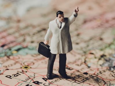
The COP23 conference is right round the corner (do I hear “climate change”?) and many data journalists around the world may wonder: How do you go about reporting on environmental data?


With the recent onslaught of hurricanes, such as Harvey, Irma, and Maria, and wildfires in Spain, Portugal and California, data journalists have been working hard to interpret scientific data, as well as getting creative to make it reader friendly.

The COP23 (do I hear climate change?) also serves as a great opportunity for data journalists to take a step back and ask:

What is the best way of reporting on data related to the environment? Where do you find the data in the first place? How do you make it relatable to the public and which challenges do you face along the way?

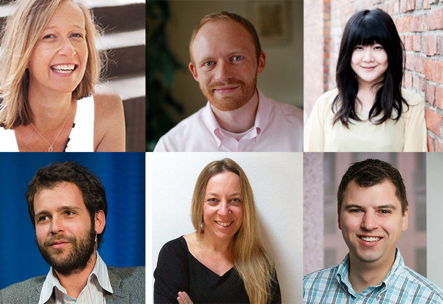
From top left to bottom right: Kate Marvel of NASA GISS (USA), James Anderson of Global Forest Watch (USA), Rina Tsubaki of European Forest Institute (Spain), Gustavo Faleiros of InfoAmazonia (Brazil), Elisabetta Tola of Formicablu (Italy), and Tim Meko of The Washington Post (USA)


We gathered seven amazing experts on the Data Journalism Awards Slack team on 5 October 2017 to tackle these questions. Tim Meko of The Washington Post (USA), Gustavo Faleiros of InfoAmazonia (Brazil), Rina Tsubaki of European Forest Institute (Spain), Kate Marvel of NASA GISS (USA), Elisabetta Tola of Formicablu (Italy), Octavia Payne and James Anderson of Global Forest Watch (USA), all took part in the discussion.

Here is a recap of what we’ve learned including tips and useful links.


Environmental data comes in many formats…only known by scientists


When it comes to working with environmental data, both journalists and scientists seem to be facing challenges. The main issue seems not to come from scarcity of data but rather from what journalists can do with it, as Elisabetta Tola of Formicablu (Italy) explained:

‘Things are still quite complicated because we have more data available than before but it is often difficult to interpret and to use with journalistic tools’, she said.

There also seems to be a gap between the speed at which data formats evolve in that area and how fast journalists learn how to work with these formats.

‘I think we are still in a moment where we know just a little about data formats. We know about spreadsheets and geodata, but then there are all these other formats, used only by scientists. And I am not really sure how we could use those’, said Gustavo Faleiros of InfoAmazonia (Brazil).

Environmental data should be more accessible and easy to interpret and scientists and journalists should be encouraged to work hand-in-hand more often. The existing incentive structure makes that hard: ‘Scientists don’t get paid or promoted for talking to journalists, let alone helping process data’, said Kate Marvel of NASA GISS (USA).


So what could be done to make things better?


“We need to open up more channels between journalists and scientists: find more effective ways of communicating’, said Elisabetta Tola of Formicablu.

We also need more collaboration not just among data journalism folks, but with larger communities.

‘Really, it is a question of rebuilding trust in media and journalism’, said Rina Tsubaki of European Forest Institute.

‘I think personalising stories, making them hyper-local and relevant, and keeping the whole process very transparent and open are key’, said James Anderson of Global Forest Watch.

Indeed, there seems to be a need to go further than just showing the data: ‘People feel powerless when presented with giant complex environmental or health problems. It would be great if reporting could go one step further and start to indicate ‘what’s the call to action’. That may involve protecting themselves, engaging government, responding to businesses’, said James Anderson of Global Forest Watch.

Top idea raised during the discussion: “It would be great to have something like Hacks&Hackers where scientists and journalists could work together. Building trust between these communities would improve the quality of environmental reporting but also the reward, at least in terms of public recognition, of scientists work.” Suggested by Elisabetta Tola of Formicablu.


To make environmental data more ‘relatable’, add a human angle to your story


As the use of environmental data has become much more mainstream, at least in American media markets, audiences can interact more directly with the data than ever before.

‘But we will have to find ways to keep innovating, to keep people’s attention, possibly with much more personalised data stories (what does the data say about your city, your life in particular, for example)’, said James Anderson of Global Forest Watch.

‘Characters! People respond to narratives, not data. Even abstract climate change concepts can be made engaging if they’re embedded in a story’, said Kate Marvel of NASA GISS.

For example, this project by Datasketch, shows how Bogotá has changed radically in the last 30 years. ‘One of the main transformations’, the website says ‘is in the forestation of the city as many of the trees with which the citizens grew have disappeared’.

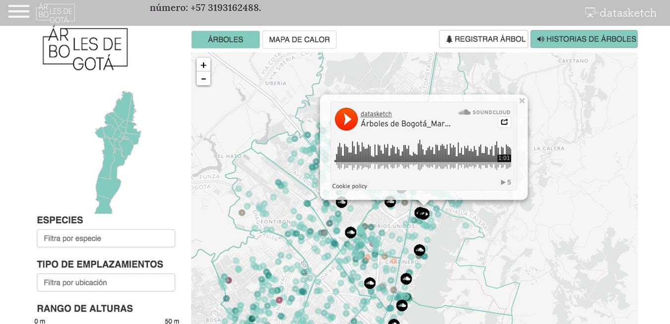
This project by Datasketch, shows how Bogotá has changed radically in the last 30 years and include citizen’s stories of trees


With this project, Juan Pablo Marín and his team attached citizen stories to specific trees in their city. They mapped 1.2 million trees and enabled users to explore narrated stories by other citizens on a web app.

‘I like any citizen science efforts, because that gets a community of passionate people involved in actually collecting the data. They have a stake in it’, James Anderson of Global Forest Watch argued.

He pointed out to this citizen science project where scientists are tracking forest pests through people’s social media posts.

One more idea for engaging storytelling on climate change: Using art to create a beautiful and visual interactive:
Illustrated Graphs: Using Art to Enliven Scientific Data by Science Friday
Shared by Rina Tsubaki of European Forest Institute


Tips on how to deal with climate change sceptics


‘Climate denial isn’t about science — we can’t just assume that more information will change minds’, said Kate Marvel of NASA GISS.

Most experts seem to agree. ‘It often is more of a tribal or cultural reaction, so more information might not stick. I personally think using language other than ‘climate change’, but keeping the message (and call to action to regulate emissions) can work’, said James Anderson of Global Forest Watch.

A great article about that, by Hiroko Tabuchi, and published by The New York Times earlier this year can be found here: In America’s Heartland, Discussing Climate Change Without Saying ‘Climate Change’

‘Keeping a high quality and a very transparent process can help people who look for information with an open mind or at least a critical attitude’, Elisabetta Tola of Formicablu added.

A great initiative where scientists are verifying media’s accuracy:
Climate Feedback
Shared by Rina Tsubaki of European Forest Institute


Places to find data on the environment

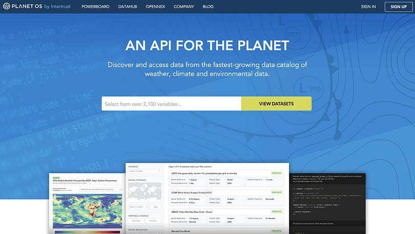
The Planet OS Datahub makes it easy to build data-driven applications and analyses by providing consistent, programmatic access to high-quality datasets from the world’s leading providers.

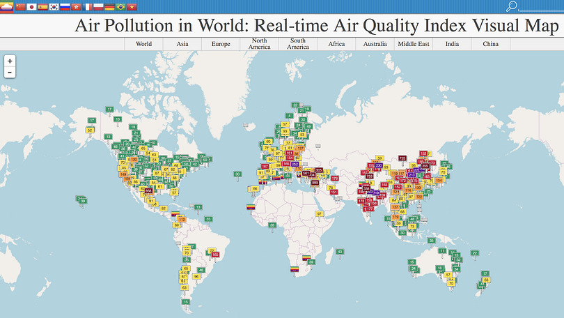
AQICN looks at air pollution in the world with a real-time air quality index.

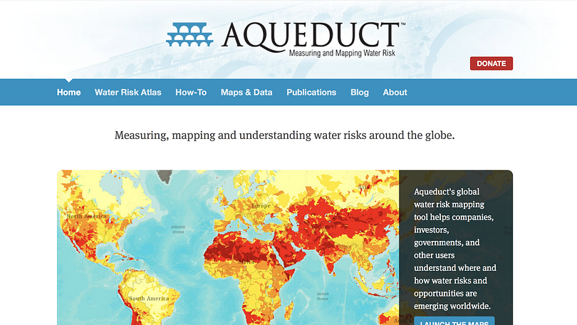
Aqueduct by the World Resources Institute, for mapping water risk and floods around the world.

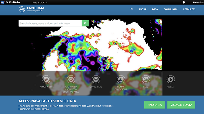
The Earth Observing System Data and Information System (EOSDIS) by NASA provides data from various sources — satellites, aircraft, field measurements, and various other programs.

FAOSTAT provides free access to food and agriculture data for over 245 countries and territories and covers all FAO regional groupings from 1961 to the most recent year available.

Global Forest Watch offers the latest data, technology and tools that empower people everywhere to better protect forests.

The Global Land Cover Facility (GLCF) provides earth science data and products to help everyone to better understand global environmental systems. In particular, the GLCF develops and distributes remotely sensed satellite data and products that explain land cover from the local to global scales.

Google Earth Engine’s timelapse tool is useful for satellite imagery, enables you to map changes over time.

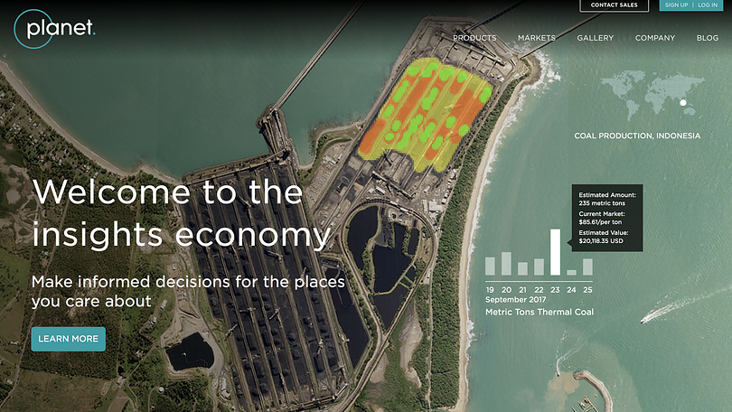
Planet Labs is also great for local imagery and monitoring. Their website feature practical examples of where their maps and satellite images were used by news organisations.


News from our community: In a few months, James Anderson and the team at Global Forest Watch will launch an initiative called Resource Watch which will work as an aggregator and tackle a broader set of environmental issues.

“It was inspired by the idea that environmental issues intersect — for example forests affect water supply, and fires affect air quality. We wanted people to be able to see how interconnected these things are,” said Anderson.


What to do if there is no reliable data: the case of non-transparent government


It is not always easy or straightforward to get data on the environment, and the example of Nigeria was brought about during our discussion by a member of the DJA Slack team.

‘This is because of hypocrisy in governance’, a member argued.

‘I wish to say that press freedom is guaranteed in Nigeria on paper but not in reality.

You find that those in charge of information or data management are the first line of gatekeepers that will make it practically impossible for journalists to access such data.

I can tell you that, in Nigeria, there is no accurate data on forestry, population figure and so on’.

So what is the way out? Here are some tips from our experts:

‘I would try using some external, no official sources. You can try satellite imagery by NASA or Planet Labs or even Google, then distribute via Google Earth or their Google News Lab. Also you can download deforestation, forest fires and other datasets from sites of University of Maryland or the CGIAR Terra-i initiative’, Gustavo Faleiros of InfoAmazonia suggested.

Here is an example:

Nigeria DMSP Visible Data By NOAA/NGDC Earth Observation Group

‘I think with non-transparent governments, it is sometimes useful to play both an “inside game” (work with the government to slowly [publish] more and more data under their own banner) and an “outside game” (start providing competing data that is better, and it will raise the bar for what people [should] expect)’, said James Anderson of Global Forest Watch.

‘It’s a really tough question. We’ve worked with six countries in the Congo Basin to have them improve their data collection, quality-control, and sharing. They now have key land data in a publicly-available portal. But it took two decades of hard work to build that partnership’, he added.

‘I think this is exactly the case when a good connection with local scientists can help’, said Elisabetta Tola of Formicablu. ‘There are often passionate scientists who really wish to see their data out. Especially if they feel it could be of use to the community. I started working on data about seismic safety over five years ago. I am still struggling to get the data that is hidden in tons of drawers and offices. I know it’s there’, she added.

‘For non-transparent governments, connect with people who are behind facilitating negotiations for programmes like REDD to get insider view’, added Rina Tsubaki of European Forest Institute.

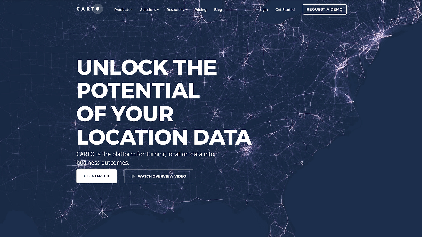
CARTO is the platform for turning location data into business outcomes.


What tools do you use when reporting on environmental data?


Here is what our data journalism community said they played with on a regular basis:

CARTO enriches your location data with versatile, relevant datasets, such as demographics and census, and advanced algorithms, all drawn from CARTO’s own Data Observatory and offered as Data as a Service.

QGIS is a free and open source geographic information system. It enables you to create, edit, visualise, analyse and publish geospatial information.

OpenStreetMap is a map of the world, created by members of the public and free to use under an open licence.

Google Earth Pro and Google Earth Engine help you create maps with advanced tools on PC, Mac, or Linux.

Datawrapper, an open source tool helping everyone to create simple, correct and embeddable charts in minutes.

R, Shiny and Leaflet with plugins were used to make these heatmaps of distribution of tree species in Bogotá.

D3js, a JavaScript library for visualizing data with HTML, SVG, and CSS.

Flourish makes it easy to turn your spreadsheets into world-class responsive visualisations, maps, interactives and presentations. It is also free for journalists.


Great examples of data journalism about the environment we’ve come across lately


How Much Warmer Was Your City in 2015?
By K.K. Rebecca Lai for The New York Times
Interactive chart showing high and low temperatures and precipitation for 3,116 cities around the world.
(shared by Gustavo Faleiros of InfoAmazonia)


What temperature in Bengaluru tells about global warming
By Shree DN for Citizen Matters
Temperature in Bengaluru was the highest ever in 2015. And February was the hottest. Do we need more proof of global warming?
(shared by Shree DN of Citizen Matters in India)


Data Science and Climate Change: An Audience Visualization
By Hannah Chapple for Affinio Blog
Climate change has already been a huge scientific and political topic in 2017. In 2016, one major win for climate change supporters was the ratifying of the Paris Agreement, an international landmark agreement to limit global warming.
(shared by Rina Tsubaki of European Forest Institute)


Google’s Street View cars can collect air pollution data, too
By Maria Gallucci for Mashable
“On the question of compelling environmental stories to prioritize, (this was a bit earlier in the thread) I feel like hyper-local air quality (what is happening on your street?) is powerful stuff. People care about what their family breathes in, and its an urgent health crisis. Google StreetView cars are now mapping this type of pollution in some places.”
(shared by James Anderson of Global Forest Watch)


This Is How Climate Change Will Shift the World’s Cities
By Brian Kahn for Climate Central
Billions of people call cities home, and those cities are going to get a lot hotter because of climate change.
(shared by Rina Tsubaki of European Forest Institute)


Treepedia :: MIT Senseable City Lab
Exploring the Green Canopy in cities around the world
(shared by Rina Tsubaki of European Forest Institute)


Losing Ground
By ProPublica and The Lens
Scientists say one of the greatest environmental and economic disasters in the nation’s history — the rapid land loss occurring in the Mississippi Delta — is rushing toward a catastrophic conclusion. ProPublica and The Lens explore why it’s happening and what we’ll all lose if nothing is done to stop it.
(shared by Elisabetta Tola of Formicablu)


Watergrabbing
A Story of Water, looks into the water-hoarding phenomenon. Every story explains a specific theme (transboundary waters, dams, hoarding for political and economic purposes), and shows the players involved, country-by-country. Take time to read and discover what water grabbing means. So that water can become a right for each country and every person.
(shared by Elisabetta Tola of Formicablu)


Ice and sky
By Wild-Touch
Discover the history and learn about climate changes — the interactive documentary
(shared by Gustavo Faleiros of InfoAmazonia)


Extreme Weather
By Vischange.org
The resources in this toolkit will allow communicators to effectively communicate extreme weather using strategically framed visuals and narratives. Watch the video to see it in action!
(shared by Rina Tsubaki of European Forest Institute)

Plus, there is a new version of Bear 71 available for all browsers:
Bear 71 VR
Explore the intersection of humans, nature and technology in the interactive documentary. Questioning how we see the world through the lens of technology, this story blurs the lines between the wild world, and the wired one.
(shared by Gustavo Faleiros of InfoAmazonia)


To see the full discussion, check out previous ones and take part in future ones, join the Data Journalism Awards community on Slack!


marianne-bouchart

Marianne Bouchart is the founder and director of HEI-DA, a nonprofit organisation promoting news innovation, the future of data journalism and open data. She runs data journalism programmes in various regions around the world as well as HEI-DA’s Sensor Journalism Toolkit project and manages the Data Journalism Awards competition.

Before launching HEI-DA, Marianne spent 10 years in London where she worked as a web producer, data journalism and graphics editor for Bloomberg News, amongst others. She created the Data Journalism Blog in 2011 and gives lectures at journalism schools, in the UK and in France.


How three women are influencing data journalism and what you can learn from them

This article was originally published on the Data Journalism Awards Medium Publication managed by the Global Editors Network. You can find the original version right here.

________________________________________________________________________________________________________________________


Stephanie Sy of Thinking Machines (Philippines), Yolanda Ma of Data Journalism China and Esra Dogramaci of Deutsche Welle, formerly Al Jazeera (Germany), new members of the Data Journalism Awards jury, talk innovation, data journalism in Asia and the Middle East, and women in news.

left to right: Yolanda Ma (Data Journalism China), Esra Dogramaci (Deutsche Welle, formerly BBC and Al Jazeera), and Stephanie Sy (Thinking Machines) join DJA Jury


We welcomed three new members to the Data Journalism Awards jury last year (pictured above). They are all women, strong-willed and inspiring women, and they represent two regions that are often overlooked in the world of data journalism: Asia and the Middle East.

What was your first project in data journalism or interactive news and what memory do you keep from it?

Esra Dogramaci: In 2012, Invisible Children launched a campaign to seek out Lord’s Resistance Army(LRA) leader Joseph Kony and highlight the exploitation of child soldiers. Then, at Al Jazeera, we wanted to see what people in North Uganda, who lived in one of the areas who were affected by the LRA actually had to say about it. They would ‘speak to tweet’ and we would map their reactions on Ushahidi using a Google Fusion table in the background.

 
Uganda Speaks by Al Jazeera


Although Al Jazeera had started doing this kind of projects back in 2009 during the war on Gaza (the experiment’s page of the Al Jazeera Lab website has now disappeared but can be viewed through WebArchive.org), it picked up steam during Egypt’s 2011 Arab Spring where, due to lack of broadcast media coverage, protesters were using social media to bring attention to what was happening.

Interactive story by Thinking Machines


Stephanie Sy: Our first data journalism project as a team at Thinking Machines was a series of interactive stories on traffic accidents in Metro Manila. We cleaned and analysed a set of Excel sheets of 90,000 road accidents spanning 10 years.

It was the first project we worked on as a mixed team of journalists, designers, and data scientists, and the first time we tried to build something from scratch with d3.js! I worked on the d3 charts, and remember being in utter despair at how hard it was to get the interactive transitions to render nicely across different browser types. It was surprisingly well received by the local civic community, and that positive feedback emboldened us to keep working.

 
Connected China, Thomson Reuters


Yolanda Ma: One of my first projects was Connected China for Thomson Reuters, which tracked and visualised the people, institutions and relationships that form China’s elite power structure (learn more about it here).

This project taught me the importance of facts and every piece of data in it (thousands, if not millions in total) went through a rigid fact-checking process (by human beings, not machines, unfortunately). I learned by doing that facts are the bones of data journalism, not fancy visualisations, even though this project turned out to be fancy and cool, which is good too.


Now, what was the latest project you worked on and how do the two compare?


ED: Towards the end of last year, I taught a data journalism module to City University London Master’s students who were able to pull together their own data visualisation projects in the space of an hour. The biggest difference is how vastly the interfaces have improved and how quick and intuitive the designs and interactive softwares are now. There are a lot more companies switched on to storytelling beyond TV or text and that knowledge combined, how do you stand out in the world of online news?

Complementary to that Al Jazeera was always a front runner because they were willing to take risks and try something new when no one else was. In the newsrooms I’ve worked at or see since, there is still a general aversion to risk taking in preference of safety — though everyone knows that to survive and thrive in this digital media landscape, its risk taking, innovation that is going push those boundaries and really get you places.

SS: Our latest related data story is a piece we put together visualising traffic jams across Metro Manila during the holiday rush season. This time we were looking at gigabytes of Waze jams data that we accessed through the Waze API. It definitely grew out of our early work in transit data stories, but reflects a huge amount on growth in our ability to handle complex data, and understanding of what appeals to our audience.

One big piece of learning we got from this is that our audience in the Philippines mainly interacts with the news through mobile phones and via Facebook, so complex d3 interactives don’t work for them. What we do now is to build gifs on top of the interactives, which we then share on Facebook. You can see an example of that in the linked story. That gets us a tremendous amount of reach, as we’re able to communicate complex results in a format that’s friendly for our audience.

YM: I’ve been doing data journalism training mostly in the past few years and helping others do their data projects, so nothing comparable really. The latest project I worked on is this Data Journalism MOOC with HKU in partnership with Google News Lab. It is tailored-made for practitioners in Asia, and it’s re-starting again soon (begins March 6), so go on and register before it’s too late!


What excites you about the future of data journalism and interactive news?


ED: The ability to tell stories in a cleaner, more engaging way. Literally everything can be turned into a story just by interrogating the data, being curious and asking questions. The digital news world has always been driven by data and it’s exciting to see how “traditional” journalism is embracing this more. I love this example from Berliner Morgenpost where they charted this bus line in Berlin, combined with a dash cam comparing various data such as demographics, voting. Its an ingenious way of taking complex data and breaking it into a meaningful, engaging way rather than pie charts.

M29 from Berliner Morgenpost


SS: There are tremendous amounts of data being generated in this digital age, and I think data journalism is a very natural evolution of the field. Investigative journalists should be able to use computer science skills to find their way through messy datasets and big data. It’s absolutely reasonable to expect that a news organization might get a 1 terabyte dump of files from a source.

YM: It excites me because it is the future. We live in the age of data, and the inevitable increasing amount of data available means there is growingly huge potential for data journalism. People’s news consumption is also changing and I believe personalisation is one of the key characteristics for the new generation of consumers, which means interactive news — interactive in many different ways — will thrive.


How are Asian and Middle Eastern media organisations (depending on your experience) doing in terms of data journalism and interactive news compared to the rest of the world?


ED: I think Al Jazeera has always been a pioneer in this. They have a great interactive team that drew together people from various disciplines within the organisation — coders, video people, designers, journalists — before everyone else was doing it and they’ve been able to shed light on stories that wouldn’t usually be picked up on by mainstream media radars.

Example that illustrates my point: The project “Broken homes, a record year of home demolitions in occupied East Jerusalem” by Al Jazeera

“Broken homes, a record year of home demolitions in occupied East Jerusalem” by Al Jazeera


SS: We have a few media organisations like the Philippine Center for Investigative Journalism, Rappler, and Inquirer who have been integrating data analysis into their reporting, but there isn’t anyone regularly producing complex data journalism pieces.

Our key problem is the lack of useful datasets. A huge amount of work goes into acquiring, cleaning, and triple checking the raw data. Analysis is “garbage in, garbage out” and we can’t create good data journalism without the presence of good data. This is where the European and North American media organisations have an edge. Their governments and civic society organisations follow open data standards, and citizens can request data [via FOIA]! The Philippine government has been making serious progress towards more open data sharing, and I hope they’re able to sustain that commitment.

Example that illustrates my point: PCIJ’s Money Politics project is a great example of an organisation doing the data janitorial work of acquiring and validating hard-to-find data. During our last presidential elections in 2015, GMA News Network and Rappler both created hugely popular election tracking live data stories.

PCIJ’s Money Politics


YM: Media organisations in Asia are catching up on data journalism and interactive news. There are some challenges of course, for example, lack of data in less developped countries, lack of skills and talents (and limited training opportunities), and even poor infrastructure or unstable internet especially in rural areas that would limit the presentation of news stories. Despite the difficulties, we do see good works emerging, though not necessarily in English. Check out some of the stories from the last GIJN’s Investigative Journalism Conference held in Nepal and you’ll get an idea.

Example that illustrates my point: This Caixin Media data story analysed and visualised the property market in China for the past few years.


Another New Normal, Caixin Media


What view do you have on the role of women in the world of news today? How is it being a woman in your respective work environment? Do you feel it makes a difference? If so, which one and why?


ED: Women are underrepresented not just in news coverage but in leadership positions too. I have to admit though that being at Deutsche Welle, I see a lot more women in senior management and it feels like a much more egalitarian working environment. However looking at my overall experience as a woman in news, you do face a lot of sexism and prejudice. Every woman I know has a story to tell and when the latest story about Uber came out a lot of my female colleagues around me were nodding their heads.

What got me through challenging times is having a fantastic network of female role models and mentors who are there to support you. That was one piece of advice I gave to prior teams, get a mentor. A lot of women feel isolated or feel the way they are treated is normal but it’s not. Women should also be aware that there is a real risk you will be punished if you speak up, challenge the status quo and tow the party line. If this happens, it’s an environment or team you probably shouldn’t be in anyway.

SS: It’s alarming to see parties around the world trying to stifle the voices of anyone who doesn’t belong and calling any news that doesn’t flatter them as “fake news.”. It’s important for us to speak up as women, and to practice intersectionality when it comes to other marginalised communities. As people who work with data, we can see past the aggregates and look at the complex messy truth. We must be able to communicate that complexity in order for our work to make a difference.

YM: Most of the data journalism teams in China are led by woman, and I think they are doing really well 🙂


What do you think makes a great data journalism project? What will you be looking for when marking projects for the Data Journalism Awards this year?


ED: Simplicity. It’s easy to get lost in data and try to do too much, but it’s often about taking something complex and making it accessible for a wider audience, getting them to think about something they haven’t or perhaps consider in a different way. I’ll be looking for the why — why does this matter, does this story or project make a dent in the universe?

After all, isn’t that what telling stories is about? The obvious thing that comes through is passion. It’s also something obvious but you can tell when a person or team has cared and really invested into the work versus projects being rolled off a conveyor belt.

SS: A great data journalism project involves three things: novel data, clever analytical methods, and great communication through the project’s medium of choice. I’m hoping to see a wide variety of mediums this year!

Will someone be submitting an audio data journalism project? With all the very exciting advances in the field of artificial intelligence this year, I’m also hoping to see projects that incorporate machine learning, and artificial intelligence.

YM: I believe data journalism is after all journalism — it has to reveal truth and tell stories, based or driven by data. I’ll be looking for stories that do make an impact in one way or another.


If you had one piece of advice for people applying for the Data Journalism Awards competition, what would it be?


ED: Don’t be intimidated by the competition or past award winners. Focus on what you do best. I say this especially for those applying for the first time, I see a lot of hesitation and negative self talk of ‘I’m not good enough’ etc. In every experience there’s something to learn, so don’t hesitate.

SS: Don’t forget to tell a story! With data science methods, it’s easy to get lost in fancy math and lose track of the narrative.

YM: Tell us a bit about the story behind your story — say, we may not know how hard it might be to get certain data in your country.


What was the best piece of advice you were ever given in your years of experience in the media industry?


ED: Take every opportunity. That’s related to a quote that has been coming up over and over again for the past week or so, “success is when preparation meets opportunity.”

SS: One of my best former bosses told me to imagine that a hungover, unhappy man with a million meetings that day was the only reader of my work. He haunts me to this day.

YM: I started my career with the ambition (like many idealistic young people) to change China. My first (and second) boss Reg Chua once said to me, don’t worry about changing China but focus on making small changes and work with a long-term vision. Sounds cliche.

He said that to me in 2012. The next year, together with two other friends I started DJChina.org, which started in 2013 as a small blog and now grown to be one of the best educational platforms for data journalism practitioners in China. The year after, in 2014, Open Data China was launched (using the domain name I registered a few years back), and indicated a bottom-up movement to push for more open data, which was incorporated into national policy within a year. So I guess all these proved that Reg was right, and it could be applied to anywhere, or anything. Think big, act small, one story (or project) at a time, and changes will happen.


left to right: Yolanda Ma (Data Journalism China), Esra Dogramaci (Deutsche Welle, formerly BBC and Al Jazeera), and Stephanie Sy (Thinking Machines)


Stephanie Sy is the founder of Thinking Machines, a data science and data engineering team based in the Philippines. She brings to the jury her expertise in data science, engineering and storytelling.

Yolanda Ma is the co-founder of Data Journalism China, one of the best educational platforms for data journalism practitioners in China. Not only representing the biggest country in Asia, she also has experience teaching data skills to journalists and a great knowledge of data journalism from her region.

Esra Dogramaci has now joined Deutsche Welle and formerly worked with the BBC, Al Jazeera in Qatar and Turkey, as well as the UN Headquarters and UNICEF. She brings to the DJA jury significant experience in digital transformation across news and current affairs, particularly in social video and off platform growth and development.


The Data Journalism Awards are the first international awards recognising outstanding work in the field of data journalism worldwide. Started in 2012, the competition is organised by the Global Editors Network, with support from the Google News Lab, the John S. and James L. Knight Foundation, and in partnership with Chartbeat. More info about cash prizes, categories and more, can be found on the DJA 2017 website.


marianne-bouchart

Marianne Bouchart is the founder and director of HEI-DA, a nonprofit organisation promoting news innovation, the future of data journalism and open data. She runs data journalism programmes in various regions around the world as well as HEI-DA’s Sensor Journalism Toolkit project and manages the Data Journalism Awards competition.

Before launching HEI-DA, Marianne spent 10 years in London where she worked as a web producer, data journalism and graphics editor for Bloomberg News, amongst others. She created the Data Journalism Blog in 2011 and gives lectures at journalism schools, in the UK and in France.

The New Data Journalism Blog is live

Welcome to our new home. As you can see, we’ve redecorated the place.

I am excited to share with you the project that kept us busy for the past few months.

The new DJB is bolder, savvier, smarter, and packed with insights from the world of data journalism and innovative storytelling.

We have a lot of new content lined up for you: articles, reviews, how-to guides and interviews with experts from the fields of data visualisations, programming and investigative reporting. As well as a few specials.

« Data » is a big buzz word, it’s also a great way to tell stories we couldn’t tell before.

We hope to launch an array of compelling web projects in the near future that will inform our audience in an engaging way, while becoming the prime destination for knowledge on data journalism and innovative storytelling.


Hei-Da.org: a not-for-profit fostering data journalism and web innovation

So we have this great new look and lots of new content. But that’s not the only change that we’ve made. There’s more…

The DJB is now part of the Hei-Da social enterprise for data journalism and web innovation, and we are very excited about it. But what does it mean exactly?

Hei-Da is a not-for-profit organisation fostering the future of data journalism, open data and innovative storytelling.

Its mission is to nurture the future of its field by building an innovation hub dedicated to research in the field of data journalism and web innovation where experiments, training and conferences would take place, unlikely collaborations would blossom, and startups tackling technologies related to data journalism can get advice and support.

We believe it is important that knowledge, skills and ideas get shared and reflected upon. We also think that news is not the only place for data storytelling skills to be used. Many NGOs, charities, local communities, governments and other organisations have data at hands that could tell compelling stories, yet they rarely have the time nor expertise to produce them. Hei-Da was also created to help them harness that data and create interactive storytelling projects on the web that support their mission.

For this to happen, we will need to gather the partners, sponsors and funding necessary for such an ambitious project. If you think you can help, please get in touch.


The DJB at TechFugees

Today is the start of the TechFugees conference in London, an exciting, absolutely free and nonprofit event organised by TechCrunch editor at large Mike Butcher to find technology solutions to the refugee crisis.

The Data Journalism Blog supports this event and I will be talking at the conference about our initiative, how data journalism has been used to cover the refugee crisis, what challenges news organisations face to get data on the crisis and what technology solutions there could be to facilitate data gathering, publishing and storytelling on the ground.

We will be covering the conference on the Data Journalism Blog (you can already see an introductory post here) and Andrew Rininsland, senior developer at The Times and The Sunday Times, will tell us about his experience of the Techfugees Hackathon happening on Friday, October 2nd in London (if you want to join, tickets are still available here).


We’ve only just begun

The Data Journalism Blog is built for a global audience of journalists, designers, developers and other data enthusiasts. People who are interested in the emergence of open data, both experts and amateurs, and want to understand better how it could change the future of information. Or, people who really like fancy infographics and want to find more data visualisations from various sources. Part of the content is very specific and would require knowledge about data journalism, other parts are very broad and could suit more novice readers.

We will thrive to push innovation to the full and experiment new techniques for ourselves, team up with partners to create compelling and interactive storytelling projects as well as deliver news and insights from the industry here on the DJB. So sit back, let us know what you think and let’s enjoy the journey. This is only the beginning.

For more info on Hei-Da.org, go and check out the website.

I hope you enjoy the new look and would love to hear your views. Catch us on Facebook and Twitter.

marianne-bouchart
Marianne is the founder and director of Hei-Da.org, a not-for-profit organisation based in London, UK, that specialises in open data driven projects and innovative storytelling. She also created the Data Journalism Blog back in 2011 and used to work as the Web Producer EMEA, Graphics and Data Journalism Editor for Bloomberg News.
Passionate about innovative story telling, she teaches data journalism at the University of Westminster and University of the Arts, London.

3 Golden Rules to #ddj — Ændrew Rininsland

1. Tell the reader what the data means

Tools like Tableau make it really easy to make exploratory visualisations, giving the user the ability to sift through the data and localise it to themselves. However, as tempting as this can be, the role of the data journalist it to tell the reader what the data means — if you have a dataset that includes the entire country but only a handful of locations are relevant to your story, an exploratory map isn’t the best approach. Aim for explanatory visualisations.


2. Simple is usually better

A quick glance through the examples page of d3js.org reveals a wealth of different and unusual ways to visualise data. While there are definitely occasions where an exotic visualisation method communicates the data more effectively than a simple line or pie chart, these are really rather rare. The Economist’s use of series charts to efficiently summarise an entire article in a tiny space demonstrates how effective the “classic” visualisation types are — there’s a reason they’ve stood the test of time (The Economist’s incredibly clear descriptions and simple writing style also really help here). Meanwhile, I don’t think I’ve ever gained any insights from a streamgraph, pretty as they are.


3. Code for quality

News moves really quickly, which can make it exceptionally difficult to code for quality over speed. Nevertheless, all aspects of your data visualisation need to work — a bug causing a minor element like a tooltip to not update or report the wrong data can at best reduce reader confidence, or at worst, taint a long and costly investigation, possibly even leading to libel proceedings. This is made all the more difficult by the fact that JavaScript is what’s referred to as a “weakly typed” language, meaning that variable types (strings, numbers, objects, et cetera) can mutate over the course of a script’s execution without throwing errors — for instance, `Number(a + b)` will either return the sum of `a` and `b` or the concatenated value of those two variables (e.g., `’1’ + ‘2’ = ‘12’`), depending on whether they’re strings or numbers to begin with. This can be incredibly difficult to discover and troubleshoot. Fortunately, projects like Flow and TypeScript seek to add type annotations to JavaScript, effectively solving this problem (My recent open source project, generator-strong-d3, makes it really easy to scaffold a D3 project using either of these). Another way to improve code quality is to provide automated tests, which are a bit more work at the outset but will prevent bugs from cropping up as you get frantic towards deadline. “Test-Driven Development” (TDD) is a good practise to get into as it encourages you to write tests at the very beginning and then develop until those pass. It’s also a lot faster than writing tests later (or not at all, i.e., “cowboy coding”) once you get the hang of it, as you can save a lot of time avoiding the “make a change, refresh, manually execute a behaviour, evaluate output, repeat” cycle.


Aendrew-Rininsland-profile-picture

Ændrew Rininsland is a senior newsroom developer at The Times and Sunday Times and all-around data visualisation enthusiast. In addition to Axis, he’s the lead developer for Doctop.js, generator-strong-d3, Github.js and a ludicrous number of other projects. His work has also been featured by The GuardianThe Economist and the Hackney Citizen, and he recently contributed a chapter to Data Journalism: Mapping the Future?, edited by John Mair and Damian Radcliffe and published by Abramis. Follow him on Twitter and GitHub at @aendrew.

Building a data journalism tools library

I’ve been working in data journalism since 2012. And one of the biggest personal challenges I still face is balancing between learning new tools, become more proficient with older ones, and not missing deadlines because I am spending too much time learning how to use data journalism tools.

When I started as a data journalism student, I began filling in a spreadsheet with links to inspiring tools I wanted to use and learn. I collected these from mailing lists, tweets, blogs and friends’ suggestions. At first, the spreadsheet was simply an ugly dump of links that I used as a student, then as a freelancer, then as a data journalist and data expert at Silk. A month ago I decided to turn it into something useful for other data journalists as well: an interactive and searchable database of data journalism tools. I knew that there were already many resources listing hundreds of (data) journalism tools. But all the ones I saw were lacking the data structure that would make it easy (and beautiful) to sift through the information.

01102015-Silk3

Silk.co is a platform for publishing, visualizing and sharing data on the Web. I realized that this was also the best tool to publish my data journalism tools’ database.  

On Silk I could:

  • quickly upload a spreadsheet to organize the information in an interactive database
  • visualize information about the tools, either as individual entries in galleries or tables or as a chart showing types of tools and other data
  • have individual profiles for each tool
  • generate inline filters that each time would allow me to find the tool I needed.

The project went live two weeks ago. You can find it at data-journalism-tools.silk.co.  I am regularly updating the Data Journalism Tools Silk, adding about 10 new tools every week. You can go to the website to check it out, or you can also “follow” it to receive free updates via email every time something new is added.

01102015-Silk2

Just as this Data Journalism Tools Silk is intended for the community, it will greatly benefit from the community’s input. For this, I’ve made a Google Form so that anyone can suggest a favourite tool.

The key thing for me is that adding real structure to data adds tremendous power to whatever presentation vector you choose to deploy. There are blogs and lists that contain many, many more journalism tools than this one. But by adding structure to each tool and putting it onto its own structured Web page, we can unlock the power of the data as a filtering, visualization and discovery tool. More structured data equals more discovery.


Alice Corona is an Italian data journalist. She received an MA of data journalism MA in The Netherlands and is currently a data journalism lead at the data and web publishing platform Silk.co. Here she regularly creates data-driven projects like “Through The Gender Lens: Analysis of 6,000 Movies”,  “Playboy, Then and Now”, “Women at the International Film Festivals” and “Patents by the National Security Agency” You can email her at alice@silk.co.

Why Data Journalism is Important

After studying Data Journalism for a year at City University I have come to appreciate the importance of having the skillset to make the most out of numbers and statistics. Many aspiring journalists still see data as something that is separate from journalism, and as something that does not interest them. In response, I have compiled some reasons why data is increasingly important:

1.       Make sense of Mass Information

Having the skills to scrape, analyse, clean and present data allows journalists to present complicated and otherwise incomprehensible information in a clear way. It is an essential part of journalism to find material and present it to the public. Understanding data allows journalists to do this with large amounts of information, which would otherwise be impossible to understand.

2.       New Approaches to Storytelling

Able to create infographics and visualisations, data journalists can see and present information in a new and interesting way. Stories no longer need to be linear and based solely on text. Data can be grafted into a narrative which people can read visually. Interactive elements of data visualisations allow people to explore the information presented and make sense of it in their own way.

3.       Data Journalism is the Future

Understanding data now will put journalists ahead of the game. Information is increasingly being sourced and presented using data. Journalists who refuse to adapt to the modern, increasingly technological world will be unable to get the best stories, by-lines and scoops and their careers will suffer as a result.

4.       Save Time

No longer must journalists pore over spread-sheets and numbers for hours when there could be a simpler way to organise the information. Being technologically savvy and knowing the skills to apply to data sets can save journalists time when cleaning, organising and making sense of data. Not making mistakes due to lack of knowledge can also save a journalist time.

5.       A way to see things you might otherwise not see

Understanding large data sets can allow journalists to see significant information that they might otherwise have overlooked. Equally, some stories are best told using data visualisations as this enables people to see things that they might otherwise have been unable to understand.

 6.       A way to tell richer stories

Combining traditional methods of storytelling with data visualisations, infographics, video or photographs, creates richer, more interesting and detailed stories.

7.       Data is an essential part of Journalism

Many journalists do not see data as a specialist and separate area of journalism, but an interwoven, essential and important element of it. It is not there to replace traditional methods of finding information, but to enhance them. The journalist that can combine a good contact book and an understanding of data will be invaluable in the future.

VISUALISATION ANALYSIS #3

http://www.guardian.co.uk/news/datablog/interactive/2012/mar/26/office-for-national-statistics-health

Simon Rogers has published a fantastic interactive graphic for the Guardian Datastore that maps teenage pregnancy rates in England and Wales from 1998 to 2010.

The visualisation shows the conception rate of under-eighteen year olds, per 1000 women, in different counties across England and Wales. The interactive map is an ideal way to present the information, as the visualisation contains a large amount of data in a comprehensible way. From the graphic we can derive that the number of teenage pregnancies has declined in the last decade, although this varies by area.

In order to focus on a specific county the user can scroll the mouse over the map and click on a different area, labelled by county at the side of the map. Once you click on a county the line graph changes to show the counties’ change in number of teenage pregnancies by year and how this compares to the England and Wales average. This allows the user to have more detailed and specific information simply by clicking on the infographic. Thus the graphic allows users to see the more personalised, local data.

By using this tool the user can focus on various localised data, and see how they compare with each other. For example, in Wales it is apparent that poorer counties, such as Merthyr Tydfil and the South Wales Valleys, are significantly over the national average regarding the number of teenage pregnancies. In contrast, geographically close but wealthier counties like Monmouthshire and Powys are below the national average. In most cases this has not altered over the decade.

The map thus proves that in certain circumstances seeing only the larger data can give a limited understanding, as it shows a national decline in the number of teenage pregnancies but does not tell us that many individual counties have not changed significantly. In this way a graphic of this kind presents to users the ‘big picture’, in a clearer way than text alone.

The graphic also allows users to ignore information that is not of interest to them and to focus on geographical locations that are. This gives users a certain amount of control over the visualisation, as information is not decided for the user, as would be the case with textual narrative.

The interactive element of the visualisation allows users to find the story or information for themselves with no difficulty. This is more satisfying than simply being told information. At a time when the general public’s trust in journalism is low, visualisations such as this demonstrate that the journalist has not played around and sifted information but presented all of it to the user and allowed them to draw their own conclusions. In this way the user can get a more detailed, accurate and neutral understanding of the issue presented. It also breaks down the barrier between journalist and user and implies trust in the user to interpret and organise the data in an intelligent way.

The graph also uses visual symbols to organise the large amount of data. The map of England and Wales is easily recognisable, as is many of the counties. The counties that are under the national average are a light shade of blue and this gets darker as the percentage increases. The use of blue and purple makes the map visually attractive and the differences in shade easily identifiable. It is apparent that darker areas cluster together and that generally the North of England is darker than the South. In this way the user can obtain information from the visualisation by looking at it alone. The darker shade of purple stands out amongst the generally lighter shades and thus the graphic signals to the reader some of the most dramatic information. Thus, although the user is given control and the freedom to explore the data and draw their own conclusions, visual signals guide them to the most extreme data.

The orange circle that is drawn around a county when it is selected contrasts with the blue, making it clear. It also correlates with the colour of the line graph, making the visualisation easily readable.

By pressing ‘play’ the user can focus on one county and see how it breaks down by each year, as well as how the colours across the UK has changed by year, thus presenting more information.

The visualisation thus works as it presents a large amount of data comprehensibly. It allows the user to interpret and organise the data, but gives them visual signals to guide them. It also gives information for the whole country, as well as localised data, thus presenting the ‘big picture’. It is clear and easy to read and breaks down the barrier between journalist and user. It is therefore an excellent way to present the data.

Visualisation Analysis #2

Simon Rogers has created a visualisation showing death penalty statistics, country by country, for the Guardian Data Blog.

http://bit.ly/hdFOpa

http://bit.ly/hflX1V

The visualisation uses a bubble graph on a map of the world to depict how many people have been given death sentences and how many people have been executed in 2011. This is then broken down by country, giving users the opportunity to compare and contrast regions.

Continue reading “Visualisation Analysis #2”

How to do a good visualisation and why it’s important

Visualisations are an important tool when presenting data, and can be used to show patterns, correlations and the ‘big picture’.

Ben Fry has said that visualisations ‘answer questions in a meaningful way that makes answers accessible to others’ and Paul Bradshaw explains that ‘visualisation is the process of giving a visual form to information which is otherwise dry or impenetrable.’

Traditionally stories have been conveyed through text, and visualisations have been used to display additional or supporting information. Recently, however, improved software has allowed journalists to create sophisticated narrative visualisations that are increasingly being used as standalone stories. These can be be linear and interactive, inviting verification, new questions and alternative explanations.

Continue reading “How to do a good visualisation and why it’s important”