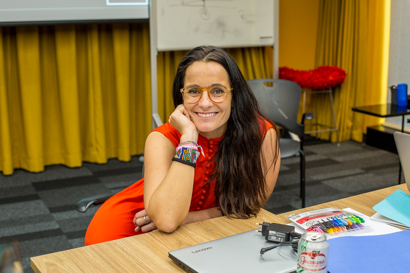
The deadline to apply to the Data Journalism Awards 2018 is fast approaching. As data journalists from around the world have just one week to gather their best data-driven work, we met with Mariana Santos, founder and co-director of Chicas Poderosas, also member of the competition jury. Her vision inspires women in Latin America and around the world. In this interview, she tells us how she wants to share her accomplishments as an innovator in digital media with other women, and to help them succeed as new media leaders.
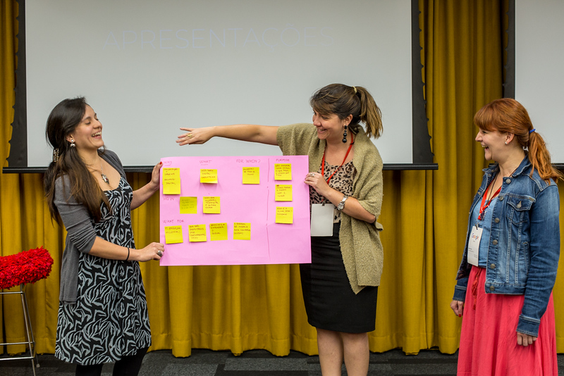
Chicas Poderosas has been “changing the face of media, one woman at a time” since 2013. What specific skills do you think are most important for women who work in the media industry?
Depending very much in what community women work in, they need specific skills.
If we talk about Bolivia, for example, the women with whom we are working there are mainly radio communicators. They have very basic access to the internet. That is why we first trained them on the basics of how to use Facebook and Twitter, such as creating groups, using hashtags, replying and doing reports with video, audio and text. Then, we organised a 3-day hackathon to show them how to make their own audio podcast.
In other countries like Colombia, for instance, we put the emphasis on fact-checking training to show how to track social media networks, and also how to understand trends. Especially in times of elections, fact-checking is important there, as fake news have been especially spread all around social networks, and it is essential in journalism generally.
An other skill we train women on is data-scraping, to understand how to work with data. We also organise data visualisation workshops, which are more about design and conceptualization of user journeys, as well as work on interfaces.
So, from technology, arts and journalism – everything comes together. Depending on the community we work in, we change the technology that we are using.
Why is there a difference between women and men in the media industry?
When you look at the development departments within newsrooms, most of them are made of men. I worked at the Guardian from 2010 to 2013, and in a group of 200 people working on development, we were only three women. You can find the same situation in Latin America, only it’s even worse.
We want to change this! We want women to grab their future with their own hands, and understand that technology is not only the future but also the present.
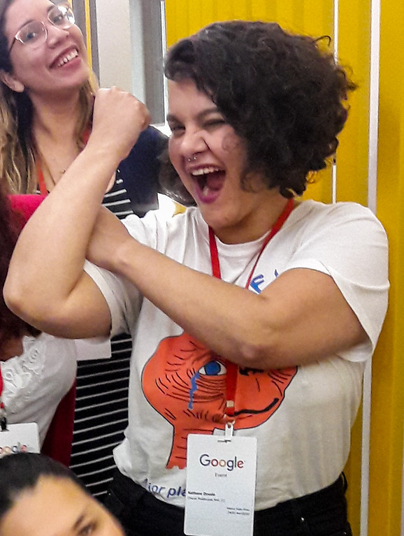
In most training programmes, as soon as it is about technology, there will be way more men than women. Creating Chicas Poderosas, which has “women” (chicas) in its name, automatically attracted more women. We’ve created a space where they feel comfortable, where it’s ok to fail, where they are not being judged, and where they can share their doubts, questions and insecurities. A space where they can grow together and be better together.
One thing you are focusing on is the situation of women in politics and how to use data journalism to improve gender inequality in Central American governments. As you are mainly working in Brazil, can you give us an insight on what the situation is like for women over there?
From what I know, and what I’ve been feeling, the political situation is very poor. Right now you have extremely corrupted candidates who run for president. Even the former president tries to get into office again, even though he is about to be put in jail.
The situation for women is worse. They have quotas for the number of women to represent congress, parliament, and the government. But in most cases, they are actually either daughters, wifes, sisters or cousins of male presidents or males who are somehow connected to the political scheme. Therefore, they do whatever they are told to do.
That’s not what we need! With Chicas Poderosas we start a discussion in politics, asking questions such as “what does it take for women to be taken seriously in politics?”
What are you looking for when voting for projects from the Data Journalism Awards competition?
Data journalism for me is the core of journalism and that is what I began with. What I look for are proposals that are varied, not laid back safe, not copying the great examples that are already there, projects that come up with something new. Engage me in the story! That’s the main thing.
Regardless of the story, I want to see variety. See out of the box, go out of your comfort zone and show me what you can do!
Besides teaching digital and new media skills, Chicas Poderosas offers leadership training. Why is it especially important for women?
In Latin America I see that women have a tendency to block themselves, to not believe that they can do the things they want to do, and therefore, there is a lack of women leaders. Why does a woman has to become more man-like in order to be seen as a leader? This is something we really want to change!
Women have so many skills and qualities that they often don’t use. This is really sad because they have characteristics that are really useful and needed for leadership.
What are your main pieces of advice for women in media leadership positions?
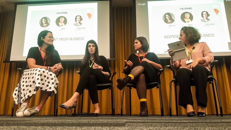
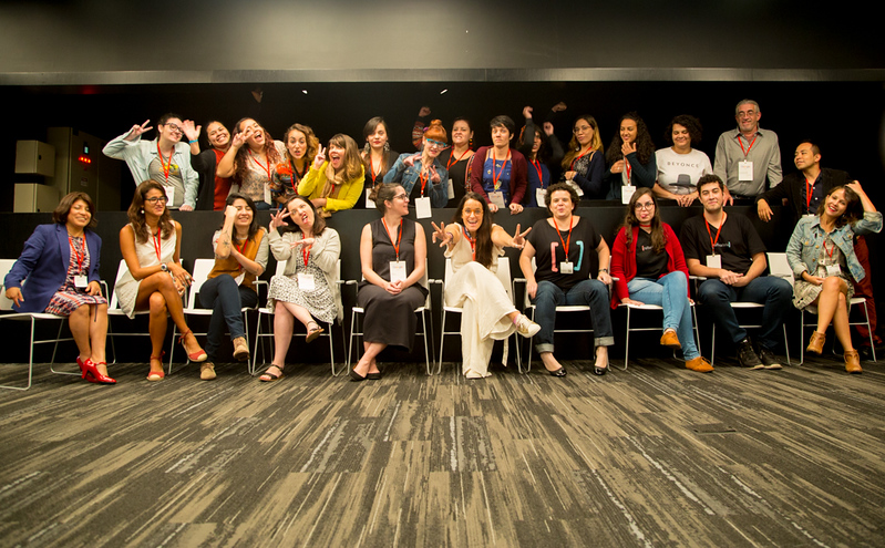
I’ve been meeting amazing women leaders in the media and we are trying to bring them to the New Ventures Lab that we have started a few weeks ago in St. Paulo, Brazil. We need more women role models in Latin America! We bring them to share their stories and insecurities, and we are trying to teach them to be very goal-driven.
As an entrepreneur you need to not only want but also to be able to do it. To run the extra mile and give a little bit more. Because you may have a full-time job, or a family to take care of.
In order to strive within new media you have to think outside of the box, because journalism has changed – print is dying, digital is here to stay. We cannot think the same way as we did in print days. The same thing goes for leadership. Whether you are a man or a woman, use all your strengths and your skills in your execution of leadership.
What upcoming projects do you have at Chicas Poderosas?
The next big goal is to finish our New Ventures Lab initiative on 25 May 2018, in St Paulo, Brazil, at Google’s offices. There, ten teams will have to reach their full potential, launch and run their own businesses.
What we want to do is to have a very solid structure in terms of investigative media training. This is our main core and it will always be.
We created a network that gathers people from 11 countries in Latin America, and supports women.
Finally, what are your favourite programmes to create graphics with?
I love making illustrations with Illustrator and animating everything in After Effects. Sometimes I like using stop-motion as well but that’s a little bit more crafty and handmade: you draw, you keep the paper, you lay it on any surface you have and take a picture of every movement you want to create. That makes a really crafty animation. It’s very time consuming but, when you don’t give me any time limitation, that’s what I love doing the most.

Michaela Gruber is a journalism and media management student, based in Vienna, Austria. During her studies she spent a semester abroad in France, where she started working for HEI-DA.
As the company’s communication officer, she is in charge of the Data Journalism Blog and several social media activities. This year, Michaela will also be HEI-DA’s editor covering the Data Journalism Awards in Lisbon, Portugal.