
We’re all acquainted with the perks and limitations of using Google Fusion, Tableau, Many Eyes and Open Street Map but I was wondering what other visualisation and infographic tools are readily accessible and available for wannabe data journalists. And more specifically, wannabe data journalists with no graphic design experience (like me).
Here are few online tools available that are just the ticket.
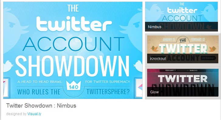
• Visual.ly Create
Recently launched, this tool allows you to create a range of infographics based on Twitter and Facebook data
• Infogr.am
Easy as 1-2-3 tool to create simple interactive charts and infographics
• Timeline
Feeds a variety of media from tweets to Soundcloud clips into a timeline. If you’re interested in timelines take a look at Timetoast too.
• easel.ly
Another simple infographic generator with pre-designed themes
• iCharts
Load data from Excel or Google Spreadsheets to create interactive charts
• Gephi
Create complex network visualisations and hierarchical graphs
• Thinglink
Make static images in your data project much more interesting by layering on audio, video and rich media links
• Picktochart
Another faff-free tool to generate vibrant infographics