Information is Beautiful by David McCandless
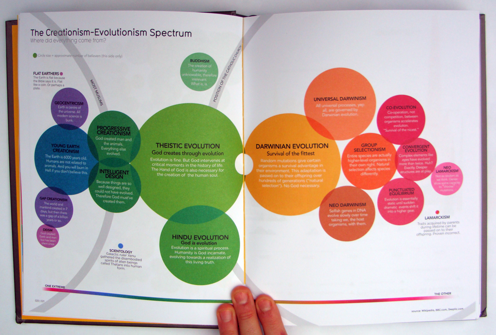
There is no denying it, David McCandless is the undefeated guru of data visualization. A compilation of his work called “Information is Beautiful” has been a success around the world and his visualizations for The Guardian’s Data Blog such as or are a good example of how pictures can sometimes speak better than words.
We met with him in a busy London cafe to discuss what news organisations need to do to embrace and adapt better to the emergence of open data…
[audio:https://www.datajournalismblog.com/wp-content/uploads/2011/04/David-McCandless1.mp3|titles=Infographics in the newsrooms, interview with David McCandless]


